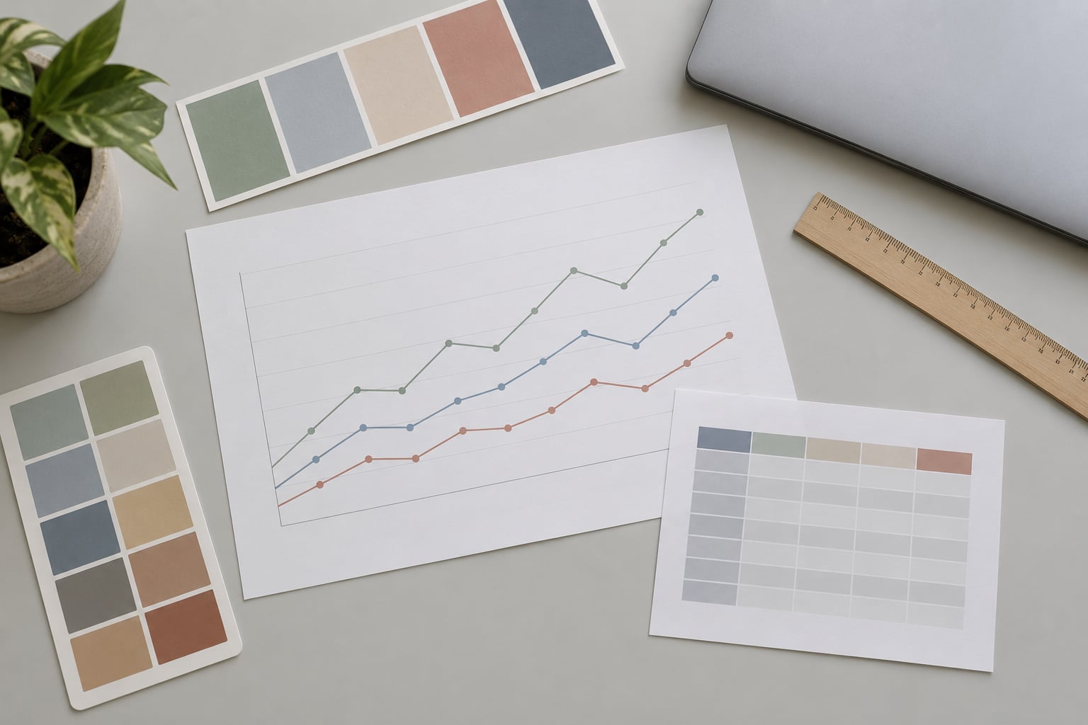
To pick colors for data visualizations, first work out whether your data is unordered categories, values on a scale, or values sitting either side of a meaningful midpoint, then match it to a palette family and check the result for contrast, colorblind readability and greyscale survival. The whole process takes about 20 minutes for a single chart, and the method below is the same one I use whether the graphic lands on a website, in a print piece, or in a newsroom dashboard nobody has opened since the election.
The reason this needs a method at all is that color is the fastest channel a reader has. Get it wrong and the chart quietly misleads: a darker bar looks more important than a taller one, or two categories read as the same thing. Get it right and readers pull values out of the graphic without touching the legend.
What follows is a six-step workflow. Skip to the step list if you already know the vocabulary, or read the palette table first if you are still deciding which kind of colors your data wants.
What You Need Before You Choose a Single Hex Code

Six inputs decide your palette, and most of them are answers rather than tools. Have them settled before you open a color picker, otherwise you are decorating instead of encoding.
- The visualization type. Line, bar, map, heatmap, scatterplot and dashboard tile all place color differently. A categorical palette that works on a bar chart falls apart on a choropleth.
- What the data means. Categories, magnitude, status, geography, change against a benchmark, or a mix. This is the single most important input and it takes one sentence to write down.
- Who reads it. A specialist who knows the domain needs no legend. A general news audience needs every color to earn its place.
- Where it appears. Screen, print, dark mode, social cards and PDF all have different backgrounds and different constraints.
- Accessibility requirements. If you publish to a public audience, assume some readers cannot separate red from green.
- Brand or style constraints. A two-color corporate palette and a twelve-variable dataset are a real conflict, and it needs a documented decision rather than a workaround.
You also need somewhere to check your work. A browser-based palette tool plus a colorblind simulator covers the whole verification step, and both are free.
Here is the decision that comes out of all six inputs. The three palette families are not stylistic preferences; each one encodes a different relationship between the values.
| Palette type | Use it when | Typical chart | How many hues |
|---|---|---|---|
| Qualitative | Values are unordered categories with no ranking between them | Line chart with 3-5 series, grouped bars, category legend | 3-7 distinct hues, all roughly equally vivid |
| Sequential | Values run from low to high and only the magnitude matters | Choropleth map, heatmap, cell background on a table | One hue or two, 5-9 steps from light to dark |
| Diverging | Values sit either side of a meaningful midpoint such as zero or a target | Change map, election margin, variance from benchmark | Two hues meeting at a neutral midpoint, 3-5 steps each side |
If you cannot fill in the “what the data means” row without hesitating, stop there. Choosing a palette before that is the single most common way these decisions go wrong.
Six Steps: How to Pick Colors for Data Visualizations
1. Clarify What the Colors Must Communicate
Write one sentence naming what each color stands for. If the sentence cannot be written, the chart does not yet have a color job.
Hue separates categories. Lightness carries magnitude, because human vision reads brightness differences far more reliably than hue differences. Status is semantic: red, amber and green already mean bad, caution and good in most newsroom contexts, so using them for arbitrary series wastes a signal readers have learned.
Two encodings get confused constantly. Categories in a gradient are wrong, because a gradient implies a continuum that does not exist between “homes” and “apartments”. And a rainbow ramp over ordered values is worse: it creates bright bands that read as peaks where the data is simply mid-range.
How you can tell it worked: hand the chart to a colleague who did not build it and ask what each color means. If they guess wrong, or shrug, the mapping is not doing its job.
2. Start With a Small, Controlled Palette
Decide how many colors you actually need before you look at any palette. Most categorical charts live comfortably between three and five series.
People reliably tell about five to eight colors apart at once, and past that the legend becomes the real content. Seven is a sensible hard ceiling; if you have more series than that, the fix is usually a small multiples layout or a filtered view, not an eighth hue.
Stay in one neighborhood of the color wheel. Hues that sit 60 to 120 degrees apart read as a deliberate family, while a scatter of complementary opposites reads as noise. Pure greens are the awkward case, so avoid the band above roughly 160 degrees and below 60 degrees, where green starts colliding with the yellows and blues next to it.
Keep every hue in the palette similarly colorful. A palette where one series is neon and the rest are muted tells the reader something, and it is almost never what you meant.
For a team building a repeatable set, define the roles rather than the swatches: neutral, highlight, comparison, warning, and a muted pair for the third and fourth series. Roles survive a redesign; a specific hex rarely does.
3. Build Contrast Around the Data
Contrast in a chart has a job to do, and that job is hierarchy. The mark the reader should notice first should have the most contrast against everything around it.
Four relationships matter. Marks against the background, adjacent categories against each other, data labels against their own mark, and the axis or reference line against the plot area.
Give large filled marks a contrast ratio of at least 3:1 against the canvas, and text a ratio of at least 4.5:1. A light line on a white background fails long before anyone notices the palette is fashionable.
The canvas needs desaturating. On a light background, keep it above roughly 95% lightness and below about 7% saturation. On a dark background, stay under 20% saturation with lightness in the 10-25% range. A tinted background is fine, but a saturated one competes with every mark you place on it.
Too much contrast is a real failure mode too. A near-black bar on a white field screams so loudly that the other six series vanish, and it flattens the differences you spent step 2 working on.
How you can tell it worked: squint at the chart. What survives the blur is your hierarchy, and what disappears is supporting detail.
4. Check for Color Vision and Accessibility Problems
Roughly 1 in 12 men has some form of color vision deficiency, which means a red-versus-green comparison in a published chart is not a small edge case. It is a large one.
| Type | Rough prevalence | What it changes | Use instead of |
|---|---|---|---|
| Deuteranomaly | About 6% of men | Red and green collapse toward the same yellow-brown | A red-green pair distinguished by lightness |
| Protanopia | About 1-2% of men | Red darkens; dark red and black merge | Deep red against a black or dark grey line |
| Tritanopia | About 1 in 20 people | Blue and green confusion, and blue versus purple | Blue and purple as the only two series |
| Achromatopsia | Rare | No color at all; only lightness remains | Any encoding that depends on hue alone |
Three rules fix most of it. Separate series by lightness, not just hue. Never use red and green as the only difference between two categories. And add a non-color cue: direct labels, line styles, dot shapes, patterns on a map, or a texture fill on stacked bars.
Then run the greyscale test. Convert the chart to black and white and look at it. If two series become the same grey, they were too close in lightness all along, and the problem was never colorblindness specifically, it was a palette with insufficient spread.
How you can tell it worked: open a colorblind simulator, run the chart through deuteranopia and protanopia, and confirm every series is still identifiable from shape or label alone. If two of them merge, split them by lightness and check again.
5. Test the Palette in the Final Visualization
A palette that survives on a swatch card can still fail on the real chart, because size, background and neighboring marks all change how a color reads. Build the chart before you commit to anything.
Check it at the size it will actually appear. A phone-width embed at 360 pixels wide needs more separation than a full-width desktop graphic, and dashboard tiles need less fill saturation because the color is competing with a number.
Test on every background the chart will sit on: the news site canvas, a white page, a dark mode theme, and the grey panel of an embed. A color that reads cleanly on pure white can disappear against a slightly tinted background.
Print needs its own pass. Grayscale documents, cheap newsprint and ink-limited printing all reduce the range you have. If the graphic must survive a black-and-white copy, the greyscale test from step 4 is not optional.
These free tools cover the checks:
| Tool | What it does | Best for |
|---|---|---|
| ColorBrewer | Categorical, sequential and diverging schemes with colorblind-safe and print-safe filters | Starting from a proven, citable palette |
| Viz Palette | Generates categorical palettes in a data-viz range and checks them for colorblind safety | Locking down 3-8 series at once |
| Viridis and similar perceptually uniform maps | Continuous ramps that survive grayscale and most color vision types | Heatmaps and choropleths with many steps |
| Adobe Color or Coolors | Wheel-based generators and harmony rules | Exploring a hue family fast, then checking it |
| Coblis | Shows how a palette looks under specific color vision deficiencies | Confirming a palette before you publish |
| IBM Color Blindness Checker | Simulates a palette in a grid of vision types | A quick second opinion from a neutral source |
How you can tell it worked: the chart reads correctly at its smallest real size, on its real background, with the legend removed.
6. Document the Choices and Refine Them Later
Record what each color means the same day you choose it, because a chart edited six months later has no memory of the reasoning. A short entry in your design system or style guide is enough.
Capture four things: the role name, the exact value, the chart type it was validated on, and the exceptions. “Category 1 is used only in quarterly comparison graphics” saves an argument later.
For newsroom teams, the useful form is a token set. A small set of named custom properties, one accent, one neutral ramp and one sequential ramp, referenced everywhere charts are built. This is the pattern that a recent r/UXDesign thread on handling visualization colors inside a design system converged on, and it is the reason palettes survive a rebrand instead of being rebuilt chart by chart.
Reuse the same value for the same variable across every chart you publish. When “confirmed cases” is one blue in April, it stays that blue in May. Consistency means readers spend their attention on the data rather than re-learning the key.
Where a brand color collides with a semantic color, resolve it in writing. If the brand red is also your alert red, either move the alerts to a distinctly different lightness or a different shape, or state plainly that the chart uses the brand red for a category and does not signal status. Silently reusing one color for two meanings is the failure, not the reuse.
One last note on contradictory advice you will meet. Some guidance says to vary saturation to separate series, and other guidance says to avoid bright saturated colors. Both are right in context: vary saturation gently within a categorical palette where you need more separation, and keep overall saturation low enough that the marks read as data rather than as decoration. The test is whether the palette draws attention to itself when nobody is reading the numbers.
How you can tell it worked: a colleague can build a new chart in your style without asking you which color is which.
Common Mistakes That Break a Chart’s Color
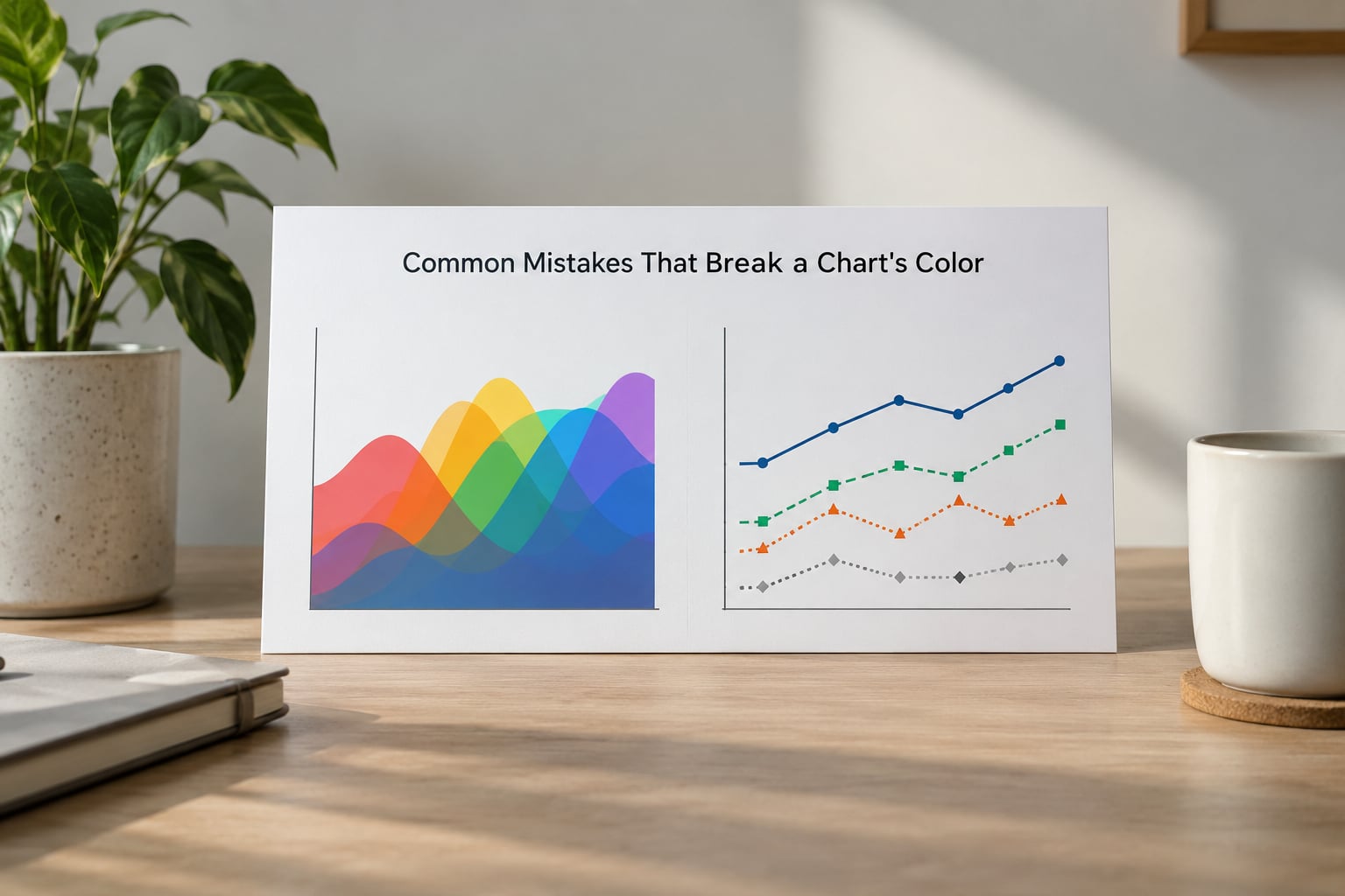
Most broken palettes come from a handful of repeatable errors. Each has a specific fix, and each takes under a minute to correct.
- Using a gradient for categories. A continuous ramp implies ranking between values that have none. Fix: distinct hues of roughly equal lightness.
- Using distinct hues for ordered values. Rainbow maps pull the eye to arbitrary mid-range bands. Fix: a sequential ramp that varies lightness, ideally a perceptually uniform one.
- Red and green as the only difference. Around 6% of men cannot separate them. Fix: add a lightness gap and a direct label.
- Too many hues. Past seven, nobody tracks the legend. Fix: small multiples, or group the long tail into an “Other” series.
- Pure, fully saturated colors. Pure red and pure blue at full intensity are harder to read and harsher on a page. Fix: sit a few degrees off pure and pull saturation back.
- Two colors sharing a hue at different lightness. This makes unrelated series look related. Fix: only do it when the values are genuinely ordered, which means the palette should have been sequential.
- A saturated background. The canvas then competes with the data. Fix: a desaturated background and let one accent color carry emphasis.
- Color as the only cue. Anything that fails in grayscale fails for a print reader and a screen reader user. Fix: labels, line styles, dot shapes or patterns alongside the hue.
Before you publish, run this short gate: check contrast at 3:1 for marks and 4.5:1 for text, view the chart in greyscale, run it through a colorblind simulator, confirm the legend explains every color used, and check the small and dark versions. If all five pass, ship it.
And occasionally ask whether the chart needs color at all. When a value can be read from position or length, an axis label and a grey bar will communicate it faster than any palette, which is why grey is the most-used color in serious data graphics.
Frequently Asked Questions
How do I choose colors for data visualizations?
Start by writing one sentence describing what each color must communicate. If your values are unordered categories, use a qualitative palette of three to seven distinct hues of similar vividness. If they run low to high, use a sequential ramp that varies lightness. If they sit either side of a midpoint such as zero, use a diverging ramp with a neutral center. Then check contrast, run a greyscale and colorblind test, and document the roles.
What colors are colorblind accessible?
There is no single set of universally safe colors, but the pattern matters more than the specific hues. Choose colors that differ clearly in lightness, because lightness survives every type of color vision deficiency. Avoid red and green as the only difference between two series, avoid deep red against black, and avoid relying on blue versus purple alone. Blue, orange and grey are a common practical starting point, and a colorblind simulator confirms the rest.
How many colors should I use in a chart?
For categorical data, aim for three to five series and treat seven as a hard ceiling. People reliably distinguish about five to eight colors at once, and beyond that the legend becomes the main content of the graphic. If your data has more categories than that, the fix is layout rather than palette: small multiples, a filtered view, or grouping the long tail into an Other series.
What is the difference between sequential and diverging color scales?
A sequential scale runs from one end of a lightness ramp to the other, light for low values and dark for high ones, and it suits data that only has magnitude. A diverging scale uses two ramps that meet at a neutral midpoint color, one hue for values below the midpoint and another for values above it. Use diverging only when the midpoint means something, such as zero change or a target.
Should categories be different colors or shades of one color?
Different colors, when the categories are genuinely unordered and you have up to about seven of them. Shades of one hue imply a ranking or a magnitude that does not exist between categories, so they belong to sequential data instead. The one exception is grouping a long tail: if a dozen categories must share a chart, two or three emphasis colors plus a neutral grey for everything else reads better than twelve hues.
How do I make a chart readable in grayscale?
Convert the chart to black and white and check whether every series stays distinguishable. If two series collapse into the same grey, spread their lightness values further apart. Add a non-color cue such as direct labels, line styles, dot shapes or pattern fills, since grayscale is also the strongest test of whether your chart depends on hue alone. Repeat the check on a printed copy before it goes to press.
Conclusion
Start tonight by writing one sentence about what your most recent chart’s colors mean. If you cannot, that is the real problem, and no palette generator will fix it.
After that, work the six steps in order: name the meaning, cut the palette to what the data needs, build contrast deliberately, check for color vision deficiencies and greyscale, test at the real size on the real background, then write the choices down.
Good data-visualization color is purposeful, accessible, tested and consistent. None of those four words is a matter of taste.