An election results map takes the numbers from an election return and draws them onto real geography, so readers can see not just who won but where they won and by how much. There are four map types worth knowing: a choropleth, where shade carries the value; a cartogram or hex map, where area is redrawn so every region reads the same size; a proportional symbol map, where a circle or bar carries the value; and a dot density map, where one dot stands for a fixed number of people. Pick the map type first, then get official results, then join them to boundary files. Get that order right and the rest is styling. Get it wrong and the map quietly tells readers something false.
That failure mode is not hypothetical. Practitioners on r/dataisbeautiful and r/gis keep circling the same complaint: the standard red-and-blue state map makes large rural states look decisive and small dense states look irrelevant, and the people who read it never notice. The fix is not fancier software. It is a deliberate choice of geography, a named source, and an honest legend.
Table of Contents
- What You Need
- Step-by-Step: How to Visualize Election Results on a Map
- Common Mistakes
- Frequently Asked Questions
- What is the best map type for election results?
- Should I show percentages or raw vote totals on an election map?
- Where can journalists get official election results data?
- How do I make an election results map accessible?
- What data do I need to build an election map?
- Is there a free tool to make election maps?
- What to do first
What You Need
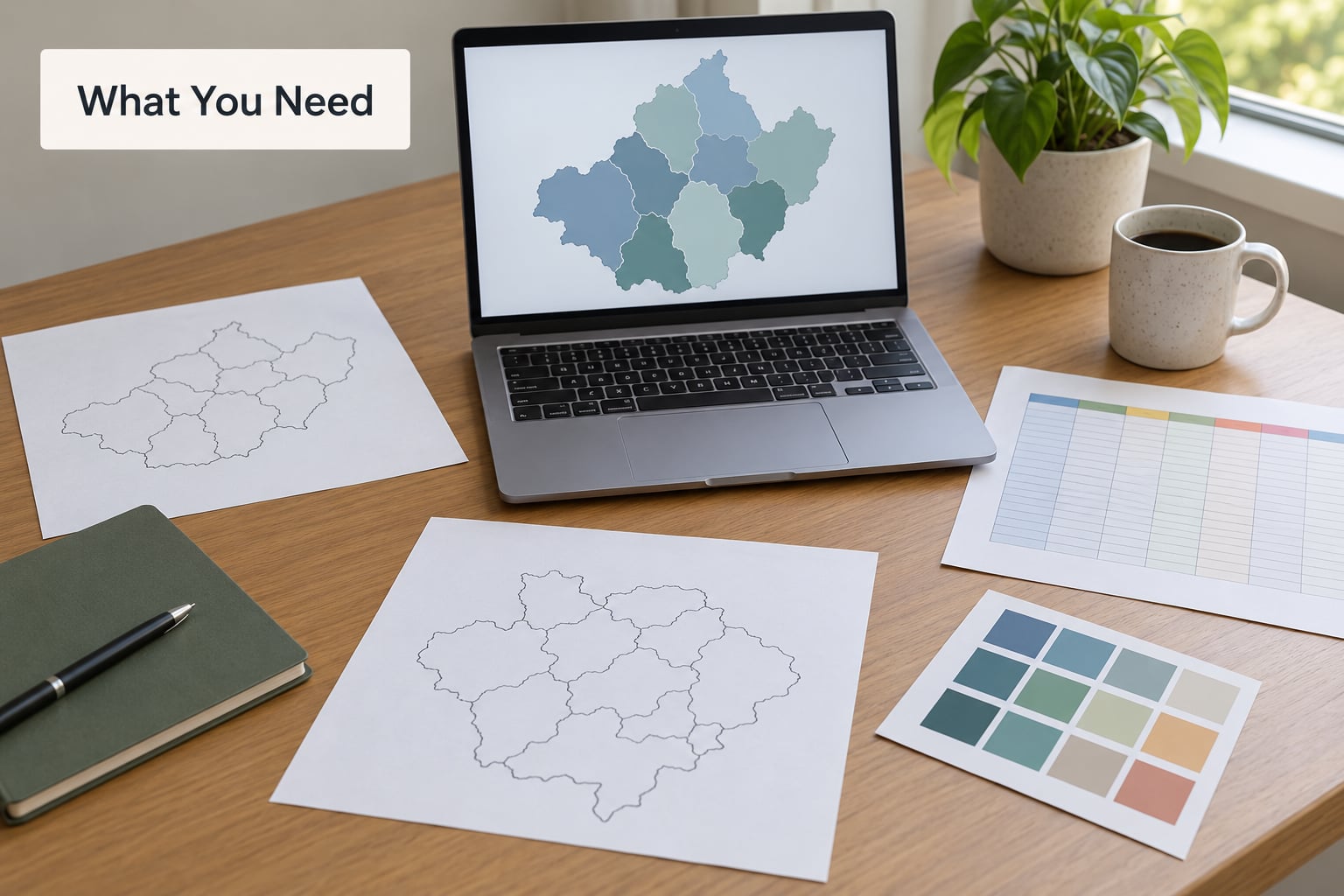
Five things, and you can assemble them in an afternoon. Most beginners fail at the second one, so it is worth reading the list in order.
Official results, not modelled numbers
For anything you publish, use the count from the body that certifies the election: a national or state elections office, or a results portal it designates. Forecasts, tracking estimates and poll averages are a different product with a different job, and mixing them with certified results on one map without a clear label is how outlets embarrass themselves.
Geographic boundary files
Every mapped area needs a matching outline. In the US that usually means county, state or district boundaries; elsewhere it means constituencies, municipalities or regions. Download them from the same census or national statistical office that publishes the geography codes, and save the version number. Boundary files change after every census and after every redistricting cycle, and a results table from one vintage silently mismatches a boundary file from another.
A mapping tool
You need one of two kinds. A hosted chart tool handles the drawing, the styling and the embed for you. A desktop or code environment gives you full control and costs more time. Which one suits you depends mostly on whether you need to update results repeatedly and whether your newsroom already has someone comfortable with code.
A results table with stable keys
Your results data needs a column that identifies each area uniquely and matches the boundary file. In the US that is almost always the FIPS code, a numeric code that identifies a state, county or district. If your results table only has area names, you have a matching problem waiting to happen, and you should fix it before you draw anything.
A palette and a verification source
Keep a color reference open while you work, and keep the official results page open so you can check your totals against it before you publish. Both habits prevent the two most common errors in published election maps.
Step-by-Step: How to Visualize Election Results on a Map
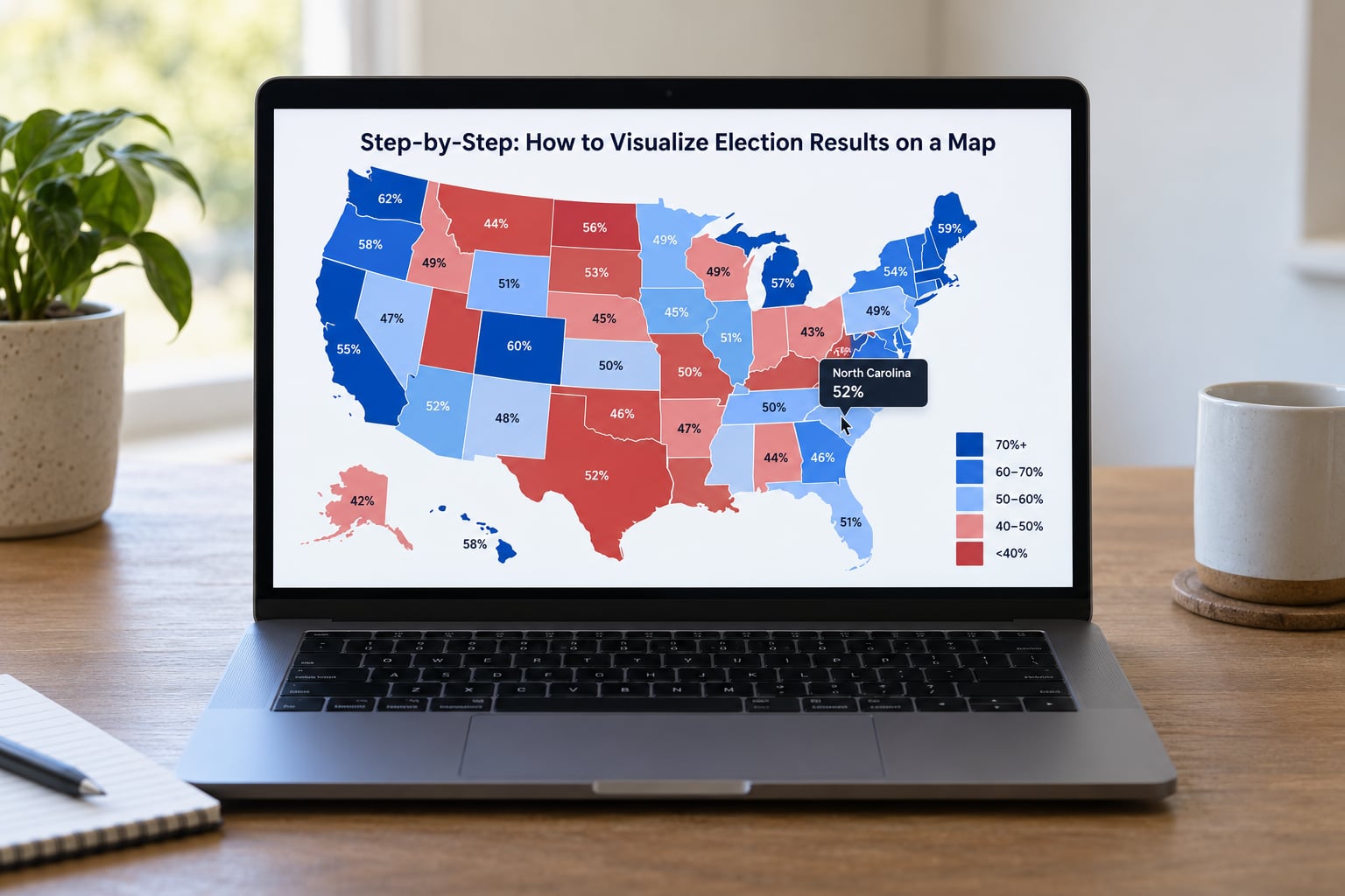
Seven steps, in the order that avoids rework. If you are learning how to visualize election results on a map from scratch, this sequence takes a couple of hours with hosted tools and longer if you are working in a desktop GIS.
1. Define the question and geographic level
Write the question down in one sentence before you open any software. “Where did the margin move most between two elections?” and “Which counties were closest?” produce different maps from the same dataset.
Then choose the geographic level, because it decides what a reader can learn. National totals on one map hide everything. State level answers who took which state and how close it was. County level shows urban-rural patterns and is where most reporting happens. District level answers representation questions. Precinct level is the finest grain most public data reaches, and it is also where data quality varies most.
One warning on the question: it should be answerable by geography. If your real question is which party gained seats in parliament, a map may be the wrong frame entirely, and a seat chart serves readers better.
2. Gather and validate the results data
Take the download from the official results portal rather than a screenshot of a newsroom graphic. Keep the raw columns you care about, which usually means vote totals by candidate, the total votes counted, and any undervote or other line the jurisdiction reports separately.
Three details decide whether your map can be trusted later. Record the reporting date and time, because results change for weeks after election night. Note whether the count is estimated or the actual precinct return, and label estimated areas as such. And record the denominator, because a percentage of votes cast is not a percentage of registered voters, and the two tell different stories.
Never overwrite the downloaded file with a cleaned copy. Keep the raw file and do the cleaning in a separate column, so you can always go back and check where a number came from. When a results file has a correction or a revised precinct count, add a note next to it rather than editing history.
3. Match results to geographic boundaries
This is the step where most beginner maps go blank. The join works when each shape in your boundary file has a key column and each row in your results table has the same key, formatted identically. A FIPS code stored as text with a leading zero will not match the same code stored as a number.
Do the join and immediately count what matched. If the number of matched records is lower than the number of shapes or rows, stop and find the unmatched ones before styling anything. A map with one color across every region is usually an entirely failed join rather than a genuine landslide, and it looks completely plausible.
Also check for duplicates. Some results files carry a row per race per county, which is fine as long as you filter to one race before joining. And confirm that the boundary file vintage matches the results vintage; a county that was created or dissolved between cycles leaves an area with no outline and a row with no shape.
4. Choose a map type and color scale
Match the variable to the visual channel. Shade carries a rate or a share. Size carries a total. Area carries a weight if you rescale it deliberately. Direction and length carry change over time. Where you put a number in the wrong channel is where readers get misled.
| Map type | What it encodes | Best for | Watch out for |
|---|---|---|---|
| Choropleth | Shade of one area | Rates, vote share, turnout, margin at state or county level | Area reads as importance, so sparse rural regions dominate the page |
| Hex or tile cartogram | Area rescaled, then shade | Side-by-side comparison of many equally important units | Equal area is not equal population; label what sets the size |
| Proportional symbol | Circle or bar size over a base map | Absolute counts such as total votes or electoral votes | Judge by area or length, not spike height; overlaps at national scale |
| Dot density | One dot per fixed number of people | Population distribution and non-participation | Needs a consistent denominator or dots mislead |
| Swing or arrow map | Direction and length of change | Movement between two elections | Swing is not a winner; label the endpoint year clearly |
| Bivariate map | Two variables at once, hue and shade | Relating turnout to margin | Hard to read; needs a strong legend and a short article |
On color, pick the scale to match the question. A rate with one direction, like turnout, takes a sequential ramp from light to dark. A two-sided quantity like margin of victory takes a diverging ramp centered on zero, with one hue for one party and another for the other, and the midpoint sitting exactly at a tie. A categorical result, like which party carried a region, takes flat distinct colors with no gradient between them.
Two color rules worth keeping. Never use a rainbow ramp on ordered data, because the extra hues invent boundaries that are not in the data. And check contrast: a red and blue pair is a poor choice for a meaningful share of colorblind readers, so consider a red and blue palette with enough lightness difference to separate, or a blue and orange pair, and always pair color with a label or a pattern so the map still reads without color.
5. Add labels, legends, and context
An unlabeled map is an opinion. Put a descriptive title above it that states the geography, the race and the variable, for example county-level margin of victory for the most recent general election, rather than “Election Results.”
Below the map, add the source, the exact reporting date and time, and the definition of the denominator. Readers need to know whether a percentage is of votes cast or of registered voters, and they need to know how fresh the data is before they draw any conclusion from it.
The legend should name the units and the breakpoints. Round breakpoints that make editorial sense rather than whatever the software defaults to, and label the midpoint on a diverging scale as a tie. Label regions directly where they are large enough, and keep labels horizontal where the map allows it, because readers have to tilt their heads to read a number.
6. Add interactivity carefully
Interactivity earns its place when it answers a question the static map cannot. A tooltip with the full vote breakdown lets a reader check your numbers without leaving the page. A filter lets someone isolate one party or one turnout band. A year slider shows how the same area changed.
What interactivity must not do is hide the main finding. If the winner only appears on hover, a reader scrolling on a phone, or a screen reader user, or someone who screenshots your map, never sees it. Put the primary result in the default view and layer the detail on top.
Time controls need a warning attached. A partially counted map from ten in the evening looks identical to a final one, so stamp the as-of time next to any time control and update it on every refresh. And keep the interaction budget small: every extra toggle is a thing to explain, and an election map with nine filter buttons is a worse read than one with two.
7. Test accuracy and publish
Run these checks in order, before the map goes live.
- Compare one known result against the official source. Pick a county you can look up by hand and confirm your number matches.
- Confirm the matched record count equals the expected area count, with no unmatched rows and no duplicate keys.
- Check that the scale midpoint represents a tie, if you are mapping margin.
- Open the map on a phone and on a narrow laptop window; confirm labels do not collide and the tooltip is reachable by touch.
- Turn off color entirely and see whether the map still communicates the result through labels and patterns.
- Run a contrast check on the palette and on the legend text.
- Read the source line, the timestamp and the title as if you were the first reader to see them.
Then publish, and keep the map’s data file linked from the page so readers can download and check it yourself. That one link does more for trust than any amount of styling.
Common Mistakes
Almost every misleading election map fails in one of a handful of predictable ways. Each has a straightforward fix.
Plotting absolute vote counts instead of rates. A choropleth of total votes cast is a population map wearing a costume. Fix: plot a share or a rate, and use a proportional symbol map if the total genuinely matters.
Using a geographic level that does not match the claim. A state map cannot show urban-rural patterns, and a county map cannot tell you who won the country. Fix: pick the level that can actually answer the question, and say which level you picked in the title.
Mismatched boundary vintages. Results from one cycle joined to outlines from another leave counties unmapped or duplicated. Fix: match vintages and verify the matched record count before styling.
All-blank or single-color maps. Almost always a join failure, not a landslide. Fix: count matched records first, and check FIPS codes for leading zeros and text-versus-number formatting.
A sequential ramp on two-sided data. A light-to-dark ramp on margin makes a small margin look moderate and a large one look huge, with no visual line between the parties. Fix: a diverging ramp centered on zero.
Unclear percentages. Vote share of what? Fix: state the denominator in the legend, and never label a bare percentage without it.
Winner labels that overclaim. A map that says “leading” at a partial count is a prediction, not a result. Fix: label the count as partial, stamp the time, and reserve winner language for certified results.
Missing sources and timestamps. A map with no as-of time is unfalsifiable. Fix: source line, reporting timestamp and data version, every time.
Interactivity that breaks on a phone. Hover-only detail and fixed-width layouts are the usual culprits. Fix: test on a real device, and make sure the essential read survives without a hover.
Frequently Asked Questions
What is the best map type for election results?
A choropleth map works well when comparing percentages or voting patterns across defined areas such as states, counties, or constituencies. Use proportional symbols when the absolute vote total matters, a hex or tile cartogram when you want every unit to read the same size, and a dot density map when population distribution or non-participation is the story.
Should I show percentages or raw vote totals on an election map?
Show both when possible. Percentages make areas easy to compare, while raw totals reveal the scale of participation and voting. State the denominator clearly, distinguish votes cast from registered voters, and never shade areas by raw counts, since that produces a population map rather than a result map.
Where can journalists get official election results data?
Start with the relevant election authority, such as a national or state elections office, and use its downloadable results files or official results portal. Record the reporting date, data version, and whether counts are estimated. In the US, archived certified results are often published as plain files once the count is complete, which is usually easier to map than a live portal.
How do I make an election results map accessible?
Use colorblind-safe palettes, maintain strong contrast, provide text equivalents for the main result, and never rely on color alone to communicate a winner. Add descriptive labels, keyboard-accessible tooltips, and a source line. Check the map with color removed and with a screen reader before publishing.
What data do I need to build an election map?
You need a results table with one row per area, containing vote totals by candidate or party and a stable geographic key such as a FIPS code. You also need a boundary file matching that same geography and vintage, ideally as GeoJSON or a shapefile. Anything you plan to map must already be a column, because shapes cannot compute votes.
Is there a free tool to make election maps?
Yes. Hosted chart tools offer free tiers with publication limits, desktop GIS software such as QGIS is free and full-featured, and code libraries such as Leaflet or D3 are free but require development time. Pick the tool that matches whether you need repeat updates or one-off custom interactivity.
What to do first
Before you open any tool, download the official results file and the matching boundary file, and confirm they join on a shared key. If you learn to visualize election results on a map by writing one sentence about the question you are answering, and if you keep the raw download untouched alongside a named source and a reporting timestamp on the finished map, most of the misleading versions of this graphic simply never happen.