
Scrollytelling is a web format where the reader’s scroll position drives the story. Each step of text sits beside a sticky graphic that animates, redraws or changes state as that step becomes the active one, so scrolling becomes the playhead of a narrative.
To make a scrollytelling story, you write the narrative first, storyboard it on paper, and only then open any software. The technical side is smaller than it looks: split the page into a text column and a sticky graphic column, tag each step, and swap the graphic when a step becomes active. A working two-column prototype takes an afternoon. A publishable data story takes two or three weeks of reporting, design and testing.
Updated for 2026. This guide covers the method, the formats, the tools, the code pattern behind the sticky graphic, and the five mistakes that quietly sink a piece like this.
Table of Contents
- What You Need
- Step-by-Step: How to Make a Scrollytelling Story
- Common Mistakes
- Frequently Asked Questions
- Do I need to know how to code to make a scrollytelling story?
- How long should a scrollytelling story be?
- How do you make scrollytelling work on mobile?
- Is scrollytelling bad for SEO and page speed?
- How is scrollytelling different from parallax scrolling?
- How do I know whether a scrollytelling story worked?
- Conclusion
What You Need
Four things have to exist before you build anything: a reader question, reporting worth staging, visual assets, and a decision about who makes the code. Skipping the first one is the usual reason a scrollytelling project turns into a pretty page with no argument in it.
A single reader question
Write the question your story answers in one sentence. “Why did rents move faster than wages in this city over the past decade?” is a workable question. “The housing crisis” is a topic, not a question. If your question has an answer you can point at, you can stage the sequence that leads to it.
Reporting with a sequence built in
Scrollytelling needs material that changes over time or over place: a series of events, a dataset with a spatial or temporal dimension, documents that accumulate, a set of interviews with different angles. A single number is not a story arc. If your reporting is one conclusion and four supporting quotes, a well-built feature article will usually serve readers better than a scroll-driven page.
Visual assets and their fallback
Decide early what each visual is made of: a map layer, a chart, an illustration, photography, or text on a canvas. Each one needs a text alternative, because that alternative is what carries the story when motion is turned off or JavaScript never arrives.
A stack decision
This is the only part most teams get wrong by stalling. Compare the five common approaches before you commit.
| Approach | Skill level | Cost | Best for | Main limitation |
|---|---|---|---|---|
| No-code builder (Webflow interactions, Vev, similar) | Low to medium | Subscription per seat | Marketing pages, campaign microsites, a first scrollytelling attempt | Harder to reach unusual data behaviour; limited control over page weight |
| CSS position: sticky only | Low | Free | Simple two-column stories, text that fades between static images | Step triggering is basic, so pacing feels blunt on long pieces |
| D3 with Intersection Observer | Medium | Free, open source | Data journalism where charts change shape at each step | You build the step logic and the transitions yourself |
| GSAP ScrollTrigger | Medium | Free core library | Scrubbed animation, pinned sections, video scrubbing | Heavier payload, and the classic failure point is a scroll container that is not the window |
| Framework components (Astro with MDX, React and Framer Motion) | High | Free, hosting costs only | Long-term newsroom projects, stories with editorial workflows and reusable blocks | Build time; you maintain the components |
The Pudding is the reference implementation most practitioners in data journalism point to, and its public write-ups are worth more as architecture advice than as design inspiration. If you can write JavaScript, D3 with an Intersection Observer covers most data stories and keeps the payload small.
Step-by-Step: How to Make a Scrollytelling Story
How to make a scrollytelling story by defining the reader journey
Before visuals, write the journey in prose. What does the reader believe when they arrive, what do they believe after the last step, and which step changes their mind? That middle part is the story, and it is usually four beats: setup, tension, reveal, resolution.
Give each beat one sentence and one visual. If a beat needs three sentences and two charts, it is two steps, not one. Readers of long-form interactive pieces scan before they commit, so the sequence has to make sense to someone who sees every fifth paragraph.
Choose a scrollytelling format that fits the reporting
Four formats cover almost everything you will build.
- Stepped is the classic: text on the left, sticky graphic on the right, the graphic changes per step. Best default for data explainers.
- Pinned keeps a section locked in place while the reader scrolls through it. Use it for a scrubbed animation or a video that maps to scroll position.
- Guided moves the reader forward with little choice. Strong for a reveal, weak for findability, so keep the total step count low.
- Exploratory hands over control: the reader filters, drags and zooms. Use it after the argument has been made, as a supporting section.
Parallax is not a narrative format. It moves layers at different rates as you scroll, which adds depth but carries no sequence. Scrollytelling tells the reader what to look at next; parallax only reacts to where they already are. Use both, but do not confuse them in a pitch.
Turn reporting into a scene-by-scene narrative
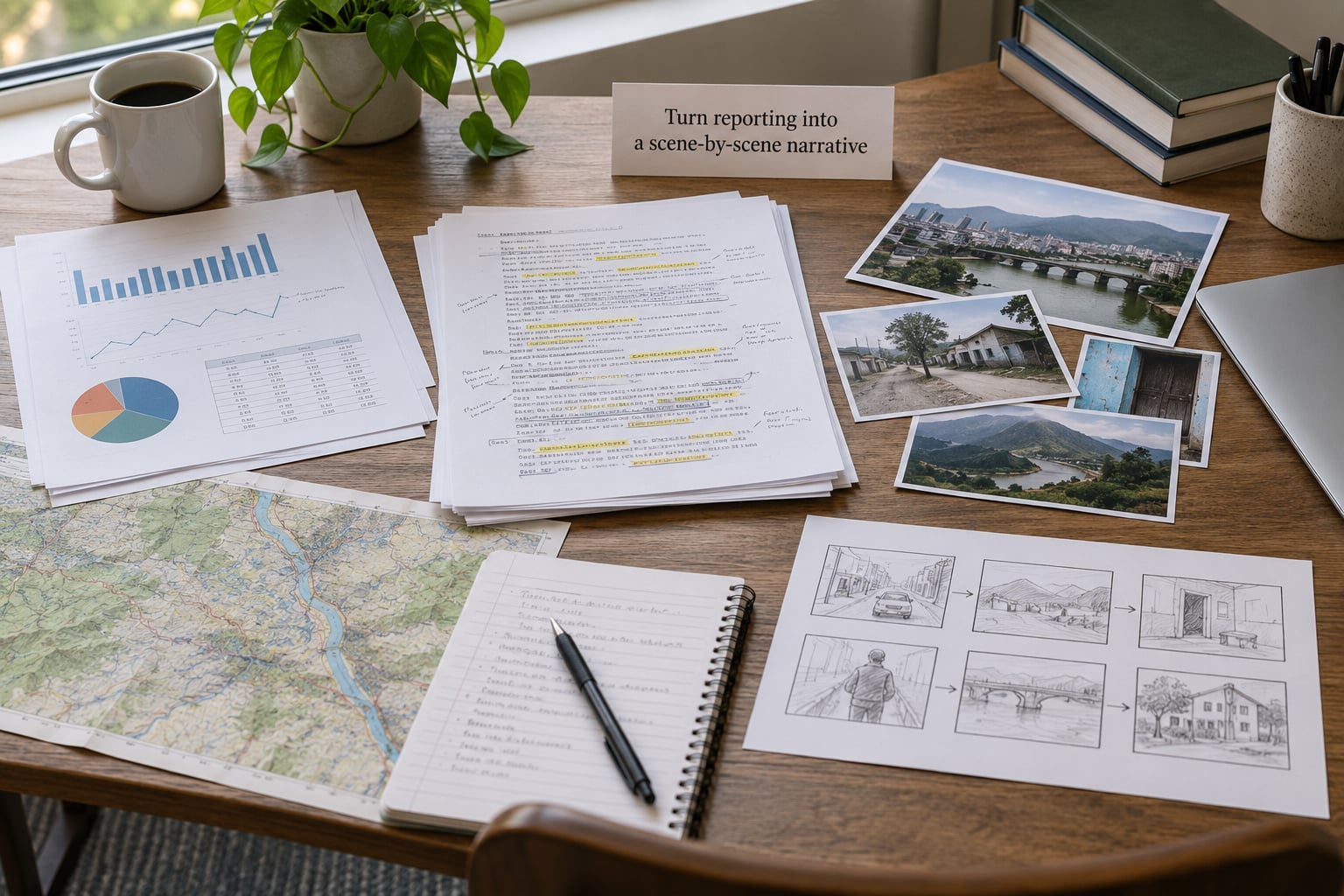
Convert your reporting into scenes. A scene has a purpose, a piece of evidence, and an end state for the graphic. Interviews usually become one quote per scene, chosen for what it changes rather than for how it reads. Documents become a scan that annotates as the reader moves through it.
The working range is five to nine steps. Under five, you usually have an article. Over nine, you have a scroll tunnel where readers lose the thread and cannot get back to anything they passed. If your material needs twelve steps, split it into two stories or move two steps into an interactive section at the end.
DW’s innovation team has recommended paper prototypes before code for years, and the advice holds: a sequence of sketched frames catches structural problems in ten minutes that take a week to find in the browser.
Design the visual steps and transitions
One step, one idea, one visual state. Decide what changes between steps: a value, a colour, a zoom level, a highlighted region. Everything else is decoration, and decoration competes with the argument for the reader’s attention.
Transitions should be continuous rather than eventful. If the data changes gradually, animate it gradually. Reserve hard cuts for genuine breaks in the argument, where the reader should feel that the ground moved. Opacity fades and short positional shifts read as calmer than bouncing or spinning entrances.
Give each step a state in the data model rather than a one-off command. When you can express a step as “highlight these districts, set these bars to these values”, transitions stop being special cases and start being a single function you reuse.
Build the interaction with accessible code
The whole pattern is a two-column grid where one column is sticky, plus a step observer. Here is the layout in full:
.scrolly {
  display: grid;
  grid-template-columns: 1fr 1fr;
  gap: 2rem;
}
.scrolly__graphic {
  position: sticky;
  top: 0;
  height: 100vh;
  display: flex;
  align-items: center;
}
@media (max-width: 48rem) {
  .scrolly { grid-template-columns: 1fr; }
  .scrolly__graphic { position: sticky; top: 0; height: 60vh; }
}
The observer marks which step is active. This version picks the step nearest the middle of the viewport, which feels steadier than “first step that touched the edge”:
const steps = [...document.querySelectorAll('.step')];
const observer = new IntersectionObserver((entries) => {
  for (const entry of entries) {
    if (entry.isIntersecting) {
      steps.forEach(s => s.classList.remove('is-active'));
      entry.target.classList.add('is-active');
      setScene(Number(entry.target.dataset.step));
    }
  }
}, { rootMargin: '-40% 0px -40% 0px', threshold: 0 });
steps.forEach(step => observer.observe(step));
Three things make this durable rather than a demo. First, steps are real headings with ids, so the page is crawlable and a reader can jump to one with an anchor. Second, ship the whole narrative as HTML underneath the graphic, so no-JS and screen-reader users get the story in order. Third, respect motion preferences:
@media (prefers-reduced-motion: reduce) {
  * { animation: none !important; transition: none !important; }
  html { scroll-behavior: auto; }
}
Keep keyboard focus visible on any interactive control, give buttons real names, and never make scroll-jacking the only route through the page. If you scrub a Lottie file or pin a section, verify the scroll container is the window, not a wrapper div. That mismatch, and scrubbing animation files, are the two problems engineers report most often with GSAP ScrollTrigger.
Test the story on real devices and with real readers
Desktop demos hide the real failure modes. Test on a mid-range Android phone over a slow connection, because that is most of your traffic, and because layout shift and input delay are what push a story out of the good performance buckets.
Then run this list:
- Does each step activate at the moment the reader expects it, or one step late?
- Does the page still make sense with motion disabled?
- Can a reader get back to a step they passed without scrolling the whole piece again?
- Does the page hold its layout when the graphic loads late?
- Is the story readable end to end in the HTML source?
- Does the whole thing survive a cold load on mobile data?
Finally, watch five real readers. Ask two of them to describe the story afterwards. If the description does not match your intended takeaway, the sequencing failed, not the animation.
Common Mistakes
Animating before you have an argument
Teams ship beautiful sequences of effects that build to no conclusion, and readers forget them within a day. The fix is a written one-sentence takeaway before any scene is designed. If a step cannot be traced back to it, cut the step.
Building a scroll tunnel
Guided formats trap readers: they cannot jump, search or leave, which frustrates return visits and hides sections from anyone arriving from a search result. Give every step a heading, a stable anchor and a visible way to the rest of the site.
Spending the performance budget on the interaction
Long pages with heavy animation tank the metrics that decide whether a reader stays. Ship vector graphics rather than raster video, load assets per step rather than up front, reserve space so nothing jumps, and measure input delay rather than assuming it is fine.
Designing for the desktop only
On a phone the sticky graphic gets a fraction of the room it had on a laptop. Rebuild the layout for a short viewport from the start, with the graphic stacked above or below the text rather than fighting it.
Treating accessibility as a final pass
Motion sensitivity, keyboard use and screen-reader navigation cannot be patched in at the end without rewriting the step logic. Decide at step one that the text stands alone, then the motion becomes an enhancement you can switch off.
Before you ship, run a five-minute check: motion preferences honoured, keyboard reaches every control, every step has a text alternative, page weight under a couple of megabytes, and the narrative present in the raw HTML. Most of these take minutes to verify and are the difference between a story people finish and a story people abandon.
Frequently Asked Questions
Do I need to know how to code to make a scrollytelling story?
No, not to start. A no-code builder with scroll triggers will get you a published page this week. But most data stories need custom step logic, and that means JavaScript. If you can write a little code, D3 with an Intersection Observer handles almost everything you need and keeps the page light.
How long should a scrollytelling story be?
Five to nine steps is the working range, and most pieces that work stay under about six. Under five you probably have an article. Over nine, readers lose the thread and cannot return to a section they passed. If your material needs twelve steps, split it into two stories instead of forcing one long scroll.
How do you make scrollytelling work on mobile?
Rebuild the layout for a short viewport rather than shrinking the desktop one. Stack the sticky graphic above the text at roughly 60 percent of the screen height, reduce steps, keep the graphic simple, and test on a mid-range Android phone over mobile data. Tap targets for any control need to be large enough to hit with a thumb.
Is scrollytelling bad for SEO and page speed?
Not inherently, but the common version of it is. Client-rendered steps can be invisible to crawlers, and heavy animation hurts the metrics that decide whether readers stay. Keep every step as real HTML with headings and stable anchors, ship the narrative without JavaScript, compress assets, and load them per step rather than all at once.
How is scrollytelling different from parallax scrolling?
Scrollytelling tells the reader what to look at next: each step of text drives a change in a graphic. Parallax moves layers at different rates as you scroll, which creates depth but no sequence. You can use both in one page, but only scrollytelling carries narrative order.
How do I know whether a scrollytelling story worked?
Instrument scroll depth, step completion rate and dwell time, then compare the last step against the first. A high drop-off between two specific steps usually means pacing or clarity, not technology. Read the drop-off locations before rewriting anything, then test one change at a time against a new story.
Conclusion
To make a scrollytelling story, do four things in order: write the reader question, write the steps as one idea each, storyboard them on paper, and only then pick a stack and build the sticky graphic with a step observer. Start with the question and the storyboard today. Everything after that is faster than it looks.