
To make charts accessible for color blind readers, stop letting color carry meaning on its own: pick a palette built for color vision deficiency, label your series directly, and add a second cue like line style, marker shape, or pattern. Then check your work in grayscale and a simulator before you publish. Budget about 30 minutes per chart once you have a palette saved.
Most of the trouble I see comes from charts that were fine on the designer’s monitor and useless everywhere else. One in twelve men has some form of color vision deficiency, and a surprising number of women do too, so “nobody on my team notices” is not evidence of anything.
A traffic-light chart is the classic offender. Red, amber and green look like three muddy variants of the same brown-beige to a reader with deuteranopia, which is the most common type of color vision deficiency. The data is technically there and completely unreadable.
Table of Contents
- What You Need to Make Charts Accessible for Color Blind Readers
- Step-by-Step
- Common Mistakes to Avoid
- Frequently Asked Questions
- What is the best color palette for charts used by people with color-vision deficiencies?
- Do I still need labels and patterns if I use a color-blind-safe palette?
- Can grayscale testing replace testing with people who have color blindness?
- How should legends work in an accessible data visualization?
- What tools can test a chart for color contrast and color-vision accessibility?
- How do I make an interactive chart accessible on mobile and with a keyboard?
What You Need to Make Charts Accessible for Color Blind Readers
Before you touch the styling, get four things sorted.
- The source data and the one point the chart is making. If you cannot say the takeaway in a sentence, redundant encoding won’t save it.
- A defined color palette with hex values. Loose brand colors picked by eye are where the failures start.
- A contrast checker. Any browser extension or color picker that reports WCAG ratios will do.
- A simulator. Browser dev tools have one built in now; desktop tools like Coblis or Color Oracle give you more control.
Add one more if you can: a colleague or reader who actually has color vision deficiency. Simulators approximate the experience; they do not reproduce it, and the difference matters more than most guides admit.
Step-by-Step
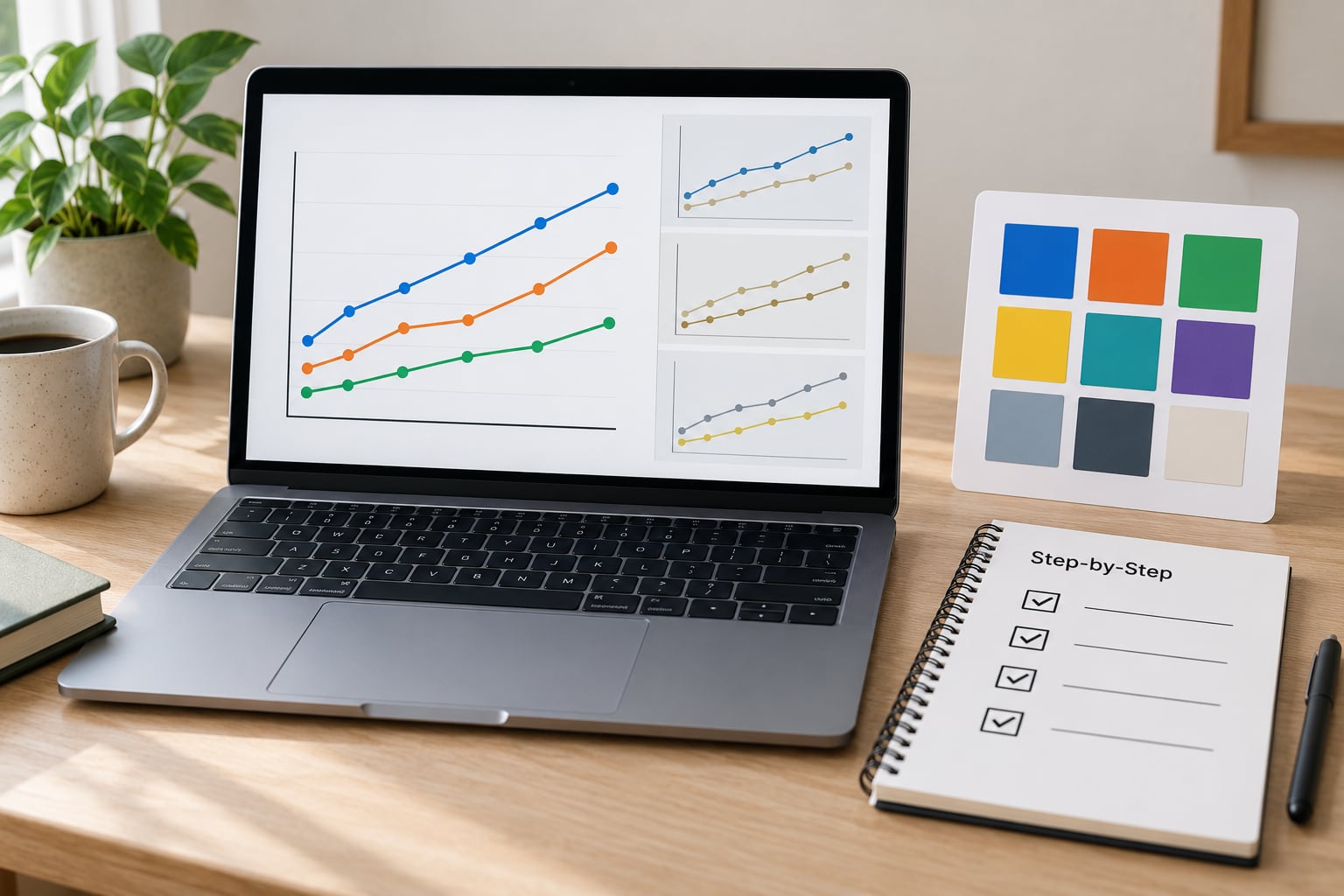
Six steps, in order. Skipping ahead is how charts end up with a nice palette and no labels.
Step 1: Identify What Each Color Means
Write down, for every color in the chart, whether it carries data or is decoration. Background panels, gridlines and hover fills are decoration. Series, categories, thresholds and status flags are data.
Then check which distinctions rest on hue alone. If two lines are told apart only by being red versus green, that is a red-green collision and it fails for roughly 6 percent of men. The same goes for a map where neighboring states differ only by shade.
How it worked: you can point at a color in the chart and name its job in one phrase.
Step 2: Pick a Color-Safe Palette
These four are built with color vision deficiency in mind, and they are what I reach for first.
Okabe-Ito is a qualitative palette of eight hues that stays separable under the common CVD types. Useful hex values: #E69F00, #56B4E9, #009E73, #F0E442, #0072B2, #D55E00, #CC79A7, #000000. The last one, black, is an easy one to forget and a useful one to have.
Viridis runs from #440154 through #3B528B, #21918C and #5EC962 to #FDE725. It was designed so that lightness changes steadily across the range, which is why it survives grayscale printing so well. Use it for continuous scales like heatmaps.
Cividis is the CVD-tuned sibling of viridis, running from #00224E to #FDE737. Similar shape, explicitly optimized for readers with deuteranopia and protanopia.
Paul Tol’s bright and muted schemes give you a seven-color option with good separation: #4477AA, #66CCEE, #228833, #CCBB44, #EE6677, #AA3377, #BBBBBB.
ColorBrewer is worth knowing too, but only pick from the colorblind-safe subset. The qualitative sets Dark2 (#1B9E77, #D95F02, #7570B3, #E7298A, #66A61E, #E6AB02, #A6761D) and Set2 pass the common filters.
Two practical rules. Keep the series count low, because five-plus colors defeat even good palettes. And check the palette in both light and dark contexts, since a mid-tone that reads fine on white can vanish on charcoal.
Step 3: Add Redundant Cues So Color Blind Readers Can Follow Along
This is the step that does the real work. Encoding information twice through different channels means losing one channel costs the reader nothing.
- Direct labels. Put the series name at the end of each line instead of in a legend. It removes the eye-travel back and forth that frustrates everyone, and it is the single biggest readability win.
- Line styles. Solid, dashed and dotted read the same in grayscale. This costs you almost nothing in Excel, Tableau, Power BI, R or matplotlib.
- Marker shapes. Circles, squares and triangles on a scatter plot distinguish groups without touching the color channel at all.
- Patterns and textures. Cross-hatching, dots and stripes on bars and pie slices give each category a distinct signature.
- Annotations. A short note on the point that matters beats a footnote nobody finds.
For interactive work, the states matter too. Filter indicators and hover highlights that change only color are invisible to a good share of your users, so pair the color change with an icon, a border or a label.
Step 4: Improve Contrast, Typography, and Labels
WCAG 2.2 asks for a contrast ratio of 4.5:1 for normal body text and 3:1 for large text and for graphical objects such as chart marks and meaningful shapes. Those are floors, not targets; thin gridlines and light gray labels often need more.
Type next. Axis labels under 11px are effectively unreadable at mobile sizes, so start at 12px and treat anything smaller as decoration. Keep the axis range honest and free of a truncated baseline that exaggerates small differences.
Legends: if a series can be labeled at its endpoint, do that instead. Keep legends to one column so the reader scans straight down, and give the keys enough size to see at all.
Write a descriptive title that states the finding rather than naming the chart. “Bus routes fell 18% after the schedule change” beats a chart labeled “Bus ridership, 2020 to 2026“. Then add alt text that says what the chart shows, what the axes are, and what the main pattern is, since a screen reader cannot see any of it.
How it worked: squint at the chart from across the room and the message still lands.
Step 5: Test with Simulators and Real Readers
Run four checks, cheapest first.
- Grayscale. Convert the image to black and white in any editor. If series merge or labels disappear, they will merge for readers too. This is the fastest validation there is.
- Simulator. Open your page in a browser with color vision deficiency emulation turned on in dev tools, then check it in Coblis or Color Oracle at the protanopia, deuteranopia and tritanopia settings.
- Keyboard pass. Tab through anything interactive. You should be able to reach every control, see a visible focus ring, and understand the current state without hovering.
- Real reader. Send the chart to someone with color vision deficiency and ask them one question: what do you think this says? Their answer is the ground truth.
Simulators disagree with each other because they use different transformation math, so treat them as a family of approximations rather than a verdict. The grayscale test is not an approximation at all.
Step 6: Publish and Monitor the Chart
Save the palette as named color tokens in whatever style guide or design system you use, so the next chart inherits it rather than starting from scratch. Record which redundant cue goes with which hue, because that mapping is the thing that breaks when someone adds a series six months later.
If the chart will be printed or exported to PDF, check the CMYK conversion. Bright saturated colors shift in print, and patterns survive the conversion far better than thin strokes do. Anyone photocopying a report in black and white is a realistic reader.
When the data updates, re-run the grayscale check. Adding a category to a line chart is exactly the moment a colorblind-safe palette quietly becomes a crowded one.
Common Mistakes to Avoid
Red versus green as the only distinction. Add a second cue: dashed versus solid, or label the lines directly.
More than five or six series. Split the chart, or switch to small multiples so each panel carries fewer categories.
Tiny legend keys. A 6px swatch gives a reader with deuteranopia nothing to hold on to. Label the series instead where you can.
Low-contrast gray on gray. Axis labels and gridlines need real contrast ratios, not whatever looked subtle in the design file.
Unlabeled series in a crowded chart. Direct labels remove the matching task entirely.
Testing only on your own monitor. Calibrated, bright, and probably not simulating anything. Run the grayscale check.
Hover-only state changes in dashboards. Keyboard and screen reader users never trigger a hover. Use persistent indicators and visible focus states.
Frequently Asked Questions
What is the best color palette for charts used by people with color-vision deficiencies?
Okabe-Ito is the safest default for categorical series because its eight hues stay separable under the common CVD types. For continuous scales, viridis or cividis work well because lightness changes steadily across the range. Whichever you choose, keep the series count to five or six and pair every hue with a second cue.
Do I still need labels and patterns if I use a color-blind-safe palette?
Yes. A color-safe palette removes hue collisions, but it cannot help readers in grayscale print, on a washed-out projector, or with an unusual screen. Direct labels, line styles, marker shapes and patterns cost minutes to add and make the chart work in conditions no palette can predict. Treat them as required, not optional.
Can grayscale testing replace testing with people who have color blindness?
No, but it is the best quick check available. Grayscale catches anything that depends on hue alone, which is the most common failure. Simulators add realistic CVD conditions but use approximations, and different tools produce different results. Only a real reader tells you whether the chart actually communicates, so use grayscale first and a person before you ship.
How should legends work in an accessible data visualization?
Prefer direct labels at the end of each line or on each bar, and use a legend only when labels will not fit. When you need one, keep it to a single column, make the keys large enough to see, and place it near the plot rather than in a corner across the canvas. A legend the reader must cross-reference is where comprehension quietly breaks down.
What tools can test a chart for color contrast and color-vision accessibility?
Browser developer tools include a built-in color vision deficiency emulation mode, and any contrast checker reports WCAG ratios. Coblis and Color Oracle simulate protanopia, deuteranopia and tritanopia across a whole image or screen. Many charting libraries also ship colorblind-safe palettes you can compare against in two seconds.
How do I make an interactive chart accessible on mobile and with a keyboard?
Every control needs to be reachable by keyboard, with a visible focus indicator, and every state needs more than color to convey it. Pair hover highlights with icons or labels, keep filter selections visible after the pointer moves away, and support pinch zoom and tap targets large enough for thumbs. Test by unplugging your mouse and using only the tab key.
If you do one thing before you publish, convert the chart to grayscale and look at it. Anything that breaks there was relying on color alone, and that single test catches most of what you would otherwise ship.