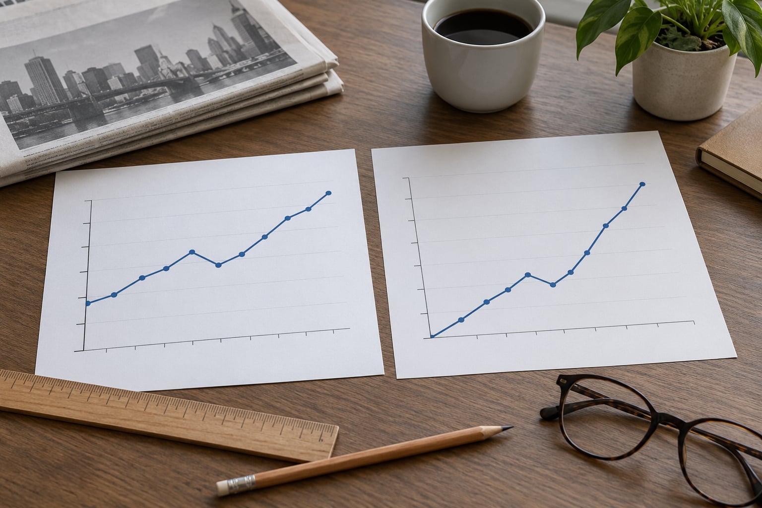
To make a chart that does not mislead readers, you match the visual to the data: a zero baseline for bar length, a defensible range for lines, encodings that stay proportional to the values, complete labels and sources, and a second pair of eyes before it goes out. Most distortion is not fraud. It is a default setting in Excel, PowerPoint or a dashboard tool, left untouched.
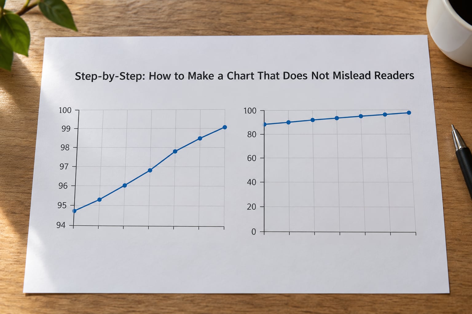
I have seen charts get published with a y-axis that started at 94 percent, a pie chart with nine slices, and a “sources” line that pointed at a homepage rather than a dataset. None of it was meant to deceive. All of it changed what people believed.
These checks matter more in 2026 than they ever have, because charts now get generated faster than anyone can read them.
Table of Contents
- What You Need
- Step-by-Step: How to Make a Chart That Does Not Mislead Readers
- Common Mistakes
- Frequently Asked Questions
- Can a line chart start above zero without misleading readers?
- Why should bar charts usually start at zero?
- When is a dual-axis chart acceptable in journalism?
- How should a chart display uncertainty or incomplete data?
- What source and methodology details belong under a chart?
- Does a statistically significant difference automatically matter to readers?
- Conclusion: Start With the Honest Baseline
What You Need
You need six things before you open a charting tool, and only two of them are software.
- The data, including the raw file, not just the exported summary someone sent you.
- The intended comparison, written in one sentence. What should a reader conclude?
- The audience and their question. A policymaker asking “how bad is it” needs something different from a subscriber asking “is it getting worse.”
- A chart form that matches the relationship in the data.
- A reliable source you can cite precisely, down to the dataset or the agency release.
- Labelling context: units, dates, definitions, and any exclusions.
- A second person, or a printed checklist, to review the visual integrity before publication.
If you cannot fill in the source line honestly, you do not have enough to publish yet.
Step-by-Step: How to Make a Chart That Does Not Mislead Readers
Start With the Question, Not the Chart
Write down the exact comparison a reader needs to make, before you pick a chart type. “Did average waiting time fall?” is a different question from “Did waiting time fall in every region?”
Then pin four things down: the unit, the population, the time period, and the decision the chart is meant to support. If you cannot fill in those four, the chart is decoration.
A worked example: the question is whether a monthly readership figure of 412,000 is good or bad. Without a definition of “readership,” a comparison period, and the population being counted, the number has no meaning, no matter how honestly it is drawn.
Check the Data Before Designing the Visual
Verify definitions and denominators first. Two numbers from two agencies can look comparable and be measured completely differently.
Then look for what is missing: suppressed categories, missing months, revised figures that were never updated in the chart, and categories that changed names halfway through the series.
Check rounding too. A percentage shown to one decimal place implies a precision the underlying estimate does not have, and readers treat implied precision as accuracy.
One more: check for survivorship bias. Abraham Wald’s aircraft work is the textbook case of drawing conclusions only from the units that came back. A chart of “what our customers who renewed did” quietly drops every customer who left.
Choose a Chart Form That Matches the Comparison
Match the chart form to the structure of the data, and let the comparison decide the form. Bars encode length well, so use them for magnitude across categories. Lines encode position over an ordered dimension, so use them for change over time. Dots are the honest option when you have few points and want comparison without a filled shape.
Small multiples beat a crowded single plot whenever the number of series exceeds about three.
| What you want the reader to see | Use | Watch out for |
|---|---|---|
| Magnitude across a handful of categories | Horizontal bars, sorted | Truncated axis, arbitrary order |
| Change over time | Line chart | Time range chosen to flatter you |
| Change over time with uncertainty | Line or dot with error bars or a shaded band | Hiding the interval |
| Distribution, not average | Histogram, box plot, strip plot | Reporting only the mean |
| Part-to-whole with two or three parts | Stacked bar | Pie charts past three or four slices |
| Two measures, two different units | Two stacked panels sharing an x-axis | Dual axes on one plot |
| A relationship between two variables | Scatter plot | Implied causation, fitted line with no method |
Avoid 3D in nearly all editorial work. Perspective shifts the apparent height and depth of shapes by different amounts, so the bar in front looks taller than the bar behind regardless of the values. The dataviz community consensus is blunt about this: the distortion trap is too easy to fall into for the payoff to be worth it.
Set an Honest Baseline and Scale
Start bar charts at zero. Bar length is read as magnitude, so cutting off the bottom of the scale multiplies every difference on the chart without touching the data.
Line charts are different. A line encodes position, not length, so a non-zero start is defensible when the range is disclosed and the point is to show variation rather than magnitude. Stock prices, body temperature and exchange rates are the usual cases. In those charts, mark the break clearly with a zigzag axis symbol rather than letting the shortened axis pass unnoticed.
Whichever you choose, test the chart at the range a reader would guess. If your y-axis starts at 94 percent, expect someone to assume it starts at 0.
Use Proportional Visual Encodings
Whatever you encode, keep the visual quantity proportional to the value. If one value is twice another, its mark should be twice as long, twice as tall, or twice as far from the baseline.
Pictograms break this rule most often. Resizing an icon to represent a number scales area, and area is the hardest thing human vision compares. Doubling the height of an icon makes it four times the area. If you use icons, keep them uniform in size and count them, or switch to bars.
The same caution applies to pie slices beyond the obvious: people judge angles poorly, so a five percent slice and a fifteen percent slice look far closer than they are.
Label What the Data Represents
Every chart needs a title that states the finding rather than the subject. “Chart 4: Monthly active users” tells the reader nothing. “Monthly active users fell for five straight months after the redesign” tells them what to check.
Then add the units, the time period, the population, and the source with enough precision that someone else could find the same data. A generic homepage link is not a citation.
Direct labels beat a legend whenever you have room. A reader should not have to flick back and forth to match a colour to a series.
Notes matter as much as labels. Say what you excluded, whether figures are estimates, and what changed in the methodology. When a series is revised, either plot the revision or footnote it.
Add the Context Needed for Interpretation
Give readers the comparison points they would need to make the judgement themselves: the target, the long-run average, the previous period, the population rate rather than the raw count.
Show uncertainty where it exists. Error bars, shaded intervals, or a note that the change is within the margin of error all serve. Hiding the interval on a poll result is a choice, and a misleading one.
Annotate carefully. An arrow pointing from a policy date to a spike implies causation you have not established. Mark the date, describe the pattern, and let the reader connect it.
Test the Chart in a Blank State
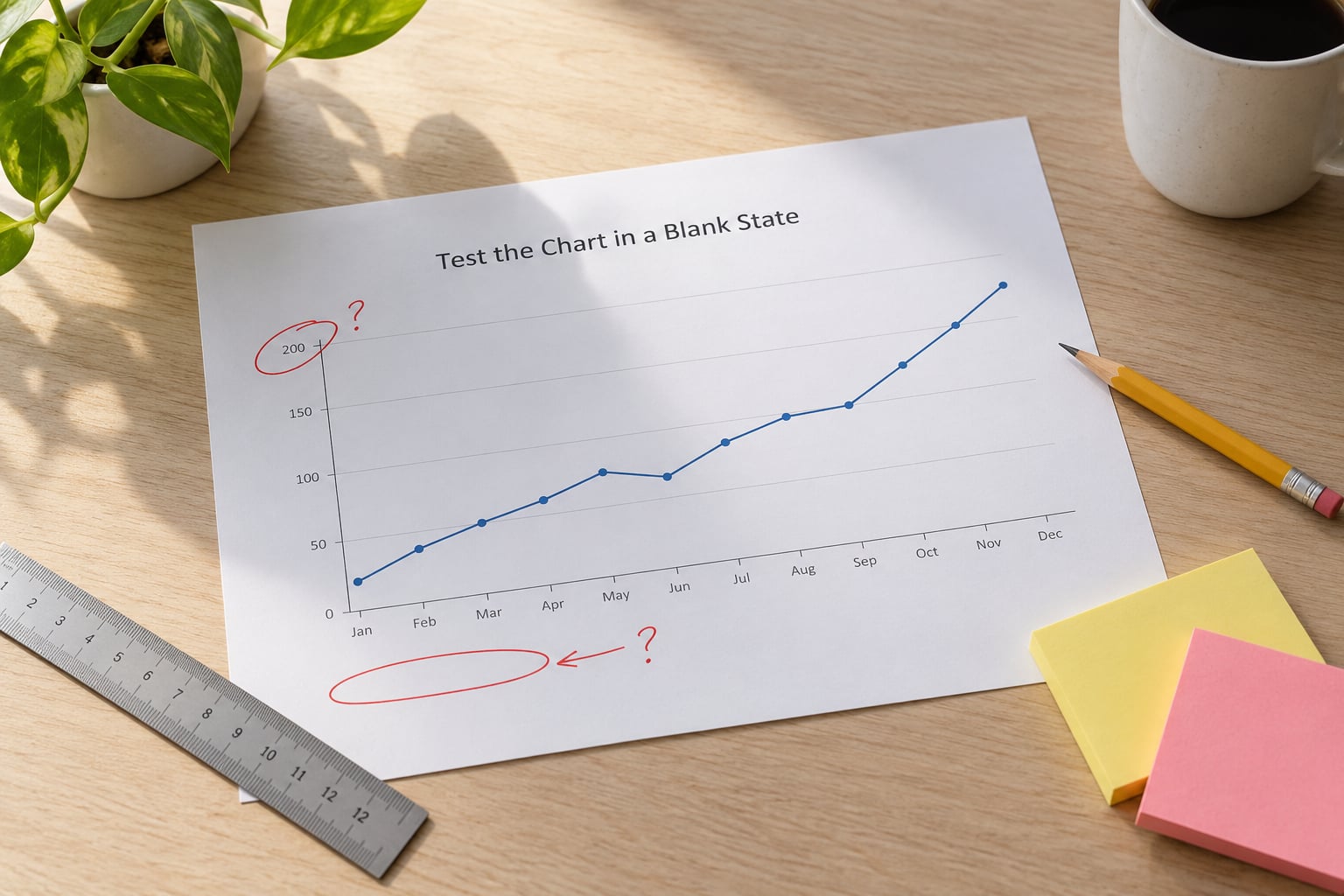
Hand the chart to a colleague with no context and give them thirty seconds. Ask four questions: what is the main finding, what are the units, where did the data come from, and over what period.
Any wrong answer is a defect in the chart, not in the reader.
What worked in newsrooms I have worked with is printing it in greyscale. If two series become indistinguishable or a category disappears, your palette is doing decoration rather than encoding.
Common Mistakes
These seven distortions account for most of what I have flagged in review. Each has a concrete correction.
| Mistake | What the reader sees | Correction |
|---|---|---|
| Truncated bar axis | A 3 percent gap that looks like a collapse | Start bars at zero, or switch to dots or a line |
| Undisclosed axis break on a line | A dip that may not exist | Mark the break with a zigzag, or set the axis to zero |
| 3D bars, pies or cylinders | Perspective reordering the values | Redraw in 2D |
| Dual y-axes | Any two series that share a range appear correlated | Split into two panels sharing one x-axis |
| Cherry-picked time range | A trend that reverses outside the window | Show the full series and note why the window starts where it does |
| Scaled pictograms or bubble area | Differences far larger or smaller than reality | Keep icons uniform and count them, or use bars |
| Missing units, source and date | Nothing can be verified | Add unit, population, period and a precise citation |
A few more deserve naming. Overaggregation hides real variation by averaging across groups until the chart is smooth and useless. Spurious correlation turns two series that happen to move together into a story about cause. And the ratio that still matters: the share of ink that carries data. Tufte’s data-ink ratio is a good check on clutter, gridlines, drop shadows and decorative backgrounds that compete with the numbers.
Most of this is not intentional deception. Practitioners in the field say the charts they have to fix come from spreadsheet and slide-deck defaults, not from people trying to rig a story.
Before you publish, run this list: does the axis start at zero or is the break marked; does the chart form match the comparison; is every value proportional to its mark; are units, period and population on the face of the chart; is the source specific; is the time range the full range; is uncertainty visible; can a stranger read the takeaway in thirty seconds.
Frequently Asked Questions
Can a line chart start above zero without misleading readers?
Yes, because a line encodes position rather than length. A non-zero range is defensible when the variation matters more than the absolute level, as with stock prices or body temperature. Disclose the range in the title or a note, and mark any break with a zigzag so the reader is never guessing where the axis begins.
Why should bar charts usually start at zero?
Bar length is read as magnitude, so a shortened baseline makes small real differences look enormous. A bar chart of unemployment moving from 9.4 to 8.1 percent is only a small change in reality, but on a truncated axis it looks like a collapse. If the bars would disappear against zero, use dots or a line instead.
When is a dual-axis chart acceptable in journalism?
Almost never on a single plot. Two series on separate vertical scales can be slid until any correlation you want appears, and readers cannot detect the manipulation. The honest substitute is two stacked panels that share one x-axis, so each measure keeps its own scale but the time alignment stays visible.
How should a chart display uncertainty or incomplete data?
Show the interval rather than hiding it: error bars for point estimates, shaded bands for a range over time, and a footnote for anything modelled. For missing data, leave a visible gap in the line and say why, rather than interpolating or dropping the period silently. Note whether a figure is provisional and when it will be revised.
What source and methodology details belong under a chart?
Name the publisher, the dataset or release, the date accessed, the units, the population covered, and the time period. Add anything that shapes the numbers: exclusions, estimated values, revisions, and changes in collection method. A link to a homepage is not a source, because a reader needs to land on the specific data behind the picture.
Does a statistically significant difference automatically matter to readers?
No. Significance tells you the difference is unlikely to be noise, not that it is large. A poll can return a significant three point gap between 48 and 51 percent, which tells a reader almost nothing about whether a policy would pass. Report the size of the difference alongside the confidence, and translate it into the units people actually live in.
Conclusion: Start With the Honest Baseline
Honest charts are a habit, not a talent. Three checks cover most of it.
First, write the takeaway in one sentence before you open the software, and check that the chart actually shows that.
Second, check the baseline and scale, and be able to defend the range you picked.
Third, hand it to someone with no context and see whether they read it the way you meant it. Do that every time, and misleading charts stop being something you catch and start being something you never publish.