
To add alt text to a data visualization, write one sentence that names the chart type, the subject, the time period and the trend, then paste it into the tool’s alt-text field or the HTML alt attribute on the image or graphic element. Everything beyond that sentence depends on how complex the chart is. Most charts are covered by a single line; anything with many series, maps or interaction needs a caption, a long description or a data table as well.
The part people get wrong is not the mechanics. It is what they choose to say. A chart is a picture of a pattern, so writing alt text like a picture caption (“bar chart of election results”) hands the reader nothing they could not already guess from the headline.
Table of Contents
- What You Need
- Step-by-Step
- Common Mistakes
- Frequently Asked Questions
- How long should alt text be for a data visualization?
- Should a data visualization have a separate data table?
- How do you write alt text for an interactive chart or map?
- Is it okay for alt text and the chart caption to say the same thing?
- What is the best way to test data visualization alt text?
- Should every data point be included in the alt text?
What You Need

Five things, and you need all of them before you type a word.
- The chart itself, at the size it will actually appear. A chart that reads clearly at full width may be illegible as a 300-pixel social card, and the description has to fit the smaller version.
- The source data, in a spreadsheet or CSV. You cannot name the headline number if you do not know what it is.
- The intended takeaway, written as one sentence. This is the sentence that becomes the alt text. If you cannot write it, the chart is not ready to publish yet.
- The output format: a static PNG or SVG in a story, a live embed from a hosted tool, or a dashboard that people click through.
- The accessibility requirement you are answering to. WCAG 2.2 Success Criterion 1.1.1 (Non-text Content) is the baseline and it requires all meaningful images to have a text alternative. Many public-sector publishers, universities and newsrooms hold themselves to the stricter AAA-style guidance that plain-language testing is needed too.
If your platform is a hosted tool like Datawrapper or Flourish, the alt-text field is in the chart settings, not in the article. If it is a repository, it belongs in the component. Either way, knowing which surface you are writing for saves an hour of arguing about the wrong place.
Step-by-Step
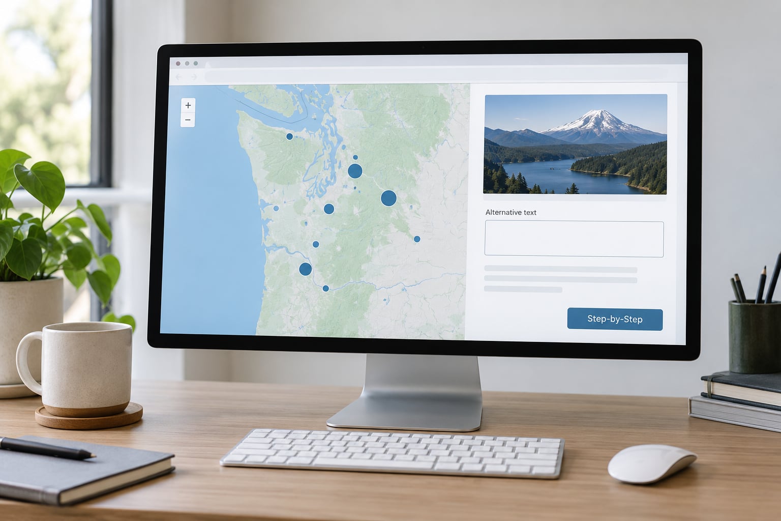
The direct answer: you add alt text in the chart tool’s accessibility or alt-text field, or in the alt attribute of the <img> or <svg> that renders the graphic, and you write it as the chart’s conclusion rather than its appearance. Here is the process in full.
1. Identify the Visualization’s Main Message
Read the chart the way a reader who has only your sentence will. What is the one thing this graphic exists to say? If the answer is “it shows that rents went up”, push further: up where, by how much, over what period, compared with what.
That single sentence is your alt text. Write it before you touch the tool. In my experience the fields that take ten minutes are the ones where nobody decided what the point was, so the description turned into a list of everything in the picture.
2. Check the Chart Type and Reading Order
The chart type decides what a reader needs spelled out, because each one hides a different thing behind the picture.
- Line charts hide exact values. Name the direction, the size of the change and any break or spike.
- Bar charts hide rank order and gaps. Name the largest and the smallest, and how far apart they are.
- Scatterplots hide density. Say whether the points form a clear relationship, and whether one cluster sits apart.
- Maps and choropleths hide the fact that area exaggerates. Name the highest and lowest regions in data order, not biggest to smallest by area.
- Heatmaps hide everything. Say what the pattern is and where the concentration sits.
- Small multiples hide the shared story. Say what is common across panels and which one differs.
Reading order matters for interactive work. A screen reader moves through the accessibility tree in DOM order, so if a tooltip sits in the markup after the heading but before the description, the tooltip text gets announced first and out of context. Put the description in the DOM before any tooltip layer.
3. Write the First Draft of the Alt Text
Four beats, in this order: chart type, subject, time period, main trend. Add the headline number when there is one.
Weak: “Unemployment chart for 2025.”
Stronger: “Line chart of UK unemployment, 2019 to 2025: the rate falls from 4.2% in early 2020 to 3.7% in 2025, with a sharp spike above 7% during the first pandemic year.”
Four beats, roughly 30 to 60 words. The old 125-character advice came from describing photographs, where you are listing contents. A chart carries an argument, and the argument needs a clause. If your draft is 20 words long, it probably only covers the chart type and the subject.
4. Add Essential Data Without Overloading the Description
Alt text is not a data table. Once you start listing all twelve values, the reader gets a wall of numbers with no hierarchy and no way to tell which one matters.
Include the two or three values that carry the story: the headline figure, the comparison point, the outlier. Everything else goes one layer down. If a reader needs all of it, that is a signal you owe them a table or a download, not a longer alt attribute.
State uncertainty when the data has it. If the last quarter is provisional, or the sample is small enough that a swing could be noise, say so in the sentence rather than leaving the reader to over-read a flat trend.
5. Test the Description for Accuracy and Clarity
Run this checklist before it ships.
- Does it name the chart type, subject and period without needing the picture?
- Does it say what the data means, not how it looks? Colour, gridlines and axis styling do not belong.
- Is every number the same as the one in the chart? Copy-paste errors here are common and embarrassing.
- Does it avoid “image of”, “graphic of”, the filename and the tool name?
- Does it read out loud without running out of breath?
- Would it still make sense if the reader never loads the image?
Then actually test it. Turn on a screen reader (NVDA on Windows, VoiceOver on macOS with Cmd+F5) and arrow through the page. Listen for whether the description is announced once, in the right place, at a sensible point in the flow. Automated checkers such as axe DevTools or WAVE will flag a missing alt attribute in seconds, but they cannot tell you whether the sentence is any good. That part is a human read.
6. Implement Alt Text in the Publishing Workflow
Where the text goes depends entirely on the tool, and the field is often not where people expect.
| Tool | Where alt text lives | Long description | Watch out for |
|---|---|---|---|
| Tableau | Set it on the dashboard or sheet, not on an individual view in most versions | Worksheet descriptions and a linked text summary | Views often expose no alt-text field of their own, which is why people fall back to mirrored tooltips |
| Flourish | Chart settings, accessibility tab, on the graphic container | Notes field and the story page text | Exported images carry nothing; the alt text lives only on the live embed |
| Datawrapper | Chart settings, accessibility, alt text field | Description and data table published alongside | Plain-text export needs the text retyped by hand |
| Power BI | Format pane, general, alt text, per visual | Report page text and a bookmarks summary | Set it on every visual; the default is blank and ships silently |
| Plotly | Not automatic. Set layout.meta or post-process the HTML to add alt | Add a description element yourself | Static export drops all of it |
| matplotlib | Not automatic. Pass metadata to savefig | Add it in the page around the figure | PNG metadata is often ignored; type the alt text in your template |
| D3 / Observable | Set the attribute on your container element in the view or index.html | Markup of your own | SVG alone is invisible to a screen reader without a role and label |
| Excel and Sheets | Right-click the chart, Edit Alt Text, or add a description in newer versions | Nearby sheet text | Alt text is dropped on copy-paste into most web editors |
That mirrored-tooltip workaround people describe in forums does technically make a screen reader speak, but it announces the label twice and strips the context that made it useful. A tooltip that repeats the axis title is worse than silence, because it trains listeners to skip your charts.
In HTML the attribute itself is straightforward:
<figure>
  <img src="rents-2025.png"
       alt="Line chart of average UK rents, 2019 to 2025: rents rise every year, with the steepest climb between 2021 and 2023, reaching 1,150 a month by 2025.">
  <figcaption>Rents rose in every region, but the pace differed sharply.</figcaption>
</figure>
For SVG and canvas graphics, the image element is not in the DOM, so the label has to be added explicitly. Pair role="img" with aria-label, and use aria-describedby to point at the longer text when you have one.
<div role="img"
     aria-label="Choropleth map of UK regions, unemployment highest in the North East at 6.1 percent and lowest in the South East at 3.2 percent."
     aria-describedby="chart-desc">
  <svg aria-hidden="true">...</svg>
</div>
<p id="chart-desc">Full figures and the underlying data are published below.</p>
In Python, the description still has to reach the page, because exporting a PNG drops the surrounding context:
fig.savefig("rents.png", dpi=200,
            metadata={"Description": "Line chart of average UK rents, 2019 to 2025."})
Treat that as a note to yourself, not as accessibility. The alt attribute belongs on the image element in your template, and it belongs there for every output, including print and PDF.
Common Mistakes
Most bad alt text for charts fails in one of six ways, and each has a simple fix.
It starts with “image of” or “graphic of”. A screen reader already announced that it is an image, and usually said “graphic” in passing. Those three words cost you twelve characters of the sentence that matters. Start with the chart type instead: “Line chart of”.
It is the filename. rents-chart-v3-final.png tells a reader nothing about rents, only about your file system. The filename belongs in the alt attribute while the file is still in development; it does not survive publication.
It repeats the caption word for word. Readers hear the caption first if it sits above the image, then hear the alt text immediately after. Two identical sentences back to back is a worse experience than one sentence. Let the caption set up the story and the alt text deliver the data.
It lists every data point. “Twelve bars: North 4.1, South 3.8, East 4.4…” is a data table squeezed into a sentence, and it reads as noise. Name the top, the bottom and the gap. Publish the rest as a table.
It explains colour. “Bars shown in different shades of blue” tells a reader what the printer did, not what the data says. Colour carries no meaning to a reader who cannot see it, and if colour is the only thing separating two series, the chart needs direct labels instead.
It treats a decorative element as content. A gridline, a background watermark or a divider line takes alt="", which tells a screen reader to skip it. An empty alt attribute is a deliberate choice, not an oversight, and it is the right one for pure decoration.
One more that is not really alt text but shows up in the same audit: a chart with a tooltip that duplicates the axis title. Screen readers announce it on every hover and it repeats what the axis label already said. Take the mirror text out of the tooltip and keep only the value.
Frequently Asked Questions
How long should alt text be for a data visualization?
For a single-series chart, 30 to 60 words is usually right. The old 125-character rule comes from describing photographs, where you list what is visible. A chart carries a conclusion, so it needs a full sentence with a subject, a period and a trend. Past roughly 80 words, move the detail into a caption or long description instead.
Should a data visualization have a separate data table?
Yes, whenever the chart carries more than a handful of values. Alt text should name the top, the bottom and the gap; the table should hold everything else. Link the table from the caption or from a sentence right after the chart, and make sure the table itself has proper headers so a screen reader can navigate it.
How do you write alt text for an interactive chart or map?
An alt attribute alone does very little, because the marks themselves are not in the DOM. Put role=u0022imgu0022 and aria-label on the container holding the graphic, keep the drawing itself aria-hidden, and make sure the label sits early in the DOM order. Every interactive control still needs its own accessible name and keyboard focus.
Is it okay for alt text and the chart caption to say the same thing?
Technically allowed, practically poor. Screen readers often announce the caption and then the alt text back to back, so a listener gets the same sentence twice with no added information. Give the caption the context and the alt text the data. If a graphic is purely decorative next to a full text description, an empty alt attribute is cleaner.
What is the best way to test data visualization alt text?
Use a real screen reader. Turn on NVDA on Windows or VoiceOver on macOS, arrow through the page, and listen for whether the description is announced once, in context, before the tooltips. Automated tools like axe DevTools catch a missing attribute instantly but cannot judge whether the sentence is useful. Both checks together take five minutes.
Should every data point be included in the alt text?
No. Alt text is a summary, not a transcript. Include the headline value, the comparison point and any outlier, then stop. A reader who needs all twelve values should get an accessible data table or a CSV download linked from the same page. Putting every point in the alt attribute makes the description harder to follow without making it more complete.
Start with the takeaway sentence. Write it before you open the tool, keep it to one line, and paste it into the alt-text field rather than into a caption that already exists. Then listen to the page once with a screen reader running. That is the whole job, and it takes about five minutes a chart.
Knowing how to add alt text to a data visualization is a small habit with an outsized payoff: it is the difference between a chart that reaches everyone who opens your story and one that quietly disappears for a chunk of them. If you want the accessibility angle covered more broadly, WCAG 2.2 success criterion 1.1.1 and the W3C technique pages are worth reading in full, and the ONS guidance on alternative text for data visualisations is the clearest short treatment of the chart-specific part.