
Start with the question your story is trying to answer, then match the shape of your data to a simple visual form, and only then worry about the tool. Readers judge values fastest when they are shown as position or length on a shared scale, so a bar chart usually beats a pie for comparison and a line usually beats both for change over time. Updated for 2026.
Most people pick a chart by scrolling through a menu until something looks right, then hope the audience reads it the way they intended. That approach has a high failure rate, and it is the reason so many published graphics get misread. The seven steps below replace the guessing with a repeatable process you can run in about five minutes.
The order matters. Goal first, data shape second, medium last. Choose the tool at the beginning and you will end up defending a chart the data never needed.
What You Need Before Choosing a Chart Type
Six inputs turn the decision from taste into arithmetic. Gather them before you open any charting menu, because each one removes a chunk of the option space.
- The reporting question. Write it as one sentence with a verb. “How did unemployment change since 2019” is a question. “Unemployment data” is not.
- The audience. A specialist who reads charts daily and a reader on a phone at a bus stop need different levels of labelling and different amounts of series.
- Your measures. One number per row, or several? Rates, totals and percentages behave differently, and a percentage can exceed 100 when the denominator moves.
- The data structure. Is there a time column, a place column, a category column, a numeric column, or several of them at once?
- The intended reading order. Do readers start at one point and move, or do they compare everything against everything?
- Medium and constraints. Print column, mobile width, static image or interactive. Also note any accessibility requirement, such as no colour-only encoding.
If you can fill in those six, you have already narrowed the field. What is left is usually two or three candidate charts, and the choice between them is a small one.
Step-by-Step: Match the Chart to the Story
Step 1: Define the Reporting Question
Write the question your chart is supposed to answer, in the words a reader would use to ask it. Then write the one-sentence takeaway that should be sitting in your head when the graphic is finished.
Keep the question and the takeaway separate, because they are not the same thing. The question is what the reader wants; the takeaway is what you found. If you cannot state the takeaway in one sentence, the chart is doing two jobs and will end up doing neither well.
Newsroom example: A reporter is handed a spreadsheet of bus delays by route and month. The question is not “chart bus delays” but “which routes got slower this year, and by how much”. The takeaway that follows from the data is a short list of routes, not a general trend.
Step 2: Identify the Main Analytical Task
Every chart does one of eight jobs: showing change over time, comparing categories, showing part-to-whole, showing a relationship between two variables, ranking, showing a distribution, showing flows, or showing deviation from a baseline. Name yours before choosing a chart type.
Most bad graphics fail here rather than later. A pie chart asked to show change over time, or a line chart asked to show part-to-whole, is a mismatch no amount of styling will fix.
Newsroom example: The delays spreadsheet is a comparison task with a time dimension, which means ranked bars for the main graphic and a small multiple by month if the trend needs showing too.
Step 3: Match the Task to the Data Structure
Data structure is what your table actually contains, independent of what you want to say. A categorical variable holds names or labels. A numeric variable holds measured quantities. A time variable holds dates. A geographic variable holds place identifiers that can be mapped. Flow data holds a source and a destination with a quantity attached.
The structure limits the honest options. A single categorical column and one numeric column supports comparison and ranking. A time column plus a numeric column supports trend. Two numeric columns support relationship. A place column plus a numeric column supports a map, and usually little else.
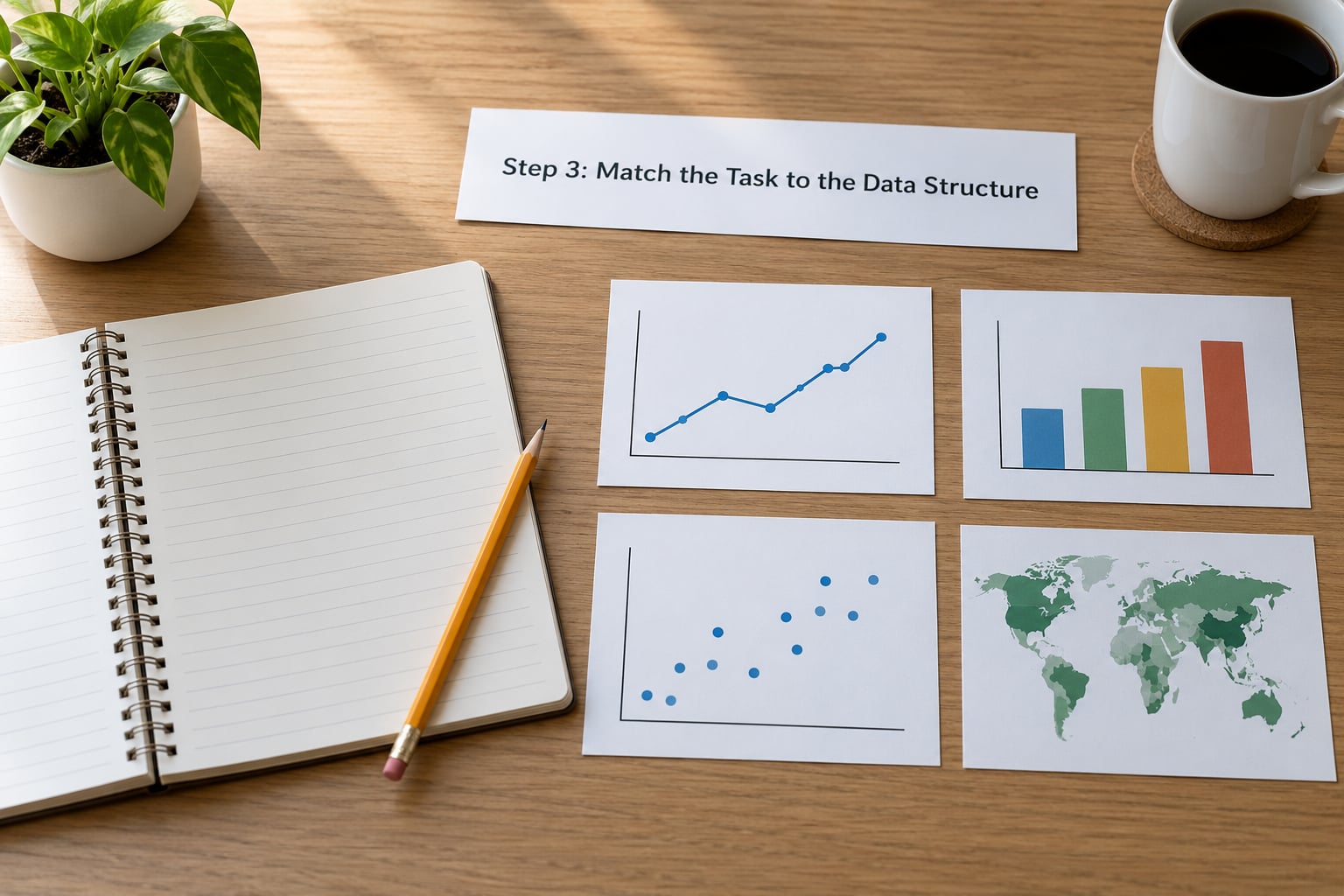
Two details change the answer here. First, volume: ten rows can be labelled directly, two hundred rows cannot, and a dot plot or a sorted bar handles what a labelled bar chart cannot. Second, continuity: if the numeric column is a true continuous measurement, a histogram or a box plot says things a bar chart of averages hides.
Newsroom example: The delays data is categorical plus numeric plus time, which is why bars work for the ranking and a line works only for a single route tracked across months.
Step 4: Narrow the Chart Choice
With the task and the structure settled, compare the two or three candidates that survive. The table below is the reference version of that comparison, grouped by family rather than by individual chart.
| Chart family | What it shows | Use it when | Do not use it when |
|---|---|---|---|
| Bar and column | Magnitude across categories | Comparing categories or ranking them | Categories are continuous measurements, or you have more than about 30 of them |
| Line | Change over time | The x-axis is genuinely time and values are continuous | Categories have no natural order, such as departments or products |
| Area | Total volume and its composition over time | You want a filled emphasis on cumulative volume | Series overlap, because filled areas hide each other |
| Stacked bar | Part-to-whole across many categories | Showing how a total splits into components | Comparing middle segments, which share no baseline |
| Pie and donut | Part-to-whole for a few slices | One total, two to five slices, a very familiar breakdown | You need readers to compare close values |
| Dot plot and lollipop | Ranking with low ink | Many categories, or long category names | You need to emphasise the area of each value |
| Histogram | Shape of a distribution | One continuous variable, binned into intervals | You only have a handful of values |
| Box plot | Spread, median and outliers | Comparing distributions across many groups | Readers do not know how to read the box |
| Scatter and bubble | Relationship between two measures | Checking correlation, or spotting clusters | You want to imply cause, or there are too many points |
| Heatmap | Pattern across two categorical axes | A matrix, such as hours by day or teams by month | Precise values matter more than pattern |
| Map and choropleth | Values attached to places | The story is genuinely spatial | Area and value happen to correlate, or the map is just decoration |
| Sankey and network | Flows between states | You have sources, destinations and quantities | The flow is a guess or the node count is high |
| Diverging bar | Deviation from a baseline | Surplus and deficit around zero or a target | The baseline is not meaningful to the reader |
| Small multiples | Many series without clutter | You have more than about five lines | The panel size makes each one unreadable |
Two principles narrow this further. Cleveland and McGill’s 1985 studies on graphical perception ranked encodings by how accurately people read them, and position along a common scale came first, followed by length, then angle and slope, then area, then colour hue. A bar chart wins comparisons because it puts values on a shared baseline where they are read as length.
That is why a pie chart is weaker than it looks. It encodes value as angle and area, two of the harder channels, and it also removes the common baseline that makes length so readable. A reader cannot reliably say whether a 22 percent slice is bigger than a 19 percent slice.
The lookup below is the version to keep beside you. It maps the analytical goal to the best chart and to the chart to avoid.
| Your goal | Reach for | Avoid |
|---|---|---|
| Change over time | Line chart, area chart, small multiples | Line chart for unordered categories |
| Comparison or magnitude | Sorted bar or column chart | Pie chart, 3D bar |
| Part-to-whole | Stacked bar, treemap, pie for 2-5 slices | Stacked area with many series |
| Relationship | Scatter plot, bubble chart by size | Bubble chart with many overlapping points |
| Ranking | Dot plot, lollipop, sorted bar | Pie chart, 3D bar |
| Distribution | Histogram, box plot, beeswarm | Line chart over binned values |
| Flows and relationships | Sankey diagram, network graph | Stacked bar used to imply flow |
| Spatial pattern | Choropleth, proportional symbol map | Map with no real spatial story |
| Deviation from baseline | Diverging bar, variance against target | Unlabelled variance column |
Where a goal and its counter-recommendation conflict, pick the chart that matches the question your reader asked. A chart that answers the wrong question cleanly is still wrong.
Step 5: Check How to Choose the Right Chart Type for Your Data
Run this suitability test before you build. Score each question yes or no, and any answer that is a clear no rules the chart out.
- Comparison: Can a reader rank two values without reading a number? If not, the encoding is too weak.
- Magnitude: Is the size of the mark proportional to the value, so a bigger value looks bigger?
- Trend: Does the x-axis run in time, with equal intervals between points?
- Distribution: Does the form show spread and shape, not just an average?
- Relationship: Are two measures plotted against each other, so clustering is visible?
- Geography: Does the place matter to the story, not just the number?
- Readability: Can it be read on a phone, with the key values labelled directly?
- Familiarity: Will the audience recognise this form without a paragraph of explanation?
The last two catch more mistakes than the first six. A technically correct chart that nobody can read on a small screen has failed, and so has one that needs a legend hunt to decode.
Newsroom example: The delays graphic passes on comparison, magnitude and readability, fails on geography because the story is not about distance, and passes familiarity because a sorted bar is something readers see weekly.
Step 6: Refine Scales, Labels, and Emphasis
The chart family is right, so the remaining work is correction rather than choice. Five things matter more than the rest.
Baselines. Bar and column charts start at zero, because bar length is the encoding. A truncated bar axis exaggerates a small change into a dramatic one, and that is the single most common misleading graphic in circulation. Line charts may use a non-zero baseline when the change is real and the range is labelled clearly, because a line encodes position rather than length.
Ordering. Sort bars by value unless the category order carries meaning, such as months, age bands or a survey scale. Unsorted bars waste the reader’s effort: every pair has to be compared by eye instead of by position.
Labelling. Put units on the axis and name the measure in the title. Label key values directly on the marks, which removes the legend entirely. A legend forces the reader to look away from the data and back again.
Colour. Use colour to encode something real, such as a group, a threshold or a highlight. Never rely on colour alone, since around one in twelve men has some form of colour vision deficiency and the two categories will read as the same. Add a second channel such as a pattern, a direct label or a different mark shape. Keep the palette to two or three hues and skip the rainbow ramp, which invents boundaries where your data has none.
Context and uncertainty. Add the baseline, the target or the average as a reference line so the reader can judge whether a value is high or low. If your figures are estimates, show the range. A projection drawn as a solid line claims a confidence the data does not support.
Keep the density low. A chart that needs a second read has too much on it, and the fix is removing elements, not shrinking text.
Step 7: Test the Chart with a Real Reader
Show the draft to someone who was not involved in making it, give them ten seconds, and ask two questions: what is the main thing this shows, and what is confusing.
Compare their answer with your takeaway sentence. If the two match, the chart is doing its job. If they name a different takeaway, the problem is usually the title, the annotation or the ordering, not the chart type.
Ask about confusion specifically. Trouble finding a label, hunting for a legend, or misreading an axis is cheap to fix now and expensive to fix after publication.
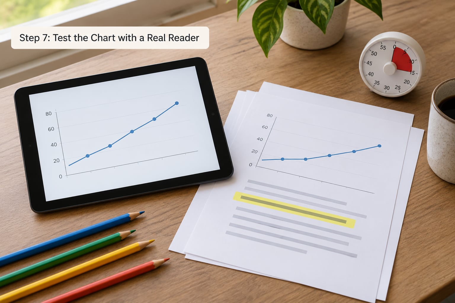
On mobile, check the chart at real width. If labels collide or the legend wraps into three lines, the fix is fewer categories, direct labels or a small-multiple layout rather than a smaller font.
One last check before it ships: ask whether a table would serve better. For six or fewer exact values, a well-formatted table is often clearer than any chart.
Common Mistakes
These nine errors account for most of the bad graphics I get sent. Each one is fixable, and each one has a specific reason it misleads.
Truncating the bar axis. Cutting a bar chart’s baseline above zero rescales every bar so a 3 percent change looks like a collapse. The fix is to start bars at zero. If you need to see small changes, plot the change itself as a line or a diverging bar, where the baseline is meaningful.
Pie charts for comparison. A pie encodes value as angle, and people read angles badly. The fix is a sorted bar chart. Keep a pie only for one total split into two to five slices that are clearly different in size.
3D effects. Perspective skews the geometry, so a 3D bar in front appears larger than a taller bar behind it. Shadows, bevels and exploded slices add nothing. The fix is flat marks in a single consistent plane.
Dual-axis charts. Two y-axes with different scales can be scaled until the lines cross, appear to cross, or cross at an arbitrary point, which manufactures or destroys a relationship at will. The fix is two separate charts, aligned on the same time axis, or normalise both series to a common base.
Too many series. Past about five lines in one panel, readers stop tracking and start guessing. The fix is small multiples, direct labels at the line ends, or a highlight chart that greys out the context series.
Line charts for unordered categories. Connecting points implies a path between them, so a line through departments suggests a progression that does not exist. The fix is a bar or dot plot.
Maps that mislead. A choropleth paints area, so large low-value regions dominate and small high-value ones vanish. The fix is a proportional symbol map, or a bar chart ranked by value with the map as supporting context. Check the map scale too: a truncated colour ramp exaggerates small differences.
Rainbow palettes. A continuous rainbow ramp has bright ends and a dark middle, so readers see structure that is not in the data. The fix is a single-hue sequential ramp for magnitude, and a diverging ramp only when the data has a real midpoint such as zero or a target.
Correlation written as cause. A scatter plot showing that two measures rise together says nothing about why. The fix is language that matches the evidence: “moved together”, not “caused”. If you claim cause, the design needs a different method entirely.
Bars in the wrong order. Randomly ordered bars make every comparison a hunt. The fix is sorting by value, unless the sequence means something.
Quick Tips for Choosing Charts Readers Understand
A few habits that raise the hit rate on any chart, whatever the type. Title the chart with the finding rather than the subject, so “Bus delays rose on the 14 route” beats “Average delay by route”.
Label values directly on the marks where space allows, and drop the legend. Show units, currency and time period in the chart itself, not in a caption three inches below. Round aggressively; a bar label reading 42.7 percent implies precision the survey probably does not have.
Keep one visual system across a multi-chart story, reusing the same colour for the same group so readers learn the key once. Preserve the source line, the unit and the date on every graphic, and make the underlying data downloadable, which is standard practice in newsrooms and costs nothing.
Default to the simplest accurate form. A sorted bar chart answers more questions correctly than a clever custom graphic, and it survives being resized, printed and read on a phone.
Frequently Asked Questions
What is the best chart type to use for most data?
A sorted bar chart handles more cases than any other form. It shows magnitude and ranking clearly, labels directly, survives a phone screen and needs no legend. Reach for a line chart when the x-axis is genuinely time, and a dot plot when you have more than about thirty categories. Pie charts stay limited to one total split into two to five clearly unequal slices.
Should I use a line chart or a bar chart for trends?
Use a line chart when the horizontal axis is real time, with equal intervals, and you care about direction and rate of change. Use bars when you care about the size of each value, when periods are few and discrete, such as quarterly budgets, or when values swing so much that a line implies a smooth path that never happened. Bars start at zero; lines may use a labelled non-zero baseline.
How do I show the distribution of numerical data?
Use a histogram for one continuous variable, binned into sensible intervals, and adjust the bin width until the shape is readable. Use a box plot when comparing spread across several groups, since it shows median, quartiles and outliers in a compact mark. Add a beeswarm or jittered dot plot when you have few enough observations to show every value individually.
When is a pie chart an appropriate choice?
A pie chart works when there is exactly one total, it splits into two to five slices, and the slices are clearly different in size so no one has to judge between close values. It also works when the categories are familiar to the audience, such as budget shares. If the reader needs to compare any two values precisely, use a sorted bar or dot plot instead.
What chart should I use to compare geographic data?
Use a choropleth when the value belongs to an area and only the pattern across regions matters. Use a proportional symbol map when you want readers to judge values, since symbol size is read more accurately than area colour. Sort by value on a bar chart when geography is context rather than the story, which is the safer choice for small regions.
Conclusion: Start With the Story
Write the takeaway sentence first, then name the analytical task, then check the data structure, then pick the simplest chart whose encoding matches. That is how to choose the right chart type for your data without a gallery, a template or a guessing game.
If you do only three things, sort the bars, label the values directly and start the bar axis at zero. Those three fix more published charts than every other change combined.