
Most statistics mistakes in news stories are not arithmetic errors. They are framing errors: a percentage printed without its base, a change described in the wrong unit, a chart that begins at 90, a headline that quietly deletes the hedge the reporter spent an hour writing. Learning how to avoid common statistics mistakes in news stories is mostly a handful of habits applied before publication, not a statistics qualification.
The most common statistics mistakes in news stories fall into three places: sourcing, where a figure is lifted from a release without checking the underlying dataset; arithmetic, where percentage points, denominators and rounding get mishandled; and presentation, where chart axes and headline wording amplify a change the data cannot support. Fix those three and most errors never reach a reader.
The workflow below takes about twenty minutes on a routine story and closer to an hour on a piece built around a dataset. That is a fair trade for a number you can defend on air.
Table of Contents
- What You Need
- Step-by-Step: A Verification Workflow You Can Repeat
- 1. Define the question the statistic has to answer
- 2. Trace the number back to its original source
- 3. Check the definition, the denominator and the scale
- 4. Add the context readers need to read it correctly
- 5. Communicate uncertainty and meaningful change
- 6. Run a claim-level verification pass before publication
- Common Mistakes: The Statistics Mistakes in News Stories That Keep Coming Back
- Frequently Asked Questions
- Does every statistic in a news story need a margin of error?
- How do I rewrite a misleading statistic without removing the underlying finding?
- What context should I include when reporting a percentage?
- When is it better to report raw numbers instead of percentages?
- When should a journalist consult a statistician?
- Conclusion
What You Need
You need five things, and three of them are free.
- The original source material — the dataset, statistical release, methods page or filing, not another outlet’s summary of it.
- A calculator and a spreadsheet — multiplication by hand in a headline argument is where mistakes live.
- Access to the underlying data — especially when a source hands you a finished chart instead of the numbers behind it.
- A plain-language reference for the measure — a glossary, a methods appendix, or the methodology paragraph you did not read the first time.
- A second pair of eyes — a colleague, your editor, or a subject expert who will read the claim and not the prose.
If the source material is missing, that is a finding in itself. A number you cannot trace to an original document is a number you cannot publish.
Step-by-Step: A Verification Workflow You Can Repeat
1. Define the question the statistic has to answer
Turn the claim in your story into a precise question, then ask whether the number answers it. “Is crime rising in the borough?” needs a population-adjusted rate over a defined period for a defined area, not a raw count of incidents reported.
Write down the population, the period and the geography the question requires. Most unusable figures fail here rather than later, and catching it now saves the argument you would otherwise have with the source.
2. Trace the number back to its original source
Go to the dataset, the methods document or the official release. Not the news coverage of it, and not the summary graphic a press contact attached to the email.
Record who created the figure, when it was published, which version or revision you used, and where a reader can check it. That four-part note is your audit trail, and it is what lets you correct the story later without starting from zero.
Data journalist Anastasia Valeeva, interviewed by the Global Investigative Journalism Network, calls blind faith in data the root failure: reporters use numbers without checking where they came from. Her two specific examples are mixing a poll up with a population survey, and confusing correlation with causation. Both pass a casual read and both are wrong.
3. Check the definition, the denominator and the scale
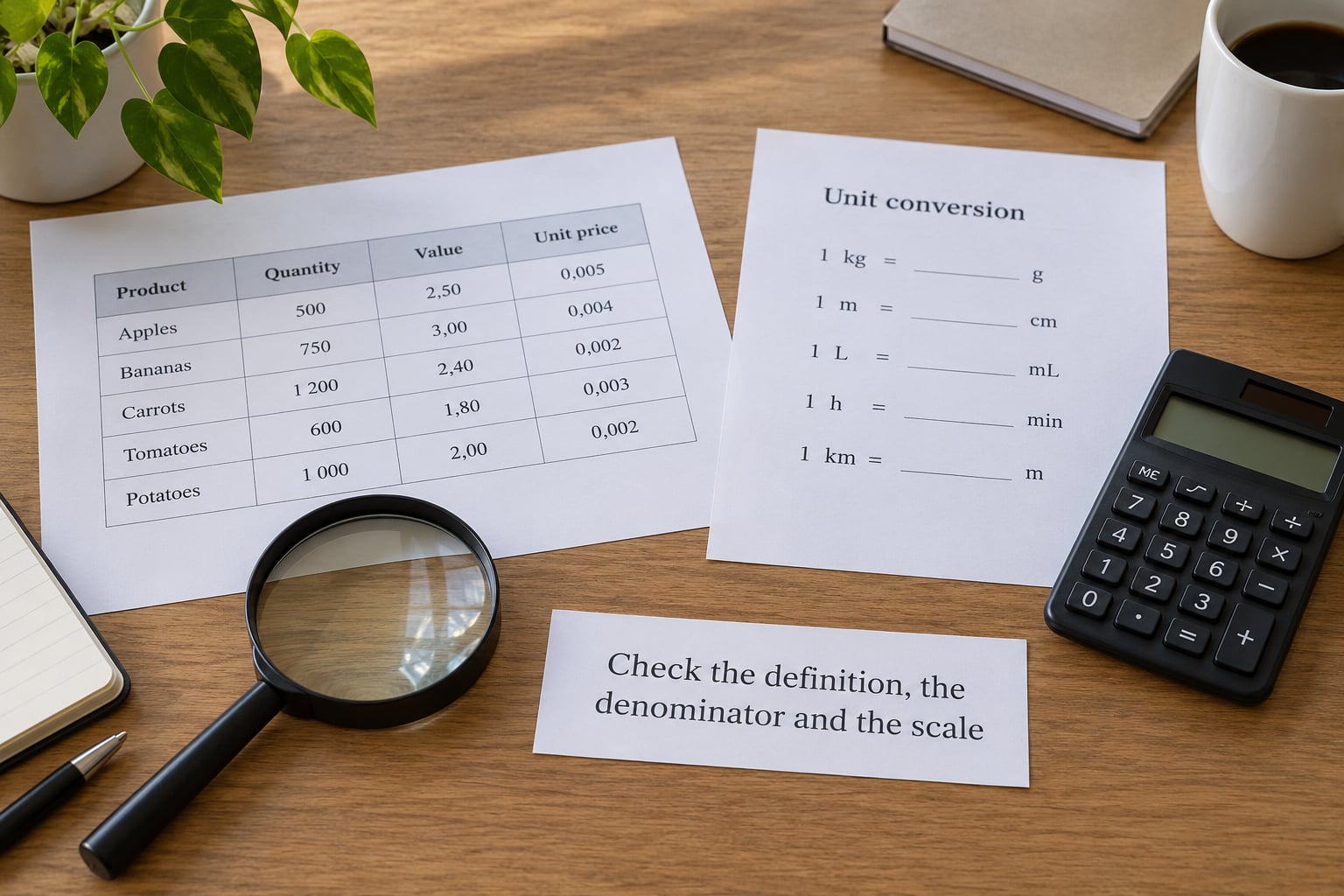
Before you check the mathematics, check what the measure is. Three questions cover most of it: what does the label count, what sits in the denominator, and what scale is it reported on?
Percentage points and percent change are not the same thing, and newsrooms mix them constantly. If a rate rises from 4 percent to 6 percent, that is a rise of 2 percentage points, or a 50 percent increase. Writing “a 2 percent increase” is wrong, and “rose 50 percent” without saying from what is worse. Same trap with counts against rates: a city can post more crime simply by having more people, which is why per-capita figures and population-adjusted rates exist.
Also confirm the collection method. A figure pulled from a different question wording, a different survey mode or a different agency definition is not comparable with the figure you are comparing it to, no matter how similar the labels look.
4. Add the context readers need to read it correctly
A bare number is almost always misleading, because the reader supplies their own baseline and it is usually the wrong one. Give them five things: the comparison value, the time span, the geographic scope, the relevant baseline or normal, and the underlying count behind any percentage.
Watch for the small-base trap. Complaints against one depot going from three to six is a doubling, technically true and editorially useless, because six is still a rounding error. Always print the absolute number next to a change in a rate. The same logic applies to relative risk versus absolute risk: a drug with a 50 percent relative risk reduction might move 2 people per 100 to 1 per 100, which is worth saying plainly.
Per-capita figures and seasonally adjusted series answer different questions. A raw count shows how much is happening; a per-capita rate shows how intense it is. Publishing one while describing the other is a framing error readers cannot detect on their own.
5. Communicate uncertainty and meaningful change
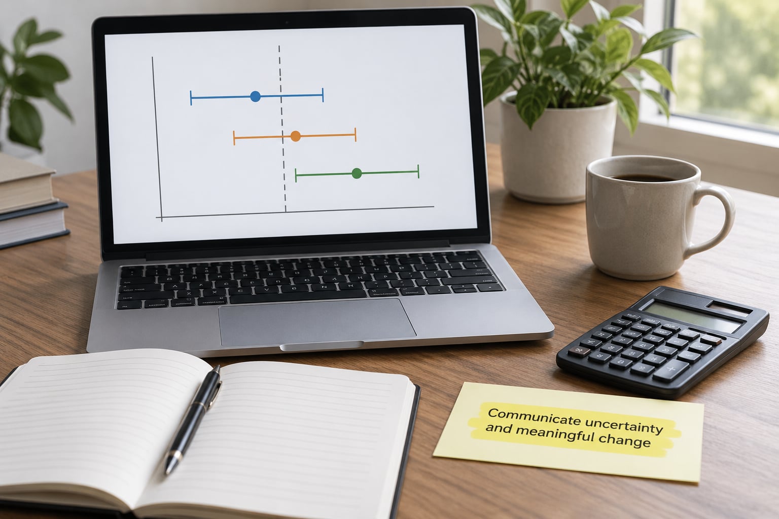
Estimates are not exact counts, and the difference needs to be visible. Give a margin of error or a confidence interval where one exists, avoid false precision such as “41.327 percent of adults” when the source reported 41 percent, and refuse to treat a small or noisy movement as a trend.
“Statistically significant” is narrower than readers hear. It means a result is unlikely under a stated null hypothesis. It does not mean large, important, or likely to hold up elsewhere, and a significant change in a subsample of 200 people is still a weak basis for a headline claim. When a change is smaller than the uncertainty around it, the honest sentence is that the data cannot distinguish it from no change.
Note what the margin of error does not cover. It describes sampling error only. Non-response bias, question wording, sampling frame problems and coverage gaps sit outside it, and a stated margin can sit next to a serious unmeasured bias.
6. Run a claim-level verification pass before publication
Recompute every derived figure from the source numbers rather than from your own notes. Then test the alternative reading: if someone hostile to your story quoted the same statistic back at you, what would they say, and does your wording already concede it?
Compare the wording to the evidence sentence by sentence. If the study found an association, the story must not say it showed an effect. If the survey found a preference, the story must not say people want.
Then get a second reader. The most reliable person is not always the best statistician. It is often the colleague who will ask the obvious question without embarrassment. The other failure point to check is the last edit: headlines and standfirsts compress hedged language back into certainty, which is where careful work gets undone.
Common Mistakes: The Statistics Mistakes in News Stories That Keep Coming Back
Ten statistics mistakes in news stories to check for in every draft
- Relative change described as percentage points. Fix: name the unit, the starting value and the ending value in the same sentence.
- A percentage with no base. Fix: print the raw count beside it, always.
- Correlation headlined as cause. Fix: use association language, or explain the mechanism you can actually evidence.
- A poll reported as if it described the whole population. Fix: state who was surveyed, how many, when, and how they were reached.
- A cherry-picked starting year. Fix: show at least five years of the series, or say why the window begins where it does.
- False precision. Fix: round to the accuracy the source actually supports.
- A pre-built chart from a source, published unchecked. Fix: rebuild it yourself from the data before it runs.
- Vague attribution. “Officials say” and “experts say” are not sources. Fix: name the person or the document, and link it.
- A forecast written in the past tense. Fix: keep it in the future tense, attribute the model, and state its assumptions.
- A number nobody on the desk can reconstruct. Fix: if you cannot show the working, you do not have it yet.
Rewrite the sentence, not just the number
Most published errors are wording problems wearing a data costume. The figure is fine; the sentence built on it is not. Rewriting is faster than re-reporting, and it keeps the finding while removing the distortion.
| Flawed wording | Why it fails | Publish instead |
|---|---|---|
| Violent crime doubled last year. | Percentage growth with no base. | Reports of violent crime rose from 14 to 27, and remain rare against 4,100 recorded offences a year. |
| The scheme cost 2 percent more per patient. | Points and percent change confused. | Cost per patient rose from 8.4 to 8.6 percent of spending, an increase of 0.2 percentage points. |
| Users who sleep eight hours score better on memory tests. | Association phrased as a result. | People who reported eight hours of sleep scored slightly higher on memory tests. The survey does not show one causes the other. |
| Experts say remote work is more productive. | No nameable source. | Two studies from named institutions found higher output on measured tasks and weaker results on creative tasks. Neither is conclusive. |
| Cases are up 300 percent. | Small denominator hides a small absolute number. | Cases rose from 2 to 8. Eight is far too few to describe a trend. |
| Unemployment will fall to 3 percent. | Forecast stated as fact. | The institute’s central forecast puts unemployment at 3 percent by the fourth quarter, based on assumptions set out in its spring release. |
| Survey finds 72 percent support the plan. | Population and method missing. | In a poll of 1,004 registered voters conducted in March by a named survey firm, 72 percent supported the plan. The margin of error was 3 points. |
| Deaths fell, so the drug works. | No comparison group. | Deaths fell in both the treatment and the comparison group, by similar amounts. |
Misleading charts are a statistics error in picture form
A chart makes a claim about magnitude, and axis settings do the claiming. The five that cause the most trouble: a truncated y-axis that starts at 90 and turns a two-point wobble into a cliff; dual axes scaled so two unrelated series appear to move together; three-dimensional effects that distort the areas and angles you are meant to compare; pie charts where one slice is exploded or enlarged; and inconsistent time windows that place a quarterly series next to a monthly one.
One more, and it is the easiest to fix: no source line. A chart without a visible creator, date and link is the fastest way to hand a reader a number nobody can check.
The operational fix matters most when a source supplies the graphic. Rebuild it from the data yourself, set the axis to zero for bar charts, keep one scale per series unless you label the second axis, and publish the source note. If the underlying data is not available, say so in the story rather than running the chart on trust.
Numbers nobody produced and nobody checked
Machine-generated summaries now produce plausible figures faster than any desk can verify them, and the error mode is familiar: a real institution, a real study, a figure that is off, or a study that does not exist. Treat every such number like a source-supplied chart. Find the original document, confirm it exists, match the figure to the document, and check whether it was published or merely preprinted. A preprint has not been through peer review, and saying so costs you four words.
The pre-publication statistics checklist
Copy this into your reporting checklist. It takes about ten minutes.
- Every central number traces to an original dataset, release or methods page, and you have the link saved.
- Each derived figure has been recomputed from source data by someone other than the person who first calculated it.
- Every percentage states its base, and every change states its starting value and its unit.
- Every rate is paired with its underlying count.
- Every estimate carries its margin of error, or an explanation of why none is available.
- Every time series shows enough history that the chosen start date cannot mislead.
- Every chart starts at zero or explains why it does not, uses one scale per axis, and carries a source line.
- Every causal verb in the story has causal evidence behind it.
- Every forecast is in the future tense, attributed, and accompanied by its assumptions.
- A second person has read the claims and the headline, not just the prose.
And when you get one wrong anyway, correct it visibly. A correction note attached permanently to the story, with the original figure and the corrected figure both shown, does more for credibility than a month of perfect copy. Errors that get buried travel further than the stories that fixed them.
Frequently Asked Questions
Does every statistic in a news story need a margin of error?
No. Margins of error apply to sample-based estimates such as polls and surveys, and they describe sampling error only. Census counts, administrative records and complete transaction data are not estimates in that sense. What every number needs is an honest statement of its precision: a margin where one exists, or an explanation of why the figure is treated as exact.
How do I rewrite a misleading statistic without removing the underlying finding?
Keep the figure and change the sentence around it. Print the base, name the starting value, and state the unit explicitly. If a rate moved from 4 to 6 percent, say it rose 2 percentage points, or 50 percent from 4 percent. Most published distortions survive because the number is real and the framing is not, so the fix is wording plus context, not deletion.
What context should I include when reporting a percentage?
Five things: the underlying count, the comparison or baseline value, the time span, the geographic scope, and whether the figure is adjusted, seasonally adjusted or a raw count. For estimates, add the margin of error. A percentage without its base tells the reader a rate but not a size, which is exactly why small-denominator doubles slip through.
When is it better to report raw numbers instead of percentages?
When the base is small, when the change is genuinely small in absolute terms, or when readers need to picture scale. Counts answer how much is happening; rates and percentages answer how intense it is. Publishing both is usually the right call. Reserve percentages for comparisons, and always pair them with the raw count so the reader can judge the denominator.
When should a journalist consult a statistician?
Before publication, not after a reader emails. Ask one when the analysis is the story rather than an illustration, when you are weighting, modelling or imputing data, when a margin of error or significance claim appears in the source, or when your own calculation changes the interpretation. A thirty-minute review routinely catches the denominator and unit errors that a line edit cannot.
Conclusion
Trace every central number to its original document, define what it measures, print its base and its uncertainty, then hand the claim to a second reader before it ships. That sequence takes minutes, and it catches the sourcing, arithmetic and framing errors that make up nearly all statistics mistakes in news stories.
One last habit: when something does slip through, correct it in the open and keep the note attached. A visible correction costs a paragraph. A buried one costs the reader’s trust in every number you publish next.