How to build a photo essay online comes down to three decisions: what the story argues, what order your images go in, and what the page weighs. A photo essay is a deliberately ordered set of photographs with captions and a short amount of written text that argues a single idea, unlike a gallery, which is a display. Get the sequence right and a good shoot becomes a piece someone can read in three minutes; get it wrong and strong photographs fall flat no matter how well they were shot.
Most of the trouble I see is not photographic. It is people trying to publish first and decide what the story is afterwards, then wondering why nobody scrolls past the second image. The fix is unglamorous: a written thesis, a slot-by-slot outline, and a page that loads quickly on a phone.
Here is the short version, before the detail.
- Write one sentence saying what the essay argues, before you shoot a frame.
- Outline the sequence before you select images, not after: opening frame, setup, escalation, turn, resolution.
- Overshoot roughly three times the frames you think you need, then cull hard on a contact sheet.
- Give every image one or two caption sentences that add something the photograph cannot say on its own.
- Compress full-bleed images to under 300KB, lazy-load everything below the first screen, and test the real page on mobile data.
What You Need to Build a Photo Essay Online
You need far less gear than most people assume and far more preparation. The material side breaks into five groups.
Editorial material. A working thesis in one sentence, background notes, and any source information you will need later. If a claim, a name or a date appears in your captions, write down where it came from now. Reconstructing sourcing three weeks after a shoot is miserable.
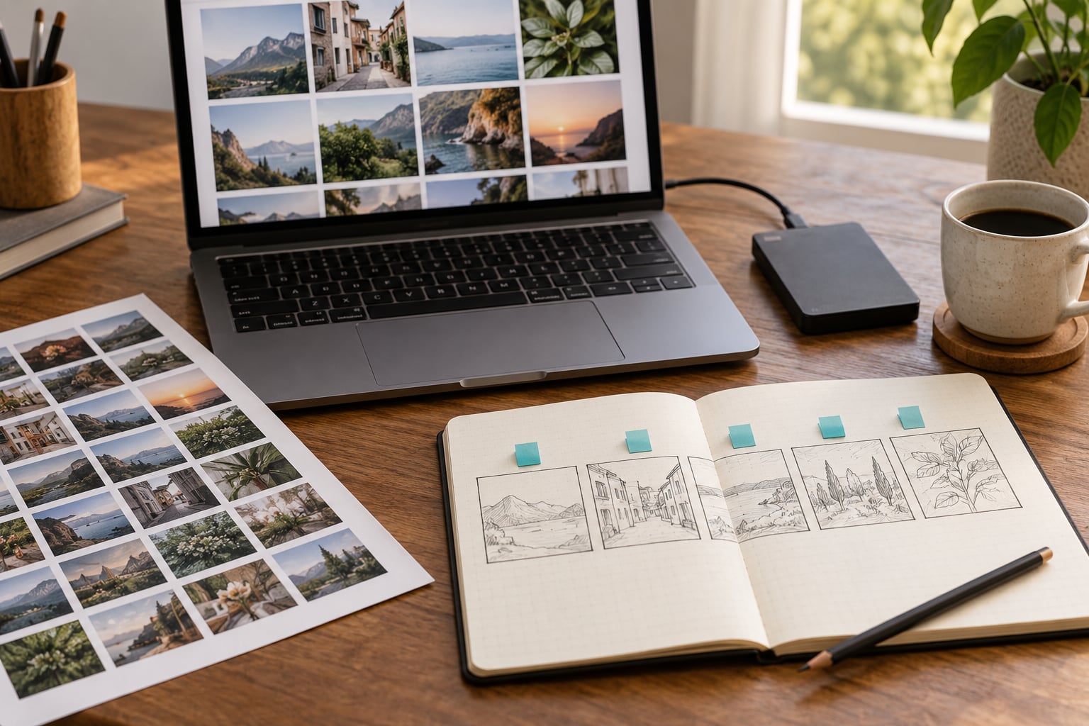
Software. Whatever you already shoot in, plus a catalogue and edit tool. Lightroom’s contact sheet and culling workflow is the industry default, but Capture One, Bridge, Photo Mechanic or a phone-based catalogue all work. What matters is being able to see your whole shoot as small frames at once, because selecting 12 images from 200 is a job you cannot do one at a time.
A publishing platform. Ten names cover almost every real case: Adobe Portfolio, Squarespace, Wix, Pixpa, WordPress, Adobe Express, Format, Cargo, Flickr and Google Sites. Which one fits depends on whether you need your own domain, whether you publish inside an existing newsroom site, and how much control you want over image delivery.
Technical specifications. Decide your longest edge before you export, not after. A full-bleed hero image on a phone screen rarely needs more than 1600 to 2000 pixels wide, and the quality difference from a 4000-pixel file is invisible at that size. Decide a maximum file weight and hold to it: under 300KB for a full-bleed image, under 120KB for a caption-sized frame.
Audience and accessibility. Know who reads this, on what device, and whether they can see your images at all. Alt text, caption or transcript for any video, and enough contrast on text over photographs are not extras, they are the floor.
Two practical habits pay off here. Back up your full-resolution files to more than one place before you start editing, because more than one social app has crashed and taken an unsaved draft with it, and more than one photographer has lost a culled edit to a corrupted card.
Step-by-Step: How to Build a Photo Essay Online
How to build a photo essay online: define the story
Write the thesis as one sentence with a subject and an argument in it, not a subject and a mood. “A night-shift bakery” is a subject. “The hour after midnight, when a bakery’s entire output is decided by two people” is a story you can sequence. The second version tells you which frames matter and which are filler, which is the whole job of a thesis.
Then name three things: who the reader is, what you want them to feel by the last image, and how long the piece should be. A general reader on a phone tolerates roughly twelve images. A classroom brief often specifies a count, a word count and a format, so check the requirements before you start rather than after you have edited 200 frames. On a photography subreddit, beginners ask for structure far more often than for gear, and the ones who get a clear structure finished are the ones who picked a question first.
Plan the visual sequence
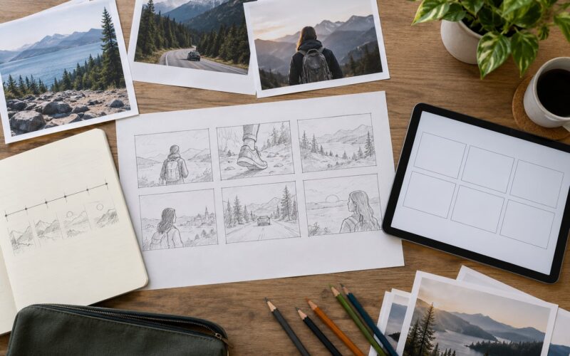
Outline the sequence before you select anything, with one line per slot. Most essays use five moves: an opening frame that establishes place, setup that gives context, escalation that tightens, a turn where something changes, and a closing frame that resolves or leaves the question open.
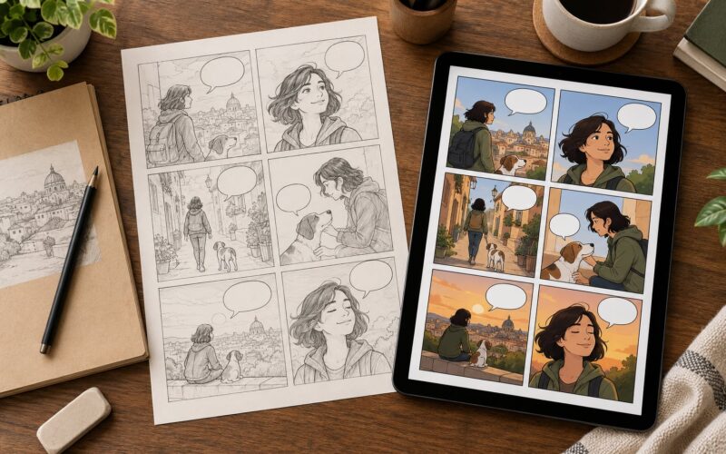
Cover four shot types in your planning, because the mix is what stops an essay looking like one photographer’s mood board. A wide establishing shot says where you are. A medium frame puts a person or object in that place. A detail shot gives the reader something to lean in on. An action or human frame supplies motion and stakes. The beginner trap the photo.net documentary forum keeps circling is overshooting without any of these slots assigned, then staring at 200 good frames with no idea which twelve carry the story.
Keep a slot list visible during the edit. It is the difference between curating and just choosing pictures you happen to like.
Select and edit the images
Build a contact sheet and judge on two axes at once: narrative value and technical quality. The frame that advances the story survives a soft focus; the frame that is sharp but adds nothing usually does not. One of the first, still-active beginner threads on photo.net is literally titled “New to Photo Essays”, and the recurring complaint is not gear, it is not knowing which images to keep.
Cull in rounds. First pass at thumbnails for story value only. Second pass for duplicates and near-duplicates. Third pass for technical faults. Then crop and colour-match across the set so the reader does not notice a jump in tone between image six and image seven, which is exactly the print-to-screen problem working photographers describe: a file that looks magnificent on a calibrated monitor can look flat and lifeless on a phone outdoors.
Watch what you remove. Pulling every image of people out of an essay about a community changes what the essay says, and the omission is the kind of thing readers notice without being able to name. Keep enough context that a stranger could place the story from the frames alone.
Write context, captions, and supporting copy
A caption is not a label. “This is my dog” tells a reader nothing they cannot see. “Ninety seconds of sleep, then back on the line” tells a reader what the frame means. Aim for one or two sentences per image, and vary them: some frames carry a short line, some carry a sentence of context, one or two carry a short quotation from a person in the picture.
Write an intro of 80 to 150 words that states the subject and the stakes, then a credits line at the end with your name, the date and anyone who helped. Somewhere in the set, quote one person directly with attribution. It is the fastest way to stop a photo essay reading as a slideshow.
One form worth studying: a portrait of a person paired with a short recorded presentation in their own voice. A Reddit user planning a photography essay about suicide survivors built exactly that, portraits plus recorded narration from each sitter, and it changes the ethics of the piece as much as the structure. The sitter hears and approves their own words before publication.
Design the online presentation
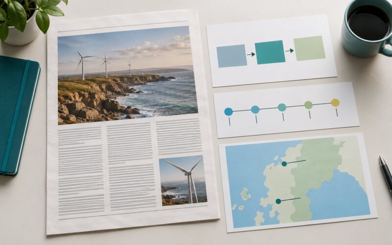
Choose the format that matches how long people will stay. A scrolling story works for a sequence that builds, because scroll position becomes the narrative clock. A slide-based feature works when each image needs to hold still for reading. A grid works for a thematic set with no strong order, which means your essay is really closer to a gallery. A multimedia package is the right call when sound or video carries part of the argument.
Search readers usually arrive mid-decision here, so pick the option and say why in a sentence rather than listing ten. The tools below handle the rest.
Then set the physical limits. Keep the reading measure between 60 and 75 characters. Give captions more space than images need, not less. Alternate full-bleed frames with narrower ones so the page has a rhythm and the reader’s eye gets somewhere to rest. Use one typeface, two sizes, and let the images carry the variation.
Whichever format you pick, the order on the page is the order in your slot list, not the order the CMS happens to display.
Add accessibility and search essentials
Every image needs alt text that describes the picture in plain words and adds the context a sighted reader takes for granted. Alt text is not the caption and not a keyword list. “Two bakers lifting a tray of loaves out of an oven at 3am, flour on the counter” is useful; “photo essay, bakery, bread, best bakery photo essay” is not.
Any video needs a transcript. Text sitting on top of a photograph needs a scrim or a solid panel so it stays readable. Everything should work from the keyboard alone, and the image order should be reflected in the page’s heading structure rather than living only in a slide widget that a screen reader cannot follow.
For search, name files descriptively before uploading, give the page a title and meta description that describe the story rather than the medium, and set alt text that includes the topic once, naturally. Keywords help a little. They do not rescue an essay that a reader cannot understand.
Optimize images and page speed
Image weight is the single biggest reason photo essays crawl on phones. Twenty images at 1.5MB each is a 30MB page, and on a mobile connection that is a long time staring at nothing.
Export at the size the layout actually uses. Serve responsive sizes so a phone downloads the small file and a large screen gets the big one. Convert to WebP, or AVIF where the target browsers support it, and compress to a visible-quality floor rather than a percentage. Lazy-load everything below the first screen, but preload only the one image that appears at the top; preloading the whole set makes the page slower, not faster. Keep one contact sheet worth of frames out of the published page entirely.
Then test the real thing rather than trusting the builder. Load the live page on a phone, on mobile data, not office wifi, and time how long until the first image appears. If it takes more than a few seconds, the fix is nearly always file size.
Publish, test, and promote
Run a pre-publish pass: check every link, confirm each image loads at the size you expect, view the page on a phone and a narrow laptop, run an accessibility checker, preview the social card, and confirm analytics is recording. Fix what breaks before the audience sees it, not after.
Clear the rights before publication, not after. Anyone identifiable in a documentary frame may need a model release, and a recognizable private location can need a property release. Minors need a guardian’s consent. If a subject is in a vulnerable position, show them the finished piece and let them withdraw from it. Never publish a work made in someone else’s studio, a venue or a workplace without permission.
Distribute through the publication you wrote it for, your newsletter, the search channel, and the social platform where that audience already is. One essay, three cuts: the full sequence on your own site, a condensed run in the newsletter, and a carousel built from the strongest five frames with the conclusion as the last slide.
Common mistakes
Choosing images before defining the story. The fix is one written sentence, written before the edit starts.
Captions that name what is visible. The fix is to write what the frame means, who is in it and what just happened.
One mood for twenty images. The fix is the four shot types: wide, medium, detail, action.
A heavy page. The fix is export size, modern formats, a hard cap per image and lazy loading below the first screen.
Hiding context. The fix is to publish the credits, the sources and the conditions under which the work was made.
Designing for a desktop monitor. The fix is to open the draft on a phone early and often; most readers will arrive on one.
Describing images badly for screen readers. The fix is plain, specific alt text that says who and what and where.
Frequently Asked Questions
What is the best format for a photo essay online?
A scrolling, full-bleed sequence works best for most essays because the scroll itself becomes the narrative clock, guiding the reader through setup, escalation and resolution. Use a slide-based feature instead when each image needs to hold still while a caption is read, and a grid only when the set has no meaningful order. Avoid auto-advancing carousels; readers lose their place and cannot go back at their own pace.
How many photos should an online photo essay include?
Ten to twenty images is the working range for an online photo essay, and twelve is a comfortable target for a phone reader. Stay above six or the sequence has no room to develop, and stay under twenty-five or the page weight becomes the story. School and client briefs often set their own count, so check the requirement before you shoot. Overshoot during the shoot by roughly three times, then cull hard.
Do photo essays need captions and descriptive text?
Yes. Captions and short supporting text are what separate a photo essay from a gallery, because they tell the reader what each frame means and how the argument moves. Give every image one or two sentences, add an 80 to 150 word intro and a credits line at the end, and include at least one direct quotation from a person in the pictures. Captions should add meaning rather than name what is already visible.
What platform or CMS should I use to publish a photo essay?
Match the platform to control and budget. Adobe Portfolio and Squarespace are polished and quick, Wix and Pixpa suit a first project, WordPress gives newsrooms full control over image delivery, Adobe Express and Google Sites work for class or client pieces, and Flickr and Cargo suit quick drafts. If you need a custom domain or must host inside an existing publication, WordPress or a hosted CMS is the realistic answer. Test image handling before committing.
How can I make an online photo essay load faster?
Export at the size your layout uses, not your camera’s native resolution, and cap full-bleed images at roughly 300KB. Convert to WebP, or AVIF where browsers support it, serve responsive sizes so phones get small files, lazy-load everything below the first screen, and preload only the top image. Skip lazy loading on that first image. Then load the live page on real mobile data and time how long the first image takes to appear.
Conclusion
Learning how to build a photo essay online is one editorial decision followed by eight production ones. Define the thesis, outline the sequence, overshoot, cull hard, write captions that add meaning, design for a phone screen, keep the page light, and clear your rights.
Start with the smallest complete version. Choose one idea, write it as a sentence, lay out the five moves with one line each, and assemble a draft of a dozen frames with captions before you touch any template or platform. A finished plain essay teaches you far more than a beautiful half-built one, and the second version is the only one anybody can actually read.