
To make a before and after image slider, stack two photos in the same box, clip one of them with CSS, and move that clip with a draggable divider. You can do it in about 30 minutes with plain HTML, CSS and about 15 lines of JavaScript, no plugin and no external library.
The idea is simple enough that most people build it as their first real CSS project. Two images sit at identical size inside a relatively positioned container, the second one is clipped to a percentage width, and dragging the handle changes that percentage. Everything else is labels, styling and accessibility polish.
Table of Contents
- What You Need
- Step-by-Step: How to Make a Before and After Image Slider
- Common Mistakes
- Frequently Asked Questions
- Can I make a before and after image slider without JavaScript?
- What is the easiest way to add this slider to WordPress?
- How do I stop the slider from jumping when I click or drag it?
- Should the before and after images be the same size?
- How can I make the slider work with a keyboard and screen reader?
- Can I use this comparison slider for images in a news story?
- Conclusion
What You Need
Four things, and three of them you already have.
- Two images shot from the same position, cropped to exactly the same pixel dimensions and aspect ratio.
- An HTML file or a custom HTML field in your CMS. A blank
index.htmlopened in a browser is enough to test. - A code editor. VS Code, Sublime Text or even a plain text file works. You do not need a build step, a package manager or Node installed.
- Browser developer tools, which you already have in Chrome, Firefox, Safari or Edge. The device toolbar in Chrome DevTools is how you test mobile widths.
For dimensions, most newsroom and portfolio work sits fine at 1600 by 1067 pixels, or 1200 by 800 for a lighter page. Whatever number you pick, both files must match to the pixel. Mismatched dimensions are the single most common reason a comparison looks wrong, and the fix takes five seconds once you know it.
Write real alt text for each image too. The before image describes the earlier state, the after image describes the current state. A renovation piece wants “Empty living room before the refit” and “Refitted living room with new bay windows and finished floor.”
Step-by-Step: How to Make a Before and After Image Slider
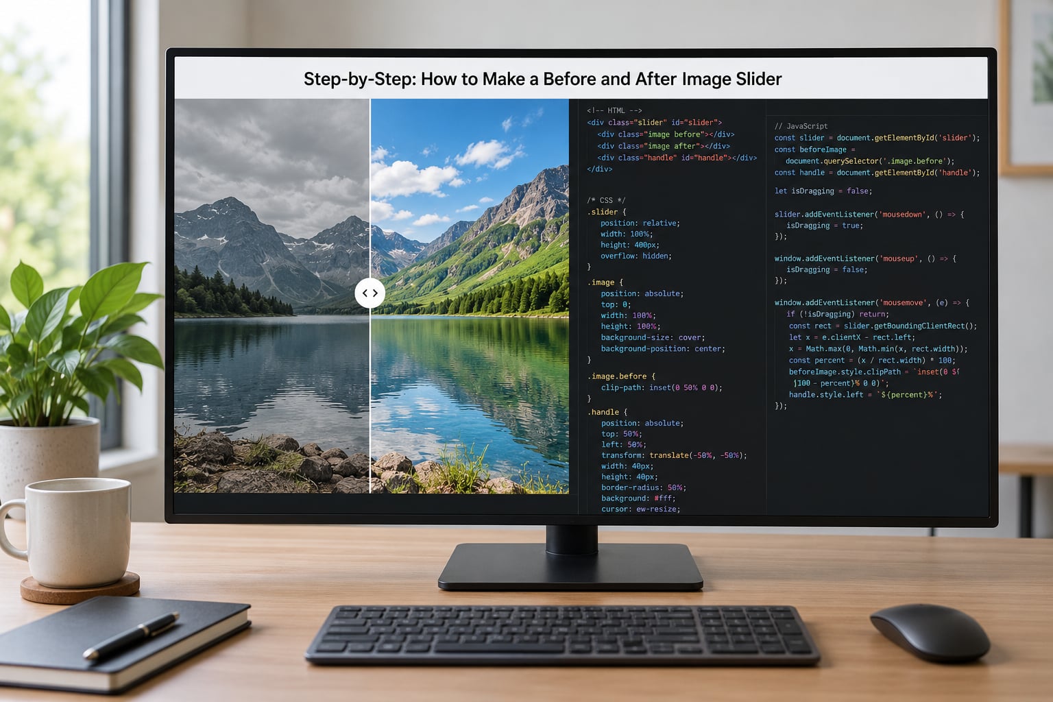
Step 1: Prepare the Before and After Images
Crop both photos to identical width and height. If the source images have different aspect ratios, pick the one that matters most and crop the other to match rather than stretching it, because stretching is what makes the after image look squished later.
Keep the camera in the same spot. A 5 percent shift in framing reads as a mistake even when it is a genuine change, so tripod the shot, mark the tripod position on the floor, and reuse it for the second frame.
Export both at the same quality. Converting to WebP usually cuts these file sizes by 60 to 70 percent compared with a straight JPEG export, and two large photos on a story page is exactly the kind of weight that pushes Core Web Vitals scores around.
Step 2: Add the Before and After Image Slider HTML
Markup stays short. One wrapper, two image layers, a divider, two labels and a native range input that handles the accessible control surface.
<div class="ba" style="--pos:50%">
  <img class="ba-img" src="before.jpg" alt="Empty living room before the refit">
  <div class="ba-after">
    <img class="ba-img" src="after.jpg" alt="Refitted living room with new bay windows">
  </div>
  <span class="ba-label ba-label--before">Before</span>
  <span class="ba-label ba-label--after">After</span>
  <div class="ba-divider"></div>
  <input class="ba-range" type="range" min="0" max="100" value="50"
         aria-label="Reveal the after image">
</div>
The range input is the accessibility story. It is a real form control, so arrow keys, Home and End already work on it before you write a line of script. The JavaScript later just keeps it in sync with the visual position.
Step 3: Position the Two Images
The container needs a defined height and a stacking context. Using aspect-ratio on the wrapper is the cleanest option, because both images then scale together with the width and you never fight a fixed pixel height on mobile.
.ba {
  position: relative;
  overflow: hidden;
  aspect-ratio: 3 / 2;
  user-select: none;
  touch-action: pan-y;
  border-radius: 8px;
}
.ba-img {
  display: block;
  width: 100%;
  height: 100%;
  object-fit: cover;
}
.ba-after {
  position: absolute;
  inset: 0;
  clip-path: inset(0 calc(100% - var(--pos)) 0 0);
}
.ba-divider {
  position: absolute;
  top: 0;
  bottom: 0;
  left: calc(var(--pos) - 1px);
  width: 2px;
  background: #fff;
  box-shadow: 0 0 0 1px rgba(0,0,0,.25);
  pointer-events: none;
}
.ba-range {
  position: absolute;
  inset: 0;
  width: 100%;
  height: 100%;
  margin: 0;
  opacity: 0;
  pointer-events: none;
}
.ba:focus-within .ba-divider {
  outline: 3px solid #2f6fed;
  outline-offset: -3px;
}
object-fit: cover matters more than it looks. It crops each image to fill the box without distorting it, so the two layers stay aligned as the container changes size.
There are two clipping techniques and you will meet both in the wild. clip-path: inset() paints a clipping mask over the whole after layer, which keeps that image at full container width the entire time, so it can never squish. The older technique wraps the after image in a div with overflow: hidden and resizes that wrapper to a percentage, which squeezes the image unless you recompute its width on every resize. Use clip-path and that whole class of bug disappears.
For the labels, position them at opposite corners with a semi-transparent black background and white text so they stay readable over a light photo.
.ba-label {
  position: absolute;
  bottom: 12px;
  padding: 4px 10px;
  border-radius: 999px;
  background: rgba(0,0,0,.55);
  color: #fff;
  font: 600 13px/1 sans-serif;
  letter-spacing: .04em;
  text-transform: uppercase;
}
.ba-label--before { left: 12px; }
.ba-label--after  { right: 12px; }
Step 4: Make the Handle Draggable
Pointer events are the modern answer. They cover mouse, touch and pen with one handler, which is why most jQuery snippets you find in older tutorials are no longer worth copying.
The maths is the whole trick: measure the container with getBoundingClientRect(), subtract the box origin from the pointer position, divide by the box width, and you have a percentage. Clamp it between 0 and 100 and you are done.
document.querySelectorAll('.ba').forEach(function (ba) {
  var range = ba.querySelector('.ba-range');
  var dragging = false;

  function setPosition(percent) {
    var pct = Math.min(100, Math.max(0, percent));
    ba.style.setProperty('--pos', pct + '%');
    range.value = Math.round(pct);
    range.setAttribute('aria-valuenow', Math.round(pct));
    range.setAttribute('aria-valuetext', Math.round(pct) + ' percent of the after image shown');
  }

  function positionFromEvent(event) {
    var rect = ba.getBoundingClientRect();
    setPosition(((event.clientX - rect.left) / rect.width) * 100);
  }

  ba.addEventListener('pointerdown', function (event) {
    dragging = true;
    ba.setPointerCapture(event.pointerId);
    positionFromEvent(event);
  });

  ba.addEventListener('pointermove', function (event) {
    if (dragging) positionFromEvent(event);
  });

  ba.addEventListener('pointerup', function () { dragging = false; });
  ba.addEventListener('pointercancel', function () { dragging = false; });

  range.addEventListener('input', function () {
    setPosition(Number(range.value));
  });
});
Notice the forEach over every .ba on the page. Scoping each handler to its own container is what stops three sliders on one story page from all jumping when you drag one of them, which is a bug a single global document handler guarantees.
setPointerCapture keeps the drag alive when the pointer leaves the box, so the divider does not freeze halfway if your finger drifts outward.
Step 5: Add Keyboard and Accessible Controls
Because the range input is a native control, keyboard support arrives free. Tab to it and the arrow keys move the divider in 1 percent steps, Page Up and Page Down jump by 10, and Home and End snap to the two extremes.
Add aria-valuenow, aria-valuemin and aria-valuemax as the script updates, and a descriptive aria-label that says what moving the control does. A screen reader announces the label, the current value and the value in words, so “50 percent of the after image shown” is far more useful than a bare number.
Keep the range input in the DOM and reachable with Tab even though it is visually transparent. Removing it from the tab order with tabindex="-1" throws away the only part of this component that already works properly for assistive technology.
Step 6: Test Resize and Image Behavior
Open DevTools, switch to device emulation and step through 375, 768 and 1280 pixel widths. At each one, drag the divider to the far end and check that both images still line up at the edges, with no gap and no doubled border.
On touch devices the classic failure is that the page scrolls instead of the divider moving. touch-action: pan-y on the container is the fix: it tells the browser to keep vertical scrolling for itself while horizontal movement belongs to your handler.
If you use loading="lazy" on the images, add explicit width and height attributes anyway. The aspect-ratio on the container already reserves the space, so lazy loading will not shift the layout when the photo finally arrives.
Skip the animated reveal if a reader has asked for reduced motion. Wrap any intro animation in @media (prefers-reduced-motion: no-preference) and it stays opt-in.
Step 7: Publish and Embed the Slider
In WordPress, the block editor accepts a Custom HTML block for the markup, and the styles belong in the theme stylesheet or a block that targets .ba. In Elementor, drop the same HTML into an HTML widget and put the CSS in the page’s custom CSS box.
Squarespace and Wix both ship a native before-and-after block, so on those platforms use the built-in widget rather than pasting custom code into a layout that will rewrite your markup the next time someone drags an element.
To reuse the slider across a newsletter or a syndicated partner page, put the finished file on its own URL and embed it in an iframe with a set width and height. Nothing else needs to load, and the embed keeps working even if your main site redesigns.
One conflict to watch: if the theme or another plugin already defines styles for input[type=range], your invisible control can pick up odd heights. Scope the CSS to .ba-range and the problem disappears.
Common Mistakes
Every one of these is a five-minute fix once you know what causes it.

| Symptom | Cause | Fix |
|---|---|---|
| The after image squishes or stretches while dragging | The clip is a resizing wrapper with overflow: hidden, so the image inside is being squeezed | Switch to clip-path: inset() on a full-size layer, or recompute the inner image width on every resize |
| Dragging scrolls the page on a phone | The browser treats the movement as a scroll gesture | Add touch-action: pan-y to the container and call preventDefault() on the touch events |
| Every slider on the page moves together | One global handler is bound to document with unscoped selectors | Loop over document.querySelectorAll('.ba') and bind inside the loop so each handler owns one container |
| The two photos do not line up at the edges | The files have different pixel dimensions or aspect ratios | Recrop both to the same width and height and add object-fit: cover |
| The layout jumps when the image loads | No space was reserved for the image | Set aspect-ratio on the container and keep explicit width and height attributes |
| Labels disappear or sit on top of each other | Both labels share one position, or the contrast is too low against a bright photo | Place them in opposite corners and add a semi-transparent dark background behind the text |
| Keyboard users cannot move the divider | The range input was removed from the DOM or hidden with display: none | Keep the input, style it with opacity: 0, and leave it in the tab order |
| The slider sits behind other page content | No stacking context on the container | Give the container position: relative and a z-index above neighbouring elements |
| The page is slow to load with several sliders | Full-resolution files served for every frame | Export WebP, size images to the largest rendered width, and lazy load everything below the fold |
One extra habit worth keeping: name the wrapper class something project-specific, like .ba as above, rather than a generic .slider. Theme stylesheet rules are the usual reason a slider mysteriously turns pink on publish but looks fine in a CodePen.
Frequently Asked Questions
Can I make a before and after image slider without JavaScript?
Yes. Layer both images at identical size, clip the top one with clip-path, then drive that clip from a native input type=range styled to sit across the whole container. The browser handles the drag, the arrow keys and the touch gestures for you. The trade-off is that you lose fine control over the handle shape, and styling a range input as a divider takes more CSS than a plain div does.
What is the easiest way to add this slider to WordPress?
Paste the markup into a Custom HTML block and add the CSS to your theme stylesheet, or drop the HTML into an Elementor HTML widget and put the CSS in the custom CSS box. Both work without installing anything. If you would rather not touch code at all, WordPress has several dedicated comparison slider plugins, but the snippet above weighs about 2 KB and ships no update prompts.
How do I stop the slider from jumping when I click or drag it?
Clamp the computed percentage to the 0 to 100 range, and calculate the position from getBoundingClientRect on every event rather than accumulating offsets from the last position. On touch devices add touch-action: pan-y to the container so the browser reserves vertical scrolling for itself. Round the value you write back to the input, since a long decimal string on aria-valuenow makes some screen readers read out a number nobody wants to hear.
Should the before and after images be the same size?
They must be, down to the pixel. Identical width, height and aspect ratio is what makes the two layers align at the edges, and mismatched files are the most common reason a comparison slider looks broken. If your originals differ, crop the wider one rather than stretching either image, then add object-fit: cover so both still fill the container responsively.
How can I make the slider work with a keyboard and screen reader?
Keep a real input type=range in the markup, style it transparent with opacity rather than hiding it, and leave it in the tab order. Arrow keys, Home and End then work with no extra script. Add an aria-label describing what moving the control does, and update aria-valuenow plus a plain-language aria-valuetext as the user drags so the announcement is useful rather than a bare number.
Can I use this comparison slider for images in a news story?
Yes, and it suits editorial work well. Satellite imagery, storm damage, a site before and after redevelopment and election-night map changes all read better as a draggable comparison than as two stacked stills. Keep the alt text descriptive for each state, host the file on your own domain so it loads inside an iframe in newsletters, and hold the divider at 50 percent so the first view shows both.
Conclusion
A before and after image slider is three moving parts and nothing exotic: matching images, two stacked layers and a clip that a drag handle changes. Get those right and the component works on every current browser without a single dependency.
Start with the boring parts. Crop both images to identical dimensions, stack them in a relatively positioned container, and clip the after layer with clip-path: inset(). Wire the drag to the container and keep the range input in sync, and you already have a working slider before you style a single label.
Only then come back for the handle, the labels and the load-time details. The clip-path layer is what keeps the after image from squishing, the per-container loop is what keeps several sliders on one page independent, and the untouched range input is what makes the whole thing usable without a mouse.