
You can become a data journalist with no coding experience, and the path starts with a spreadsheet. Most entry-level data work is filtering, sorting and pivoting rows in Excel or Google Sheets, then charting the result in a point-and-click tool like Datawrapper or Tableau Public. Coding matters later, but it is not the entry ticket.
That is good news, because the bottleneck for most beginners is not code. It is deciding what question to ask, judging whether a dataset can answer it, and being honest about what the numbers do not prove.
This guide walks the whole route: what to set up before you start, a six-step workflow you can follow this month, the beginner mistakes that cost the most time, and honest answers about how long it actually takes. Nothing here assumes you have written a line of code, and nothing here asks you to buy anything to get started.
What You Need
You need four things, and only one of them is software. The other three are habits you already have some version of from any reporting job, school assignment or research project.
A spreadsheet you are comfortable in. Not an expert one. You should be able to filter a table, sort it, delete obvious duplicates, and build a pivot table that counts how many rows fall into each category. If you cannot do those four things yet, that is your first month of practice, not a disqualification.
A browser and an account with a spreadsheet tool. Excel if you have it, Google Sheets if you do not. Sheets runs in a browser, handles CSV files from public portals without complaint, and shares cleanly with editors, so it is a perfectly legitimate professional choice rather than a beginner shortcut.
A place to write things down. A notebook file or a text document where you record, for every dataset: where it came from, what each column means, what you changed, and what you are unsure about. In 2026, the single most common reason a data story gets pulled is not a math error. It is that nobody can reconstruct how the numbers were produced.
A source habit. Public records portals, agency report pages, court docket systems, budget documents, inspection reports, census and survey releases. Local and state portals in the United States, national statistical agencies, and parliamentary or FOI offices elsewhere all publish machine-readable tables nobody has looked at yet.
Tools that cover the work without coding
This table is the practical core of the no-code path. The “Coding required” column is the one most beginner guides leave out, so here it is stated plainly.
| Tool | What it does | Coding required | Cost | Learning time |
|---|---|---|---|---|
| Excel or Google Sheets | Filter, sort, pivot, calculate, spot odd values | No | Free tier available | Weeks of regular use |
| OpenRefine | Clean inconsistent spellings, whitespace and duplicates in bulk | No | Free | One afternoon |
| RAWGraphs | Build a chart from a spreadsheet with almost no configuration | No | Free | An hour |
| Datawrapper | Publication-quality charts, maps and tables with annotations | No | Free tier available | A day or two |
| Tableau Public | Drag-and-drop interactive dashboards and charts | No | Free | A few days |
| Flourish | Animated and interactive storytelling visuals | No | Free tier available | A day |
| Knight Lab Timeline Builder | Build annotated timelines from spreadsheet rows | No | Free | An hour |
| QGIS | Map layers, boundaries and geographic analysis | Steep learning curve, no code | Free | Days to weeks |
| SQL | Query large databases directly instead of downloading them | Yes, and the one most worth learning next | Free | Several weeks |
Learn these in the order listed. Spreadsheets first, because everything downstream depends on reading a table properly. Charts tools second, because a chart is a claim and you should only make one once you know what the data says.
Communities matter as much as tools at this stage. NICAR, the National Institute for Computer-Assisted Reporting, and IRE, Investigative Reporters and Editors, run training and listservs where reporters ask working data journalists real questions. The News Nerdery Slack, the Data Visualization Society, and r/dataisbeautiful are useful for seeing finished work and reading how people argue about chart choices.
Step-by-Step: From a Question to a Published Data Story

Here is the workflow I would give someone starting cold. Each step ends with a check that tells you whether it worked, because the most common beginner failure is jumping ahead to the chart.
Step 1: Start With a Story Question, Not a Dataset
Beginners often find an interesting file and then look for a story inside it. It usually goes badly. The dataset should serve the question, not the other way around.
Write the question first, in one sentence, in plain language. Not “analyse crime data” but “which neighbourhoods had the largest rise in reported burglaries per 1,000 households over five years.” The second version tells you which agencies to call, which years to request, and what a good answer would look like.
Then name three things: who this matters to, what you are comparing against what, and what evidence would change your mind. That last one is the discipline that separates a data story from a data illustration. If no result could ever contradict you, you have found a chart, not a story.
Check: a stranger could read your question and tell you roughly which two or three public bodies hold the data.
Step 2: Find and Assess the Right Data
Public data is published by people with reasons to shape it. That does not make it useless. It means you have to read it properly before you use it, which is a habit, not a skill you need software for.
Ask six questions every time. Who collected it and who funded the collection? When was it collected, and how current is it really? What does each column actually count, and is a person counted once or many times? Are units consistent, or do some rows report dollars and others report thousands? What is excluded, and are the missing regions systematically the poor ones? What changed in the middle of the time series, such as a definition change or a new reporting system?
Open records portals are the usual starting point, and so are agency annual reports, budget line items, inspection and licensing databases, court records, and FOI requests to the body that holds the data you want. When a dataset is old, narrow or oddly shaped, a records request to the agency is often faster than hunting for a substitute.
Check: you can write a plain-English paragraph saying where this data came from, what it covers, and what it cannot tell you. If you cannot write that paragraph yet, you are not ready to chart it.
Step 3: Clean and Check the Data Without Coding
Cleaning is not glamorous and it is most of the work. The goal is a table where every row means the same thing, every column means the same thing, and any change you made is written down.
Work in this order. First, remove exact duplicate rows. Second, look at the text columns and fix inconsistent entries, because the same agency name typed four different ways will split into four groups and quietly ruin your counts. OpenRefine does this well if the file is large. Third, decide what a blank cell means, because blank usually means “not reported,” not zero, and treating it as zero is a factual error you would have to publish.
Fourth, scan for outliers. One row with a decimal point in the wrong place or a year recorded as 2099 will wreck an average. Fifth, check the totals. Add a column, sum it, and compare against the figure the agency published in its own report. If your total disagrees, something in your cleaning is wrong, and finding that out now is much cheaper than after publication.
Keep a changes log. Three lines is enough: what you changed, how many rows it affected, and why.
Check: your row count matches the source’s stated count, and every filter you applied can be listed in one sentence.
Step 4: Find the Pattern and Make a Simple Chart
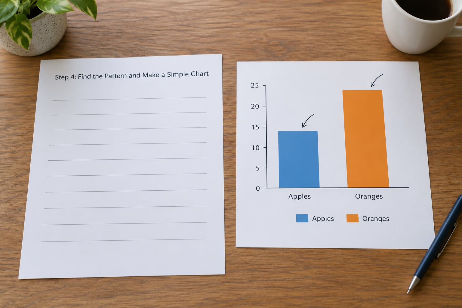
You are looking for one finding, not a dashboard. Read your summary table and ask what is genuinely odd in it. One district four times the regional average. A category that grew every single year. A gap that opens in a specific month.
Then pick the chart form that matches the shape of the finding, not the one that looks impressive. Bar charts compare categories. Line charts show change over time. Scatter plots show whether two things move together. Maps only work when location is the point of the story; a map of raw counts will mislead you whenever areas differ wildly in population, so you almost always need rates or normalised figures instead.
Colour carries meaning or it is decoration. If one series is the subject of the story, colour that one and leave the rest grey. Label lines directly instead of relying on a legend. Add a source line and a note explaining anything a reader could misread, such as an axis that does not start at zero.
Check: cover the labels and show the chart to someone outside your beat for ten seconds. Ask them what it says. If their sentence differs from yours, the chart is doing too much work.
Step 5: Write the Story Around the Evidence
The structure that works is finding, context, evidence, caveat, conclusion. Lead with what the data shows, in numbers a reader can hold. Then give the background that makes those numbers matter, such as what the agency is supposed to do and what it has promised before.
Put your chart where it does the most explanatory work, not at the top by default. Annotate it with the specific finding you are describing. Then say what the data cannot show, plainly, before your reader has to ask.
Reporting still matters. Numbers show a pattern; people explain why it happened. A records request that produces two years of internal correspondence will often carry a better story than a third chart.
Check: every number in the text matches the chart, and each one can be traced to a row you can point at.
Step 6: Publish, Explain, and Improve
Before it goes out, do four things. Write a sourcing note listing each dataset, its publisher and its date. Describe each chart in alt text that says what the chart shows and what the finding is, not just that a chart exists. Read it on a phone, because a wide table that works on a laptop becomes an unreadable smear. Then send the analysis file to a second person and ask them to reproduce your headline number from scratch.
After publication, watch for corrections. Small projects are where you learn this, and newsrooms remember people who fix errors quickly and say so plainly.
Check: someone else can rebuild your main number from the files you would hand over.
Common Mistakes
Starting with a favourite chart. You find a map template you like and go looking for data to fill it. Reverse this every time: the finding chooses the chart.
Trusting unsourced data. A number lifted from a blog post, a press release or a social post is not a source. Follow it to the originating record. Working practitioners put it bluntly: learn how the data was created and where it came from before you learn how to manipulate it.
Overstating correlation. Two lines rising together is not proof one causes the other. Say what the data shows, name the relationship you are describing, and avoid causal language your evidence cannot carry.
Hiding uncertainty. Estimates, partial coverage and revisions belong in the story, not in a footnote. Readers handle caveats well when they see them early.
Using colour without meaning. If a rainbow palette carries no information, it adds noise and fails readers who cannot distinguish the colours. Use one accent colour and grey for context.
Comparing raw counts across unequal populations. Rates and normalised figures exist for a reason. Always state the denominator next to the number.
Waiting until the skills are perfect. The career profilers who get asked this question all say the same thing: build something slightly above your current level and let the project raise you. Waiting to feel ready is the readiness trap.
One more thing worth settling early: when to learn code. My rule is to start when a spreadsheet stops being enough, and the signal is specific and repeatable. If you routinely hit files where formulas become unreadable, or you spend more time downloading and merging than analysing, SQL is next. It is the smallest gap between a no-code workflow and direct database access, and it pays off quickly in newsroom work.
Frequently Asked Questions
What is data journalism?
Data journalism is the practice of gathering, cleaning, analysing and visualising data to support and report a news story. A data journalist finds a public or requested dataset, checks what it can and cannot prove, finds the pattern that carries the story, charts it clearly, and writes the narrative around what the evidence supports. It is a reporting job with numbers as the raw material.
Do data journalists need to code?
No, not to start. Most people who use data regularly in newsrooms work in Excel or Google Sheets, and filtering, sorting and pivoting cover most day-to-day needs. Coding becomes valuable when you need to query large databases, scrape records or build custom interactives, which is why SQL is usually the first one worth learning. Learn it when your spreadsheets stop being enough, not before.
Is Excel enough for data journalism?
For a large share of published work, yes. Spreadsheets handle filtering, sorting, deduplication, simple calculations and pivot tables, which is where most beginner stories live. Pair them with OpenRefine for messy text columns and a charting tool such as Datawrapper or RAWGraphs when you publish. Move to SQL when files get large enough that downloading and merging eats your time.
How long does it take to learn data journalism with no coding experience?
Give it three months of regular part-time work before you expect to publish something you are proud of. The first month usually goes to spreadsheet fluency and finding usable sources. The second goes to cleaning and charting a story you care about. The third is where you publish and revise. People learn faster than that, but very few finish in a fortnight.
How do I build a data journalism portfolio with no experience?
Publish three to five small pieces rather than one large one, and keep each one fully documented. Include your sourcing note, the spreadsheet or cleaning file, and a short write-up of what you found and what you could not answer. Local and niche outlets, community publications and trade newsletters are realistic first homes, and the finished archive matters more than any credential.
Do I need a data journalism degree to get hired?
No. Plenty of working data journalists came in self-taught, through reporting jobs, fellowships or freelance credits, and newsrooms care far more about the work than the certificate. A degree helps if you want teaching or research roles, or if you are starting without any reporting experience at all. If you are early in your career, a masters programme is a network and a placement as much as a qualification.
Conclusion
The shortest path is the one you actually start. Pick a question about something local that you already care about, find one credible public dataset that can speak to it, and build one clear chart from it. Publish it, keep the sourcing note, and use whatever the response teaches you as the reason to do a second one.
Nothing on that list requires code, a degree, or a budget. Spreadsheet fluency and a habit of checking where numbers came from will carry you through your first several stories, and everything else you can add once you have published something worth improving.