
A news timeline is an interactive graphic that puts a story’s events in date order, with a line of text and media for each one, so readers can see how a crisis, an investigation, or a political fight actually unfolded. Learning how to build a timeline for a news article is mostly editorial work: the hard part is deciding which events belong, what counts as confirmed, and what the sequence implies. The technology takes an afternoon once the reporting is solid.
Most newsrooms get this backwards. They open a graphics tool, start sliding cards in, and only then ask whether every date has a source behind it. Reverse that order and the graphic becomes the easy part.
Table of Contents
- What You Need
- Step-by-Step: How to Build a Timeline for a News Article
- 1. Define the timeline’s editorial purpose and boundaries
- 2. Create the event list and gather reliable sources
- 3. Normalize dates, times, names, and place labels
- 4. Organize events in a defensible editorial order
- 5. Design the timeline for scanning and context
- 6. Implement the timeline in the newsroom stack
- 7. Test, fact-check, publish, and maintain it
- Common Mistakes
- Frequently Asked Questions
- What is the best tool for building a news article timeline?
- Can I build a news timeline with spreadsheet data?
- How do I update a timeline after it has been published?
- How can I embed a news timeline in an article?
- What is the most accessible way to display a timeline?
- How should I handle events with disputed or incomplete dates?
- Conclusion
What You Need
Before you open a single tool, line up seven things. Missing any one of them is what turns a timeline into a liability instead of an asset.
- The story scope. A written sentence describing what question the timeline answers. If you can’t finish that sentence, you don’t have a timeline yet.
- Verified event sources. Court filings, transcripts, official statements, wire copy, and direct reporting. Every event needs at least one of these attached.
- Editorial guidelines. Your desk’s rules on anonymity, source attribution, corrections, and how you describe unverified claims.
- A content management system. WordPress, Arc, Drupal, or a custom stack. The CMS decides how the embed behaves on mobile.
- A timeline tool or build method. No-code hosted services, spreadsheet-driven open-source tools, or a custom build.
- Design assets. House fonts, brand colors, a headline style, and image rights cleared for web use.
- Testing devices. At least one phone, one laptop, a keyboard, and a screen reader before publication.
Tools like TimelineJS from Knight Lab, Datawrapper, and Flourish all handle the rendering. None of them will decide whether your fourth event belongs, and that is exactly the decision a reporter has to make.
Step-by-Step: How to Build a Timeline for a News Article
1. Define the timeline’s editorial purpose and boundaries
Start with the reader’s question, not with your data. Write it down in one line: “When did the warning signs appear, and who knew what and when?” That sentence sets the boundaries.
Next, choose navigation. A linear chronology suits most breaking news and investigations, because time is the causal spine. A branching or causal sequence fits stories where several threads run in parallel, such as a data breach or a court case with separate proceedings.
Then set a date range and write your acceptance criteria. Something like: every event carries a named source, no more than fifteen events, and no card states a motive as fact. If a card fails the criteria, it gets cut.
You know the scoping worked when a colleague who did not report the story can read the timeline and describe its shape accurately.
2. Create the event list and gather reliable sources
Build a plain list first. One row per event, with columns for date, headline, body text, media link, and source. Resist formatting anything until the list is finished and sorted.
Attach a source to every single row. Not a link to your own earlier article, but the document or the direct reporting behind the claim. Documents are better than coverage; a filing tells you what was said, while an article tells you what someone wrote about it.
Label uncertainty explicitly. Use a status column with three values: confirmed, disputed, and context. Confirmed events have a primary source. Disputed events have sources that conflict, and the card must say so. Context entries are background that helps the reader interpret the sequence without being part of it.
Ten solid events beat thirty vague ones. Unsourced chronology is the most common reason a timeline gets pulled from a story, and it is the easiest problem to fix while the draft is still open.
3. Normalize dates, times, names, and place labels
This step is where accuracy quietly breaks. Write every date in ISO format, YYYY-MM-DD, so nothing sorts wrong because a month name got abbreviated. Where a time matters, store the time zone alongside it and convert to a single display zone before you publish.
Decide how you handle partial dates. “Sometime in early March” needs a convention: either the first of the month with a qualifier in the copy, or the month and year with no day. Pick one and apply it everywhere.
Normalize names too. One person, one spelling, one form of address. Places get a consistent granularity, so a single incident is not labelled with a country while another is labelled with a street corner.
Then record what happens when news breaks after you publish. Your data model needs a way to mark an event as added later, with the date it was added, so the timeline never pretends the whole sequence was known from the start.
4. Organize events in a defensible editorial order
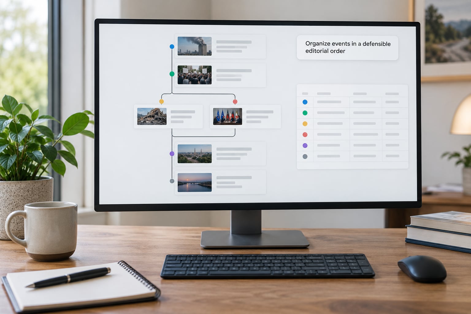
Linear chronological order is the default and it should stay your default. Readers infer meaning from adjacency, so the order of two cards is itself an editorial claim.
Group by theme only when the time order genuinely obscures the story. A legislative vote sequence might be easier to follow by policy area than by clock. A disaster log is almost always better by hour.
Branching sequences need an explicit rule for when one branch merges back into another. Otherwise you get a diagram where two lines sit side by side and readers assume one caused the other.
That is the trap worth naming: a timeline can imply causation purely through sequence. If two events sit next to each other, most readers will connect them. Only place events together when your reporting supports the connection, and say plainly when it does not.
5. Design the timeline for scanning and context
Design for two reading speeds. The fast reader scans headlines and dates only. The slow reader opens a card and wants the detail, the document, the quote.
Keep headlines short enough to survive on a phone. Most tools truncate around 30 to 40 characters in the navigation rail, so write to that limit and put the full sentence in the card body.
Use color to group, not to decorate. One hue per theme or status, held consistent across every card, with the legend visible. If you use a second accent for disputed events, make sure it reads as a warning and passes contrast against the background.
Filters earn their place on long timelines and get in the way on short ones. Same for zoom controls, background imagery, and animated transitions. Motion in particular should be optional, because some readers get nausea from parallax scrolling and some simply close the tab.
Media should load on demand. A timeline with twenty embedded videos that all autoplay is a page nobody finishes. Lazy-load video and audio, compress images, and always supply captions and transcripts.
6. Implement the timeline in the newsroom stack
There are three realistic routes, and the choice is mostly about who maintains it after publication.
A no-code hosted service. Datawrapper is the newsroom default for a reason: it produces responsive embeds, handles accessibility features, and exports cleanly to print and slides. You paste a spreadsheet or upload a CSV, style it in the browser, and get an embed snippet. The catch is that published output lives on the vendor’s infrastructure, so check the terms for your publication model and the free tier’s branding limits.
A hosted data-visualization service. Flourish is the stronger choice when the story needs scrollytelling, animated transitions, or a live data connection. Feature writers tend to land there because the template-first approach gives you a designed frame before you have written copy. The learning curve is steeper, and on a breaking deadline that cost is real.
A spreadsheet-driven open-source build. TimelineJS reads a Google Sheet or a JSON file and renders an interactive timeline you can host yourself, with no vendor in the middle. It is fast, free for commercial use, and it is the fastest route from a spreadsheet to a published embed. The trade-offs are real: a spreadsheet edit goes live immediately with no version control, design customization needs CSS, and the Google Sheets publishing flow is a recurring source of broken embeds that people report on forums again and again.
A custom build is worth it only when the timeline is the product, such as an ongoing tracker. Otherwise you are maintaining code and a content pipeline for a graphic that a reporter could have shipped on a spreadsheet.
Whichever route you take, keep the data in version control even when the tool is hosted. A JSON file in the repository gives you history, review, and a way to rebuild after someone breaks the embed. Analytics, filters, and print exports all come out of that decision rather than being bolted on later.
7. Test, fact-check, publish, and maintain it

Run this checklist before the timeline goes live, and do not skip it because the embed works on your machine.
- Every date re-checked against its primary source, including time zone conversions.
- Every card carries a working link, and every link opens without a login.
- Mobile layout checked at a narrow width, with no sideways scroll and no cut-off text.
- Keyboard navigation through the entire timeline, including filters and cards.
- Screen reader test, confirming each event announces its date before its headline.
- Captions and transcripts on all video and audio.
- Color contrast checked against the requirement your publication works to, commonly WCAG 2.1 AA.
- Loading speed measured on a mid-range phone, not a workstation.
- Structured data validated where you publish it.
- A named owner and a correction process written down before launch.
Then publish and watch the first week. Which cards get opened, where readers drop off, and whether anyone reaches the last event will tell you more than the design review did.
Maintenance is the part newsrooms skip and then regret. A published timeline is an evergreen asset that needs an owner, a quarterly date check, and a visible correction process. When an event changes, update it and note the change. When a card was wrong, fix it in place and say so, rather than quietly editing.
Common Mistakes
Mixing event dates with publication dates. A story that ran on Tuesday about a Monday event is not a Tuesday event. Two date columns in your sheet, always, or the chronology quietly lies.
Relying on unsourced chronology. A list assembled from memory or from other people’s coverage without checking is a liability. The fix is simple and annoying: attach a primary source to every row or cut the row.
Cramming too many events into one view. The recurring rule of thumb in newsroom training is to keep it under fifteen slides, because past that point readers stop scrolling. Group the rest into era labels or cut them.
Implying causation through sequence. Fix it with explicit language. Say what your reporting establishes and what it does not, in the card, where the reader is looking.
Ignoring mobile. Iframes break constantly inside CMS editors that strip width and height attributes. Test on a real phone and set explicit responsive widths in the embed.
Shipping inaccessible controls. Filters and navigation that only respond to a mouse, or cards announced without a date, make the graphic unusable for part of your audience. This is a requirement, not a nicety.
Hiding sources. If readers cannot see where an event came from, the whole thing reads as assertion. Put the source on the card, not behind a footnote.
Publishing without a correction process. Decide now who updates the timeline after launch and how you label a change. Retrofitting that after a correction request is where timelines get deleted.
A few habits cover most of this. Write acceptance criteria before you build. Cut anything you cannot source. Test on a phone and with a keyboard. Own the graphic after it publishes.
Frequently Asked Questions
What is the best tool for building a news article timeline?
For most newsrooms, a spreadsheet-driven open-source tool like TimelineJS is fastest to publish and free for commercial use, with hosting you control. A hosted no-code service such as Datawrapper is better for branding, accessibility features, and print export. Flourish suits scrollytelling and live data. The right answer depends on whether you optimize for speed on a deadline or control after publication.
Can I build a news timeline with spreadsheet data?
Yes, and it is usually the fastest route. Export your event list as CSV, upload it, and map your columns to the tool’s fields, which usually means date, headline, text, media URL, and group. Spreadsheets work well for breaking news and short investigations. For long-running projects where several people edit at once, keep a JSON file in version control so you get history and review.
How do I update a timeline after it has been published?
Assume you will, and design for it before launch. Give the timeline a named owner and put the data somewhere you can review, ideally in version control. When an event changes, edit the record, add the revision date, and republish. Note corrections on the timeline itself rather than only in a social post, because readers of an evergreen graphic rarely see social updates.
How can I embed a news timeline in an article?
Every hosted tool gives you an iframe snippet that you paste into the article body or a custom HTML block in your CMS. Give the iframe explicit width and height values so it does not collapse, and make sure it is served over HTTPS. Test the published page on a phone, since many editors strip iframe attributes and break responsiveness in the process.
What is the most accessible way to display a timeline?
Keep the same content available in plain chronological text, either on the page itself or immediately after the graphic. Every event needs a readable date, a caption or transcript for media, keyboard-operable navigation, and labels that announce the date before the headline. Never rely on color alone to convey status, and do not autoplay video.
How should I handle events with disputed or incomplete dates?
Mark the status in your data model, not in your head. Use three labels: confirmed, disputed, and context. A disputed card shows the conflicting sources and says the claim is unresolved. For an incomplete date, use a consistent convention such as the month and year with no day, and say so in the card. Never silently pick the tidiest date.
Conclusion
Start with the reader’s question, in one sentence. Then build a sourced event list, normalize the dates and names, choose an order you can defend, and only then pick a tool. The graphic is the last step, not the first.
Get those three things right and the rest is production. Skip them and you will spend the afternoon fixing a chronology that was never accurate to begin with.