Learning how to write about health data responsibly comes down to three things: prove where every number came from, check whether publishing it could single out a real person, and frame it with the denominator and the uncertainty it deserves. It takes an afternoon of setup and a hard look at every number before publication, and it is doable whether you are a staff reporter, a freelancer or a student with a spreadsheet and a deadline.
Protected health information (PHI) is any individually identifiable information about a person’s health, care or payment for care, such as a name tied to a diagnosis, a medical record number, or a county-level count of a rare condition. Under HIPAA, PHI is what a hospital, insurer or covered business associate must safeguard. Journalists are generally not covered entities, so HIPAA usually does not govern what you publish — but state law, other federal rules, your own ethics obligations and the human consequences to patients all still apply.
The rest of this guide walks through that work in order. It is written for reporters, editors and developers who publish health statistics, hospital quality data, maps, patient stories or downloadable datasets, often without a legal department to ask.
Table of Contents
- What You Need
- Step-by-Step
- Define the claim and audience decision
- Check the source, provenance and collection method
- Audit definitions, denominators and calculations
- Review privacy and re-identification risk
- Separate findings, interpretation and advice
- Add context, uncertainty and limitations
- Choose accurate language and visuals
- Document review, approval and corrections
- Common Mistakes
- Frequently Asked Questions
- Do journalists need legal approval before publishing health data?
- How small should a demographic group be before its data becomes identifying?
- Can a health-data story give readers personal medical advice?
- What should I do if I discover an error after publishing?
- How should uncertainty be reported without confusing readers?
- Conclusion: Start With the Evidence
What You Need
Most of the damage in health-data stories comes from missing paperwork, not from bad intentions. Before you touch a dataset, get these nine things in place.
- The source files themselves, in the format you received them, plus every file that came with them. Keep the original untouched; work on a copy.
- A data dictionary or codebook. Field names alone rarely tell you what a column means, what a missing value encodes, or whether a code changed between years.
- Methodology notes from whoever collected the data: inclusion rules, exclusions, imputation, survey response rates, how cases were confirmed, and when the collection method last changed.
- Access permission in writing. Records requests, public-records filings, data sharing agreements or terms-of-use permissions. A spreadsheet emailed to you in a hurry still needs a provenance note.
- A privacy review, by counsel, your standards editor, or a data journalist with re-identification experience. Not every story needs it; maps and rare-condition counts usually do.
- A subject-matter reviewer — a clinician, epidemiologist, pharmacist or biostatistician who will read your draft for factual accuracy, not for tone.
- The relevant public-health guidance from bodies like the CDC, NIH or WHO, so your story sits alongside mainstream advice rather than contradicting it.
- Your corrections policy, read once before you start, so you know what a fix looks like when you need it at 9 p.m.
- A reporting checklist you can actually run before publication. The one at the end of this guide works as a starting point.
Step-by-Step
Define the claim and audience decision
Write one sentence, on paper, before opening the data: “This dataset can support the claim that ___, and it cannot support ___.” Then name who finds it useful and which decision or question it should never be used to answer.
That single sentence does more work than it looks. It forces you to admit, early, that a vaccination coverage dataset cannot tell you whether a specific person’s doctor recommended a vaccine, and that a hospital readmission file cannot tell you why anyone came back.
You know the step worked when a colleague reads your sentence and cannot tell you a stronger question the story should be answering instead.
Check the source, provenance and collection method
Establish who collected the data, why, when, and how, and write it down where a reader can see it. Coverage gaps, excluded populations, changed methods, missing records and known conflicts of interest all belong in the story, not in your notebook.
Method changes are the quiet killer. When a case definition or a lab test changes in year three of a five-year series, comparing year one to year five is comparing two different things. If you cannot find documentation of a break in the series, treat the comparison as unsupported and say so.
Ask the source three questions before you ask them anything interesting: who is missing from this file, what changed in how you collect it, and what would you warn me about if I got it wrong? An agency that answers all three plainly has probably told you the story’s biggest limitation already.
Audit definitions, denominators and calculations
Check every variable against the codebook, confirm units, then prove each rate from raw counts yourself. If the source says 62% and your arithmetic gives 61.7%, you need to know which is right before it goes on screen.
The most common errors, in the order I see them:
- Wrong denominator. A rate per 1,000 that silently uses a population base from a different year or a different geography.
- Percentage versus percentage point. A rise from 4% to 5% is an increase of one percentage point and a relative increase of 25%. Both are true; conflating them is how stories overshoot.
- Unweighted survey data treated as raw counts. If the data is weighted, your simple counts of records are not a statement about people.
- Unit confusion. Rates, counts, and age-standardised figures are not interchangeable even when they share a label.
- Rounding that invents precision. A survey estimate of 23.456% with a margin of error of four points does not deserve three significant figures.
Reproduce the headline number in a separate notebook, from raw data, before you write a word of prose about it.
Review privacy and re-identification risk
Removing names is the start, not the finish. Once identifiers are stripped, what remains can still single someone out — and the risk depends on the type of data, not just the names.
| Data type | Re-identification risk | Responsible treatment before publishing |
|---|---|---|
| Named patient with a rare diagnosis | Extreme | Never publish without explicit, informed consent and a genuine right to withdraw |
| County or ZIP-level case counts | High | Suppress or pool cells below a minimum group size; widen geography to regions |
| Timestamps with location data | High | Bin or jitter times, round coordinates, drop exact visit sequences |
| Demographic cross-tabs (age, sex, ZIP, condition) | Medium to high | Check every published cell, not just the table you looked at; suppress rare-category combinations |
| Aggregate national or state rates | Low | Publish with denominators, sample sizes and the collection method described |
| Hospital quality rankings | Low for patients, real for staff | Safe to publish; consider how named low performers are described |
Two practical thresholds do most of the work. First, any cell you publish should be large enough that no individual is inferable — many agencies use a minimum cell size around 10 to 20, and hospital quality reporting commonly uses 25 for rate calculation for exactly this reason. Pick a threshold, write it down, and apply it everywhere without exception. Second, treat the combination of attributes as the risk unit, not the individual field: age band plus ZIP code plus condition plus month can identify a person even when every field alone looks harmless.
De-identification methods are worth knowing by name. Safe Harbor strips a fixed list of 18 identifiers, though records that share a ZIP code with a suppressed date can still be re-identifiable. Expert Determination uses a statistician to assess the actual risk in a specific dataset. k-anonymity means every record shares its values with at least k-1 others, and it breaks down against varied datasets unless you check l-diversity and t-closeness too. Differential privacy adds statistical noise to queries and is the strongest of these for published statistics, at the cost of some precision. None of them is a guarantee — a 2016 competition re-identified many participants in a de-identified research dataset built for a prize, which is why people who work with health data say the safe harbor label alone should never end your review.
Get a second pair of eyes on any map, any rare-condition story, and anything derived from a public-records request. And separate the concept of de-identified from unlinkable to a reader: a table with no names can still be traced to one person by a neighbour who knows who was treated last month.
Separate findings, interpretation and advice
Label what the data shows, what you think it means, and what a reader should do, and never let the three blur together. A common structure is to state the finding first, then the interpretation in a clearly signposted sentence, then the practical takeaway.
That last part carries the highest stakes. A dataset cannot diagnose anyone, and a story should not tell a reader to start, stop or change a medication. Direct readers with personal questions to a clinician, pharmacist or their local public-health department, and name the warning signs that warrant prompt care where the topic calls for it.
Consent is part of this step, not a form. It is a continuing conversation with a named patient: what they agreed to, whether they can change their mind after publication, and whether they have read the parts of the story that describe them. A signature on a release does not cover a detail that appeared three paragraphs later.
Add context, uncertainty and limitations
Every number needs three companions: a denominator, a baseline, and an honest account of what the data cannot show. A 40% rise means nothing until the reader knows it started from 2% and over how many years.
Report uncertainty where it exists — confidence intervals, margins of error, ranges, or a plain statement that the estimate is imprecise. Where a survey or model supplies it, use it. Where you do not have an interval, say the figure is an estimate rather than implying precision you cannot support.
Compare like with like: same age standardisation, same case definition, same geography, same time period. And put the limitation where the reader will meet it, not in a small-print footer. Most readers will not read it there, and the ones who do deserve a straight answer.
Check whether the data itself carries bias before you write about a gap. Underdiagnosis, uneven screening access, insurance coverage and reporting practices all shape who appears in health data, so a disparity in the numbers is often a disparity in measurement as well as in health.
Choose accurate language and visuals
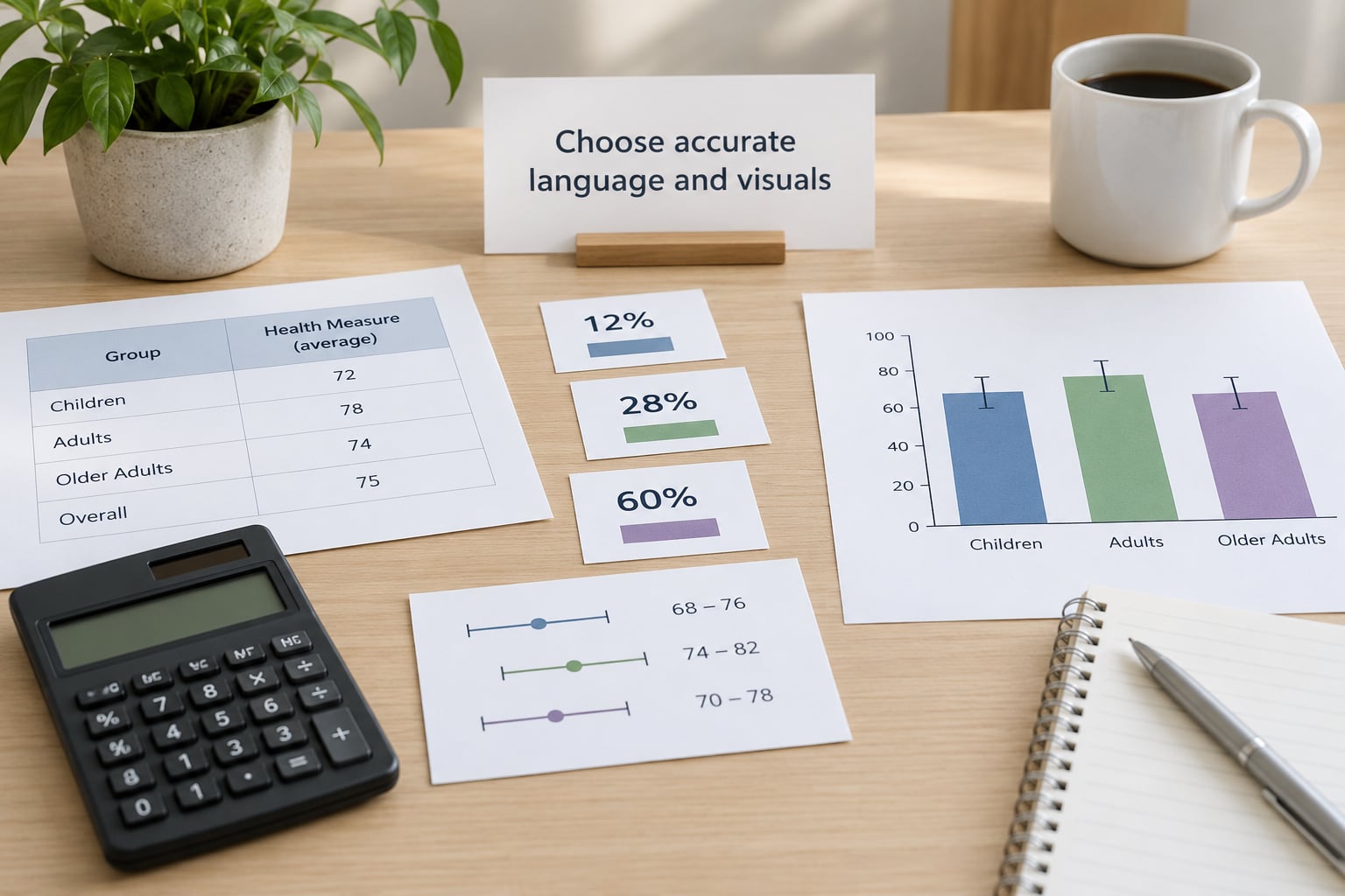
Match the verb to the evidence. Association is not causation; a correlation is not a mechanism; a projection is not a forecast. If the data supports “was associated with”, do not write “caused”, and if it supports “may reduce”, do not write “reduces”.
Visuals carry the same burden as prose. A truncated axis turns a 1% change into a cliff. Always start a bar chart’s value axis at zero unless you label the break clearly, and never use a map of raw counts where a per-capita rate belongs, because raw counts mostly show you where people live.
Label modelled estimates as modelled, mark projections as projections, and give every chart alt text that states the finding in words. Alt text is not a description of a blue rectangle; it is the sentence a screen reader user would otherwise miss entirely. Then look at the whole set: three charts, a table and a headline often tell subtly different stories, and reconciling them is your job.
Document review, approval and corrections
Keep an auditable record rather than a memory. Store the source file, the request that got it to you, the scripts that produced each figure, the calculation notes, the names and dates of reviewers, and the version history of the published piece.
That record is what lets you answer a question six months later about a number in a chart, and it is what lets a colleague take over when you leave. It also makes corrections precise: you can identify exactly which figure changed, by how much, and in which paragraphs.
Before publication, run one pass for independent calculation, one for editorial review, one for methodological review, one for privacy review where the material calls for it, and one for source links, update dates and error reporting. Add an “updated” line with the month and year using your CMS date field, and put a visible route for readers to report an error.
Health data changes as new releases land and as agencies revise their own figures. Say when your figures were current, and check for a revised release before you re-publish or update a story.
Common Mistakes
Causal inflation. “The vaccine caused the condition” written over a dataset that only shows co-occurrence in time. Fix: describe the relationship, quote the study design, and name what would establish causation.
Misleading percentages. A relative increase reported without the baseline. Fix: give the absolute numbers and both framings when the gap is large enough to matter.
Cherry-picked comparisons. Comparing this year to 2019, or one hospital to a national average, while the rest of the series tells a flatter story. Fix: publish the series, or state plainly why the comparison window was chosen.
Hidden uncertainty. Publishing a modelled projection to two decimal places with no interval. Fix: round to the precision the method supports and label the estimate as an estimate.
Over-specific labels. A chart titled “Mercer County” when the underlying cells were pooled across three counties. Fix: label the geography the data actually covers.
Disclosing through small groups. A table where one intersection has two people in it, in a town of four thousand, with a condition that is already public. Fix: apply a minimum cell size to every cell you publish, including totals and footnotes.
Correlation dressed as medical guidance. A finding about an association turning into a recommendation for individual readers. Fix: end the health-advice part of the story with a direction to a qualified clinician.
Consent treated as a one-time signature. A patient agreeing to be named, then finding their diagnosis described in detail they did not expect. Fix: confirm the specific details before publication and keep a route to withdraw.
Ignoring the datasets behind the charts. Publishing a story with a “download the data” link that contains more detail than the article does. Fix: audit the download itself, since that file travels further than the story.
Three habits catch most of the rest: have someone else recompute your two most important numbers from raw data, read the story aloud for any sentence that promises more certainty than the method allows, and assume that any chart can be screenshotted, cropped and read without its caption. If the finding still holds in that stripped-down form, you are close to done.
Frequently Asked Questions
Do journalists need legal approval before publishing health data?
Most outlets do not require it for routine aggregated statistics, but they should require it, or an equivalent standards review, for anything with small cells, rare conditions, patient images, exact locations or records obtained under a confidentiality agreement. A useful rule: if the material came with a restriction attached, treat that restriction as binding regardless of what the law technically permits. Freelancers and student outlets should at minimum get a second reader who understands privacy risk, and document who approved the story and when.
How small should a demographic group be before its data becomes identifying?
There is no universal cutoff, so adopt one and apply it without exceptions. Many public-health and quality-reporting programs use a minimum cell size between 10 and 20, and some use 25 or more, below which counts are suppressed or pooled into a wider geography. Treat combinations of attributes as the real risk unit: a group of eight in a small ZIP code, filtered by age band, month and a rare condition is identifying even though no single field reveals it.
Can a health-data story give readers personal medical advice?
No, not in the sense of diagnosing, dosing or recommending treatment to an individual reader. A responsible story describes what a dataset shows, explains what researchers think it might mean, and tells readers with personal questions to consult a clinician, pharmacist or public-health department. Name the warning signs that call for prompt care where the topic calls for them. This keeps the story useful without turning a population finding into an individual prescription.
What should I do if I discover an error after publishing?
Correct it quickly and visibly rather than quietly. Amend the figure in the article, note what changed and when in a dated correction line, and check whether the same error exists in the downloadable data, charts, related stories and social posts. If the error could identify a person or expose sensitive information, escalate to your standards editor or counsel immediately and consider whether a takedown is warranted. Then tell the sources who supplied the data, so the upstream record can be fixed too.
How should uncertainty be reported without confusing readers?
Attach uncertainty to the number it belongs to, not in a separate methods section. Give the figure with its interval or margin of error, and add one plain sentence on what that range means: roughly the range you would expect if the same process were repeated. Round to the precision the method supports, say explicitly when a figure is a model or a projection, and avoid false balance by giving one side a precise number and the other a vague phrase.
Conclusion: Start With the Evidence
Start with the evidence: narrow the claim to what the data can actually support, check who collected it and what it leaves out, and test every cell you plan to publish for the risk of pointing at one identifiable person. Then frame the result with a real denominator, a baseline and honest uncertainty, and keep your own interpretation visibly separate from what the data shows.
Use the story as evidence, not as a substitute for professional medical advice, and point readers with personal questions to a qualified clinician. The whole workflow takes less time than a round of fact-checking, and it is the difference between a number that informs people and one that harms them.