
To read a web analytics dashboard, fix the date range and the comparison period first, then read headline metrics, traffic sources, page-level engagement, and key events in that order before you look at anything else. It takes about fifteen minutes once you know what each number measures, and no training at all if someone explains the definitions.
The mistake almost everyone makes is starting with the big number. Traffic looks fine, traffic looks terrible, and then what? Dashboards answer questions, not vibes, so the skill worth building is a fixed routine you repeat every week with the same filters, the same date range and the same comparison period.
One more thing before we start. If you learned analytics before July 2023, some of your mental model is out of date: Universal Analytics stopped processing data, and the tools people still call “bounce rate” now mean something different in GA4. Later in this guide I flag where that changes your reading.
Table of Contents
- What You Need
- Step-by-Step: Read a Web Analytics Dashboard
- The core metrics explained, side by side
- Common Mistakes and How to Fix Them
- Frequently Asked Questions
- What is the easiest way to read a web analytics dashboard?
- What is the difference between users, sessions, and page views?
- Is a high bounce rate always bad for a news website?
- Which web analytics metrics should a journalist focus on?
- How often should a newsroom review its analytics dashboard?
- Can I compare analytics data from different platforms?
- What to Do First
What You Need
You need three things, and only one of them is software access.
Access with a known scope. Make sure you know which property or project you’re looking at, and that it covers the site you think it covers. Cross-domain setups and unfiltered internal traffic cause more confused reviews than any metric definition ever will.
A comparison period. A number alone tells you nothing. Decide before you open anything whether you are comparing the last 28 days to the 28 days before that, the same period last year, or a year-to-date view. News traffic is seasonal, so the year-ago comparison usually beats the week-ago one.
A clean filter state. Check what filters are active on the view before you trust anything. Practitioners who review dashboards weekly keep their filter setup identical week after week, because an active filter permanently removes matching data from the view and the change can take time to settle.
Worth adding to the same list: the report path for each metric you care about. Knowing that engaged sessions live under Reports > Engagement > Overview saves you from guessing at a menu every time.
Step-by-Step: Read a Web Analytics Dashboard
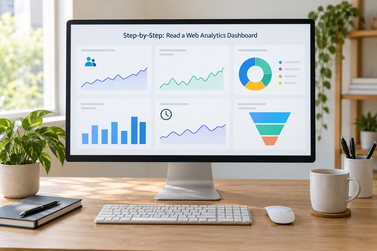
Start With the Dashboard Time Frame and Key Metrics
Read the time frame before the numbers. A dashboard defaults to the last 28 days or the last seven, and neither is the same thing, so confirm the range, confirm the comparison period and note any segment or filter chip sitting under the report title.
Then the headline row. Users, sessions, engaged sessions and engagement rate are the four cards that matter most for a content site. Page views sit lower on the list because page views count events, not people: one reader refreshing a page produces several.
How you know it worked: you can state the change in plain words, for example “sessions are down 12 percent against the same period last year”, before opening a second report.
Check Where the Traffic Came From
Open Reports > Acquisition > Traffic acquisition. This report splits sessions by channel and is where most of the useful decisions hide, because the channel mix tells you what kind of visit you are looking at.
Organic search traffic tends to arrive with intent and reads one or two pages. Direct traffic often includes untagged links and dark social, so treat it as an upper bound rather than a truth. Referral traffic can carry your best readers or can be a scraper hitting a tools page at 3 a.m.
What changes in the mix actually mean: if total sessions are flat but referral is up and organic is down, you did not grow. You swapped one audience for another, and the new one may behave completely differently on your engagement metrics.
Understand Which Pages and Content Earn Attention
Move to Reports > Engagement > Pages and screens, and sort by session duration or by average engagement time rather than by page views. The top of that list is your honest audience report.
Compare the entrance metric with the page’s own numbers. High entrances paired with short engagement usually means the page is a promise your site does not keep, and the fix is usually the headline or the first paragraph rather than the topic.
Exit rate needs context. A high exit rate on a confirmation page is good news. A low exit rate on a landing page often means readers are cycling and leaving without a decision.
Read Engagement Without Misleading Yourself
In GA4, an engaged session is one where engagement lasted 10 seconds or more, or the visitor saw two or more pages, or triggered a key event. Engagement rate is the share of sessions that qualified.
Average engagement time measures active time on the site across a session, not the clock on a single page. Comparing it with the old Universal Analytics “average session duration” is comparing two different instruments, and old tutorials that treat them as the same thing will send you down the wrong path.
Scroll depth and completion rate exist in some tools but not all, so read them where they exist and never mix them into the same chart as time metrics. Knowing how to read a web analytics dashboard means knowing which of those measures your tool records before you go hunting for it.
Identify Conversions and Meaningful Actions
Most dashboards define a conversion as a key event you chose to mark, such as a newsletter sign-up, a search, a download or a share. Look at Reports > Conversions > Key events and check the event names first, because unconfigured events quietly turn every page view into a conversion.
Sort the key events report by event count and read the top five. For a newsroom, sign-ups, searches and scroll-to-the-end events usually tell you more than any dashboard widget.
The check that matters: conversion rate multiplied by sessions should give you a number close to the raw event count. If it doesn’t, a duplicate or misfiring event is in there.
Compare Trends and Turn Findings Into Decisions
Set the date range comparison, then segment. Cutting by channel, device or landing page usually turns a vague drop into a specific cause, and it takes about a minute.
Before you act on a spike or a fall, run three sanity checks: is it seasonal, is it a bot pattern, and is the sample big enough to matter? A 200 percent jump on 40 sessions is not a trend. A jump that arrives from one referrer, at one hour, with zero engagement, is usually automated.
Write the decision down before you leave the dashboard, with a name and a date against it. “Investigate the landing page drop with the design lead, Thursday” beats “traffic looks down”.
Common Mistakes While You Read
Six errors account for most bad reads, and they are covered in detail below: comparing mismatched date ranges, treating page views as people, ignoring bot and internal traffic, reacting to small samples, keeping filters on by accident, and assuming the ad platform and analytics should agree.
That last one deserves a warning. Clicks in an ad platform and sessions in analytics are counted differently, and consent-based measurement can remove a share of users before analytics ever sees them, so a persistent gap between the two is not evidence that one is broken.
The core metrics explained, side by side
Here is the table I keep open in a second window. It is deliberately short, because a dashboard showing twenty metrics is a dashboard nobody reads.
| Metric | What it measures | Where to find it in GA4 | Healthy signal | Common trap |
|---|---|---|---|---|
| Users | Distinct people or devices in the period | Reports > Engagement > Overview | Rising with flat sessions per user | Read as unique visitors across all time |
| Sessions | Visits, cut when inactivity passes 30 minutes | Reports > Engagement > Overview | Stable or paired with engaged sessions | Confusing visits with people |
| Engaged sessions | Sessions with 10s+ time, 2+ pages, or a key event | Reports > Engagement > Overview | Rises alongside sessions | Assuming every session should engage |
| Engagement rate | Share of sessions that engaged | Reports > Engagement > Overview | Holding steady over months | Applying a universal benchmark |
| Average engagement time | Active time on site per session | Reports > Engagement > Overview | Flat or improving per article type | Comparing it to old session duration |
| Exit rate | Share of exits from a page | Reports > Engagement > Pages and screens | Read per page role | Judging a page by exit rate alone |
| Key events | Actions marked as conversions | Reports > Conversions > Key events | Few, named, rising | Counting every page view |
Three numbers are enough for a weekly check on most sites: sessions, engagement rate and key events. Everything else is a drill-down you trigger because one of those three moved.
Common Mistakes and How to Fix Them
| Mistake | The fix | Tip |
|---|---|---|
| Comparing incompatible date ranges | Pin the range and the comparison period before reading any card | Use the same 28-day window every week |
| Treating page views as unique people | Read users and sessions for volume, views for content depth | Ask how many views one reader would generate |
| Ignoring bot and internal traffic | Exclude known internal addresses and check referral sources for patterns | Look for flat engagement rates from one source |
| Reacting to small samples | Check the session count behind any percentage change | Ignore swings under a few hundred sessions |
| Leaving filters applied | Clear the filter chips at the start of every review | Photograph the filter state in your weekly note |
| Expecting ad platform and analytics numbers to match | Compare like with like: clicks to sessions over the same window | Allow for consent-based measurement losing a share |
| Confusing correlation with cause | Change one thing, then watch two full periods | Note what else changed that week |
Frequently Asked Questions
What is the easiest way to read a web analytics dashboard?
Start with the date range, then the four headline cards, then traffic sources, then one page-level report. Keep the range and comparison period identical every week so changes mean something. Fifteen focused minutes beats an hour of scrolling reports, because a dashboard answers questions in a fixed order.
What is the difference between users, sessions, and page views?
Users are distinct people or devices. A session is a visit, ending after 30 minutes of inactivity. Page views count every time a page loads, so one reader can generate ten. Use users and sessions for volume, and page views to see how much of a site a visitor actually worked through.
Is a high bounce rate always bad for a news website?
No. Under GA4, bounce rate means a session with under 10 seconds of engagement, one page and no key event. Plenty of news traffic lands on a single story and leaves, which is normal reading behaviour. Judge it next to engagement rate and per-page performance rather than treating the rate as a verdict on your content.
Which web analytics metrics should a journalist focus on?
Sessions from organic search, engagement rate on individual articles, returning versus new readers, newsletter sign-ups and search events. Those five tell you whether the journalism is reaching strangers, holding them, and bringing them back. Add scroll or completion data where your tool records it, since it is the clearest signal of whether an article was finished.
How often should a newsroom review its analytics dashboard?
Weekly, on a fixed day, for about fifteen minutes, plus a longer monthly review. Weekly catches drops while you can still act on them. The monthly session is where you compare against the same period last year, look at returning readers, and decide what to commission. Daily checking mostly produces anxiety rather than information.
Can I compare analytics data from different platforms?
Only loosely, and never as exact numbers. Different tools count sessions, filter out known bots and handle consent differently, so the same day can differ by a wide margin. Use one tool for trends over time and treat a second platform as a directional cross-check. If the two disagree consistently, check measurement settings before you trust either.
What to Do First
Open your dashboard this week and write down three things: the date range, the comparison period, and the session count. Then check whether returning readers are up or down over the same window last year. That single comparison usually tells you more than any other number on the screen, and it takes five minutes.
After that, pick the one report that answers the question you actually have, and ignore the rest until next week. The habit that sticks is booking fifteen minutes to read a web analytics dashboard the same way every week. A dashboard is a tool for settling one argument at a time, and the readers who get the most from it are the ones who stop trying to see everything at once.