
Google Trends is a free tool that turns a sample of anonymised Google searches into a relative score from 0 to 100, and that is the honest limit of it for journalism: it shows when and where people searched for something, not how many people did. This guide walks through how to use Google Trends for reporting in six repeatable steps, from framing the question to saving the evidence, so a trend-based claim survives an editor asking “how do you know that?”
The tool is genuinely useful for reporters. It shows you whether a story is part of a growing national conversation or a spike in one city, whether interest in a policy arrived before or after the coverage, and whether the topic you are chasing has a seasonal rhythm your desk keeps rediscovering every year. It is free, it needs no account for ordinary use, and it covers search data going back to 2004.
What it cannot do is count people, prove what they believed, or reproduce the same curve twice. Once you internalise those three limits, everything else is technique.
Table of Contents
- What You Need Before You Use Google Trends for Reporting
- Step-by-Step: Running a Query That Holds Up Under Scrutiny
- Common Mistakes That Undermine a Trends-Based Story
- Frequently Asked Questions
- Does Google Trends give me exact search volume?
- How far back does Google Trends data go?
- Are screenshots enough to document a Google Trends finding?
- How do I use Google Trends for breaking news?
- Why is Google Trends not showing trending searches or data for my term?
- How trustworthy is Google Trends for measuring public opinion?
- Conclusion
What You Need Before You Use Google Trends for Reporting
You need four things before the first query: the tool itself, a comparison set, decided filters, and a verification habit. Skipping the last two is how trend charts end up in stories as decoration rather than evidence.
- A browser and trends.google.com. You do not need a Google account to search terms, change filters, or download a CSV. An account is needed for some saved or shared features.
- A comparison set of terms. A single query gives you a curve but no baseline. Decide up front what you are comparing against, usually the bare entity name, the name plus a qualifier, and a control term that shows the general news cycle.
- Chosen geography and dates. Know whether you are asking about the world, a country, a state, or a city, and pick a window that contains the event you care about. Filters change the numbers.
- A verification source list. Official announcements, agency press feeds, the event calendar, and a timestamped archive of major coverage. Trends tells you interest changed; only these tell you why.
- An evidence folder. One place for the CSV export, screenshots of every filter, and a short note per finding. You cannot reconstruct a query later if you only remember the shape of the curve.
The search type filter matters more in a newsroom than in marketing, and reporters routinely forget it exists. Under the main search box you can restrict results to Web, News, Image, YouTube, or Shopping, and News is the one to switch on first.
- Web Search gives you overall public behaviour, including everything a person types, however clumsy.
- News Search isolates searches that happened around news coverage, so it rises as a story circulates rather than when the underlying problem first surfaced.
- Image Search can reveal whether a story turned visual, which sometimes signals a phase of public attention rather than a volume change.
- YouTube Search catches audiences who never read a headline, often younger or in markets where your outlet has little reach.
- Shopping Search tells you whether an event moved purchase intent, useful for consumer stories and price reporting.
Running the same term on Web and News and getting two different shapes is a normal result, not a bug. It usually means the topic led on social or word of mouth and was later picked up by outlets. That gap is a story angle in itself.
Step-by-Step: Running a Query That Holds Up Under Scrutiny
Step 1: Define the reporting question
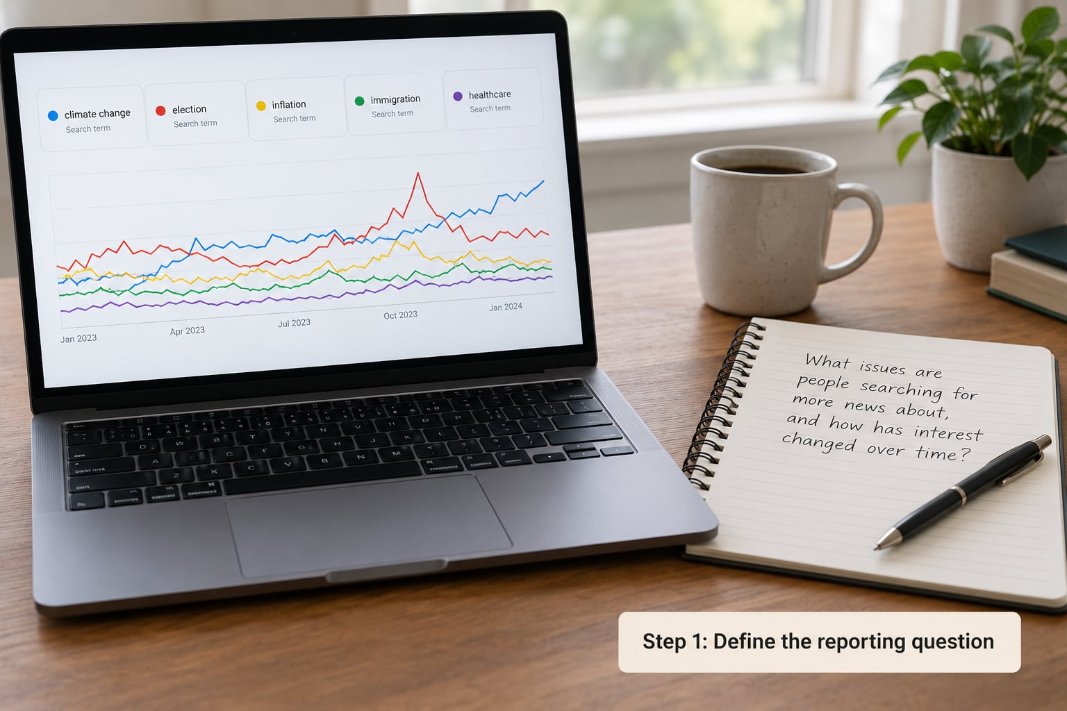
Write the reporting question before you open the tool, in five parts: the entity, the location, the time period, the comparison term, and the claim the research is meant to support. “Is there anything in this water crisis story?” is not a question. “Did searches for the plant’s name rise in the two counties around the facility after the shutdown announcement, relative to similar plants elsewhere?” is.
That framing matters for accuracy, not just tidiness. Google Trends fills in the gaps you leave: a vague entity name pulls in unrelated results, and an over-narrow phrase returns “not enough data”. If a name is ambiguous, say so in your notes before you see the curve, because after you see a number you will be tempted to defend it.
Keep the question in writing. Reporters who lose the original framing end up writing around whatever the chart happened to show.
Step 2: Check the headline trend
Open Interest over time and read the curve before anything else. You are looking for shape, not height: a single narrow spike, a sustained climb, a seasonal wave, or a decline that started before you started paying attention.
A narrow spike usually points at an event. A step change that holds for weeks usually points at something that changed in the world, such as a new policy, a court ruling, or a facility closing. A wave that repeats on the same dates each year is seasonality, and reporting it as news each time is how desks embarrass themselves.
Record the dates and the relative values in your notes as you look. Also record what the score means: 100 is the highest point in the window you selected, not a count of searches, and every other number is a ratio to that peak. If two terms were in the same comparison, their curves share one scale, so the relative gap between them is meaningful. If they were run separately, the numbers mean nothing to each other.
A 0 is not zero interest either. It usually means the volume was too low to show in the sample.
Step 3: Compare related searches and terms
This is where reporting value appears. The Related queries tab lists what people typed alongside your term, and the Rising tab lists what grew fastest, with a percentage rather than a 0-100 score. Rising values are growth rates from a tiny base, so a query can show Breakout and 4,000 percent because it moved from eleven searches to a few hundred.
Read them for the questions the public is actually asking. A cluster of rising questions about symptoms, eligibility, refunds, or where to vote is a checklist of the next piece you should write, and often a list of the misconceptions you need to correct in your own copy.
Switch to News Search here too, and add comparison terms up to the five the tool allows. Useful comparisons for reporting include the bare name against the name plus a year, a policy name against the plain-language phrase readers use, and one control term from a separate story running the same week.
Search operators narrow a comparison when a term is ambiguous. They work in the Trends search box, and the effect is different from a normal Google search because the term still has to be broad enough to clear the sampling threshold.
- Quotes, for example “district attorney”, force the exact phrase and cut out the people who searched the two words separately in a different order.
- Minus, for example mercury -planet, removes results for the unwanted sense of the word.
- Plus, for example hurricane +landfall, forces that word into the search rather than leaving it optional.
- Topic versus search term, chosen in the search box type toggle, decides whether Google matches the exact words or the broader concept. Topics usually carry more volume, which matters when you are checking whether a story has cultural reach beyond its literal wording.
Topics are also where over-reading is easiest. A topic covers a cluster of concepts, so a rise can be driven by a neighbouring subject you never mentioned.
Step 4: Filter by geography and time
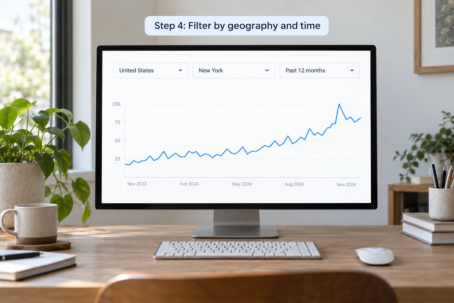
Open Interest by region next, and then drop the geography filter from world down to country, then state, then city. What you are testing is whether the story is national or local, because that decides whether you send it out nationally or chase it as a dateline story with a specific authority.
The city-level view is the most useful filter in the tool and the least used. A curve that looks like a gentle national wobble often turns into a sharp spike in three specific cities, which usually means a local event, a localised news hook, or a concentrated campaign.
On dates, pick the window that contains your event and stick to it. Widening the window rescales everything: because the scores are relative to the peak inside the window, a wider window lowers the score of your event. That is why the same query returns a different curve tomorrow, and why a chart you cannot reproduce is a chart you should not publish.
Take a screenshot with every filter visible in the frame. Readers and editors should be able to see the geography and the date range without asking you.
Step 5: Verify why interest changed
Every spike you plan to write about needs a cause, and the cause comes from outside Trends. Work down a checklist: an official announcement from an agency or company, a court filing, a scheduled event such as a vote, hearing, or game, a product release, a weather event, or simply the publication of major coverage elsewhere.
Timing is the diagnostic. If the announcement timestamp falls two hours before the peak, the story is a response to news. If the peak precedes the coverage by a day, something else moved first and it may be the more interesting thread. If interest rises in a country that has no connection to the event, you are probably looking at a name collision, which is why ambiguous entities get flagged in Step 1.
Then check the entity itself. Trends matched what people typed, not who they meant, and an ordinary surname or a product name shared with a celebrity will drag in unrelated searches.
If two searches in your list share a spike, you may have a feedback loop: an outlet covered the story, coverage drove searches, searches were reported as public concern, and other outlets covered the concern. Google publishes guidance on this loop, and it is worth reading before you write “what the public wants” anywhere near a chart.
Step 6: Document and report the evidence
Download the CSV from the Download button on any chart, keep the screenshots with filters visible, and write a methodology note in plain language: the exact term or topic, the comparison terms, the geography, the date range, the search type, and the date you pulled it.
Then write the finding the same way in your story. Say interest in searches for the facility name rose sharply in the week after the shutdown announcement, and describe it as a search-interest signal, not as evidence of what residents think. That single change in wording is what keeps you on the right side of the line between reporting and asserting something the data cannot carry.
For recurring coverage, build the routine. A weekly export of a fixed set of beat terms into a sheet, with filters locked, gives you a dated series you can compare week to week. Change a filter and the whole series breaks, so lock them and note any change you make. That habit is what separates how to use Google Trends for reporting as a habit from a one-off chart nobody can reproduce.
Common Mistakes That Undermine a Trends-Based Story
Almost every bad use of Google Trends in journalism comes from one of these. Each has a quick fix.
Reading relative scores as counts. A score of 60 is not 60 searches and not 60 percent of anything. Say “search interest” or “relative interest” every time, and never put a number where a reader will assume a headcount.
Publishing the meaning of 100 without saying what the peak was. 100 simply means the highest point in the window you chose. Always state the window.
Comparing scores across separate queries. Two runs normalised separately cannot be compared at all. If you need a comparison, run them in the same comparison, or say in your note that they were run separately.
Overloading one query with too many terms. Five terms already dilutes attention, and adding synonyms of the same concept makes the lines indistinguishable. Split the question into two runs instead.
Ignoring zero and low-volume results. A flat line at zero usually means insufficient sample, not absence of interest. For a narrow term, move up to a topic, drop the date range, or switch search type.
Attributing a spike without checking what happened. The curve shows when, never why. Open a second tab with the news and official record before you write a sentence.
Treating a spike as proof of public opinion. Searches can be news-driven, school-driven, exam-driven, or automated. Practitioners on data-focused forums keep pointing this out because the same mistake keeps appearing in published charts, and analysts there regularly cross-check Trends against ground truth they already hold.
Forgetting that trends can be pushed. Coordinated campaigns and bots can manufacture a query spike, which is a known reporting risk in any dataset built from platform activity. A spike that a rival campaign stands to benefit from deserves a second source before it appears in a headline.
Describing an ambiguous term as a single entity. Check the Related queries first. If half the rising terms belong to a different meaning, the curve is measuring two things at once.
One more practical note: if Trending Now looks empty, that list updates frequently and by region, so it can genuinely be blank or limited in your country at that moment. It is a live discovery feed, not an archive, and it is useless for historical questions. Build your own comparison instead.
Frequently Asked Questions
Does Google Trends give me exact search volume?
No. Google Trends scales results from 0 to 100 inside the time range, geography, and category you selected, based on a sample of anonymised searches. A score of 100 is the highest point in that window, not a search count, and 0 usually means the sample was too small rather than zero interest. If you need a volume number, use keyword tools built for that and treat Trends as a directional signal.
How far back does Google Trends data go?
Google Trends covers search data from 2004 onward for most terms, with the granularity depending on the volume of the query. High-volume terms can be examined hour by hour or day by day across the full period, while lower-volume terms may only support daily, weekly or monthly views. That is also why narrow, local or recent terms sometimes come back with too little data to draw a line at all.
Are screenshots enough to document a Google Trends finding?
A screenshot works if every filter is visible in the frame: the search terms, the geography, the date range, and the search type. Download the CSV as well, because it preserves the underlying values and lets anyone rebuild the chart. For a published story, add a short methodology note naming the query, the comparison terms, the filters and the date you pulled the data.
How do I use Google Trends for breaking news?
Switch the search type filter to News and use a short date window, ideally the last seven days, so the scale is not flattened by older history. Check related and rising queries to see what the public is searching for in the same hour as the story breaks. Treat the result as a snapshot of attention rather than a measure of opinion, and re-pull it later, since the curve moves quickly during a fast story.
Why is Google Trends not showing trending searches or data for my term?
Two different problems have two causes. Trending Now is a live, frequently refreshed feed that can be empty or limited in your region at a given moment, so it is not usable for historical questions. For a term with no data, the volume was probably below the sampling threshold, which is common for obscure names, local topics and very recent events. Widening the date range, switching to a broader topic or changing the search type usually fixes it.
How trustworthy is Google Trends for measuring public opinion?
It is trustworthy as a measure of search interest and untrustworthy as a measure of opinion. The data is sampled and anonymised, scores are relative to whatever window you picked, results are not perfectly reproducible, and coordinated activity can distort a curve. Cross-check important findings with reporting, other datasets, and on-the-ground sources, then describe what you found as an indicator of interest rather than proof of what people believe.
Conclusion
Pick one reporting question, write it in five parts, and run one controlled comparison with the filters written down before you look at the curve. Check the city-level view, check News Search, and go and find out what happened that day.
Then save the CSV, the screenshot and the note while the answer is still interesting. Search interest is a signal about attention, and the reporters who get quoted are the ones who say exactly what it does and does not show. As of October 2026, that is still the whole trick: the tool is free, and the discipline around it is the job.