A comic-style explainer is a short piece of sequential art that walks a non-expert through one idea, from a problem to a conclusion, using the devices readers already know from comics: speech balloons, caption boxes, visual metaphor and a clear left-to-right reading order. To make one, you write the explanation as a narration script first, cut it into one idea per beat, turn each beat into a panel, keep every panel in the same visual style, then time the panels to the voiceover.
That is the whole method, and it takes a small team about a week to two weeks for a 90-second piece. The part that trips people up is not drawing. It is deciding what a panel is for.
Most of the production problems in this format come from one habit: writing the script before setting any visual constraint. If the script has no idea of how many panels it can afford, the artwork ends up carrying text the audience was never meant to read. Below is how to make a comic style explainer, from the brief on a Monday to a vertical cut for social by Friday.
Table of Contents
- What You Need
- Step-by-Step: How to Make a Comic Style Explainer
- Common Mistakes
- Frequently Asked Questions
- How many panels do I need for a 60-second comic explainer?
- Does a comic style explainer have to be funny?
- How do I keep characters and art style consistent across panels?
- Can AI generate comic panels for a newsroom explainer?
- How do I make a comic explainer accessible?
- What tools can a beginner use without drawing experience?
- Conclusion
What You Need
You need fewer things than a comic book does, but you need them in a specific order. Miss the storyboard and you are drawing your way out of a structural problem.
The artefacts
- A one-page brief. The audience, the single question they leave with, and the constraint the piece must respect. One page. If it runs longer, the piece is trying to do two jobs.
- Source notes. The reporting, the data and the quotes you are allowed to put on the page, kept in one file so step 5 can check every visual claim against it.
- A narration script with a word budget. Roughly 150 words per finished minute, so about 225 words for a 90-second explainer.
- A panel breakdown. One row per panel, with the beat it carries and the shot size. This is the artefact that stops scope creep.
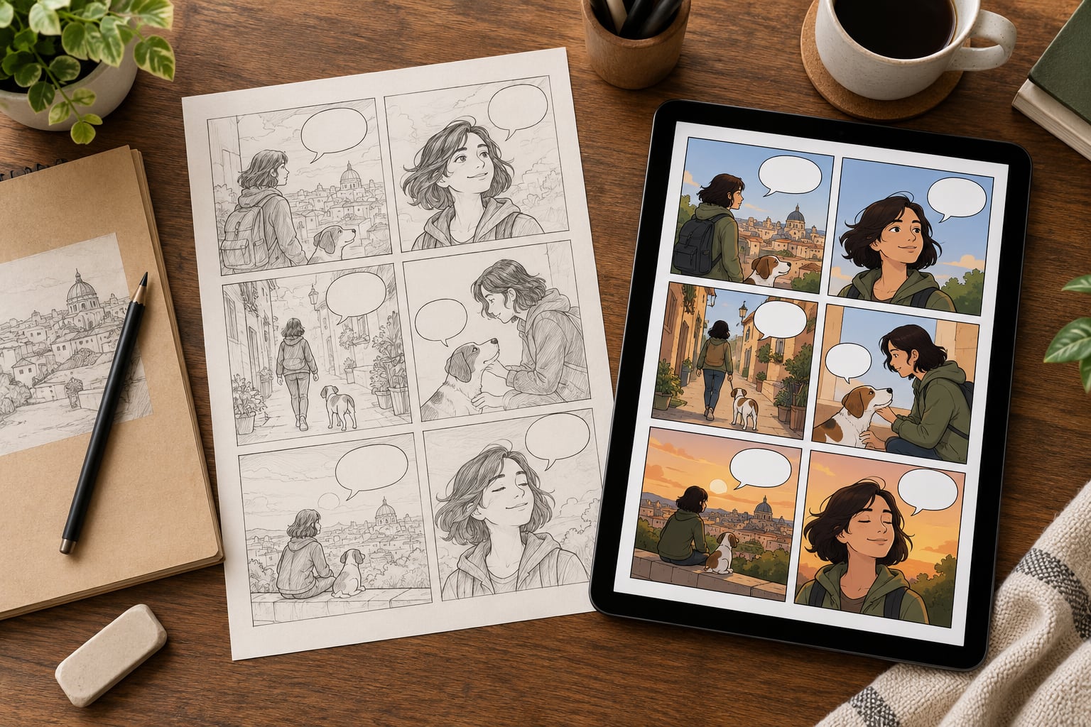
- A storyboard. Blank panels in a grid with rough sketches and placeholder captions, which is where you find out whether the story works.
- A style system. A character sheet, a limited palette of three or four colours, one line weight and a type pairing. Written down, not held in someone’s head.
- A final accessibility and readability check. Contrast, type size, reading order, text alternatives.
The tools, routed by what you can already do
The forum question that comes up most often in r/ComicWriting and r/writing is whether you need to be able to draw. You do not, but you do need to be able to make choices about frames, and there are three routes to that.
- No drawing, layout only. Canva, Figma or Google Slides for panel grids and typography, with stock or generated art placed inside. Fastest route, and it works for news explainers where the diagram carries the meaning. One panel every 3 to 4 seconds keeps the cut readable.
- Hybrid, the route I use most. Clip Studio Paint, Procreate or Krita for the panels, with a simplified character design that repeats: same face, same clothing, same silhouette. Procreate and Krita are free and both handle ink layers and flat colour without a subscription.
- Generated and animated. An AI image generator for panel drafts, Photoshop or Illustrator to clean up line weight and lettering, then After Effects, DaVinci Resolve or CapCut to move the panels and record a voiceover. After Effects has graphic-novel presets that do most of the look work for you.
Audio does not need to be solved at the start, but it needs to be planned. A text-to-speech read is fine for locking timing in the storyboard stage, and it stops you from discovering at the end that your script is two minutes long.
Step-by-Step: How to Make a Comic Style Explainer

Six steps. Brief and takeaway, visual narrative, words, panels, evidence, then review and publish. The order matters because each step constrains the next one, and moving two steps ahead is how explainers end up with 40 panels and a two-minute runtime.
Step 1: Define the Question and Takeaway
Turn a broad newsroom topic into one audience question and one memorable conclusion. If you cannot write the takeaway in a single sentence that a reader could repeat to a colleague, the piece is not ready to leave your desk.
Work out what the audience already knows. Most explainers fail because they assume too little, then bury the answer under twelve panels of context the audience did not need. Write down what they can be assumed to know, and what they must be shown.
Then write the intended action or understanding. Not a click. Understanding, agreement, or a changed mind, depending on the story. An explainer that does not change anything in the reader’s head is a summary, and a summary belongs in the article body.
How to tell it worked: your takeaway sentence survives being read aloud without a follow-up clause.
Step 2: Build a Clear Visual Narrative
Sequence the story as hook, context, explanation, consequence, conclusion. Then decide how many panels that needs. The arithmetic is simple: a comfortable pace is 3 to 4 seconds per panel, so a 60-second explainer lands at 15 to 20 panels and a 90-second piece at 20 to 25. If your script needs 30, either cut it or accept that the piece is two minutes long.
One panel carries one idea. If you need two sentences to describe what is in a panel, you need two panels.
The graphic novelists I have read treat this as craft rather than layout. Here are the parts worth learning before you draw anything:
- Reading order. Left to right, top to bottom, like text. Readers scan for the next panel before they finish the current one, so put the important panel largest and highest.
- Gutters. The white space between panels. Gaps are time and emphasis: a wide gap means a beat has passed, a narrow one means urgency.
- The 180-degree rule. Once you establish where your character or subject stands, keep the same side of the scene across panels. Cross the line and the reader’s brain reads a flip in position, not a camera move.
- Eye line. Characters looking left read as looking at the previous panel; looking right read as looking at what comes next. Get this backwards and the sequence reverses in the reader’s head.
- Shot sizes. Wide for context, medium for action, close-up for the detail that carries the point. Cut from a wide two-panel establishing shot to a close-up of the one number the reader needs.
- Panel transitions. Matching shots flow, action lines jump, a cutaway to a detail panel pauses the story. Pick the transition deliberately; accidental cuts read as mistakes.
How to tell it worked: you can tell the story out loud using only the panel thumbnails, with no script in your hand.
Step 3: Write Dialogue, Captions and Labels
Comics carry an argument in two channels at once, and the trick is knowing which channel each sentence belongs in. Four devices do most of the work.
- Narration in caption boxes, for the argument. Use the top or bottom of a panel, in the reader’s own voice, and keep the tense and person consistent throughout.
- Speech balloons for what a person says out loud. One speaker per balloon, no balloon tail pointing at a listener.
- Labels and arrows for pointing at the thing you are naming, so the sentence never has to say it.
- SFX lettering for sound made visible. Use it for impact, not decoration, and never as filler on every panel.
Keep balloons to about 30 characters and caption boxes to about 60. Anything longer gets shrunk to fit, and shrunk text is the single most common reason a comic explainer fails on a phone.
Weak: “This data visualization shows that the number of reported cases increased significantly over the past several months.” Improved: caption reads “Reported cases, three months”, and an arrow labels the line “up 40%”. The picture says the rest, so the words shrink and the meaning grows.
How to tell it worked: no panel needs a sentence longer than two lines at phone size, and the reader never has to look back at the previous panel to understand this one.
Step 4: Draw or Design the Panels
Style consistency is what makes a set of panels read as one piece rather than a folder of unrelated images. Fix these five things before you draw the first finished panel, and hold them across every panel.
- Line weight. One ink weight for outlines, one for detail. A second brush size reading as a different weight is what makes generated art look generated.
- Palette. Three or four colours plus black. Colour carries meaning: if red only ever marks the problem, red is doing work.
- Character sheet. Front, three-quarter and side views, plus three expressions you actually use and a note on height relative to other recurring figures. This is the fix for inconsistent characters across panels.
- Layer stack. Keep ink, flat colour, shadows and lettering on separate layers. It costs an hour at the start and saves a day when a palette change lands after review.
- Hierarchy. One focal point per panel: strongest contrast, largest shape, sharpest line. If everything is loud, nothing is.
Work in thumbnails first. Six to twelve rough sketches at postage-stamp size find composition problems in ten minutes that finished panels find in three hours. Compose the problem and consequence panels first, because those are where a confusing story shows up.
Illustrations and evidence have different jobs. Art carries the argument and the emotion; evidence carries the number. Do not ask a cartoon to be a chart.
How to tell it worked: put any two panels side by side and they look like they came from the same afternoon.
Step 5: Add Data, Maps and Evidence
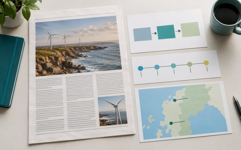
Every chart, map, timeline or annotated document inside a comic explainer has to be there because the drawing could not say it. Decorative scenery is the thing to cut first, because it costs the most and explains the least.
Simplify before you insert. One line on a chart beats four. Label units on the axis or in the caption, never both. Start a bar chart at zero unless there is a reason a reader would be misled otherwise, and say so in the note if there is. Keep the visual claim inside the evidence: if a panel shows a steep rise, the underlying series has to actually rise.
Sources go in a citation strip at the foot of the panel or page, in a type size you would not be embarrassed by, linked where the publication allows it. A reader who wants to check your work should be able to do it in under ten seconds.
For a data-heavy piece, this is usually the step that needs the second pair of eyes. Ask a reporter to confirm each number on the page against the file, not against your memory.
How to tell it worked: every number a reader could pull off the page traces back to a line in your source notes.
Step 6: Review, Test and Publish
Most comic explainers ship as stills, and a moving panel is a small craft with its own rules. The basics: move the camera inside the panel rather than cutting away from it, keep the movement slow enough to read, and cut on the beat of the narration.
- Pan and zoom. A slow push into the part of the panel the narration is describing. The cheapest effective move, and enough for most pieces.
- Layer separation. Background, character, foreground on separate layers, moved at slightly different speeds for parallax. Reads as depth from stills.
- Parallax in 2.5D. Push in and offset the layers together. Reads as a moving scene without drawing new frames.
- Page turns versus cuts. Turn between pages to signal a change of place, cut within a page to advance time. Using both the same way flattens the rhythm.
- Timing. Hold a panel until the sentence over it finishes, then move. Panels that leave before the narration does are the usual reason a comic explainer feels rushed.
Full frame-by-frame animation is a different production with a different cost. Motion comic craft is the right choice when the explainer is about a process, a document or a decision, where movement through space carries the meaning.
Sound does the same job. A voiceover read at roughly 150 words per minute, with light music underneath and one sound effect at the moment the point lands, is enough. Record the scratch voiceover first and keep it to the final cut; a new narration means new timing on every panel.
Then run the review. Editorial reads for accuracy and tone. A fact-checker checks every figure and attribution against the source file. Design checks the style system held. Someone opens the piece on a phone in airplane mode and reads it with the sound off, because that is how a good share of your audience will meet it.
For accessibility, every panel needs a text alternative that says what it shows and what it argues, not what it looks like. Any text baked into the art needs to survive at phone size: at least 16px equivalent, high contrast against its background, and never the only place a fact appears. If the story can be told in the captions, keep the story in the captions.
Publish to the format that fits. A web article wants 16:9 or a vertical stack of panels that reads without sound, plus the text alternative. Social wants 9:16, one idea per screen and burned-in captions. A newsletter wants the panel set plus a paragraph that stands alone for the readers who scroll past. Start from the panel set, not from a new project.
How to tell it worked: a colleague who has not seen the story reads it on a phone, with no sound, and can state your takeaway afterwards.
Common Mistakes
Most of these come from the same place, which is finishing the script before setting any visual limit.
- Decoration standing in for structure. A busy background with no argument behind it. Fix: ask of every panel what job it does. If the answer is “it looks good”, it goes.
- Too many characters. Four recurring figures is plenty for an explainer. Every extra one costs you a drawing slot and a consistency risk. Fix: two characters plus one device, such as a guide who is visibly not human.
- Inconsistent visual language. Line weight drifting, palette shifting between panels, a character’s clothing changing. Fix: the style system from step 4, printed and open on the second monitor.
- Text too small to read. The most common reason a comic explainer gets scrolled past. Fix: design at phone size from the start, not at desktop size and shrunk.
- Unclear panel order. Reading order or eye lines running backwards. Fix: number your panels during the storyboard pass and follow the numbers in the layout.
- Humor that is not supported by the reporting. A joke about a person, a community or a crisis. Fix: keep the wit in the narration voice, aimed at the process rather than the subject.
- Missing sources. A number on a panel with nothing behind it. Fix: the citation strip, added at step 5 before review, not after a reader asks.
- Colour-only meaning. Red for danger, green for good, and nothing for a reader who cannot see the difference. Fix: colour plus a label or a shape change.
- Panels that drift from the narration. By panel 12 the storyboard no longer matches what the voiceover says. Fix: lock the script before art, and cut a panel rather than re-voice a line.
The production tip that saves the most time: set your panel count at the storyboard stage and treat it as a ceiling. New ideas go into a list for the next piece, not into the layout.
Frequently Asked Questions
How many panels do I need for a 60-second comic explainer?
At a comfortable reading pace of 3 to 4 seconds per panel, a 60-second explainer needs 15 to 20 panels. That also matches the script budget of about 150 words per finished minute, so the two constraints agree. If your script needs 30 panels, cut the script or accept a two-minute runtime rather than speeding up the cut.
Does a comic style explainer have to be funny?
No. The genre takes its structure from comics, not its tone. Plenty of published comic explainers, including policy and science pieces, run dry and still hold attention because the panels carry a visible problem and change. Keep any humour aimed at the process rather than the subject, and make sure the joke does not cost you a fact.
How do I keep characters and art style consistent across panels?
Write a character sheet with front, three-quarter and side views plus the three expressions you actually use, then fix one line weight and a palette of three or four colours before drawing finished panels. Work from the sheet for every panel rather than from memory, and keep ink, flat colour, shadow and lettering on separate layers so a late palette change does not undo the whole page.
Can AI generate comic panels for a newsroom explainer?
Yes, usefully, for panel drafts, backgrounds and layout exploration. It is a poor fit for final published panels, because characters drift between images and lettering comes back unreliable. The workable pattern is generate, then rebuild the panels in an illustration app where you control the line weight, palette and text, and always run a source and fact-check pass before publication.
How do I make a comic explainer accessible?
Give every panel a text alternative that states what it shows and what it argues, not what it looks like. Keep any text baked into the art large enough to read at phone size, at least 16px equivalent, with strong contrast against its background. Never let colour be the only carrier of meaning, and put a plain-text version of the argument in the caption so the piece survives with images off.
What tools can a beginner use without drawing experience?
Start with a layout tool you already know, such as Figma or Canva, for the panel grid, arrows and labels, and place simple shapes or stock illustration inside. When you want more control, Krita or Clip Studio Paint handle ink and flat colour for free. For motion, CapCut or DaVinci Resolve will pan and time still panels without a full animation workflow.
Conclusion
Learning how to make a comic style explainer comes down to three habits: write the takeaway before anything else, set a panel ceiling in the storyboard, and keep the style system in writing so every panel matches the last one. The script, the panel breakdown and the storyboard are the cheap part of the work, and they are where the piece succeeds or fails.
So start small. Write your one-sentence takeaway, sketch the panel sequence at thumbnail size, and hand the storyboard to a colleague before a single finished panel exists. If they can follow it, the artwork is a solvable problem. If they cannot, no amount of drawing will rescue it.
That is how to make a comic style explainer that survives a newsroom deadline, a phone screen and a reader with the sound off.