
A news graphic loads faster when you cut the bytes, cut the round trips, and control when each byte is requested: export in a modern format, serve it at the size it is actually displayed, mark its dimensions, lazy load everything below the fold, and cache the rest. That is the whole playbook, and most newsroom graphics can lose half their weight in an afternoon. Here is how to make a news graphic load faster, with the numbers to aim for at each stage.
The usual culprit is not a slow server. It is a 3.8 MB PNG chart exported straight out of a design tool, dropped into an article with no width, no height and no alternative format. The browser downloads all of it, including the pixels nobody will ever see, before it can paint anything.
This guide is written for journalists, editors and newsroom developers. It assumes you can open a browser and upload a file, and it works whether your graphics live in WordPress, Arc Publishing, a static site generator or a hand-rolled template.
Table of Contents
- How to Make a News Graphic Load Faster: What You Need
- How to Make a News Graphic Load Faster: Step-by-Step
- How to Make a News Graphic Load Faster: Common Mistakes
- Frequently Asked Questions
- What file format is fastest for charts and infographics on a news site?
- Should I lazy load the hero image on a news article?
- How big should a news graphic be?
- How do I check whether a news graphic loads fast?
- Why are my WordPress news pages slow even when images are small?
- How do I speed up an interactive chart embed?
- Conclusion
How to Make a News Graphic Load Faster: What You Need
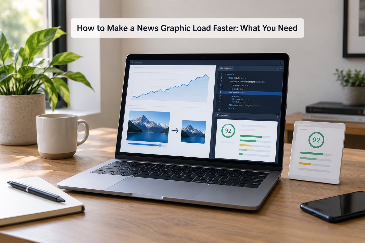
Five things, and nothing exotic. Everything on this list is free or has a free tier that is enough for newsroom work.
- The original asset. The design file or the data behind the chart, so you can re-export rather than re-compress a lossy file. Re-exporting from source is always cleaner than unpicking damage from a 12-times-compressed JPEG.
- Browser developer tools. Chrome or Edge, right-click, Inspect. The Network panel is where every speed mystery gets solved, and it ships with the browser you already use to read the news.
- A compression tool. Google’s free Squoosh web app handles lossy and lossless in the browser, cwebp and avifenc do the same from a command line, and ImageOptim handles batches on a Mac. TinyPNG works if you only want a quick lossless squeeze.
- Access to your template or CMS. You need the ability to add attributes to an image tag. If you write in WordPress, that means either the block editor’s image settings or a small snippet in your theme or a code-hooks plugin.
- A recorded baseline. One PageSpeed Insights run on the published article URL before you change anything. Without a before number you cannot tell whether your work helped or whether traffic mix did.
One caveat worth stating up front: you cannot fix a slow graphic with a fast CDN if the server takes four seconds to answer. Check the time to first byte before you touch a single image.
How to Make a News Graphic Load Faster: Step-by-Step
Measure the Current Load Before You Try to Make a News Graphic Load Faster
Open PageSpeed Insights, paste the article URL and run the mobile audit. It returns a Largest Contentful Paint score, a Cumulative Layout Shift score, an Interaction to Next Paint score, a total page weight and a list of the assets eating the most bytes.
LCP is the metric that governs your graphic. It is the time from navigation until the largest above-the-fold element finishes painting, and on a story page that element is almost always your lead chart or photo. Google treats 2.5 seconds or less as good, 2.5 to 4 seconds as needing improvement, and anything past 4 seconds as poor. CLS counts layout jumping and should stay at 0.1 or below. TTFB, the server’s first response, should land under 0.8 seconds.
Then open the Network panel, reload the page, and sort by size. You are looking for three numbers: the total transferred weight of the page, the number of requests, and the dimensions and byte size of each image.
This is the moment where guessing turns into fixing. Forum threads on news themes describe the same turning point: once people opened per-asset data, they stopped blaming their host and found the file that was 60 percent of the page.
| Symptom | Likely cause | Where to check | Fix |
|---|---|---|---|
| Page sits blank for several seconds, then loads fast | Slow server response, not images | Network panel, first document request timing | Fix hosting or caching before touching graphics |
| Lead chart appears late but everything else is fine | Lead graphic is oversized or in an old format | PageSpeed Opportunities list | Re-export and prioritise the lead image |
| Text jumps around as the story loads | Missing width and height attributes | Inspect the img element | Add explicit dimensions matching the aspect ratio |
| Phone users complain, desktop users do not | One fixed-size desktop asset served to every device | Network panel on a mobile device | Add srcset with smaller variants |
| Scrolling stays smooth but the top of the story stalls | Many render-blocking CSS and script requests | Coverage or Network waterfall | Defer nonessential scripts, inline critical CSS |
Write the numbers down. You will reuse this list at the end.
Compress and Export the Graphic Efficiently
Format choice comes first, because it decides how much you have to compress. AVIF is the smallest and best-supported modern option for photographic and mixed content, with WebP a close second and the safer default when your audience skews older. PNG is the right format for flat-colour charts, logos and anything with hard-edged text, but only when it has been exported at a sensible size. JPEG remains fine for photographs. SVG is the strongest choice for simple vector charts, bar races and maps built from paths, and it scales without ever getting blurry.
Lossless compression removes wasted data without touching a single pixel, which is why it suits line charts and text-heavy infographics. Lossy compression discards detail your eye cannot resolve, and it is the only practical option for a large photo.
The test after compressing is visual, not numerical. Zoom a data label to 200 percent and look at it. Check the lightest line in the series, the thinnest gridline, the small country names on a choropleth. Check flat colour areas for banding, and check the lightest tint of a sequential scale, because compression shows up first where there is barely any contrast. If a label frays or two adjacent colours step into each other, the quality setting is too aggressive for that graphic.
| Graphic type | Target file size | Format |
|---|---|---|
| Lead or hero chart, above the fold | 150 to 250 KB | AVIF or WebP |
| Inline chart inside the story body | 80 to 150 KB | WebP, or SVG if it is vector |
| Thumbnail and social preview image | 20 to 40 KB | WebP or JPEG |
| Animated GIF explainer | Under 1 MB, or convert to MP4 | MP4 or WebM with a poster image |
| Interactive embed poster frame | Under 30 KB | WebP or JPEG |
| Video poster frame | 40 to 80 KB | WebP or JPEG |
Exceed a budget on a chart with 40 labelled bars and the right answer is to simplify the chart, not to compress it further. A legend nobody reads and a gridline nobody sees are free bytes to delete.
Serve Responsive Sizes and Reuse Assets
A phone downloading a 1600-pixel-wide chart because that is the only version on the server is the most common waste in news graphics. Build a few widths instead, hand the browser a list, and let it choose.
This is the markup to start from. Four attributes do most of the work: srcset with the variants, sizes telling the browser how wide the image will render, explicit width and height to reserve the space, and a modern source inside a picture element with a fallback for older browsers.
<picture>
  <source type="image/webp"
          srcset="chart-400.webp 400w, chart-800.webp 800w, chart-1600.webp 1600w"
          sizes="(max-width: 700px) 100vw, 700px">
  <img src="chart-800.png"
       srcset="chart-400.png 400w, chart-800.png 800w"
       sizes="(max-width: 700px) 100vw, 700px"
       width="800" height="450"
       alt="Unemployment rate by month, January to June"
       decoding="async">
</picture>
The width and height attributes are what fix layout shift. They let the browser reserve the correct box before a single pixel arrives, so the headline does not get shoved down the page when the chart loads. Set them to the real rendered size and keep the aspect ratio identical across every variant, or you trade a fast load for a jumping one.
WordPress generates srcset automatically for images uploaded through the block editor, and the Media Library produces scaled sizes. If your theme is not doing it, that is a theme or plugin problem, and a custom image CDN such as imgix or Cloudflare Images will do the resizing and format conversion on the fly.
On reuse, be careful. Shared SVG symbols and sprite sheets do cut requests, but an icon sprite in a news template can quietly break the labels a screen reader needs. Reuse assets that are genuinely identical; never merge two charts into one file to save a request.
Control Loading and Improve Delivery
Lazy loading tells the browser to defer anything outside the viewport, which on a long story means every chart after the first one stops competing for bandwidth. Set it with loading="lazy" on those images.
Never lazy load the lead graphic. Doing so tells the browser to wait until layout is settled before fetching the one image that decides your LCP, which makes the metric worse rather than better. For the hero image use loading="eager" and fetchpriority="high", and add a matching preload link in the page head if your template lets you.
Then cut the rest. Defer scripts that are not needed for the first paint, especially analytics tags, chat widgets and social embeds. Inline the small amount of CSS required for the above-the-fold layout and load the rest without blocking. Watch for the pattern newsroom templates inherit from marketing sites: a page builder that bundles a carousel, a popup modal and eleven plugins, each with its own stylesheet.
Delivery is the other half. Set a long cache lifetime on images with a versioned filename or a cache-busting query string, and serve them through a CDN so a reader in another country gets them from an edge server near them rather than from your origin. Caching rules without versioning is where things go wrong: readers keep seeing last week’s chart because the URL never changed.
Test on Real Devices and Connections
Open the Network panel, switch to the mobile device emulation, and throttle the connection to a slow profile such as Slow 4G. Reload and watch the waterfall. The chart should be the first large thing to arrive, and everything below it should stay unrequested until you scroll.
Compare the two versions side by side and record the numbers in the same place you wrote the baseline: page weight, request count, LCP, CLS, the file size of the lead graphic. If page weight dropped by half and LCP moved from 3.4 seconds to 1.6 seconds, you have a result worth defending in a budget document.
Then check what a fast load cost you. Tab through the article with the keyboard and confirm the chart is reachable and that focus order still makes sense. Run a screen reader over the graphic and confirm the alt text still describes what the chart shows, not what the file is called. If the chart is interactive, test that tooltips and filtering still respond, because aggressive optimisation sometimes strips the script that makes a Flourish or Datawrapper embed work.
Finally, test on a real phone on mobile data, not just on office WiFi. That is where your audience actually is.
How to Make a News Graphic Load Faster: Common Mistakes
Uploading the export straight from the design tool. A 3000-pixel-wide PNG at full quality is 90 percent waste on a phone. Re-export at twice your display width and nothing more; for a 700-pixel column, 1400 pixels covers high-density screens.
Compressing an already compressed file. Running a JPEG through a lossy compressor twice softens text and smears colour edges, and the second pass can make the file bigger. Always go back to the original.
Lazy loading the hero graphic. This is the most popular optimisation advice on the web and it is wrong for the lead image. The fix is fetchpriority="high" on the first visual, lazy loading for everything after it.
Fallback that shows nothing. If the WebP source fails and the fallback is missing, your reader gets an empty box. Keep a real fallback file and give the container a defined height so nothing collapses.
Turning on a CDN with no cache headers. A CDN in front of an origin that never expires files just proxies slowness. Set a real max-age on image responses and version your filenames.
Trusting one lab score. PageSpeed Insights runs on a simulated phone connection and will never tell you what a reader on a five-year-old Android in a train tunnel experiences. Use it for before-and-after comparison, then confirm with real users through your analytics or a field performance monitor.
Installing optimisation plugins on a hunch. The single most common newsroom complaint is that a caching plugin broke a layout that worked fine yesterday. Test one change at a time, on staging, with a way back.
One final tip: write down a performance budget for graphics and hold to it. If a lead chart must stay under 250 KB, say so in the style guide, put it in the designer’s brief, and check it at upload rather than at the end of the week.
Frequently Asked Questions
What file format is fastest for charts and infographics on a news site?
AVIF is usually the smallest and WebP is the safest modern default, both cutting file weight substantially compared with PNG or JPEG. For flat-colour charts with hard text, SVG scales without blur and often beats every raster format. Keep PNG for line art and logos, and JPEG for photographs. Whatever you pick, compress it before upload, because the format choice and the compression pass solve different halves of the problem.
Should I lazy load the hero image on a news article?
No. Lazy loading the lead graphic tells the browser to defer the one image that decides Largest Contentful Paint, which usually makes your worst metric worse. Use loading=u0022eageru0022 and fetchpriority=u0022highu0022 on the first visual and preload it in the head. Lazy load every chart, photo and embed below the fold, where the deferral is pure gain because those assets are not needed for the first screen.
How big should a news graphic be?
Aim for 150 to 250 KB for a lead chart above the fold, 80 to 150 KB for a chart inside the story, and 20 to 40 KB for thumbnails. Interactive embeds should show a poster frame under 30 KB, and video posters under 80 KB. If a chart with 40 labelled bars busts its budget, redraw it with fewer labels rather than compressing it harder, since readers cannot read 40 labels anyway.
How do I check whether a news graphic loads fast?
Run the published article URL through Google PageSpeed Insights and record LCP, CLS, INP, total page weight and the size of each image. Then open the Chrome Network panel, throttle the connection to Slow 4G and reload to see the real order of requests. Keep both numbers, before and after, because that comparison is the only evidence that a change worked.
Why are my WordPress news pages slow even when images are small?
Small images are often not the problem. Page builders, plugin stacks and ad or analytics scripts add render-blocking CSS and JavaScript that delay the first paint, and a slow host inflates time to first byte regardless of your graphics. Check the Network waterfall and the Coverage panel for unused CSS before optimising any further images. Forum discussions about slow news themes land on the same cause repeatedly: server response time, not payload.
How do I speed up an interactive chart embed?
Load the embed as a lazy iframe below the fold and show a compressed poster image in the reserved space until a reader interacts with it. Keep the initial poster under 30 KB and give the container a fixed height so nothing shifts. If the embed sits above the fold on a breaking-news story, publish a static fallback version of the chart in the first wave and upgrade to the interactive version once the traffic spike passes.
Conclusion
Measure the page first, find the single heaviest asset on it, and change one thing. In most newsroom cases the fix is the same three moves: re-export the lead graphic in a modern format at twice its display width, add width and height plus srcset so every device gets the right size, and lazy load everything below the fold. That is how to make a news graphic load faster, and it takes an afternoon rather than a sprint.
Record the before and after numbers, set a file size budget in the style guide, and the next story starts from a better baseline than the last one did.