
Readers do not arrive at your tool to explore it. They arrive with one question about one thing — is my street in this flood zone, who voted against this ordinance, did this doctor take industry payments — and they leave the moment that question is answered, or the moment they conclude you cannot answer it.
So the whole job of how to make a lookup tool readers actually use comes down to one decision made before any code exists: name the exact question a person types. Get that right and the interface, the URLs, the embeds and the measurement all follow from it. Get it wrong and you ship something technically excellent that almost nobody opens.
There is hard evidence for how easily this goes sideways. Digital Democracy, a free public search tool over California legislature transcripts built with academic backing, was judged “not impactful, as it required engaged and motivated citizens to proactively visit the website and use the tools” (ISOJ, 2022). Free, useful, well built. Zero traction. Nothing about the build was the problem.
A working version of this takes a solo builder a few focused weeks if the data already exists, or a newsroom team a quarter if the data does not. Below is the sequence I would actually follow.
Table of Contents
- What You Need
- Step-by-Step
- How to Make a Lookup Tool Readers Actually Use
- 1. Identify the question readers are trying to answer
- 2. Prepare reliable, limited source data
- 3. Design the input around natural language
- 4. Make results immediately understandable
- 5. Test the task with real readers
- 6. Launch, measure use, and improve the tool
- Common Mistakes
- Frequently Asked Questions
- What is a reader-facing lookup tool in journalism?
- How do you make a searchable database for readers without developers?
- Why do newsroom tools get almost no traffic?
- What metrics should a lookup tool be measured on instead of pageviews?
- Should a newsroom build a tool or write a story?
- How do you keep a lookup tool from going stale?
- Conclusion
What You Need
Five things, and only five. If you cannot assemble all of them, the tool is not ready to start.
- The reader problem. One sentence naming who arrives, what they type, and what a good answer looks like. Not “help people explore the data” — that is not a reader problem.
- Source data. A structured file with one row per record: a filing, a vote, a licence, a parcel, a prescription record. CSV, JSON or a database table is fine.
- Subject-matter input. Someone who knows the dataset well enough to spot a nonsense value and to explain what a column means when a reporter calls.
- A technical path. Any of the options in the table below will work. None of them is the bottleneck.
- Five test subjects. Colleagues who have never seen the tool, plus two questions each that they genuinely want answered.
| Team capacity | Realistic path | What you get | Where it tops out |
|---|---|---|---|
| Solo builder, no dedicated developer | Flourish or Datawrapper for the visual layer, Airtable or Google Sheets as the backing store, a static site generator for record pages | A working search, per-record URLs, an embeddable frame | Weak fuzzy search, per-record pages need manual export work, no incremental updates |
| Two or three people, mixed skills | Elasticsearch or Postgres full text over a scheduled export, server-rendered record pages, a small front end | Instant search, autocomplete, thousands of indexable record URLs, automated refresh | Someone has to own the pipeline and the uptime |
| Full news app team | Everything above plus alerting, permalinks, save-and-return features, an API, per-topic landing pages | A tool that can become standard investigative infrastructure | Scope creep is the real risk, not engineering capacity |
Pick a row before you argue about frameworks. ProPublica’s advice to newsroom developers is that the coding leg is the most teachable of the three legs a team needs, and that graphics editors and designers already writing scrapers are the talent pool in front of you, not graduate CS hires. The stack matters far less than whether one person owns the data going in.
Step-by-Step
How to Make a Lookup Tool Readers Actually Use
The framing that matters: a reader-facing lookup tool serves a person trying to find out whether a specific named thing is in a set. A reporter-facing tool serves a professional scanning for patterns. Those are different products.
Most of the design guidance that circulates in newsrooms comes from reporter-facing work — dashboards, alert triggers, multimedia aggregation, filter panels. Readers do not want that. In the ISOJ survey of 193 journalists, multimedia aggregation scored near the bottom (photos 6%, video 4.6%) while search, filtering and custom alerts scored highest. Those journalists wanted to find a thing, and readers are even less patient. A TV reporter interviewed in that research described her own hard limit: 90 seconds, and a complex analytical visualisation does not make it. Treat ninety seconds as the design budget.
So the question to write on the wall before you build anything is simple: when someone lands here, what do they type? “Jordan Lee.” “415 Linden Ave.” “Prescription 1234567.” “Precinct 4.” Whatever it is, that string is the entire user interface. Filters, charts and narrative framing are decoration around that string.
1. Identify the question readers are trying to answer
Collect reader questions before you design anything. Search your own site’s logs and search-console data for the entity names people already look up, read the comments and corrections emails, and check what people type into general search engines when they want to know this specific thing. You are looking for a pattern of concrete strings, not a theme.
Then write the lookup decision in one line: “Given a person, school or address, the reader wants to know whether it appears in this record set, and if so, what the relevant records say.” If your sentence cannot be filled in with a concrete noun and a concrete output, the scope is still too broad.
Reject every feature that does not serve that one line. A map is out unless geography is part of the question. A timeline is out unless change over time is the point. A download-the-whole-dataset button is out, unless your reporter-facing colleague is a secondary audience. This is not minimalism for its own sake — in the ISOJ work, teams instinctively built visual richness and users wanted to find a thing.
Scope to one record unit a person could plausibly search for: a name, an address, a school, a licence, a precinct, a prescription. “Browse the data” is not a record unit. If your dataset genuinely supports five different lookups, ship one and hold the rest; you can add the second lookup when the first has repeat visitors.
2. Prepare reliable, limited source data
Choose the authoritative source first and write down what it does and does not contain. Public records series have edges: a filing series that starts in 2011, a council record set that omits voice votes, a complaint database where only filed complaints appear. Readers cannot calibrate for gaps they cannot see, so publish the boundaries on the tool itself rather than in a methodology page nobody opens.
Then do the unglamorous work. Standardise names and addresses so that “St. Mary’s” and “Saint Marys” hit the same record. Deduplicate. Reconcile entities that changed name or address mid-series. Where two source rows disagree, keep both and show the disagreement rather than silently picking one.
Decide now what the tool does when there is no record. This sounds trivial and it is the single most common way these tools lose trust. A confident-looking empty state reads as “you are clear.” A clearly labelled “no record found in this series, which covers 2016 to 2026” reads as what it is. Never render an absence as a clean bill of health.
Keep the file small on purpose. A dataset of a few thousand well-matched rows beats a million rows with inconsistent keys, because search quality collapses long before the dataset gets big.
3. Design the input around natural language
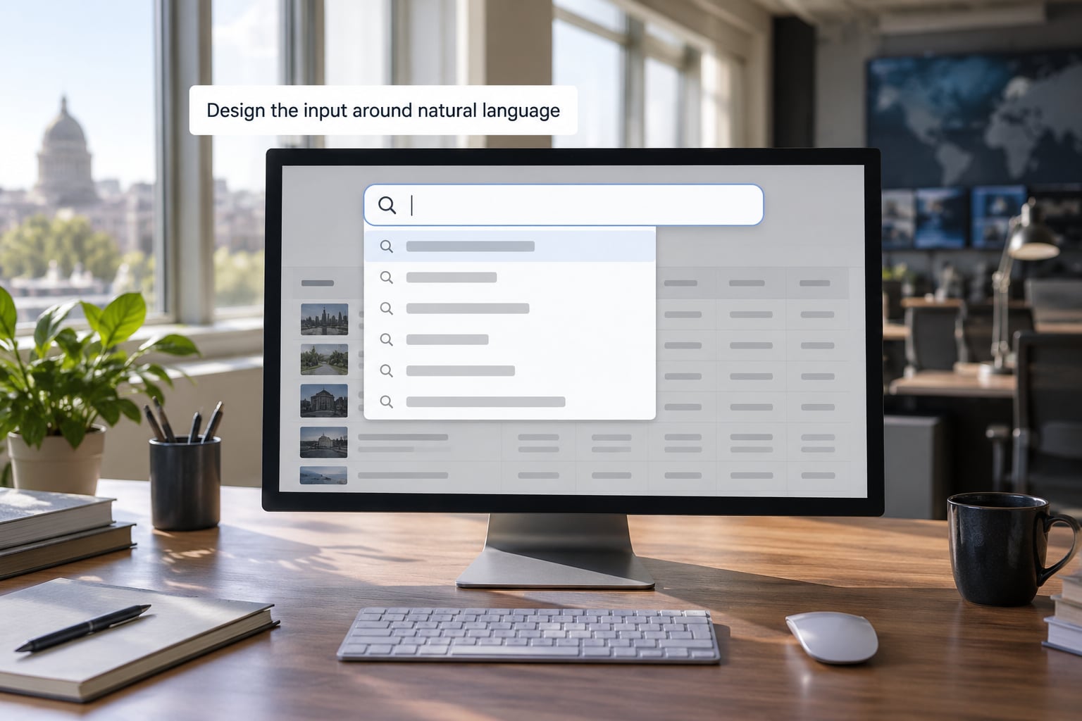
One field, at the top, with a label that says what to type. “Search by name or address” beats a magnifier icon with a placeholder that disappears the moment you click. Keep the field visible while scrolling results; readers refine and re-search constantly.
Autocomplete is the highest-value thing you will build. It does three jobs at once: it confirms the reader spelled it the way the data has it, it exposes the exact vocabulary of your dataset, and it prevents the blank-result page that kills a first impression. Start with prefix matching on the highest-value field, then add fuzzy tolerance for transpositions and missing middle initials.
Build in synonyms and aliases, because readers will not use your vocabulary. St abbreviations versus spelled-out forms, former names, “Dr” versus no title, “Ave” versus “Avenue”. Every alias you add is a search you stop losing.
Give a clear recovery path when a search misses. Offer the closest matches, show what field the reader could try instead, and keep the query visible and editable. A dead end at the first search is where most sessions end.
Search first, filters second. A wall of filter dropdowns signals a database rather than an answer, and readers must reverse-engineer your schema to use it. If you do need filters, put them below the results and make sure every filter state has its own shareable URL.
4. Make results immediately understandable
Rank the most likely match first and show the next two or three underneath, so a reader with a common name can self-correct. If two records are genuinely close, show the field that separates them — middle name, birth year, street number — before the reader concludes you have the wrong person.
Show the source record next to anything you derived. This is the strongest trust signal available to a lookup tool, and it comes straight from the ISOJ interviews, where journalists “would rather be given the primary sources and the underlying information to form their own stories” than a conclusion pre-chopped for them. Readers behave the same way. A derived flag with no visible underlying record invites the reader to assume you editorialised.
Put the update date on the result. A record without a date is worse than no record, because the reader cannot tell whether absence means “no entry” or “not loaded yet”.
Then give people one obvious next action: send this result to someone. A shareable result card or a permalink with the query baked into the URL turns a private lookup into distribution you did not have to pay for.
Most importantly, give every record its own indexable URL. This is the tactic that separates a lookup tool that gets used twice from one that compounds. A single search page lives at one address and competes with everything else on your site. Thousands of record pages — /records/12345 with a real title, real text and a real link from the parent page — become searchable landing pages that bring readers in for years, arriving from search engines on the exact question your tool answers.
Check the rendering honestly. ProPublica deliberately tested on a deliberately cheap, low-quality monitor to catch designs that wash out for real users. Do the same on a mid-range phone, on a train, with one hand.
5. Test the task with real readers
Five people is enough for a first pass. Each gets two questions they genuinely want answered, thirty seconds to read the landing page, and a task: find the answer. Say nothing while they work.
Measure three things. Can they complete the lookup at all. Where they hesitate — every pause is a place the interface is asking the reader to do your job. And what they misunderstand, particularly whether they read an empty result as a clean result or a missing one.
The first thing to look for is not a search failure. It is a landing-page failure: someone arrives from your story, does not know what to type, and bounces without attempting a search. That points straight back to step one.
Watch what they type, not what you expected them to type. Every string you did not anticipate is a missing synonym, a missing alias or a label that failed. Fix those before you touch anything visual.
6. Launch, measure use, and improve the tool
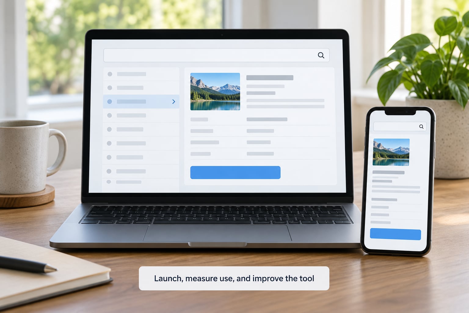
Distribution decides adoption more than features do. The highest-conversion path is embedding the search directly in the story that prompted the question, with the story supplying the context the tool cannot. Second is linking to it from every related story and from the topic tag, so a reader arrives from four entry points instead of one. Third is the per-record pages, which bring in people who never saw your story at all.
Ask for the newsletter at the moment of a result, not at the door. A reader who just found their own school in a spending database is having a very specific moment, and that is when a signup converts. The same applies to alerts: offer a follow-alert on a record or an entity the reader just looked up, because returning is what you are actually trying to buy.
| Metric | What it tells you | The failure it exposes |
|---|---|---|
| Search-to-result rate | Share of searches that return at least one record | Data gaps, spelling and synonym coverage |
| Zero-result search terms | The questions your dataset cannot answer | Coverage gaps, and your next reporting lead |
| Result clicks per search | Whether people found what they needed or gave up | Ranking, or a result page that is not specific enough |
| Return frequency | Whether the tool became a habit or a one-off | No reason to come back: no alerts, no new records surfaced |
| Embed-attributed sessions | Whether in-story placement is working | The embed is buried, broken on mobile, or missing context |
Do not measure pageviews on a lookup tool. One-off visitors are 60% of traffic but generate almost no revenue, while highly engaged users generate 110 times more, so a tool used twice by ten thousand people and a tool used once by a thousand people look identical on a pageview dashboard (Piano.io data via News Pain Points, March 2026). A reader who searched for their own name and emailed the result to their neighbour is worth counting; a bounce from a social post is not.
Watch for automated traffic in the same numbers. Bot visits grew sharply through 2025, so a rising search count with a flat result-click count is more likely a scraper than a success.
Finally, plan for decay. Every lookup tool rots when the upstream series changes format, gets discontinued, or starts publishing on a new schedule. Decide before launch who checks the pipeline and how often, and put a visible last-updated date on the tool. A stale lookup with no date is worse for your credibility than no tool at all, because readers will cite it.
Common Mistakes
Six patterns account for most abandoned lookup tools. Each one looks reasonable in a design review.
| What you built | What the reader came for | The fix |
|---|---|---|
| A searchable PDF | A specific record, instantly | One indexable page per record, with the PDF as the source link |
| A wall of filters | To type something they already know | One search field first; filters below and optional |
| A browse-everything database | An answer about one named thing | Refuse the browse page. Ship the lookup |
| A download gated behind an email form | One number, right now | Result first, signup offered after; the file stays free either way |
| An embedded iframe with no URL of its own | Something to send to a friend | A standalone tool page plus a shareable result permalink |
| A tool with no per-record URLs | A permanent citation for their own case | Stable record pages with real titles, real text, real links |
Two more traps worth naming. The first is judging your tool by whether it matches the formats your newsroom already uses. That critique, usually traced to Lewis and Usher’s tool-driven normalization argument, means the best reader-facing tools often look wrong to internal review because they do not resemble our existing templates.
The second is inheriting opacity from the source. If you republish an official rating without explaining how it was calculated, you have made that rating more findable and no more legible — and readers will hold you responsible for the confusion.
Some quick implementation notes. Publish a plain methodology note on the tool page stating what is included, what is excluded and when it was last refreshed. Make every result citable, so a reporter can name the tool in a story. Test on an old phone and a bad connection, not on your own machine. And when you demo the tool internally, do not drive it — hand someone the keyboard and stay quiet.
Frequently Asked Questions
What is a reader-facing lookup tool in journalism?
It is a newsroom-built web app that lets the public search a specific public-records dataset about themselves or their community — their school, doctor, council vote or parcel — and get a sourced, shareable result, instead of browsing an undifferentiated pile of data. The defining trait is a one-field instant search and one stable URL per record, so a reader can arrive, get an answer and send it to someone else.
How do you make a searchable database for readers without developers?
Use a hosted visual layer such as Flourish or Datawrapper for presentation, Airtable or Google Sheets as the backing store, and a static site generator to emit one page per record. You will get working search and per-record URLs without engineering help. The honest limits: fuzzy matching is weak, and each upstream data refresh means regenerating pages. Start there only if the dataset is small and rarely changes.
Why do newsroom tools get almost no traffic?
Usually because nothing routes a reader to them at the moment they have the question. Digital Democracy, a free search tool over California legislature transcripts, was judged not impactful because it required engaged and motivated citizens to proactively visit the website (ISOJ, 2022). The usual culprits are a single URL with no per-record pages, no embed in relevant stories, and no search term the reader would ever type.
What metrics should a lookup tool be measured on instead of pageviews?
Search-to-result rate, zero-result search terms, result clicks per search, return frequency, and embed-attributed sessions. Pageviews actively mislead here: one-off visitors are 60% of traffic but generate almost no revenue, while highly engaged users generate 110 times more, so a heavily used tool and an ignored one can look identical on a pageview dashboard (Piano.io data via News Pain Points, March 2026).
Should a newsroom build a tool or write a story?
Build the tool when the reporting produces a record set people will ask about by name — filings, votes, inspections, permits — and publish the story alongside it to supply context. Write the story alone when the finding is a single narrative that does not need repeated individual lookups. In practice the tool is usually the more durable asset, because readers return to it whenever their own record enters the dataset.
How do you keep a lookup tool from going stale?
Assign an owner before launch and schedule a check on the upstream source, not just on your own server. Public-record series change format, change schedule or get discontinued without notice. Put a visible last-updated date on every result, keep the raw source link, and if the pipeline breaks, say so on the tool itself. A stale lookup with no date is worse than no lookup, because readers will cite it.
Conclusion
Write down one real question a person would type, in the exact words they would type it. Then assemble the smallest dataset that can answer it properly, build a single search field over those records, give every record its own page, and put the tool where the question gets asked.
Test it with five colleagues who have never seen it before. Everything after that — filters, charts, alerts, maps — is optional, and adding it too early is the most reliable way to end up with a beautiful tool nobody opens.