
A data dashboard for readers is a single page that answers one public question with a small set of clearly labeled visuals, where every number carries its measure, time frame and comparison baseline, so a non-expert gets the point in seconds without any training. Most dashboards fail because the team starts with the tools instead of the reader.
The fix is a seven-step workflow: name the reader’s task, audit the data, build a reading order, match charts to the question, add context and annotations, design the interactions, then test with real readers. Each step produces something you can show someone else, and each step has a clear signal that it worked. The whole process takes most of a day for a single question, plus a day of testing.
Table of Contents
- What You Need
- Step-by-Step: How to Design a Data Dashboard for Readers
- How to Design a Data Dashboard for Readers: Start With the Reader Task
- Audit and Validate the Data
- Build a Reading Order and Visual Hierarchy
- Choose Charts That Match the Question
- Add Context, Labels, and Annotations
- Design Useful Interactions and Responsive States
- Test for Accuracy, Accessibility, and Comprehension
- Common Mistakes
- Common Mistakes and Quick Fixes
- Frequently Asked Questions
- What is the difference between a data dashboard and a data visualization?
- What is the best tool for designing a reader-facing data dashboard?
- How many charts should a reader-facing data dashboard include?
- How should I make an interactive data dashboard accessible?
- Should a reader-facing dashboard show uncertainty and missing data?
- How do I test whether readers can understand my dashboard?
- Conclusion
What You Need

Required items are fewer than most teams assume. You need a written reader question, source data you can trace back to its origin, editorial context from whoever reported the story, one charting tool, and a decision about which devices you support.
Before anything else, write down where the numbers come from. A government open-data portal such as a Socrata instance, a public records request, or a scrape of a published dataset all work, as long as you can name the publisher and the date you pulled it. If you cannot name the source, you are not ready to draw a chart.
For the tool, browser-based options are the easiest fit for published pages. Datawrapper and Flourish handle annotation, mobile layout and responsive embedding without code, Observable Plot and D3 give full control when you have a developer, and Tableau Public is a reasonable middle ground if your newsroom already lives in that ecosystem. Excel is fine for shaping data, and fine for a quick internal draft, but I would not ship a spreadsheet screenshot to readers.
Optional features are worth adding later, not first. Animation, a filter panel, a map explorer and a download button all add work and page weight, and each one needs a reader need behind it before you build it.
Decide your accessibility target up front, because retrofitting it costs more. Most teams aim at WCAG 2.2 AA, which means text and interface elements hit a contrast ratio of at least 4.5 to 1, nothing is encoded by color alone, and every interactive element works from a keyboard. Decide your device floor as well. A sensible default is a mid-range phone on a slow connection, not the newsroom’s own machine.
Step-by-Step: How to Design a Data Dashboard for Readers
Here is the full sequence, with what you produce at each stage and how you know the stage is done. Read it in order; each step depends on the one before it.
How to Design a Data Dashboard for Readers: Start With the Reader Task
Write one primary question in the reader’s own words, then one decision or understanding the page should support. “How much did rents rise in my area, and is that unusual?” is a reader question. “Rents by bedroom count” is a topic, not a question.
Then describe who is asking it and how much they know. A reader who follows local housing policy knows what a median rent is. A reader who opened the page from a search result may not know the difference between a median and an average, and that difference changes the answer.
You know this step is done when you can say what a reader will do differently after reading the dashboard, and you can name the one number they should not be able to miss. If you cannot name that number, you have a topic, not a dashboard.
Audit and Validate the Data
Provenance first: who published it, when, and does the version you have match what is published now. Then definitions, because the same label can mean different things across agencies. Median, gross and net, incident versus reported offense, and address versus parcel are three that cause real errors in news coverage.
Check units and denominators on every measure. A percentage with no denominator is unusable, and raw counts next to rates invite the reader to compare two different things. Note the date coverage, and find the gaps: missing months, suppressed cells, partial returns. Say how many records are missing and how the agency handled them.
Look for anomalies before you look for stories. A spike to double last quarter’s volume is usually a methodology change, a boundary change or a backlog being cleared, and publishing it as a crisis is how newsrooms end up correcting themselves a week later.
Document every transformation you make: joins, filters, exclusions, rounding. This step is done when someone who did not build the pipeline can reproduce your headline number from your notes.
Build a Reading Order and Visual Hierarchy
A reader-facing dashboard is read in one direction, top to bottom, in about five seconds for the first pass. Put the finding first, the context that makes it meaningful second, the supporting views third, and the methodology last. That inverted-pyramid order is the single biggest difference between a page that works and one that bounces.
Express the hierarchy with position, type scale, spacing and restrained color. One headline number set larger than everything else, one accent color used only for the series you are discussing, and generous white space around each block. Two accent colors and your hierarchy collapses.
Two layout patterns cover most cases. A full-width hero visual with small supporting panels underneath works when one picture carries the argument. A two-by-two grid works when four views of the same measure matter equally. Executive summaries with a row of stat cards work only when each card has a comparison next to it, otherwise they are just large numbers.
Watch the scroll. Practitioners describing long public visualizations say readers get bored of a massive scrolling build within a few minutes, and drop-off tends to happen right where the layout stops repeating. Cut anything that does not advance the argument.
Choose Charts That Match the Question
Match the form to the data shape, then check it against the reader’s question. This is the mapping I keep next to the build, with the trap for each one.
- Change over time, reader asks “is it rising or falling?” Use a line chart, or small multiples for many series. Watch for a truncated axis exaggerating small moves.
- Ranking, reader asks “which is biggest?” Use a horizontal bar chart sorted by measure. Vertical bars waste space on long labels.
- Part of a whole, reader asks “how is it split?” Use a stacked bar, or a hundred-percent stacked bar. Pie charts fall apart past five slices.
- Change in total and split, reader asks “is the rise volume or mix?” Use a stacked column over time. Interior segments are hard to compare across bars.
- Distribution, reader asks “how spread out is it?” Use a box plot, histogram or dot strip. Showing only the average hides the spread.
- Relationship, reader asks “do two things move together?” Use a scatter plot with a trend line. Readers will read correlation as cause.
- Geography by rate, reader asks “where is the rate highest?” Use a choropleth map. Large land areas dominate visually even at equal rates.
- Geography by count, reader asks “where are the events?” Use a dot map. Expect overplotting in dense areas.
- Progress against a goal, reader asks “are we on track?” Use a bullet chart. Gauge charts waste the space they take up.
- Many series at once, reader asks “which one matters here?” Use small multiples or sparklines in a table. Fifteen overlapping lines communicate nothing.
Two chart choices cause more damage than any others. Dual-axis line charts let you imply any relationship you like by rescaling one side, so avoid them for a general audience. Three-dimensional bars and pies distort the comparison the reader is making, so drop them entirely.
This step is done when you can state, for each chart, the sentence it is meant to let a reader say out loud.
Add Context, Labels, and Annotations
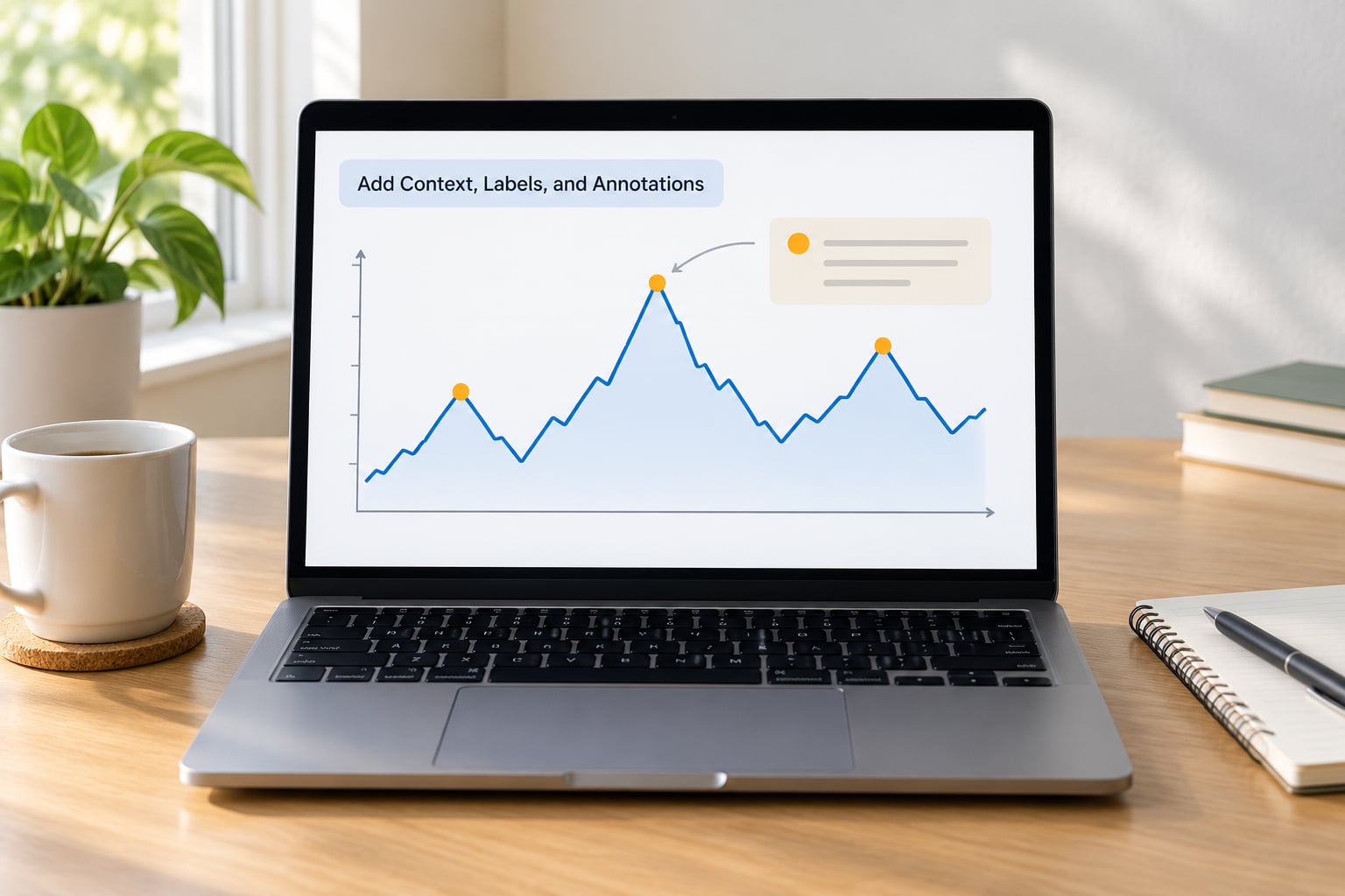
A number without a frame is decoration. Every measure needs its measure spelled out, its time period, its source, and something to compare against, which is usually the previous period, a five-year average or a stated target.
Put the source and a visible last-updated stamp near the data, not buried in the footer. Readers cannot tell whether numbers are current, and missing timestamps erode trust faster than almost any design choice.
Annotations should explain why a change matters rather than asking the reader to infer it. A short line at the peak of a line chart saying the cause, with a link, does more for comprehension than a paragraph underneath.
Make definitions available where the term appears, on hover or tap, rather than on a separate glossary page nobody visits. Then write the methodology note in plain language, covering what is included, what is not, and the main caveats. Finally, publish a corrections path, so a reader who spots an error knows where to send it.
When the data is uncertain, say so. Show the range, or state the limitation in the caption. Acknowledging caveats reads as competence, and implying precision you do not have reads as carelessness.
Design Useful Interactions and Responsive States
Interaction should support the main finding, not compete with it. Most reader dashboards need three things: a tooltip with the exact value, a filter or two where the reader genuinely has a choice, and a link to the underlying data.
Design the states you rarely think about. What does the page show while data loads, when a filter returns nothing, when a screen is narrow, and when a reader has JavaScript turned off? An empty chart with no message reads as broken, so give every state a sentence.
Keep the essential finding readable without hovering, without animation and without a wide screen. On mobile, stack panels vertically, drop secondary filters behind a single control, and cut the number of visible panels rather than shrinking type.
For performance, lazy-load anything below the first screen, embed in a responsive container, and hold the added weight of the whole visualization to a couple of megabytes. A tracker that loads fast on a five-year-old phone reaches more people than a richer one that stalls.
Everything interactive must work from a keyboard, in a sensible order, with visible focus. If it cannot be operated without a mouse, it does not exist for a meaningful share of readers.
Test for Accuracy, Accessibility, and Comprehension
Accuracy testing comes first and is not optional. Have someone who did not build it recompute three numbers by hand from the source. Then check that the labels match the data, that filters return what they claim, and that the timestamp is true.
Run the mechanical checks next: keyboard only, a screen reader, contrast, zoomed text at 200 percent, and the smallest phone your readers actually use. Fix what breaks before you ask anyone to interpret the page.
Then run the comprehension test, which is the one people skip. Put the dashboard in front of five people who did not build it and who do not work in data. Give them the reader question and sixty seconds. Ask what they think the chart says, why it matters, and whether the evidence supports their interpretation.
Watch where they look first. If their eye does not land on the finding, the hierarchy is wrong. If they reach for a hover to get a value that matters, that value belongs in the chart. If they ask a question the dashboard cannot answer, you either add context or narrow the scope.
Interviews with practitioners who built public trackers during fast-moving events describe the same pressure: development was extremely fast-paced and chaotic, as readers were. That is exactly why a fixed test protocol matters more under deadline, not less.
Common Mistakes
These are the failures that recur, each with the specific correction that fixes it.
- Starting with the tool. Pick the question first, then the software. Reversing the order produces a beautiful page answering a question nobody asked.
- Omitting definitions. A reader who does not know what the measure includes cannot judge it. Put the definition beside the number.
- Using color as the only cue. Add direct labels, patterns or marker shapes, so the page still works in grayscale and for color-blind readers.
- Crowding the first screen. Cut panels until the finding is unmistakable. White space is not wasted area.
- Hiding the source. Move the source and last-updated stamp next to the data, where the eye already is.
- Overstating small changes. Start the axis at zero on bars, or annotate the percentage change, so a two-percent move does not look like a collapse.
- Adding controls without a reader need. Every filter should answer a question you have actually heard a reader ask.
Common Mistakes and Quick Fixes
Most reader-facing dashboards fail in one of four ways. Here is the scannable version, grouped by where the failure happens.
Design failures. Too many panels compete for attention, so cut to the one finding plus what supports it. Two accent colors flatten the hierarchy, so keep one and let size and position do the rest. A dozen series on one axis turns into noise, so switch to small multiples. Three-dimensional bars distort the very comparison the reader is making, so use flat shapes.
Encoding failures. A truncated axis on a line chart exaggerates small movements, so either start at zero or label the change explicitly. Dual-axis charts let you imply any relationship you like, so split them into two charts. Pie charts with more than five slices are unreadable at newsroom sizes, so use a stacked bar. Choropleths on raw counts mislead whenever population differs, so show rates on maps and counts on a dot map.
Editorial failures. No source line means no trust, so publish one with the date. A methodology note written for analysts is invisible to readers, so write it in plain language. Corrections need a route, so link a form or an address. And uncertainty belongs in the caption, not hidden in a footnote, especially when an agency revised its methodology mid-series.
Technical and accessibility failures. Color-only encoding, missing focus states and low-contrast gray labels are the three that recur most, and all three are cheap to fix before launch and expensive after. Heavy embeds push the page past a few megabytes, which costs you readers on slow connections. Tooltips that hold the only copy of a key value, filters that do not work on touch, and charts that need hover to explain themselves all break the experience for someone.
A few quick habits help more than any single technique. Design the mobile layout first, since it constrains everything else honestly. Give the page one number that must be understood, then make sure nothing competes with it. Show a comparison next to every figure. And write the takeaway as a sentence before you build, because if you cannot write it, the data is not ready for readers.
Frequently Asked Questions
What is the difference between a data dashboard and a data visualization?
A data visualization is any single chart, map or graphic encoding data. A dashboard is a composed page: a set of visuals, labels and controls arranged around one reader question, with hierarchy deciding what gets seen first. The distinction matters because a chart can be well made and still fail on a page that gives the reader no reading order, no baseline and no source.
What is the best tool for designing a reader-facing data dashboard?
For most newsrooms, Datawrapper or Flourish. Both annotate, adapt to mobile and embed responsively without code. Choose Observable Plot or D3 when you need custom interaction and have a developer on staff, and Tableau Public when your newsroom already uses it. Excel is useful for cleaning and drafting but is a poor choice for a published page.
How many charts should a reader-facing data dashboard include?
Three to five on the first screen, and no more than about a dozen on the whole page. Each additional chart competes for attention and page weight, so every panel after the fourth should justify itself against the reader question. If you find yourself adding panels to fill space, the layout is wrong rather than the panel count.
How should I make an interactive data dashboard accessible?
Meet WCAG 2.2 AA: at least a 4.5 to 1 contrast ratio for text, no information carried by color alone, full keyboard operation with visible focus, and a text summary of each chart for screen readers. Keep the key finding readable without hovering or animation. Test with a keyboard and a screen reader before launch, not after a reader complains.
Should a reader-facing dashboard show uncertainty and missing data?
Yes, and readers treat missing caveats as a reason to distrust the whole page. Show ranges where the data supports them, state how missing values were handled, and note when an agency revised its methodology. Acknowledging limits reads as accuracy. Implying precision the source does not have reads as carelessness, and readers are right to assume the worst.
How do I test whether readers can understand my dashboard?
Give the page to five people outside the project with the reader question and sixty seconds. Ask what they think the chart says, why it matters, and what question remains. Watch where their eye lands first. If it is not the finding, fix the hierarchy. If they hover to find a key value, print that value in the chart instead.
Conclusion
Designing a data dashboard for readers comes down to a sequence, not a style. Start from the reader’s question, prove the data, arrange the page so the finding lands first, pick a chart that matches the shape of the data, then add the context, labels and source notes that make a number trustworthy.
Your first three actions are small. Write the reader question in one sentence. Audit the data and write down where every number comes from. Decide the single number that must not be missed. Everything after that is layout.