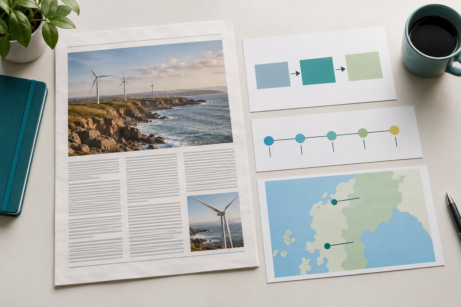
An illustration earns its place in a news story when it does something a photograph cannot: show an abstract idea, a hidden system, or an event nobody could photograph. Knowing how to use illustration in news storytelling means settling the visual need before anyone commissions art, briefing an illustrator in language that survives a deadline, and checking the finished piece for accuracy, sensitivity and access. Most of the work happens before a pen touches paper.
Illustration in journalism is a commissioned drawing, painting or vector graphic made to accompany a reported story. It explains ideas that have no visible form, depicts places and events that cannot be photographed, and gives a publication a consistent visual voice across a beat, a series or a whole archive.
Readers use pictures as shortcuts. A diagram of a voting procedure tells them what the text takes four paragraphs to explain. A recurring character drawn the same way every week tells them, before they read a word, that this is the same ongoing story and not a new one.
What follows is the working process: what you need in hand, how to choose the form, how to brief and edit, how to check the art before it runs, and how to tell afterwards whether it helped. It suits reporters, assigning editors, art directors and visual journalists at digital, print and newsletter outlets, plus small newsrooms with no design department at all.
- Decide the point first. One sentence naming what the reader should understand, written before any art is discussed.
- Pick the simplest form that serves that point. Diagrams, maps, timelines, spot illustrations and data graphics each fail differently.
- Brief in full. Angle, constraints, format, deadline, usage rights, credit line.
- Edit at the sketch stage. That is where the idea is still cheap to change.
- Check accuracy and sensitivity. Including whether any detail implies something the reporting does not support.
- Ship accessible. Alt text, contrast, and every key fact also present in text.
Table of Contents
- What You Need to Use Illustration in News Storytelling
- Step-by-Step: How to Use Illustration in News Storytelling
- Common Mistakes
- Frequently Asked Questions
- What is an illustration in a story?
- When should a news story use an illustration instead of a photograph?
- What are some examples of methods of illustration used in journalism?
- How do illustrations help readers understand a news story?
- Can newsrooms use AI-generated illustrations?
- Who decides what the illustration shows in a newspaper?
- Conclusion
What You Need to Use Illustration in News Storytelling
You need six inputs before a brief can be written, and a commission that starts without them usually comes back with art that has to be redrawn.
- A settled story objective. One sentence: after this piece, the reader should understand how the runoff counting works, or see why rents rose, or know what changed in the ordinance.
- Verified information. The facts the drawing will depict, checked by the reporter rather than assumed by the illustrator. Numbers in a chart come from the same source as the numbers in the copy.
- Audience context. Whether the reader arrives on a phone, in a printed broadsheet, or in an inbox at 7am. A label that reads cleanly on a laptop can be unreadable at newsletter width.
- A chosen visual format. The deliverable, not a vibe: one spot illustration, a three-panel sequence, an annotated map, a timeline, a scrollytelling scene, or a set of characters for a series.
- An accessible visual system. A palette that survives colour-blind readers and greyscale printing, and type that meets contrast guidance without shrinking to nothing.
- Sign-off from an editor or subject expert. Somebody with authority to say the drawing misstates the story, and somebody who can verify the technical details.
Order matters more than people expect. Commissioning before the angle is locked is the single most common reason an illustration gets pulled, and the reporter rarely gets the time back.
Step-by-Step: How to Use Illustration in News Storytelling
The process below runs in order. Skipping ahead is where newsrooms waste money: art made for a story that then changes shape cannot be patched, only restarted.
Start with the story’s communication goal
Start by writing one sentence that says what the reader should be able to explain after reading, without scrolling back. If that sentence needs an “and” in the middle, you have two goals and probably two pieces.
The common goals, with the visual job each one sets:
- Explain a process. How a claim moves through an appeals court, how a ballot is counted, how a supply chain broke. The drawing shows sequence and decision points.
- Establish context. Where a village sits in a watershed, how a species range has shifted. The drawing shows position and scale.
- Show change over time. Before and after a policy, a drought, a redevelopment. The drawing shows the same frame twice.
- Locate an event. A strike across several sites, damage along a river. The drawing shows geography, not faces.
- Humanise an experience. What a waiting room, a night shift or a housing application feels like. The drawing carries tone without claiming a person’s account.
- Open an emotional door. The long-form feature where a reader needs to feel the scale before the reporting lands.
You know the goal worked when five readers can repeat the sentence back to you in their own words. If they describe the picture instead, the picture is doing the talking and the story is not.
Choose the visual form that matches the reader’s need
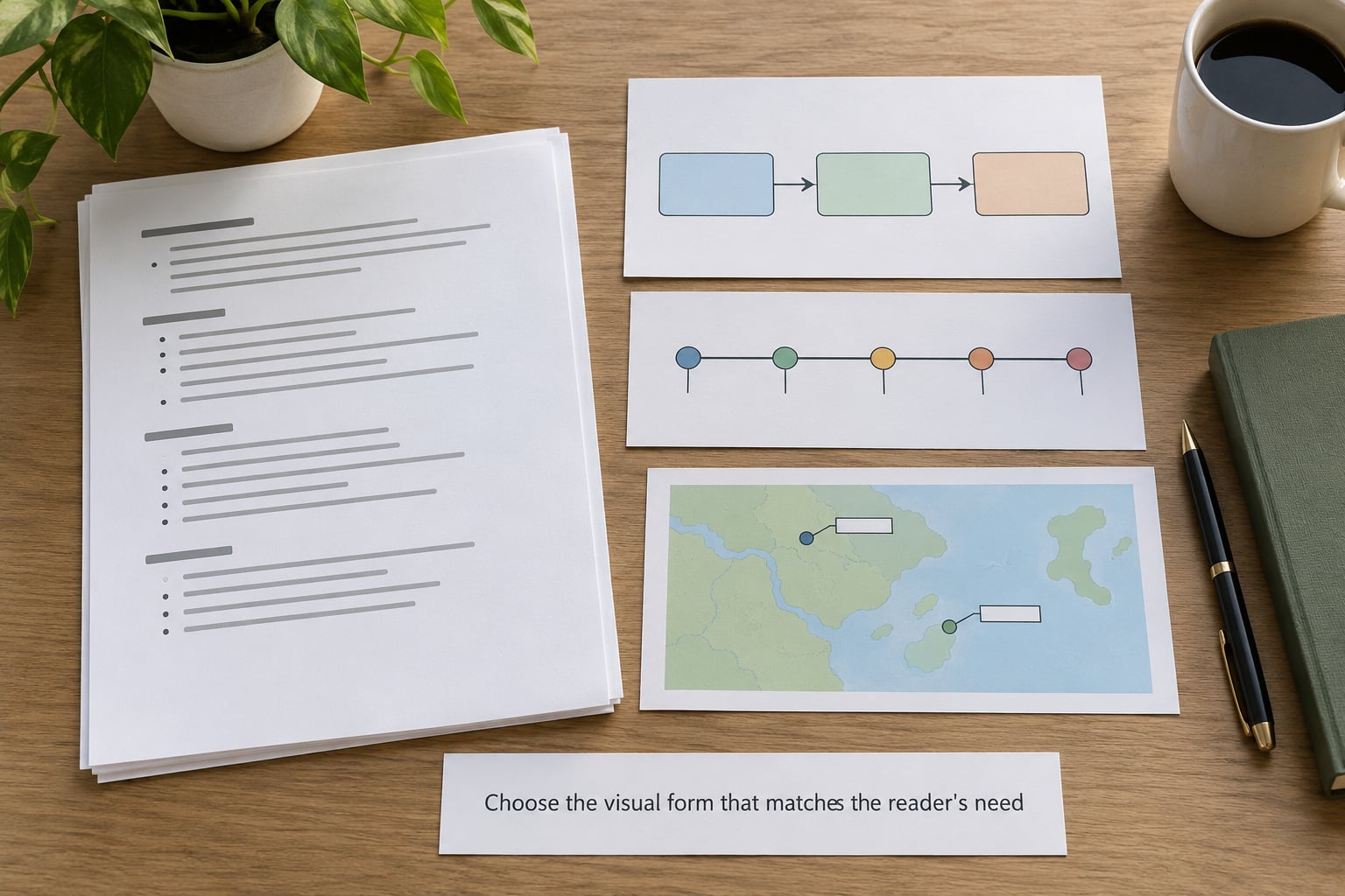
Choose the format that carries your sentence most directly, then cut anything that does not help with it. Format is a decision about reader need, not about style.
| Format | Story it suits | Check before commissioning |
|---|---|---|
| Explanatory diagram | Processes, rules, systems with steps | Can a reader follow the arrows without the text? |
| Annotated map | Place-based reporting, infrastructure, routes | Is the geography simplified honestly, with a note saying so? |
| Timeline | Chronologies, investigations, court cases | Are dates sourced, and is the scale even? |
| Spot illustration | Opinion pages, comment columns, single-concept columns | Does it comment on the idea rather than restate the headline? |
| Character or recurring series | Ongoing coverage of one beat or one subject | Will this style still be usable in six months? |
| Scrollytelling scene | Long features where a scene changes as the reader scrolls | Does the scene still read on a small screen and with motion off? |
| Data-driven graphic | When the evidence is numeric | Can a designer build it from the published dataset? |
A simple test: finish the sentence “this drawing shows ___” in three words or fewer. If you need a paragraph, you want a different format, or two pieces instead of one.
Two rules keep formats honest. Simplify the drawing, never the finding, because a cleaner picture of a complicated result is a false picture. And match the rendering to the subject, since a flat minimal icon set on a specialist topic quietly tells expert readers the newsroom thinks the subject is trivial.
Build the visual hierarchy
Build one focal point and let everything else support it, because a reader spends about a second deciding where to look first.
- One hero element. The thing the sentence is about, given the largest area and the strongest contrast.
- Scale does the sorting. If the important label is the same size as the background texture, nothing is important.
- Cut the middle. Most weak illustrations carry five ideas at equal weight, which reads as none of them.
- Design at the delivery size. Open the file at the width the reader actually sees, on the device they actually use, and check the smallest text there.
- Keep the frame calm. Background texture, drop shadows and gradients add weight without adding meaning.
Greyscale is the honest test. Squash a draft to black and white and if the focal point disappears, colour was doing the sorting work, and not reliably for every reader.
Write concise labels and a clear visual narrative
Write labels the way you would speak them, in three to seven words, and let the image carry cause and effect instead of adjectives.
Reporting is written for comprehension at speed; labels are not an exception to that rule. A label reading “Subsequent regulatory adjustments implemented across the review period” tells a reader nothing about what changed. “Rules changed last year” tells them where to look.
- Lead with the verb. “Counted”, “Closed”, “Reopened” beat “Counting process”, “Closure event”.
- Delete the throat-clearing. No “the”, no “process of”, no “approximately” unless the number really is approximate.
- Sequence cause and effect. Three panels in the order the reader should think, with panels numbered if the order is not self-evident.
- Put the specifics in the caption. The caption carries names, figures and sources so the artwork can stay uncluttered.
- Read every label aloud. Anything you stumble over is jargon the reader will stumble over too.
If a label needs a footnote, the label is wrong. Move the qualification into the caption rather than shrinking the type.
Check accuracy, ethics, and accessibility
Run every finished piece through a review that covers factual representation, ethical depiction and access, in that order, because accuracy problems are the ones that force corrections after publication.
On accuracy and ethics:
- Every depicted detail has a source. Uniforms, signage, vehicle types, building styles and terrain all imply claims. If the reporting places the event 2,000 kilometres from where the illustrator drew the vegetation, that is a correction, not a style note.
- Real people need permission. Drawing an identifiable politician from reference photographs is different from drawing a fictional official. Say in the brief whether likenesses are allowed.
- Symbols carry history. Check what a costume, a flag, a gesture or a caricature of an accent implies to the communities it describes. Stereotype risk is usually invisible to the group inside it.
- Trauma gets restraint. For violent or victimising events, abstraction is usually the right register. Do not stylise suffering to make a page attractive.
- Generated images need disclosure. Most style guides expect a label when synthetic imagery runs. Beyond the label, generated art invents plausible-looking detail, which is precisely the failure mode a newsroom cannot afford.
On access:
- Write alt text that carries the finding. Describe what the drawing shows and what it demonstrates, not that it is “an illustration of”.
- Never encode meaning in colour alone. Add a line, a shape or a pattern so a reader who cannot distinguish the hues still gets the difference.
- Hold contrast to guidance for text over image and for label-to-background separation.
- Keep the facts in text. Every key point the drawing makes must survive with images disabled, including motion versions.
Test the illustration with readers
Test with a handful of readers before publication by asking three questions, in order, and stop looking at the artwork yourself while you listen.
- What is this story about?
- What changed, and when?
- What did the picture help you understand that the text did not?
Five people who did not see the art is enough to expose the usual problems: a focal point in the wrong place, a label that reads as a claim, a chronology that reverses cause and effect. Revise the drawing, not the questions.
A quick useful signal is whether readers volunteer the drawing at all. If nobody mentions it, it may be decoration, and decoration is the most common failure in the format.
Publish, measure, and improve
Publish with the caption, credit line, alt text and rights in place, then judge the result by comprehension rather than by clicks alone.
Before it runs:
- Placement follows the reading order. A diagram explaining paragraphs four to seven goes where it prevents the reader stalling, not automatically at the top.
- Caption, credit and rights. The illustrator’s name, the usage covered, and where the art may appear, all in the file rather than in someone’s memory.
- Delivery behaviour. Size the file for mobile, check it loads on a slow connection, and prepare the crops for social and email.
- Reuse deliberately. A series brief should define how recurring characters and palettes stay consistent, and a style guide helps more than a folder of past finals.
After it runs, watch the signals that actually reflect comprehension: whether readers reach the annotated section, whether the explanation package is read to the end, whether questions arriving in the mailbox come from the drawing rather than the headline, and whether scroll depth holds at the illustrated point.
Traffic on its own proves very little. A dramatic image lifts clicks and teaches nothing, which is why a comprehension check belongs in the same file as the alt text.
Common Mistakes
The failures below all share one cause: the illustration was chosen before the story’s job was defined.
- Decorating instead of explaining. The art matches the mood of the piece and adds nothing a reader could use. Fix: write the one-sentence goal, then cut any element that does not serve it.
- Reusing ready-made library art. A generic image of a city, a handshake or a server rack implies a scene your reporting never witnessed, and readers cannot tell it was a placeholder. Fix: commission or draw specifically.
- Overloading the frame. Twenty labels, six colours and three competing focal points. Fix: one idea, one hero element, everything else supports.
- Relying on colour to carry meaning. Two series categories distinguished only by hue disappear in greyscale and for colour-blind readers. Fix: add a line, a shape or a direct label.
- Writing alt text as a file name. “Illustration for story 4.jpg” gives a screen reader nothing. Fix: state what the drawing shows and what it demonstrates.
- Treating a dramatic image as neutral reporting. A scene staged for impact reads as a record of what happened. Fix: say plainly in the caption that the artwork is an interpretation.
- Letting constraints arrive late. “No recognisable likeness of this person,” handed over after the sketches, forces a restart. Fix: put every restriction in the original brief.
Quick Tips
Run these checks in the ten minutes before you publish.
- Name the reader takeaway in one sentence and confirm the drawing supports exactly that sentence.
- Remove every decorative element that survived only because it looked good in the sketch round.
- Read the labels aloud at normal speed; rewrite anything you stumble on.
- Open the file at the smallest width it will ship at and check the text.
- Verify each depicted detail against the reporting, including background detail nobody thought to check.
- Ask what a reader loses if the image never loads, and put that information in text.
- Confirm the credit line, the usage terms and the alt text are in the file before it is queued.
Frequently Asked Questions
What is an illustration in a story?
An illustration in a story is a drawing, painting or vector graphic made to accompany reported writing rather than to decorate a page. It visualises something the words describe but cannot show: an abstract idea, a hidden system, a place nobody could photograph, or a change across time. In newsrooms it is usually commissioned from a freelance illustrator and shaped by an art director.
When should a news story use an illustration instead of a photograph?
Use illustration when the subject has no visible form or no reliable photographic record: legal procedures, supply chains, policy changes, disease spread, events that happened before or after a camera could be there. Use photography when a specific person in a specific place at a specific moment is the point of the story. The mix works best when both are asked to do what each does better.
What are some examples of methods of illustration used in journalism?
The main methods are spot illustration for a single concept, the editorial cartoon for argument and satire, caricature for a recognisable public figure, explanatory diagrams for processes and rules, annotated maps for place reporting, timelines for chronologies, data-driven graphics for numeric evidence, scrollytelling scenes for long features, and motion illustration for video and social cut-downs. A recurring character series keeps one beat visually consistent over months.
How do illustrations help readers understand a news story?
Illustrations compress and order. A diagram lets a reader grasp a four-step process in seconds instead of paragraphs, a map places an event in space, and a timeline fixes the order of cause and effect. Consistent visual language also signals continuity, so a reader recognises at a glance that a new image belongs to an ongoing story they have already seen.
Can newsrooms use AI-generated illustrations?
Some do, under conditions. Most style guides expect clear disclosure whenever synthetic imagery runs, so readers are not left guessing. The larger risk is accuracy: generated images invent confident-looking detail, such as signage, uniforms or building types, that no source supports. Treat generated art as a sketch for a human illustrator to redraw, and never let it carry factual claims on its own.
Who decides what the illustration shows in a newspaper?
The reporter owns the story’s accuracy and the assigning editor owns the plan, while the art director turns that into a brief covering angle, format, constraints and deadline. The illustrator interprets the brief and submits sketches, and editing happens at the sketch stage, with the reporter checking depicted detail against the reporting. A standards or subject expert signs off before publication, and the illustrator is credited by name.
Conclusion
Start with one sentence naming what the reader should understand, then pick the simplest visual form that carries that sentence, and test the result with a few readers before it runs. If the drawing only adds polish, cut it. If it lets someone explain the story to a friend without rereading, it has done its job.