
To normalize map data by population, divide every count by the population of the same place and time, then publish the result as a rate (per 1,000, per 10,000 or per 100,000) rather than a raw total. In practice the hard part is not the division, it is finding a denominator that matches your map’s boundaries and year, then dealing with the places where the population is too small for the rate to mean anything. That join problem is where most mapping projects stall.
I work with census and administrative data often enough that I have made every mistake in this guide at least once. The workflow below is what I now run before anything reaches a graphic. It takes about an hour of setup for a county-level layer, more if your geography is custom.
Population normalization, defined: normalizing map data by population means dividing a count of events, people or assets in a place by the population of that same place, producing a per capita rate. The formula is simple — rate = count ÷ population. The rate lets a county of 900 and a county of 900,000 sit on the same legend without the big one shading darkest by default.
Table of Contents
- What You Need
- Step-by-Step: How to Normalize Map Data by Population
- Common Mistakes
- Frequently Asked Questions
- Should I use a raw count map or a per capita map?
- How do I deal with small population denominators and unstable rates?
- What is the difference between a per capita rate and population density?
- What is the modifiable areal unit problem and how does it affect rates?
- What do I do when my geography has no official population estimate?
- Conclusion
What You Need
Three datasets have to line up before any calculation happens, and the whole job is really about lining them up. You need a numerator table (crimes, hospital admissions, permits, business registrations) that already carries the geography you intend to map.
You need a population denominator for that exact same geography, from a named, citable source. In the United States that is the Census Bureau decennial count, the Population Estimates Program, or the American Community Survey 1-year or 5-year estimates. Outside the US, WorldPop and the Global Human Settlement Layer cover most countries at 100m or 1km resolution.
You also need a boundary file with a stable identifier column. GeoJSON, a shapefile or a geopackage is fine, as long as it carries a key you can join on — a FIPS code, a GEOID, a local district ID. And you need a written rule for what happens to unmatched rows before you start, because there will be some.
| Dataset | Coverage | Smallest unit | Watch out for |
|---|---|---|---|
| Decennial Census (PL 94-171) | United States | Block | Ten-year gap between counts; redistricting years change boundaries |
| Population Estimates Program | United States | County | Vintage must match the numerator year as closely as possible |
| ACS 1-year estimates | US places over 65,000 | Tract, block group, PUMA | Unavailable for rural areas; wide margins of error |
| ACS 5-year estimates | United States | Tract, block group | Five-year window smears short-term change; treat as a period estimate |
| WorldPop | Global | ~100m grid | Modeled, not counted; aggregate the grid to your polygons yourself |
| GHSL (JRC) | Global | ~1km grid | Built for urban settlement modelling; coarser than WorldPop |
Everything above is US-centric except the last two rows, so if you are mapping elsewhere, check whether your national statistics office publishes estimates at the unit you need before assuming you must fall back on a gridded surface.
Step-by-Step: How to Normalize Map Data by Population
Six steps take you from a raw count to a defensible rate map. Skip any of them and you will publish a number that quietly means something other than what your headline claims.
1. Choose a Meaningful Geographic Unit
The geographic unit is whatever becomes one color on the map, so pick it before you pick anything else. Counties are stable and well understood, which is why newsrooms default to them, but they vary enormously in both land area and population — a county can hold 40,000 people or four million.
Census tracts are smaller but far less familiar to general readers, and tract boundaries shift every ten years. If your narrative depends on neighborhood-level fairness, use PUMAs or a published neighborhood scheme and name it in the graphic. You know the choice worked when a reader can look up one of your areas in the census and find matching boundaries.
2. Match Counts and Population Denominators
Match the denominator to the numerator by joining on the same identifier for the same year, and treat any identifier that fails to match as a decision rather than an inconvenience. Practitioners building neighborhood-level maps hit this wall constantly: newsroom or advocacy boundaries rarely match a published estimate, so the join returns nothing.
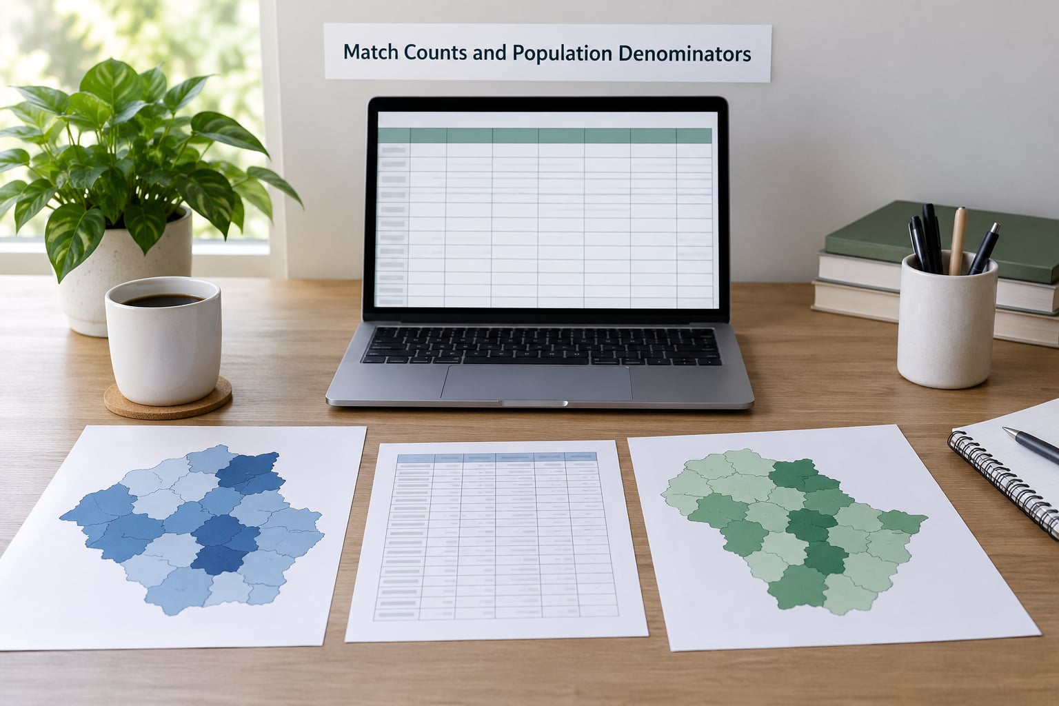
Here is the join in pandas, which is the same logic in every other tool:
counts = counts.merge(pop, on="geo_id", how="left", validate="one_to_one")
counts["pop_missing"] = counts["population"].isna()
counts["count_missing"] = counts["events"].isna()
Run that check before you compute anything. Zero means the boundaries line up. Hundreds of unmatched rows means your identifier scheme disagrees with the denominator, and no amount of arithmetic fixes it.
In SQL the join is the same shape, and the count of unmatched rows is one query:
SELECT c.geo_id, c.events, p.population
FROM counts c
LEFT JOIN population p ON p.geo_id = c.geo_id
WHERE p.population IS NULL;
When no official estimate exists for your custom areas, the fallback is dasymetric weighting: take a finer-grained population surface (a grid, or parcel and building-footprint data) and sum the population inside each polygon. That is areal interpolation, and it is far better than falling back to raw counts.
3. Calculate a Per-Capita Rate
A per-capita rate is the count divided by the population of the same place, multiplied by a constant, and the multiplier exists only to make the number readable. Ten crimes in a place of 2,000 people is 5 per 1,000; one crime in a place of 50 people is 20 per 1,000.
That second example is the whole argument for normalization in one line. On a raw-count map the place with 10 crimes disappears and the place with 1 crime is invisible too, because both are pale. On a rate map, and only after you check the small denominator, the second place is the story.
# per 1,000 residents
counts["rate_1k"] = counts["events"] / counts["population"] * 1000
counts.loc[counts["population"] == 0, "rate_1k"] = None
Guard the division by zero explicitly. Silent infinities in a rate column will happily flow through a classification scheme and blow out your legend.
4. Choose the Right Scale
Pick the multiplier so the values land in a range a person can read without zeros, and then label it exactly. Per 1,000 suits crime and service calls, per 10,000 suits incidents that are more unusual, and per 100,000 is the near-universal convention for health outcome rates.
Choosing the scale also changes what your reader thinks they are looking at. Per 100,000 rates in a small population can exceed 1,000, which reads like an impossibility until you check the denominator. Whatever you pick, the unit belongs in the legend, in the subtitle, and in the source note.
Percentages are a different normalization and get confused with rates constantly. A percentage divides by a group that is part of the population (poverty rate, share of households without a car), not by the whole population. Dividing a percentage by population again is a double normalization and it is always a mistake.
5. Check for Statistical Instability
Suppress or flag any place whose denominator is too small to support the rate, because a rate built on 50 residents is arithmetic, not evidence. Set a minimum denominator, delete those places from the shading, and say how many you removed.
For survey estimates, the coefficient of variation gives you a defensible cutoff: the margin of error divided by the estimate. Above roughly 25 percent the estimate is too noisy to map confidently. One documented workflow masks every geography above that threshold in grey, which works but can leave a US tract map overwhelmingly grey and push readers to doubt the whole graphic. Two safer options are a dot overlay for the unreliable areas, or a pair of maps showing the lower and upper bounds so the reader sees the range the data actually supports.
counts["cv"] = counts["moe"] / counts["estimate"]
counts["reliable"] = counts["cv"] < 0.25
6. Map and Explain the Result
Classify the rates honestly and annotate the denominator on the face of the graphic, because a shaded map with no visible methodology is an invitation to over-read. Quantiles guarantee equal numbers of places per class but exaggerate small differences; natural breaks follow the distribution of your data and suit rate maps that are heavily skewed, which most of them are. An unclassed continuous ramp avoids the problem of implying hard cut points, and is often the most honest option for a rate map.
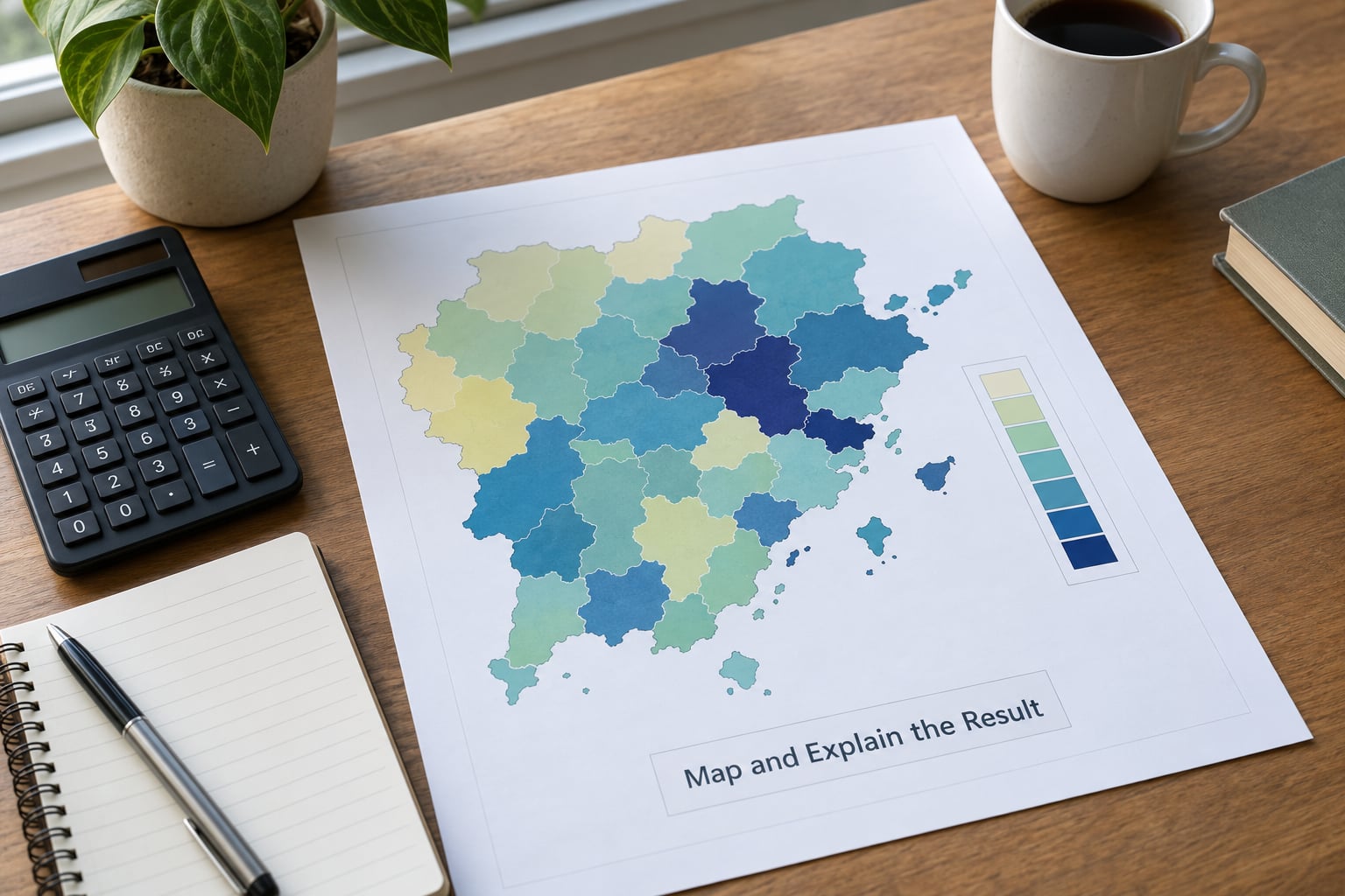
In QGIS the whole calculation fits in one field calculator expression, which is useful when you do not want to leave the map project:
"events" / NULLIF("population", 0) * 100000State the geographic unit, the numerator and its year, the denominator dataset and its vintage, the multiplier, the suppression threshold, and the count of suppressed areas. Six lines of source note, and readers stop guessing what they are looking at.
Common Mistakes
Raw counts shading a choropleth is the most consequential error, because large populations dominate the darkest class automatically. Fix it by publishing the rate map, and if you keep the count map for scale, pair the two side by side so the rank reversal is visible.
- Mismatched years. A numerator from 2026 divided by a denominator from four years earlier quietly biases fast-growing areas. Match the vintage, or state the gap in the note.
- Boundaries that moved. Tracts and districts get redrawn. When boundaries changed, use the geography that existed in the denominator’s reference year, or avoid the comparison.
- The wrong denominator. Total population is not the same as adults, or households, or the group at risk. A rate whose denominator does not match the numerator’s population is meaningless even when the arithmetic is right.
- Double normalization. Dividing a percentage by population, or a rate by an already-normalized denominator. One division, once.
- Class breaks that lie. Equal-interval classes on a skewed rate distribution push almost every place into the lowest band. Use natural breaks or quantiles, and check the class counts before you style.
- Undisclosed uncertainty. Shading a survey estimate without its margin of error presents a guess as a fact. At minimum, flag or mask high-CV areas.
- Ignoring MAUP. The modifiable areal unit problem means your numbers change when you redraw the zones, not just when the data changes. Openshaw and Taylor showed zoning choices alone can flip an apparent correlation from strongly negative to strongly positive, so test a second unit and say how sensitive the result is.
- Reading a rate as individual risk. A county-level rate describes a county. It says nothing about any person in it, which is the ecological fallacy and the easiest way for a map to be misread in the comments.
Frequently Asked Questions
Should I use a raw count map or a per capita map?
Use a raw count map when the question is about scale, where the absolute number of people affected matters, such as total people losing Medicaid coverage. Use a per capita map when the question is about relative prevalence, such as which counties have the highest rate. Raw count choropleths are close to population maps in disguise, because large populations shade darkest no matter what the underlying rate is. Publishing both together is usually the most honest option.
How do I deal with small population denominators and unstable rates?
Set a minimum denominator, for example 100 or 1,000 people, and suppress anything below it rather than publishing a rate built on 50 residents. For survey estimates, compute the coefficient of variation as margin of error divided by estimate, and treat anything above roughly 25 percent as unreliable. You can mask those areas in grey, overlay dots, or publish lower-bound and upper-bound maps so readers see the range.
What is the difference between a per capita rate and population density?
A per capita rate divides a count by people, so it answers how much per resident. Population density divides people by land area, so it answers how crowded a place is. Density is a property of the denominator itself and needs no numerator, which makes it useful for showing where people live. Rates normalize one variable against another; density describes the geography. Mixing them up is why some maps label a density surface as a rate.
What is the modifiable areal unit problem and how does it affect rates?
MAUP is the observation that results change when you redraw the zones or change the size of the zones, even when the underlying data never moves. Openshaw and Taylor showed that zoning choices alone can shift an apparent correlation from strongly negative to strongly positive. For a rate map this means your unit choice changes the pattern, so test a second geography and tell readers how sensitive the finding is.
What do I do when my geography has no official population estimate?
Aggregate a finer-grained population surface to your polygons using dasymetric weighting, which is areal interpolation: sum population from a grid or from parcel and building-footprint data inside each of your areas. Population is not evenly spread inside a polygon, so weighting by building footprints beats assuming a uniform distribution. WorldPop and GHSL grids work well for this. Falling back to raw counts is the worst option and hides the bias rather than fixing it.
Conclusion
Start by matching your counts to a population denominator on identical boundaries and the same year, then publish a clearly labelled per-capita rate rather than a raw total. Flag the places where the denominator is too small, name your suppression threshold, and put the denominator dataset and its vintage in the source note. That sequence takes most of the misleading out of a map before a reader ever looks at the colors.