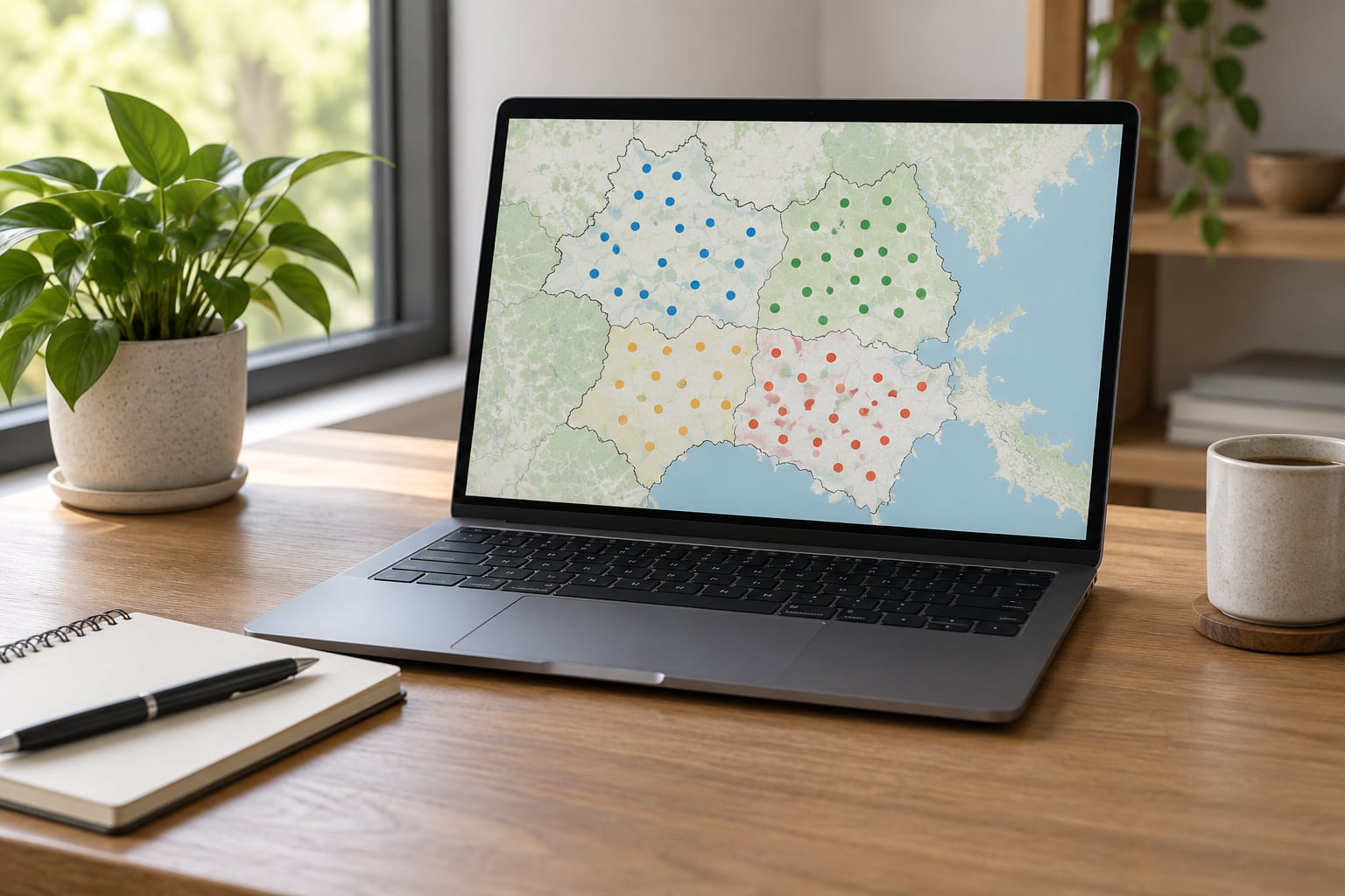
To make a dot density map, take a polygon layer with a numeric count field, pick a dot value such as one dot equals 100 people, then scatter that many identical dots at random inside each polygon. QGIS does it with a random-points tool plus count-based symbology; ArcGIS Pro has a built-in dot density renderer. The whole job takes about an hour once the data is clean.
A dot density map is one of the few map types that shows a total and its shape at the same time. Every dot is the same size, every dot carries the same value, and the dots sit inside the area they belong to, so a reader can see both that a district has a lot of something and roughly where inside the district it sits.
That last point is also where things go wrong. Most dot maps people complain about were made with a dot value that was far too small, or with a polygon layer in the wrong projection, or with the boundary line drawn so heavily that the map reads as a dark outline instead of dots. Those three fixes are most of the work.
What You Need to Start
You need four things, and only the first one is hard to get.
A polygon boundary layer with a numeric count attribute attached. Not a rate, not a percentage, not an already-calculated density figure — a raw count. If your source only gives you people per square mile, multiply it back by the polygon area before you start, because a dot map shows totals and a rate map shows intensity.
A mapping tool. QGIS and R are free, ArcGIS Pro and Tableau Desktop are paid, and D3 is free once you are comfortable writing JavaScript. The comparison below covers the ones that come up most often.
| Tool | Cost | Best for | Learning curve | Main limitation |
|---|---|---|---|---|
| QGIS | Free, open source | Desktop newsroom maps, print exports | Moderate | No native dot density renderer; you build it in two steps |
| ArcGIS Pro | Paid licence or subscription | Newsrooms that already use the Esri stack | Moderate to steep | Cost for smaller outlets |
| Tableau | Paid, with a free public tier | Fast interactive story maps | Low | Limited control over exact dot placement |
| R with sf | Free | Reproducible, scripted pipelines | Steep if you have never coded | You write the plotting logic yourself |
| D3 or Observable | Free | Interactive maps of hundreds of thousands of dots | Steep | Canvas slows down past roughly 10k points without WebGL |
You also need an equal-area projection for the project. Web Mercator, the default in a lot of web mapping, stretches area toward the poles, which silently distorts how many dots fit in a region. Equal-area projections such as EPSG:5070 in the contiguous United States or EPSG:6933 globally keep area honest.
Finally, decide the scale of the story before you touch the data. A national map and a city map cannot share a dot value, so knowing whether you are covering one metro area or the whole country saves you from tuning the same map twice.
Step-by-Step: How to Make a Dot Density Map
Define the question and decide what one dot means
Turn the reporting question into a mapping task before opening any software. “Where does the city’s heat risk fall?” becomes “one dot equals 50 residents inside each census tract, showing where people live,” which is a population map, not a risk map. The heat layer stays a separate story or a separate map.
Then choose the dot value. The widely used starting rule is to pick a value that leaves two or three dots in the smallest area you plan to map. If your least-populated tract has 900 people and your largest has 480,000, a dot value of 300 gives you three dots in the smallest tract and 1,600 in the largest, which is readable. A dot value of 10 would give 48,000 dots in one polygon and turn the map into a solid slab.
Write the dot value down before you start. You will need it in the legend, and picking it early stops you from unconsciously choosing a value that flatters your conclusion.
Prepare and clean the point data
For dot density mapping you are not plotting observations. You are plotting generated symbols, so your input is a polygon layer plus one numeric field. Clean it in this order: confirm the count field is an integer type, remove or zero out null counts, and delete duplicate geometry rows.
Check the extremes next. Open the attribute table, sort by the count field, and look at the top and bottom ten rows. A trailing zero in one cell, a value pasted as text, or a county whose units are thousands rather than units will wreck the dot value tuning and you will not notice until the map looks wrong.
Also verify the geography is complete. If your boundary file has holes, gaps or slivers from a bad join, dots will land in the gaps or leak through the slivers. Most of the odd-looking dot maps I have debugged turned out to be a topology problem in the source polygons rather than a settings problem in the renderer.
Choose the projection and map extent
Set the project projection to something equal-area before you generate anything. In QGIS, open Project > Properties > Coordinate Reference System, search for an equal-area projection for your region, and set it as the project CRS. Then run Processing > Toolbox > Vector research > Reproject on your polygon layer so it matches.
The same applies in ArcGIS Pro: set the map coordinate system to an equal-area system in Map > Properties > Coordinate System, and if the data is stored in a geographic system like WGS 84, run Project or Export Features to write out a projected copy rather than relying on on-the-fly reprojection.
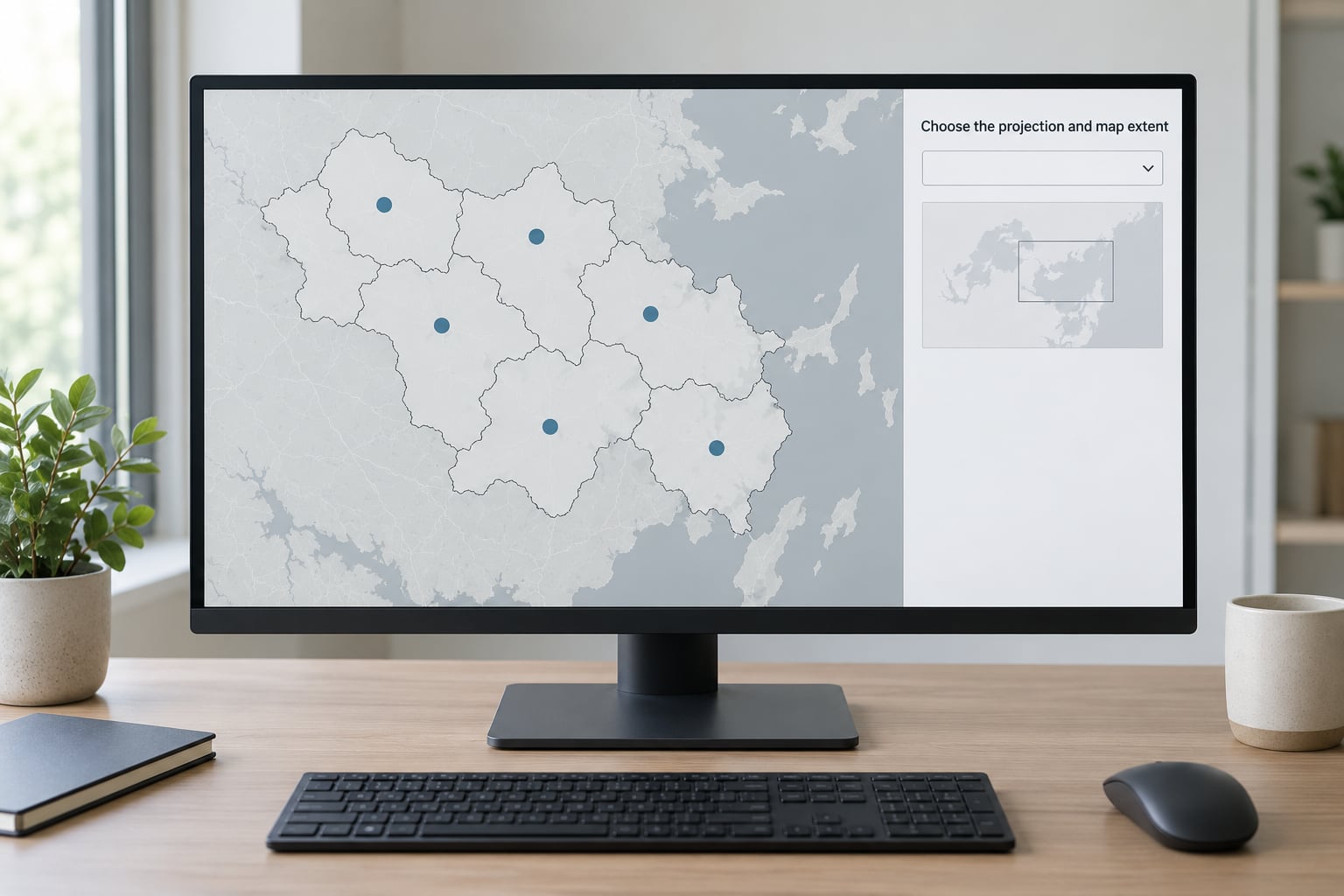
For web output, use equal-area for the dot layer and Mercator for the surrounding basemap, and watch what happens at the seam. Most newsroom maps cover a single country, where the difference is small enough to ignore. Cross an ocean or cover a continent and it is not, so keep the frame tight.
Set the extent so the story area fills roughly two thirds of the canvas. Leave room for a legend and a source line, and clip the map to the region you are actually reporting on rather than the full extent of the data file.
How to make a dot density map in QGIS, ArcGIS Pro, Tableau, R or D3
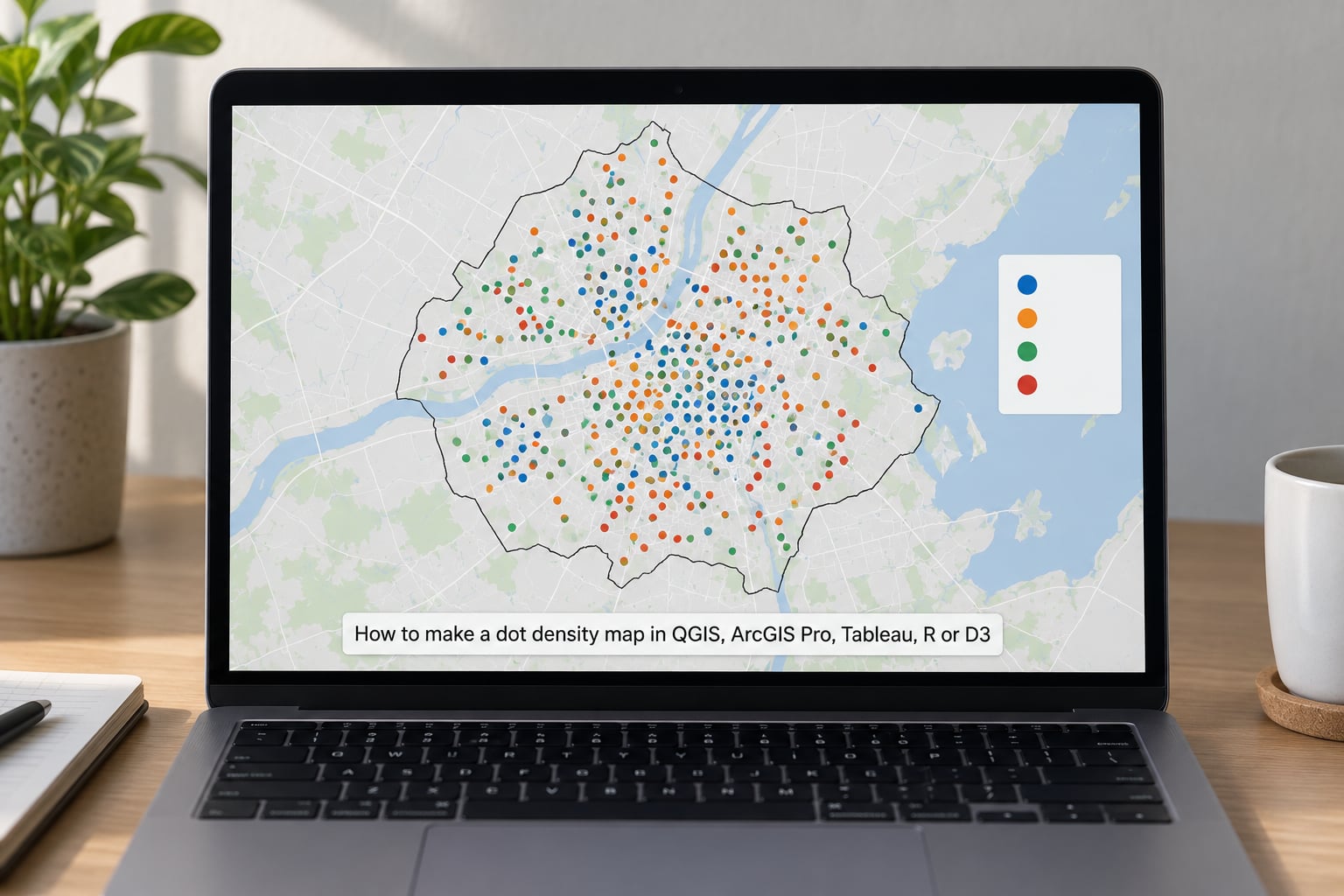
In QGIS: load the polygon layer, then open Processing > Toolbox and run Vector research > Random points. Set the input to your boundary layer, choose the point count from an attribute field, and select the field holding your counts. Tick the option to assign each output point the attributes of its source polygon, which is what lets you style and label later. Run it, and you now have a point layer where one point means one dot value.
Style that point layer: right-click it, choose Layer Properties > Symbology, and switch the renderer to Graduated with your count field as the column and a very small circle as the marker. Because every dot is already worth the same amount, style it as a single symbol and set the marker size manually instead of letting graduated classes change the size.
In ArcGIS Pro: right-click the polygon layer > Properties > Symbology > Dot density. Pick the count field from the Field selector box, type the dot value into Value, and use the dot template and Size controls to set the symbol. Set dot size in Points, not relative to the data, so the dots stay identical across zoom levels.
In Tableau: drag the polygon layer onto the view, then drag the count field to Marks. Change the mark type to Density, set Size to a small value, and switch the aggregation to Sum. Colour by a second field to get a two-colour dot map. Tableau places dots in a hex pattern rather than truly at random, which reads tidier and is worth knowing when you compare two exports.
In R: use sf and st_sample. Convert the layer with st_as_sf, then st_sample(x, size = st_drop_geometry(x) / dot_value, exact = FALSE, what = “centroids”) or sample uniform inside each polygon with st_sample(rep = 1). That gives you a point per dot, which you plot with geom_point and a fixed size.
In D3 or Observable: convert each polygon to a MultiPolygon, triangulate it, and draw a number of random points proportional to each triangle’s area. Sampling triangles by area instead of testing every candidate point against the polygon boundary is the same idea noted in a well-known Observable notebook on WebGL dot maps, and it is why those maps handle millions of points. On plain canvas, expect trouble past about 10k dots.
Add context, labels and annotations
Add only what a reader needs to decode the map. That means a legend that says in words what one dot is worth, a source line naming the dataset and its date, and labels on a handful of places rather than on every polygon. Use a fine outline on the boundary layer, usually around 0.2 to 0.4 points in grey, so the shapes read without competing with the dots.
Test readability and export the final map
Zoom the map to the size it will actually appear in the story. If the densest area merges into a solid block, raise the dot value and re-check the smallest area still has two or three dots. Export from QGIS with Project > Layouts > Add Layout, setting the image size to the slot in the page, or at least 1600 pixels wide for a full-width story block.
For print, export PDF or SVG rather than PNG so the dots stay sharp. For interactive, export GeoJSON or TopoJSON and keep the legend as HTML text so it scales with the page.
Common Mistakes and How to Fix Them
1. Dots appear outside the polygon. Almost always a projection mismatch between the boundary layer and whatever you generated the points in. Reproject both layers to the same equal-area CRS and regenerate.
2. The map is an unreadable black mass. The dot value is too small for the scale. Double it and look again. As a rough guide for a city-scale map, aim for a few hundred to a couple of thousand dots across the whole frame; for a national map, tens of thousands.
3. Treating raw observation points as density. If your data is a list of individual events rather than aggregated totals, a dot map of that data is a point map, which answers a different question. Use a graduated symbol map or a kernel density estimate instead.
4. Using the wrong projection. Web Mercator is the usual culprit. Equal-area projections keep a dot meaning the same thing everywhere on the map.
5. Dots landing on water or industrial land. Random placement ignores land use, so population dots settle in the middle of a lake. Mask the point layer to a land-use or habitable-area layer with a clip or difference tool before styling.
6. Legend never says what a dot is worth. This is the most common complaint about published dot maps. Write “1 dot = 100 residents” in the legend itself, not only in the body copy, and state the data year and source.
7. Counts mapped where rates were needed. A populous rural county will dominate a count map no matter how sparse it looks per person. If the story is about intensity, use a choropleth of the rate and say so.
8. Two exports of the same data look different. Random placement means each run produces different dot positions. Both are correct. Fix a random seed if you need a reproducible export, and never describe an individual dot as a real person.
Frequently Asked Questions
What is an example of a dot density map?
A population dot map is the standard example: census tract population counts become identical dots, one dot equalling 100 people, scattered inside each tract. Other common ones use election results by district, broadband connections by exchange area, traffic crashes by beat, or livestock counts by farm parish. In each case the pattern shows both the total and roughly where it sits inside the area.
What are the downsides of using a dot density map?
Three main problems. Dots are randomly placed, so the map implies a precision it does not have and two runs produce different patterns. The dot value is a design choice that can make a map look sparse or saturated. And the result inherits the modifiable areal unit problem, since the pattern changes when you swap in different or larger boundary units.
How to create a dotted map?
Open a polygon layer with a numeric count field, set the project to an equal-area projection, then generate one point per dot. In QGIS run Processing Toolbox Vector research Random points using the count field, then style the result with a small fixed marker. In ArcGIS Pro use Layer Properties Symbology Dot density and type your dot value into the Value box. Style the outline lightly and label the dot value in the legend.
How to make a dot density map in ArcGIS Pro?
Right-click the polygon layer and choose Properties, then open the Symbology pane and pick Dot density from the renderer list. Choose your count field, enter the value each dot represents, then use the dot template and Size fields to set the symbol, keeping all dots identical. Add a legend that states the dot value in words, and check the map at story size before exporting.
When should I use a dot density map instead of a choropleth?
Use a dot map when you want readers to see the distribution of a total inside each area, especially when areas vary a lot in size. Use a choropleth when the question is about intensity, since shading can show a low-density but sparsely populated area clearly. If your reader needs one number per area to compare quickly, the choropleth is the easier read.
Why are my dot density dots appearing outside the polygon?
The usual cause is a projection mismatch between the polygon layer and the point layer, so the points land in the wrong coordinate space. Reproject both layers to the same equal-area CRS and regenerate the points. A small number of escapees can also come from topology errors, where slivers and gaps in the source boundary leave space for points to slip through.
Conclusion
Start by opening your polygon layer and looking at the smallest and largest count values. That tells you the range of possible dot values before you open a single renderer, and it is the only step that cannot be skipped.
Then set an equal-area projection, pick a dot value that leaves two or three dots in the smallest area, generate one point per dot and style every point identically. Check that no dots fall outside their polygon, that the densest area has not turned into a solid block, and that the legend states what one dot means. If those three checks pass, the map is ready for the story.