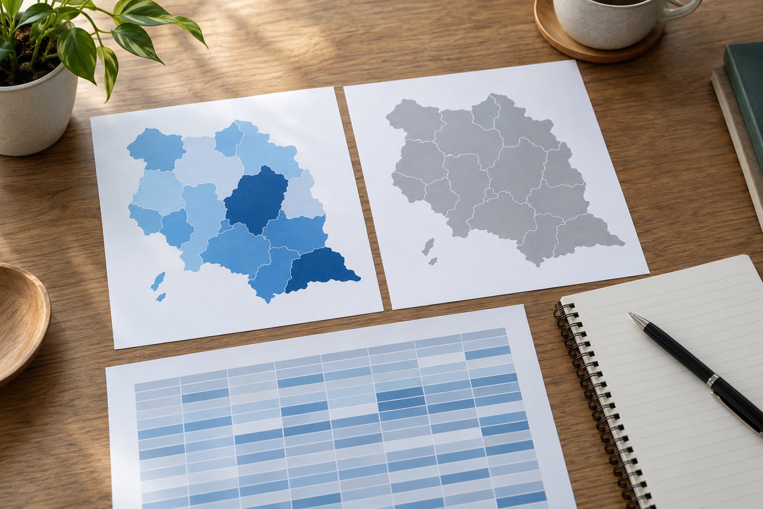
A choropleth map is the right choice when you are comparing one continuous value across defined geographic regions and the reader’s real question is about place. It works by shading each region with a color drawn from a light-to-dark ramp, so clusters, hot spots, and directional patterns show up in a single glance that no table or bar chart can match.
The catch is that a choropleth quietly lies when you feed it raw totals. Shading regions by count almost guarantees that the biggest region wins, and readers will read that as meaning something it does not. Get the measure right first, then worry about color.
Table of Contents
- What You Need
- Step-by-Step
- Choropleth vs Other Map Types
- Common Mistakes
- A Few Small Questions Worth Settling Early
- Frequently Asked Questions
- When should I not use a choropleth map?
- How many color classes should a choropleth map have?
- How do you handle missing data in a choropleth map?
- How do you compare rates fairly across regions of different sizes?
- What is the difference between a cartogram and a choropleth map?
- What are the downsides of using a dot density map?
- Conclusion
What You Need
You need five things before you open a mapping tool, and one of them decides the whole project.
- The data table. One row per region, with a shared location key such as a county FIPS code, state postal abbreviation, or ZIP code. If your rows are people rather than places, you do not have a choropleth dataset yet.
- A matching boundary layer. The same geography, from the same vintage. Precinct boundaries drawn for one election joined to precinct results from the next produce a map full of quietly wrong regions.
- A normalized metric. A rate, ratio, percentage, or per-capita figure. Counts and totals are the one input that reliably breaks the format.
- The audience question, in one sentence. Not “show the data” but “which districts have double the statewide rate” or “where did the decline happen.”
- An editorial check and a tool. Somebody who will read the map and say whether it matches the data, plus whatever you actually build in: a spreadsheet’s conditional formatting, a Python or R library, or a hosted mapping platform.
Two definitions worth keeping straight as you go. A thematic map is any map whose main job is to show a pattern rather than location, and a choropleth is one type of thematic map. A cartogram is a different type: it resizes every region by the value itself, so area encodes the number instead of the fill. That is a genuinely different chart, not a variant, and it comes up often enough that it deserves its own answer below.
Step-by-Step
Six steps, in order. Skipping the first two is the most common way a published map ends up being corrected by a reader.
Start with the reader’s geographic question
Start with the question, and only accept the map if the question is genuinely about where. Ask three things: is the data tied to a boundary, is the reader comparing places rather than times, and would a reader who saw the spatial pattern learn something they could not get from a sorted table?
If the answer to any of those is no, the map is the wrong tool. A story about how a rate moved over ten years wants a line chart. A story about which of four categories each district falls into may only need a categorical map with three or four flat colors. A story about where individual incidents happened wants points, not filled polygons.
Reject the choropleth when the comparison is temporal, categorical, or point-based. That is the whole test, and it takes about a minute.
Check that the geographic comparison is fair
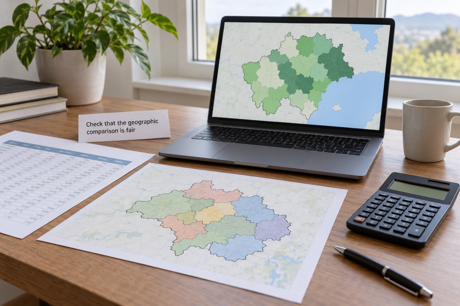
Fairness problems come from five places, and you should check all five before styling a single color.
- Unit of analysis. Counties in the Mountain West can be larger than some states in the Northeast. Area is doing visual work in every choropleth, whether you meant it or not.
- Denominator. Use a rate per 1,000 people, per 100,000 residents, or per capita rather than a total. Say the unit in the legend title every time.
- Missing regions. A district with no reporting is not the same as a district with a value of zero. Give it a neutral gray and label it, or readers will read absence as a finding.
- Boundary changes. Redistricting, annexations, and consolidations mean a “same region” comparison across years may not be one. Note the vintage or drop the time comparison.
- Data quality. Survey-based measures with wide confidence intervals and administrative counts with none will look equally confident on the map. That is a false equivalence you created.
The fastest honest test is to publish the uncorrected version next to the corrected one. Analysts working in this space say the normalized map usually looks nothing like the raw one, and seeing both makes the reasoning defensible in a way no caption can.
Choose a choropleth classification method
Classification is how you decide which values share a color, and the method changes what the map claims. Sequential suits a single-direction measure; diverging only earns its place when there is a meaningful midpoint, such as the national average or a change of zero.
| Method | How it bins | Use it when | Watch out for |
|---|---|---|---|
| Unclassified | No classes, a continuous ramp | Exploring your own data before deciding anything | Almost unreadable for a general audience; keep it off the published page |
| Quantiles | Each class holds the same number of regions | You want readable contrast across a skewed distribution | Makes a mild spread look dramatic; the lightest and darkest classes can be near-identical values |
| Equal interval | Classes are equal slices of the value range | Values are roughly evenly distributed | Leaves most regions in one or two middle classes when a single outlier stretches the range |
| Natural breaks (Jenks) | Classes minimize variation within each group | You want the color boundaries to follow real clusters in the data | Breaks are fitted to your data and are hard to explain to a reader comparing two years |
| Standard deviation | Classes sit a set distance from the mean | You want to describe how unusual a region is against the distribution | Harder for a general audience to parse than round numbers |
One outlier can flatten everything else. A national map where one small territory holds a wildly different value stretches the ramp so the other regions collapse into two nearly identical shades, and the real pattern disappears. Either winsorize the extreme value, classify the remainder and show the outlier as a marked exception, or state the value in the annotation.
Design colors that make the pattern legible

Use one light-to-dark sequential palette for a single-direction measure, and keep between three and seven color classes. More than seven and readers stop distinguishing shades; fewer and you throw away detail you had.
Skip rainbow scales. A rainbow ramp introduces color order that has no relationship to the values, so two regions a step apart in data can look more different than regions at the extremes. Reserve a distinct accent color for a region that matters to the story, never as decoration, and make sure the ramp stays readable for colorblind readers by varying lightness rather than only hue.
Give no-data regions their own neutral gray, distinctly outside the ramp. Drop the white strokes between regions if the borders are noise, keep them if the borders carry meaning.
Add context, labels, and interaction
A published map needs a headline that states the finding, a legend titled with the measure and its unit, and a source note that names the dataset and the date range. Those three lines do more for comprehension than any amount of styling.
Label the regions that carry the story directly, or readers should be hunting through a legend. Then solve the exact-value problem, because nobody can read a number off a color ramp. Tooltips on hover work on desktop; on mobile and in static contexts, add a short annotation naming the top and bottom values, or pair the map with a small sorted table of the figures behind it.
One recovery trick worth borrowing: overlay proportional circles for the underlying counts on top of the rate shading. The rate answers “where is this worst” and the circles answer “how much is actually happening there,” which is the pairing readers tend to remember.
Test whether readers understand the map
Test comprehension, not aesthetics, and do it with someone who did not build the map. Five questions cover most of it: name the region with the highest value, say what the color represents, state the time period, point to where the source is named, and say whether the map shows rates or totals.
If your colleague gets any of those wrong, the fix is in the design, not the reader. Recurring failures point to specific causes: a legend with no units, a title that names the topic instead of the finding, or a ramp with too many classes.
Choropleth vs Other Map Types
Knowing when to use a choropleth map mostly means knowing what the other options are for. Five formats cover almost everything a newsroom publishes, and they fail in opposite directions.
| Map type | Data it expects | Boundary dependent | Use it for | Watch out for |
|---|---|---|---|---|
| Choropleth | Normalized rate or ratio per region | Yes | Regional comparison, hot spot detection, coverage gaps | Size bias and loss of local detail |
| Proportional symbol | Raw totals or counts | No | Magnitude of volume, and pairing counts with a rate base | Circles overlap in dense areas and cover small regions |
| Dot density | Counts within an area | Yes, as the frame | Counts that are spread rather than recorded at an address | Readers must estimate by eye, and rates get lost |
| Heat map | Continuous density surface from points | No | Where events cluster when no clean boundary applies | Depends on bandwidth, and the edges are arbitrary |
| Isopleth or isoline | Measured values at scattered stations | No | Continuous surfaces like rainfall, temperature, or elevation | Implies smooth variation the samples never measured |
| Cartogram | Any value, resized to match | Loosely | Neutralizing land area when small regions have extreme values | Distorted shapes are harder to read and to name |
Two newsroom examples show the split clearly. Mapping total restaurant locations by county tells you almost nothing except where people live, so a food-desert story needs restaurants per 1,000 residents and then a choropleth. The same story might then overlay the raw counts as circles so the reader sees that the worst-served county also has the fewest places in absolute terms, which is a different and more urgent claim.
Public health reporting follows the same logic with county-level rates for disease, vaccination, or air quality. There, the choropleth earns its place because the pattern itself, contiguous clusters of high burden along a river or a border, is the finding. An election story is harder: a winner-take-all shading hides the margin, so proportional symbols sized by margin often tell the truth better than any color scheme.
Common Mistakes
These seven misread triggers account for most of the bad choropleths in circulation, and each has a straightforward correction.
| Mistake | What the reader takes away | Correction |
|---|---|---|
| Mapping raw totals | The biggest region is the worst-performing region | Divide by a population or area denominator and label the unit |
| Very unequal region sizes | Large regions dominate attention regardless of value | Switch to a proportional symbol map, or a cartogram if the size effect is the story |
| Too many color classes | Every shade looks meaningfully different | Cut to three to seven classes, or use quantile bins |
| Missing data folded into zero | Silent districts are the safest districts | Use a separate no-data gray and name it in the legend |
| Unlabeled or unit-less legend | The reader cannot tell what the color measures | Title the legend with the measure and the unit, always |
| Interactivity with no static fallback | Mobile and social readers see an empty frame | Make the key values visible without a hover, in annotation or a companion table |
| No source or date range | The figure is unfalsifiable and gets ignored by editors | Print the dataset name and period in the graphic itself |
Two more come up constantly in critique threads. A winner-take-all election map hides the margin, so a district shaded a barely darker tone than its neighbor reads as a landslide; show the margin or use proportional symbols. And a single-year snapshot of population movement implies causation that the data cannot support, so either add more than one period or say plainly that it is a snapshot.
On accessibility, treat color as one channel of several rather than the only one. Direct labels, distinct lightness steps, and a written alt text describing the pattern all cost little. A useful alt text names the measure, the region, the extremes, and the time period rather than saying “map of regional data.”
A Few Small Questions Worth Settling Early
Three cases sit outside the clean rules, and knowing them in advance saves an argument later.
Can I map a discrete value, like the legal driving age by state? Sometimes. If there are only two or three distinct values, a categorical map with a small number of flat colors is more honest than a sequential ramp, which implies a continuum that does not exist. Once you have eight or nine ages, you are back to a ranked list and a bar chart reads better.
What if my regions are all similar in size? Then raw counts are less misleading than usual, because area is no longer doing hidden work. Even so, publish the rate version when you can, since the day the regions get merged is the day the comparison breaks. If your regions genuinely are near-identical, say so in the annotation so the reader can judge.
How do I keep the map honest after aggregation? Expect a single shade to hide a badly underserved pocket inside an otherwise strong county. Three options help: overlay the underlying points, add an inset map zooming into the extreme region, or publish the underlying table so readers can drill past the aggregate. Aggregation is unavoidable, but hiding it is a choice.
Frequently Asked Questions
When should I not use a choropleth map?
Skip it when the data is raw counts, when the comparison is over time, when readers need exact values, or when the pattern is better read as points or categories. A bar chart ranks better, a line chart shows change better, and a proportional symbol map handles totals better. The format earns its place only when a normalized value varies across real boundaries and the spatial pattern is the point of the story.
How many color classes should a choropleth map have?
Three to seven. Fewer than three throws away detail you already computed, and more than seven makes shades that readers cannot reliably tell apart. Start at five, which is usually enough to show clustering without noise, and only add a class when the data has a real gap at that point rather than for visual variety.
How do you handle missing data in a choropleth map?
Give missing regions their own neutral gray that sits outside the sequential ramp, and say what it means in the legend, because no data and zero look identical otherwise. If a large share of regions are missing, the map is probably not publishable yet, and you should note the coverage limit in the annotation rather than quietly dropping those regions.
How do you compare rates fairly across regions of different sizes?
Normalize every value against a denominator, such as a rate per 1,000 people or per 100,000 residents, and use the same denominator everywhere. Check that small regions do not have rates so unstable that a handful of cases swings them, and flag them. Raw counts on a choropleth simply rank regions by population, which is what the map will show whether you intend it or not.
What is the difference between a cartogram and a choropleth map?
A choropleth keeps real geographic area and encodes the value with fill color, so large regions look large. A cartogram rescales each region so its area is proportional to the value, which removes the size bias but makes the map a harder shape to read. Use a cartogram when land area would distort the comparison, such as a small state with a very high rate.
What are the downsides of using a dot density map?
Dots are counts, not rates, so a dense small district and a dense large district can look equally extreme unless you scale the denominator into the dot value. Readers also have to count or estimate dots, which is slow and imprecise, and the result breaks down when values are high enough that dots merge. For rates, a choropleth is usually the more honest read.
Conclusion
The decision rule is short: use a choropleth map when the story compares a normalized value across meaningful geographic regions and the pattern of where is the interesting part. If the data is totals, or the story is really about time, or readers need a specific number, choose a different chart instead of working around the problem.
When the map is right, start by validating the measure and its denominator, then pick a classification you can explain, label the scale with its units, and test comprehension with one person who did not build it. That last step catches more problems than any amount of color tweaking, and it is still the one most teams skip. As of 2026, the tools are not the bottleneck; the decision to map at all is.