
If you want to know how to use Datawrapper for news charts, the short version is this: you paste or link a spreadsheet of data, choose a chart format that matches the story, style it, add a source and a one-line takeaway, then publish to get an embed code you drop into your story. A basic bar chart takes about 15 minutes from spreadsheet to a live embed, and you do not need to write a line of code.
I build these for a small newsroom, so this guide walks the whole path rather than stopping at the upload screen. The parts that trip people up are rarely the design, they are the data check and what happens after you publish.
The interface described here is the current Datawrapper editor, the one with the Create menu, team workspaces, the Visualize and Data Table tabs, and the publish step that generates an embed code. Older tutorials you find online still show login screens and buttons that no longer exist.
What You Need
Five things, and only one of them is software.
- A Datawrapper account. Sign up with an email address. Newsrooms usually set up a team workspace so charts live in a shared place instead of one person’s account.
- One clean dataset. A CSV or spreadsheet with a header row, one row per observation, no merged cells, and no blank rows in the middle.
- The source details. Dataset name, publishing organisation, the date you pulled the numbers, and any link you are allowed to share. You cannot invent these at 9pm on deadline.
- A stated takeaway. One sentence, the thing you want a reader to remember after five seconds. Everything else in the chart is support for that sentence.
- Somewhere to embed. A CMS, a newsletter tool, or a social card. Somebody has to paste the final code, so find out who before you start.
One newsroom rule I would keep: decide the takeaway before you open the editor. Charts built without a stated point end up as five metrics competing for attention.
Step-by-Step: How to Use Datawrapper for News Charts
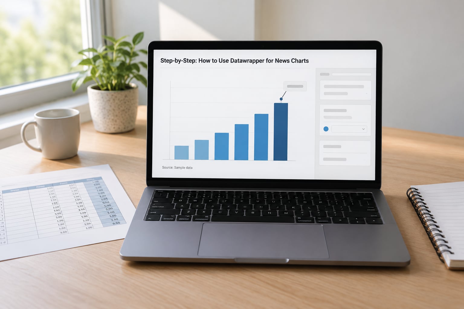
1. Prepare and check the data
Clean data is the step that decides whether the chart is defensible. Put your series in columns, one column per thing you want to compare, one row per observation, and a header row that uses plain names your colleagues will understand six months from now.
Then check four things before uploading: units are stated in the header (say rate per 100,000 rather than a bare number), missing values are blank cells rather than zeros or dashes, categories use one spelling throughout, and the rows are sorted in the order you intend to display. A category called North in row 4 and northern region in row 40 will split your series in two.
For numbers, use plain digits. Leave out currency symbols, thousands separators and unit suffixes inside the cells, and move that information into the header or the axis where readers will actually see it.
2. Choose the chart type that matches the story
Pick the format that fits the comparison, not the one that looks impressive. If readers need a precise figure for a single category, use a table; if they need to see which place or category leads, use bars; if the point is movement over time, use a line.
| Chart type | Best for | Typical newsroom use | Do not use it when |
|---|---|---|---|
| Bar chart | Comparing categories | Department budgets, seat shares, top ten lists | You have more than about 25 categories |
| Line chart | Change over time | Unemployment, cases, rainfall, budget over time | Your x-axis has uneven or irregular dates |
| Area chart | A stacked total over time | Spending split by department across years | You only have one series |
| Table | Precise lookup | Full results list, ward-by-ward figures | You want a visual pattern to show |
| Choropleth map | Geographic patterns with a filled region | Unemployment by county, results by constituency | The reader only cares about a handful of places |
| Symbol map | Magnitude at specific points | Station locations sized by volume | Region boundaries matter more than points |
| Locator map | Showing where something is | A facility, a route, a single incident | You have numeric data to compare |
A general rule that holds up: comparison means bars, time means lines, geography means a map, exact lookup means a table.
3. Upload or paste the dataset
From the Datawrapper home screen choose Create, pick a chart type, and you land in the editor with the Data Table tab open. You have three ways to get the numbers in.
Paste works if you copied a clean rectangular block from Excel, Numbers or Google Sheets. Copy from a spreadsheet, not from a webpage, and paste into the table area. Upload a CSV if your file is on disk. Link a live source if the data changes on a schedule, using a published Google Sheet or a Socrata dataset.
The column headers you typed become the labels on your chart, so check the Visualize tab immediately after the import. If a column came through empty, the problem is almost always a stray blank line or a merged cell in the original file.
4. Design the chart for a newsroom audience
Start with the descriptive title and subtitle. The title states what is measured, the subtitle states the takeaway in plain language, and together they tell the story even if the reader never touches the chart.
Then set the axes honestly. Keep the value axis starting at zero for bar charts so the lengths stay comparable, label the units on the axis rather than repeating them on every bar, and thin the gridlines so they guide the eye without competing with the data.
For color, use one of the built-in palettes and check the colorblind-safe option in the chart settings. Never encode a value with color alone, pair it with labels or position. Keep fonts at the defaults unless you have a reason, and preview at mobile width, because a chart that reads fine on a 27-inch monitor often turns into unreadable six-pixel text on a phone.
5. Add context, annotations, and sources
This is where a Datawrapper chart stops being a screenshot of a spreadsheet. Annotations let you point at the specific bar or point that carries the story, so you can write first fall since 2019 on the month that matters rather than leaving the reader to hunt.
Highlight one series or one bar in a stronger colour when the news is about that specific item, and keep everything else muted. Use the tooltips for detail that only some readers need, so the default view stays readable.
Then fill in the source fields in the chart footer: the data source, the date, and a link. A chart with no source line should not go live, and if your data is a newsroom calculation from public figures, say so explicitly, for example Source: newsroom analysis of public returns data. Readers do check this, and a wrong number with a visible source is fixable in a way an unattributed one is not.
6. Check accessibility and mobile readability
Run four checks before you publish, in this order.
- Contrast. Squint at the chart. If the lightest data colour disappears against the background, change the palette.
- Text alternatives. Write alt text or a chart description that states the finding in a sentence, for example Bar chart showing unemployment highest in the north-east districts, at twice the national average.
- Keyboard and focus. Open the published chart and tab through it. Interactive tooltips that trap focus or hide data behind hover only are a problem for anyone using a keyboard.
- Mobile. Load the chart on a real phone, not just a narrow browser window. Check the title is not truncated, labels do not collide, and the chart scrolls rather than squashing.
Colourblind readers are roughly one in twelve men, so this is not an edge case. A palette that fails them usually fails anyone printing the story in greyscale too.
7. Preview, export, and embed the chart
Hit Publish when the chart is ready. Datawrapper renders it and gives you a shareable public link plus an embed code block, which is an iframe snippet you paste into your story. That is the whole publishing step: no plugin, no developer, and the chart updates itself when the data changes if you linked a live source.
Three things to know about what happens next. First, if you edit a published chart you must republish and then replace the embed code in your story, otherwise readers keep seeing the old version. Second, your public link is useful for social posts and newsletters, where iframes get stripped, so send readers to the chart page rather than hoping it embeds. Third, keep PNG or SVG exports for slide decks and social cards, since a static export cannot update itself.
Common Mistakes
Almost every newsroom chart problem I have seen comes down to one of these.
- Text used as a number. A column mixing 1,200 and n/a breaks sorting and often renders as zero. Leave missing values empty and label them in the notes.
- Inconsistent category names. Capitalisation and spelling variants split one series into two. Standardise the column before upload, every time.
- Map regions not matching. Datawrapper cannot match a region name it does not recognise, and the affected areas fall back to a default shade. Use the official names from the map’s own region list and check the count of matched regions before you publish.
- Huge-country choropleths. Colour matching across a whole continent tells you almost nothing. Use smaller regions, or switch to a symbol map with a size legend.
- Truncated value axis on a bar chart. Bars that do not start at zero exaggerate differences. Start at zero, or switch to a dot plot where a non-zero baseline is legitimate.
- Publishing to the wrong workspace. In a team account, your primary team decides where the chart lives and who can see it. Check the active team before you start, or a half-finished chart lands in front of the whole newsroom.
- Forgetting to republish after an edit. A corrected chart keeps showing old numbers in your story until you paste the new embed code. This is the mistake editors complain about most.
- No source line. The easiest fix in this list and the one most often skipped. Fill it in before you publish, not after someone asks.
A few habits keep charts sharp over time. Give recurring graphics a name that includes the cadence, so the March and April versions are easy to find. Duplicate the previous chart as a starting point rather than rebuilding the styling. And keep a copy of the source data with the story files, because a chart without its dataset becomes an argument you cannot win.
Frequently Asked Questions
Is Datawrapper free for journalists?
Yes for basic use. The free plan covers creating, publishing and embedding charts, maps and tables, which is enough for a single reporter or a small team producing a handful of graphics. The paid plans lift the limits on the number of visualizations, add team and workspace features, custom branding and logo removal, and priority support. Datawrapper publishes current plan details and pricing on its own site, since the limits change over time.
Can I use Datawrapper charts in a news article?
You publish the chart in Datawrapper and paste the embed code it generates into your story. The embed is a standard iframe snippet, so it works in most publishing systems and newsletter tools. A few platforms strip iframes, including some hosted newsletter editors, so keep the public chart link handy as a fallback. Send that link to social accounts, where embedded iframes never render.
How do I add a source to a Datawrapper chart?
Use the source fields in the chart settings, in the annotation or description area of the editor. Give the dataset name, the publishing organisation, the date you pulled the figures and a link. If the numbers are your own calculation from public records, say so plainly in the source line. The source appears at the bottom of the published chart and travels with every embed and export.
Which Datawrapper chart should I use for a time series?
Use a line chart when the point is how a value moved over time, and an area chart when you have several series that add up to a total. Make sure your date column is recognised as a date, with consistent spacing between points, because irregular dates distort the slope. For a small number of exact figures, a table is often clearer than a line.
Does Datawrapper work with Google Sheets and Excel files?
Yes. You can paste a block copied from Excel, Numbers or Google Sheets straight into the data table, or upload a CSV. You can also link a published Google Sheet or Socrata dataset so the chart pulls fresh numbers on republish, which is how newsrooms keep recurring graphics current without rebuilding them. Keep the source file tidy, because Datawrapper reads it exactly as it is.
How do I make a Datawrapper chart accessible?
Pick a colorblind-safe palette, never encode a value with color alone, and pair colors with labels or position. Write alt text or a chart description that states the main finding in a sentence rather than describing the picture. Then check contrast, tab through the published chart to test keyboard focus, and load it on a phone to confirm labels do not collide.
Conclusion
Start with one clean dataset and one sentence you want the reader to leave with. Pick the chart format that matches that sentence, fill in the source line before you publish, and check the result on a phone. Those four things take longer to explain than to do, and they are the difference between a chart that carries a story and one readers scroll past.