To make charts in R for publication, you build the figure with ggplot2 and export it to the venue’s technical spec: vector PDF, EPS or SVG at 85 mm or 180 mm width, or raster at 300 to 600 dpi, with legible type, a color-blind safe palette, and a source note under the figure.
Most charts get rejected or sent back for rework because of the export, not the analysis. Someone saved a screen-resolution PNG of the wrong size, the type shrank to five points when the figure was scaled to column width, and the legend ran off the canvas.
This guide walks the whole job: install the tools, inspect the data, pick a chart that answers the reporting question, build it, label it properly, design it for accessibility, then export it reproducibly. If you already know ggplot2, budget about an hour. Starting from a fresh install, plan an afternoon.
Table of Contents
- What You Need
- Step-by-Step: How to Make Charts in R for Publication
- 1. Install R and Set Up a Reproducible Project
- 2. Import and Inspect the Data
- 3. Choose a Chart That Matches the News Question
- 4. How to Make Charts in R for Publication with ggplot2
- 5. Add Publication-Quality Labels and Context
- 6. Design for Color, Contrast, and Accessibility
- 7. Export the Final Chart in the Right Format
- Common Mistakes
- Frequently Asked Questions
- Conclusion
What You Need
R itself, RStudio, and a handful of packages cover the whole workflow. None of this needs a server or a paid tool.
- R (4.x) from CRAN or your system package manager. The examples here run on R 4.2 or newer on Windows, macOS and Linux; nothing depends on a specific point release.
- RStudio Desktop, the free build. RStudio bundles tidyverse packages, but install them explicitly so the script runs on any editor.
- ggplot2 for the grammar, readr and dplyr for loading and shaping data, scales for axis formatting.
- svglite for SVG output and ragg for high-resolution raster output with better anti-aliasing than the base devices.
- patchwork or cowplot for multi-panel figures. Optional, unless you are assembling panels.
- ggsci for journal-style palettes. Optional, and useful if you are matching a specific publisher.
- renv to lock package versions, and Quarto if you want figures that regenerate from raw data every time a document builds. Both optional.
The install step is the same everywhere. Run this once per project:
install.packages(c("ggplot2", "readr", "dplyr", "scales", "svglite",
                   "ragg", "patchwork", "ggsci"))
Step-by-Step: How to Make Charts in R for Publication
1. Install R and Set Up a Reproducible Project
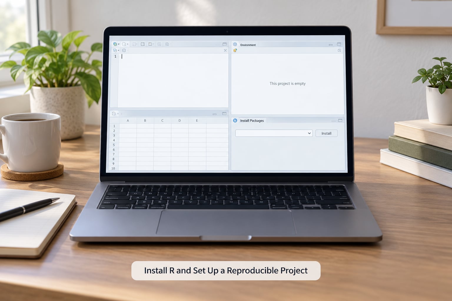
Create a new RStudio project in its own folder rather than working in the default global environment. That gives you a real directory for raw data, scripts and output, which is half the battle for reproducibility later.
Lock the package versions so the figure still builds in six months:
install.packages("renv")
renv::init()
renv::snapshot()
What tells you it worked: a renv.lock file appears in the project root, and reopening the project restores the same package set. Keep one script per figure. Name it something descriptive, like figure_unemployment_line.R, because you will have forty of these by the end of the year.
2. Import and Inspect the Data
Load the file, then look at it before you plot anything. Skipping this step is how you end up with a chart of column headers.
library(readr)
library(dplyr)

dat <- read_csv("data/city_budget.csv")

glimpse(dat)
summary(dat$year)
colSums(is.na(dat))
Check three things: column types parsed the way you expect, dates not turned into character strings, and no silent blanks. read_csv() reports a column spec guess, and you can override it when it guesses wrong, for example col_types = cols(date = col_date("%m/%d/%Y")).
Then filter to the window you can defend. If your story covers three years, do not plot six and mention the caveat in a caption nobody reads.
dat2 <- dat |>
  filter(year >= 2020, region != "Total") |>
  mutate(share = amount / total_amount)
What tells you it worked: glimpse() shows the column type you intended, and the row count matches what you expect from the source.
3. Choose a Chart That Matches the News Question
The chart form follows the question, not the data type. Line for change over time, bar for ranking a few categories, dot for a distribution where bars waste ink, and maps only when geography is genuinely the story.
- Line chart: a continuous measure tracked across time, ideally with regular intervals. Uneven time gaps need a date x-axis rather than a row index.
- Bar chart: comparing magnitudes across a handful of named categories, sorted by value rather than alphabetically.
- Dot plot: many categories where the reader compares position, not area. Easier to read than bars past about a dozen rows.
- Scatter plot: relationship between two numeric variables, with transparency when points overlap.
- Small multiples: the same measure across many groups. Facets with a fixed y-axis beat one chart with ten colors.
What tells you you chose right: you can state the finding in one sentence without referring to a color or a legend key.
4. How to Make Charts in R for Publication with ggplot2
Every ggplot is three pieces: data, an aesthetic mapping, and a geom layer that draws it. Start minimal and add only what earns its space.
library(ggplot2)

p <- ggplot(dat2, aes(x = year, y = share, colour = region)) +
  geom_line(linewidth = 0.6) +
  geom_point(size = 1.2) +
  scale_y_continuous(labels = scales::label_percent(accuracy = 1)) +
  labs(x = NULL, y = "Share of total spending") +
  theme_minimal(base_size = 11)

p
Notes on that code. scale_y_continuous() with label_percent() kills scientific notation and gets rid of the 1e-04 axis labels that make figures look machine-made. base_size sets every text element at once, so changing it changes the whole figure coherently.
Build in layers instead of one long expression. Assign p without printing it, then add + geom_hline(y = 0, colour = "grey40") on its own line. When a figure breaks, you can print each stage and find the layer that caused it.
Add uncertainty when you have it. geom_errorbar() or geom_linerange() takes the same data frame and a ymin and ymax column, so a point estimate never reads as a fact when it has spread.
5. Add Publication-Quality Labels and Context
A figure should be understandable with the caption cut off. That means the title says what happened, not what the data is, and the caption carries the who, where, when and how.
p <- p +
  labs(
    title = "Transit spending share fell in every region after 2022",
    subtitle = "Share of total city budget allocated to transit, 2019-2024",
    caption = "Source: municipal budget filings, retrieved September 2026. Values rounded to nearest 0.1%.",
    colour = NULL
  )
Color the series variable NULL to drop the axis title from the legend, because the subtitle already names the measure. Keep the caption under the figure and include the source, the retrieval date and any rounding you applied. Reviewers ask for provenance, and a missing source line generates email back and forth.
Direct labels beat legends when you have few series. Drop the legend, keep the lines, and add geom_text(aes(label = region), hjust = -0.1, show.legend = FALSE) at the last point of each line. Also expand the axis so the label does not sit on the plot edge.
6. Design for Color, Contrast, and Accessibility
About one in twelve men has some form of color vision deficiency, and plenty of figures get printed in grayscale on a photocopied press. Design for the worst case and both problems go away.
library(scales)

palette <- c("#0072B2", "#D55E00", "#009E73", "#CC79A7")

p <- p +
  scale_colour_manual(values = palette) +
  theme_minimal(base_size = 11) +
  theme(
    panel.grid.minor = element_blank(),
    legend.position = "bottom",
    plot.margin = margin(6, 20, 6, 6)
  )
That palette is the Okabe-Ito set: it stays distinguishable for the common forms of color blindness and holds up in grayscale. viridis is the safer default for continuous scales like a heatmap, since it is monotonic in lightness.
Never let color carry meaning alone. Add a second channel: line type, point shape, or a direct label. Check the result by converting the palette to grayscale mentally or with a color picker, or by running a contrast checker on your text and background. Aim for body text around 7 to 8 points at final printed size, and never below 6.
For a newsroom that also publishes to the web, write alt text for the figure as part of the same script. One sentence describing the trend, then the data and source.
7. Export the Final Chart in the Right Format
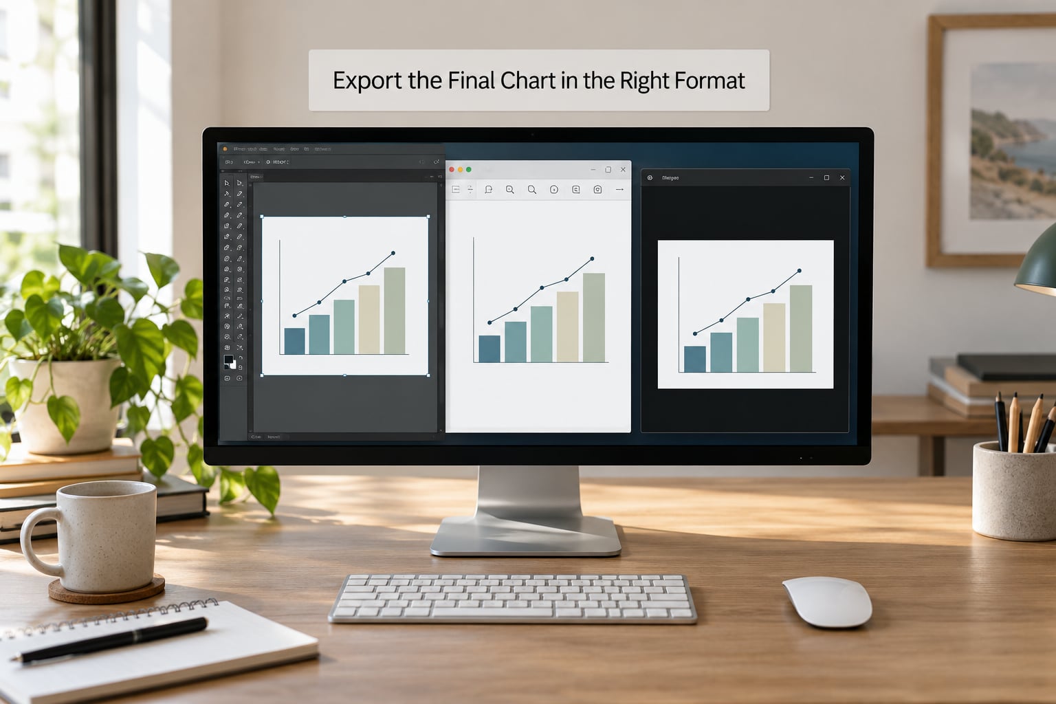
Export last, and export to the width the figure will occupy on the page. ggsave() takes width, height, units and dpi, plus a device, and those four arguments decide whether production accepts the file.
ggsave(
  filename = "output/figure_transit_share.pdf",
  plot     = p,
  device   = cairo_pdf,
  width    = 180, height = 95, units = "mm"
)

ggsave(
  filename = "output/figure_transit_share.png",
  plot     = p,
  device   = ragg::agg_png,
  width    = 180, height = 95, units = "mm",
  dpi      = 600, bg = "white"
)
Why those numbers. Standard journal and newspaper widths are 85 mm for a single column, 120 to 135 mm for a 1.5 column figure, and 180 mm for a double column or full page width. A 180 mm wide figure at 300 dpi is about 2126 pixels across; at 600 dpi it is 4252 pixels, which is what you want for photographs or dense heatmaps. Exporting at the true final width is the step most often skipped, and it is the step that decides whether the type is legible in print.
| Format | Best for | How to export it | Resolution |
|---|---|---|---|
| PDF (vector) | Line, bar, scatter and map figures | cairo_pdf | Not applicable, scales to any size |
| SVG (vector) | Web publishing and hand-off to Illustrator | svglite::svglite | Not applicable |
| EPS | Journals that still ask for it | Post-process a vector PDF, keep text as text | Not applicable |
| PNG | Web, newsletters, social, drafts | ragg::agg_png | 300 dpi at final size |
| TIFF | Photographs and continuous tone rasters | tiff device | 600 dpi, sometimes 1200 for line art overprint |
Vector is the default answer for charts made of lines, points and shapes: the text stays sharp at any zoom and editors can recolor it. Raster is the answer when the figure contains a photograph, a gradient or a fine-grained heatmap.
Two export details that cause trouble. Set bg = "white", because a transparent background turns black when production flattens the file. And if you convert text to paths with device = cairo_pdf plus pdf.options, keep the font available on your own machine, since a missing system font silently substitutes a different one and changes the line breaks.
For a multi-panel figure, build each plot separately, then combine and export the assembled object so every panel shares one width and font size:
library(patchwork)
combined <- p1 + p2 + plot_layout(ncol = 2, widths = c(1, 1))
ggsave("output/figure_two_panel.pdf", combined,
       device = cairo_pdf, width = 180, height = 100, units = "mm")
If the whole figure must regenerate from raw data, put the script in a Quarto or R Markdown document with cached chunks. The figure then updates whenever the underlying data changes, which is how you avoid version drift between the chart and the analysis. That end-to-end loop is the real answer to how to make charts in R for publication: the chart stops being a file somebody exports once and becomes a build step the desk repeats.
Common Mistakes
Every one of these has a two-line fix.
- Labels clipped or overlapping. Use
check_overlap = TRUEongeom_text(), orscale_x_discrete(expand = expansion(add = 0.5))to buy room at the edges. - Axis that starts somewhere other than zero for a bar chart. Bar length encodes magnitude, so a truncated baseline exaggerates differences. Set
expand_limits(y = 0). - Default gray background and gridlines. Start from
theme_minimal()ortheme_classic()and droppanel.grid.minor. - Low contrast or color-only encoding. Switch to a color-blind safe palette and add line type or point shape as a second channel.
- Legend covering the data or sitting off canvas. Use
legend.position = "bottom", or drop the legend and label the series directly. - Missing source note. Put it in
labs(caption = ...)so it exports inside the file and cannot be forgotten. - Blurry output. Export raster at 300 to 600 dpi with
ragg::agg_png, and remember that raising dpi without raising the pixel dimensions does nothing. - Type too small at final size. Judge sizes in millimetres, not screen pixels, and re-export at the true column width to check.
- Scientific notation on axes. Add
scales::label_comma(),label_percent()orlabel_dollar()to the scale. - Fonts changing in the exported file. Set
base_familyexplicitly and confirm the font is installed before exporting.
Two habits cover most of the rest. Read the author guidelines for your target venue before you draw anything, not after acceptance. And keep a pre-submission checklist next to your scripts: correct format, correct physical width, resolution stated, fonts legible at final size, palette passes a grayscale check, caption and source present.
Frequently Asked Questions
How do I create charts in R?
You create charts in R by passing data and an aesthetic mapping to ggplot(), then adding a geom layer to draw it. aes(x = year, y = value) says which columns drive the positions, and geom_line(), geom_point() or geom_col() decides how they appear. Layers combine with +, and theme() controls fonts, gridlines and margins. For a first figure, build it in two lines, print it, then add one setting at a time.
What does plot() in R do?
plot() is the base R graphics function, and it is still the quickest way to see data. It draws straight onto the current graphics device rather than building an object you can modify, which makes it fast for exploration and awkward for fine control. ggplot2 returns an object, adds layers incrementally, and keeps styling separate from data. For publication figures most people use ggplot2 and save base R for quick checks.
How can I visualize data in R?
Start from the question, not the dataset. Change over time calls for a line chart, comparison of a few categories for bars, distribution for a histogram, box plot or violin, relationship between two numeric variables for a scatter plot. In ggplot2 the fastest route is facets for small multiples. For large data, sample first with slice_sample(), and for interactive exploration RStudio’s Viewer pane gives you hover values without extra packages.
How do I save a high-resolution plot from R?
Use ggsave() with explicit width, height, units and dpi, and pick a raster device that anti-aliases well, such as ragg::agg_png. For a 180 mm double-column figure, 300 dpi gives roughly 2126 pixels across and 600 dpi roughly 4252. Set bg = white so the background is not transparent. For line and bar charts, prefer a vector device like cairo_pdf or svglite instead, since text stays sharp at any zoom.
What resolution and file format do journals require for figures?
Most journals want vector files, usually PDF or EPS, for line, bar and scatter charts, and TIFF at 300 to 600 dpi for photographs or continuous tone images. Draw the figure at its final physical width, commonly 85 mm single column or 180 mm double column, and size type for that width. Guidelines vary by publisher, so read the author instructions for your target journal before exporting rather than after submission.
How do I combine multiple ggplot2 charts into one figure?
Build each panel as its own ggplot object, then combine them with patchwork or cowplot. patchwork keeps ggplot2 scales and themes aligned and supports layouts such as plot_layout(ncol = 2). Export the combined object rather than each panel, so all panels share one width, height and font size. For journals, assemble to the full 180 mm width even when each panel is narrow, and keep panel labels in the plot rather than added later in a graphics editor.
Conclusion
Start with one verified data set, not a folder of possibilities. Read the target’s figure guidelines, choose the chart form that answers your reporting question, build it in three layers, then label it fully and export at the exact physical width it will occupy.
Everything after that is refinement: a color-blind safe palette, a direct label instead of a legend, a source note in the caption. Doing those three things gets most figures past a figure checker on the first submission, and it is the difference between how to make charts in R being a script you run once and a process the desk can rerun.