
Flourish here means Flourish Studio, the no-code data visualization platform at flourish.studio that Canva acquired in 2022, not the English verb and not the wellness brand that shares the name. How to use Flourish for storytelling comes down to one sequence: write the reporting question, clean the data, pick the visual that carries the finding, wrap it in a story with annotated slides, then publish and embed. With a clean dataset ready, a publishable first story takes an afternoon and no code.
Menu labels have moved around as Flourish’s editor and workspace views have changed, so this guide names the button and the setting rather than promising a pixel-perfect path. Where the two views differ, the setting name is the same.
Table of Contents
- What You Need
- How to Use Flourish for Storytelling: A Step-by-Step Workflow
- Common Mistakes
- Frequently Asked Questions
- What is the difference between a visualization and a story in Flourish?
- Do I need to know how to code to use Flourish for storytelling?
- How do I make a scrollytelling data story in Flourish?
- How do I embed a Flourish story in WordPress or another CMS?
- How many rows of data can Flourish handle before it slows down?
- Is Flourish free to use for journalism and data stories?
- Conclusion
What You Need
Five things need to exist before you open the editor, and the first two decide whether the story works at all.
- A reporting question. One sentence that says what changed and who should care.
- Reliable data. A spreadsheet you have already checked, with a source you can name on the page.
- A defined audience. A newsroom reader on a phone, a nonprofit donor, a colleague in a meeting.
- A Flourish account. The free tier covers building and publishing most public stories; the paid tiers add private projects, larger exports and team features.
- A format. One chart, a slide sequence, a scrollytelling piece, or an animated race, chosen before the template.
The distinction people miss most often is between a visualization and a story. A visualization is a single chart a reader can hover over and explore. A story is a sequence of slides that walks a reader through one idea at a time, with text between the visuals carrying the argument.
Every chart in a story is still an ordinary visualization, and the Create story button sits in the top right of the editor once you have a working chart. Pressing it turns that one chart into the first slide of a story, and the Slides panel is where the rest get added. That one button is the whole difference between a chart and a narrative.
A third thing people call Flourish is the embed. Publishing produces a public URL and an embed code that you can drop into a newsroom CMS, a WordPress block, or a Substack post, where it resizes to the width of the frame you put it in.
How to Use Flourish for Storytelling: A Step-by-Step Workflow
The workflow runs from editorial intention to publication in seven steps, and the order matters more than the tool. Most weak data stories are made by starting at step 3 and working backwards, which is why the first two steps get the most attention here.
1. Start with the reporting question
Write down the question the reader should be able to answer after the story ends. “How has bus ridership recovered since 2020?” is a workable question. “Here’s our bus data” is a topic, not a question.
From that question, name the one insight the visual has to reveal, and the one action you want afterwards. A good insight is a change, a ranking, a gap or a distribution. If you cannot say which it is, the data probably is not ready.
Write the headline you want to publish at this stage, before any chart exists. Reading it back is the fastest test of whether the story has a point. Editors often find that the headline changes the chart choice, and that is the point of writing it early.
2. Prepare and check the data
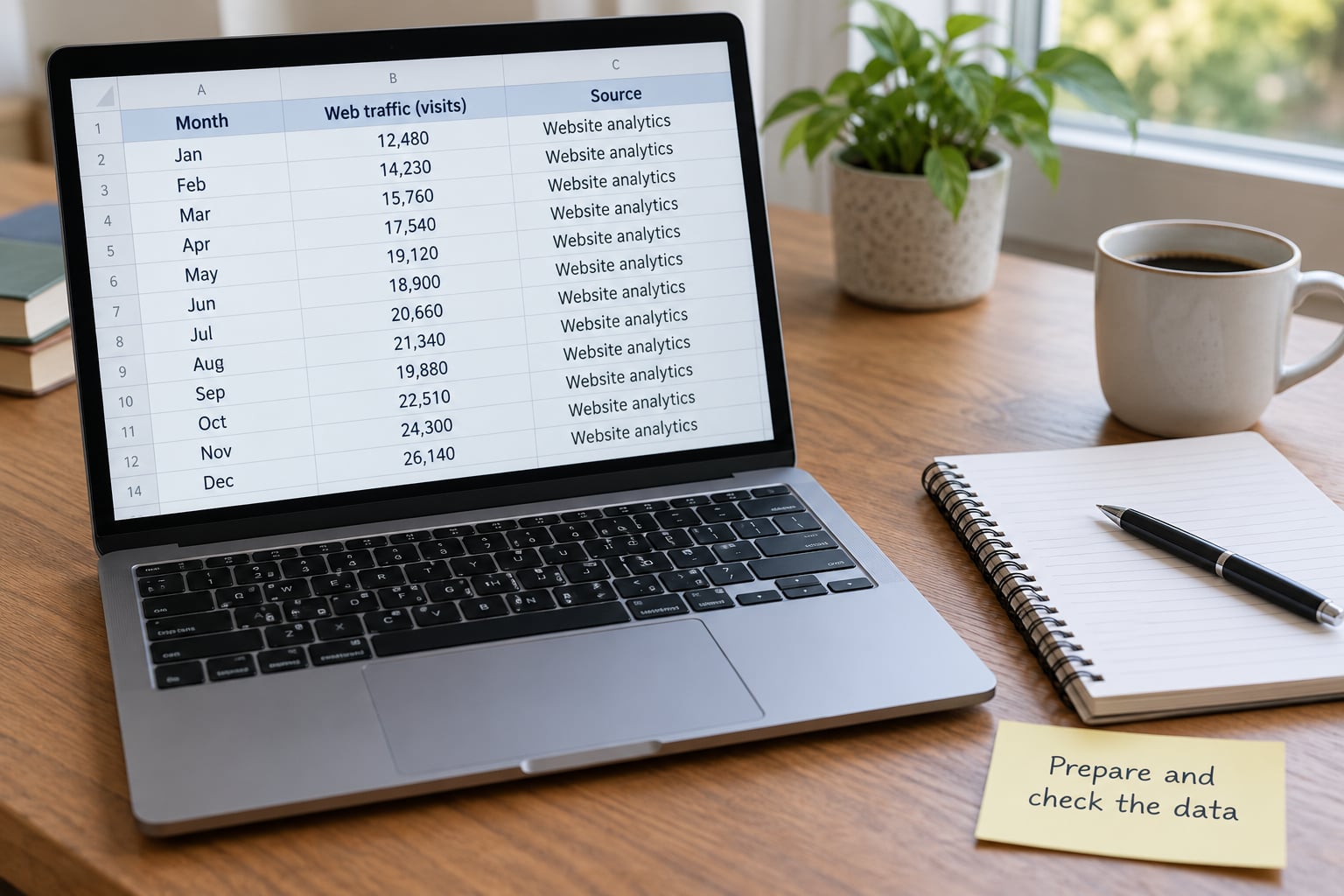
Flourish accepts CSV, XLSX and a linked Google Sheet, and it can clean far less than you might hope inside the data panel. Do the reshaping in a spreadsheet, a script or a notebook, then upload the finished table.
The checks that save time later:
- One header row, no merged cells, no blank rows in the middle of the table.
- Units in the header or the column name, not buried in a cell: Deaths per 100,000, not Deaths.
- Missing values left genuinely empty or labelled “no data”, never zero. Zero claims something happened.
- Dates in one consistent format so Flourish sorts them correctly.
- Long or wide shape matched to the template, since many templates expect one row per time step and one column per series.
Record the source, the date you pulled it and the definition of any measure that is not obvious. You will need all three for the source note at the end of the story, and hunting them after publication is miserable.
Size is the other thing to handle now. Templates have individual row limits, and very large files make the editor’s live canvas slow. A practitioner writing about hands-on use reported visible lag at around 216,000 rows and solved it by cutting the file to about 10,000. If your dataset is bigger, aggregate or sample it outside Flourish before upload.
3. Choose the visual that advances the story
Match the visual to the comparison you are reporting, not to the one that looks most impressive. The table below maps the reporting intent to the visual that carries it.
| What you are reporting | Visual that fits | Why it works in a story |
|---|---|---|
| A change over time | Line chart or animated timeline | Shows direction and pace; an animation can pace itself to the story’s length |
| Size compared across categories | Bar chart, or a slope chart for two points in time | Bar length is honest and reads instantly; a slope isolates the change |
| Parts of a whole | Stacked area, donut or treemap | Only worth a slide when the split itself is the finding |
| Relationship between two variables | Scatterplot | Exposes clusters and outliers that a summary number would hide |
| A ranking that changes over time | Bar chart race | Turns a static league table into a sequence the reader follows |
| Where something happened | Map or map story | Carries geography; one slide per stage of a journey |
| Flow between categories | Sankey diagram | Shows where volume moves, which no bar chart can do |
| A narrative argument | Flourish Story with several slides | Sequences the argument; each slide makes a single point |
Anything past six series on one chart is a sign the story needs more than one slide. The eye stops tracking that many lines or colours, and the reader has nothing left for the annotation.
4. Build the first version in Flourish
Open the template chooser and pick the template that matches the visual you just decided on, not a near neighbour you can convert later. Templates differ in the data shape they expect, and switching later can cost you a remap.
Upload or paste the data, then work in the Data tab and set your column bindings. Bindings are how Flourish knows which column is the label, which is the value and which is the time field. The template lists each field it needs and where your data must go; a dropdown showing the wrong column is why a chart renders with blank or nonsense labels.
Switch to the preview and the Settings panel to style it. Titles, axis ranges, colour, hover tooltips, background and theme live there, and the panel differs slightly between the desktop editor and workspace views while the setting names stay the same.
Save early and often. Every change re-renders the live canvas, and stacking several edits at once is where editors feel slowest.
5. Turn the chart into a narrative
With a working chart, press Create story in the top right. Your chart becomes slide one and the Slides panel opens beside it. From there, add text slides and further visualizations, and reorder them in the sequence the argument needs.
Structure each slide around one idea:
- A headline that states what the slide shows, not what it contains.
- An annotation on the exact point of change, since an unannotated chart asks the reader to hunt.
- A short caption that gives the number in words for anyone who cannot read the axis.
- An introduction slide with the question, and a closing slide with the takeaway and the source.
Annotations should say something the axis cannot: why a line jumps, which policy changed, what a shaded band means. An annotation that repeats the value beside the value is noise, and it is the most common flaw in amateur data stories.
Set the default view for each slide so the reader starts every step already framed on the part that matters. A map that opens zoomed out to the whole continent every time is a slide that does no work.
6. Add context, sources, and interaction

Context is what separates a story from an animated chart. Put the definition of your measure, the time frame, the geography and the source in visible text on the slide rather than in a footnote nobody opens.
Interaction should follow the argument, not decorate it. Use hover tooltips for the detail a reader may want, filters when the story genuinely has a second dimension, and a link out to the full dataset for anyone who wants to check your work.
Choose a navigation style that matches the format. Scroll-driven navigation suits long scrollytelling pieces; dots or arrows suit short sequences of four or five slides. The official help documentation covers one specific case worth knowing: setting Navigation style to None, via the cog control next to Slides, hides the navigation and leaves a clean single-slide story that still behaves like the original chart.
Accessibility settings are worth ten minutes. Pick a colour-blind-safe palette instead of a red-green pair, keep text large enough to read on a phone, and check that the story does not depend on colour alone to carry its meaning.
7. Test, review, and publish
Run this before the story goes out:
- Open the published link on a real phone, on mobile data, and watch what loads first.
- Scroll the whole story end to end and time how long each slide holds before it changes.
- Tab through the story with a keyboard and confirm every control is reachable.
- Read the headline and the source note as written, not as intended.
- Check the numbers in the annotations against the source data one final time.
- Confirm the share preview renders, since a story that looks broken in a social card spreads badly.
Then publish, and copy the embed code for your CMS rather than linking out. The embed resizes with the container, so a story placed in a 600-pixel column should be tested at that width too. If you need a static asset for print or social, export a PNG or a video from the published view instead of screenshotting the editor.
Common Mistakes
Almost every weak Flourish story comes from one of the following, and each has a quick fix.
- Choosing the chart before the story. Fix: write the reporting question and the headline first, then pick the visual.
- Too many series on one slide. Fix: split the chart into two slides, or filter to the lines that carry the point.
- Hiding the uncertainty. Fix: show the range or the margin of error where the data has it, and say what it covers.
- Annotations that repeat the chart. Fix: replace any annotation that names a value with one that explains it.
- Burying the source. Fix: put source, date and definitions on the final slide in visible text.
- Never testing on a phone. Fix: open the published link on mobile before you publish anything, every time.
- Treating interactivity as reporting. Fix: if the finding is one sentence, publish a static chart and a paragraph. Motion costs the reader time and returns nothing.
One more worth naming: uploading a raw export because the cleaning felt like a chore. The data panel can rename columns and unpivot, but it cannot reconcile sources, so a messy file produces a messy story no matter how good the design is.
Frequently Asked Questions
What is the difference between a visualization and a story in Flourish?
A visualization is one interactive chart a reader explores by hovering. A story is a sequence of slides, each holding a visualization or text, that walks the reader through an argument in order. You create one from the other by pressing Create story in the top right of the editor, which turns your finished chart into slide one of a new story.
Do I need to know how to code to use Flourish for storytelling?
No. Flourish is a no-code platform: you choose a template, upload a spreadsheet, map your columns and style the result through settings panels. The only code you might touch is the embed snippet when you place a published story in a CMS, and most CMSes now have a block that inserts it for you.
How do I make a scrollytelling data story in Flourish?
Build and style your first chart, press Create story, then add slides in the Slides panel and set the navigation style to the scroll-driven option. Give each slide one idea, set its default view so it opens framed on the key area, and add an annotation at the moment of change. Test the pacing on a phone before publishing.
How do I embed a Flourish story in WordPress or another CMS?
Publish the story first, then copy its embed code and paste it into an HTML block in WordPress, or use a Flourish block where one is available. In other CMSes the embed code goes into a custom HTML element. Test the live page at narrow widths, because the story scales to its container and text can get small.
How many rows of data can Flourish handle before it slows down?
Every template has its own limit, so there is no single number. Large files make the editor canvas slow, and a hands-on review reported noticeable lag at about 216,000 rows, resolved by reducing the file to roughly 10,000. Keep the working set small and do any aggregation before upload rather than expecting the data panel to do it.
Is Flourish free to use for journalism and data stories?
Flourish has a free tier that covers most common scenarios, including building and publishing public stories, and Canva has owned the platform since 2022. Paid tiers add things newsrooms tend to want, such as private projects, larger exports and team collaboration. Check the current plan details on Flourish before assuming a feature is included.
Conclusion
Start with the reporting question, not the template. Write the headline you want to publish, prepare a small clean spreadsheet with units in the headers and the source written down, and choose the simplest visual that makes that one finding legible. Everything else in a Flourish story, the slides, the annotations, the interaction, is added after the finding works as a plain chart.