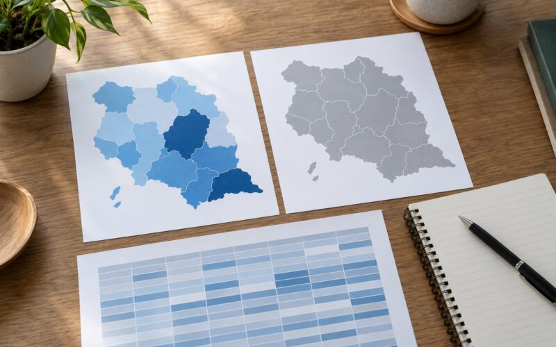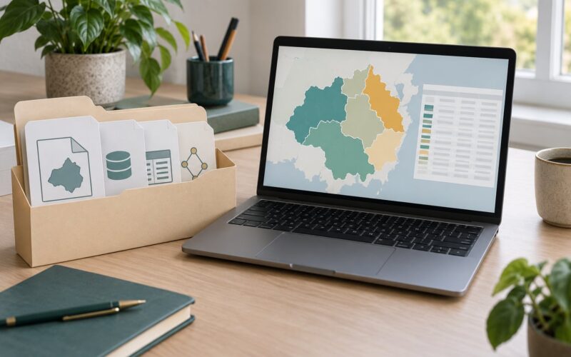
Mapbox is a maps platform for publishing your own cartography, and Mapbox GL JS is the free JavaScript library that draws it in a browser using WebGL. Learning how to use Mapbox for news maps takes a reporter or editor with no coding background roughly a day: clean the data, build a style, add interaction, then embed the finished map in a story.
The reason newsrooms bother is ownership. A Mapbox map uses your colors, your fonts, your labels and your data, so the map is part of the story rather than a picture of someone else’s. Embedding a generic map iframe gives you none of that.
This guide walks the whole pipeline, from the editorial question to the published embed, and it covers the parts tutorials usually skip: verifying boundaries before they go on air, making the map usable without a mouse, and testing on a phone.
Table of Contents
- What You Need
- Step-by-Step
- Common Mistakes
- Frequently Asked Questions
- Do I need to know how to code to use Mapbox for news maps?
- What is the best data format for a news map?
- Can I update a Mapbox map after publication when new data arrives?
- How do I make an interactive news map accessible to readers?
- Should I use Mapbox Studio or Mapbox GL JS?
- How much does it cost to publish a Mapbox map?
What You Need
You need a free Mapbox account, an access token from that account, and a dataset in a format Mapbox accepts. You also need a plain-language editorial question, because a map built without one turns into decoration.
- A Mapbox account and access token. The token is a string of characters that authorises requests to Mapbox’s APIs. You find it on your account’s Tokens page and it appears in every code sample and embed you will write.
- Your data, in GeoJSON or another supported format. GeoJSON is the easiest starting point. CSV works for simple point data, and shapefiles and GeoTIFF need conversion or tiling first.
- A modern browser with WebGL enabled, which covers current versions of Chrome, Firefox, Safari and Edge on desktop and mobile.
- A clear editorial question. One sentence: what should a reader understand after ten seconds with this map?
- Source attribution for everything you map, including the basemap provider, collected before you start rather than at publish time.
- A second device for testing, ideally an older phone, because most broken newsroom maps I have seen failed on mobile rather than on the reporter’s laptop.
Two tools sit under everything else, and confusing them causes most early friction. Mapbox Studio is a visual editor in the browser: you upload data, click layers together, adjust colors, and publish a style. Mapbox GL JS is a library you call from your own code, which is where you get custom interaction, filters and scroll-driven behaviour. Many newsrooms use both, and the split is worth keeping clear from day one.
Step-by-Step
1. Define the map’s news purpose
Start by writing down the single thing the map must prove. “Where did eviction filings concentrate between 2023 and 2025” is a map. “Evictions in America” is a subject, not a map.
From that sentence, fix four things. Choose the geographic level: neighbourhood, city, county or national. Inappropriate geography is the most common flaw in published news maps, because a tract-level pattern drawn on a national frame invites readers to over-read it. Identify the comparison or pattern, whether that is change over time, rate against a national average, or two variables against each other. Decide what the map cannot responsibly communicate, and say so in the text if readers would otherwise assume it. And set the geographic level in the sentence itself, so the map and the caption cannot drift apart later.
If you cannot write the finding as a sentence without a map, you may not need one.
2. Prepare and verify the map data
Clean the data before it reaches Mapbox. Tools like Mapshaper in a browser and QGIS on the desktop will both simplify geometry, drop duplicate records and convert a shapefile into GeoJSON, and Mapshaper is the faster option when the file is already clean.
Preserve the source date on every feature as its own column. You cannot explain a map later if you cannot say when the underlying records were collected. Keep the original file untouched and write down every transformation you apply, because a correction three weeks after publication starts with that log.
Run this check before styling anything:
- Missing values: count nulls in every column you plan to map. A blank rendered as zero is a lie the map tells quietly.
- Duplicate records: many the same feature onto the same pixel and darkens a colour for no editorial reason.
- Inaccurate boundaries: check that district or ward polygons match the official version used by the body you are citing.
- Misleading classifications: confirm that any category you invent, such as high, medium and low, has a stated rule behind the cutoffs.
- Coordinate problems: longitude and latitude swapped, or values outside their valid range, produce features in the wrong ocean.
- File size: below roughly 10 MB, GeoJSON is fine. Above that, simplify or tile it.
The easiest failure to catch is the swapped column. Many public datasets label their coordinates location-long and location-lat, and Mapbox reads longitude first.
3. Choose a basemap and visual hierarchy
The basemap is the ground your data sits on, so pick one that recedes. A light, minimal style with few labels keeps attention on your layer, and a dark style works well when the story is about night-time events, weather or outages. Satellite imagery suits wildfire, flood and damage coverage where land cover carries meaning, but it overwhelms small point features unless you dial the data layer’s contrast up hard.
Change two or three things and stop: the background colour, the water colour, and the label colour. Studio lets you edit the style’s layers directly, and a newsroom style that removes the default points of interest is usually more useful than one that adds decoration.
Then set a hierarchy. Your data layer gets the strongest contrast on the map, the basemap sits a step back, and labels come last. Check the result in greyscale, because roughly one in twelve men has a colour vision deficiency and a map that only works in full colour excludes them.
4. Add markers, lines, and data layers
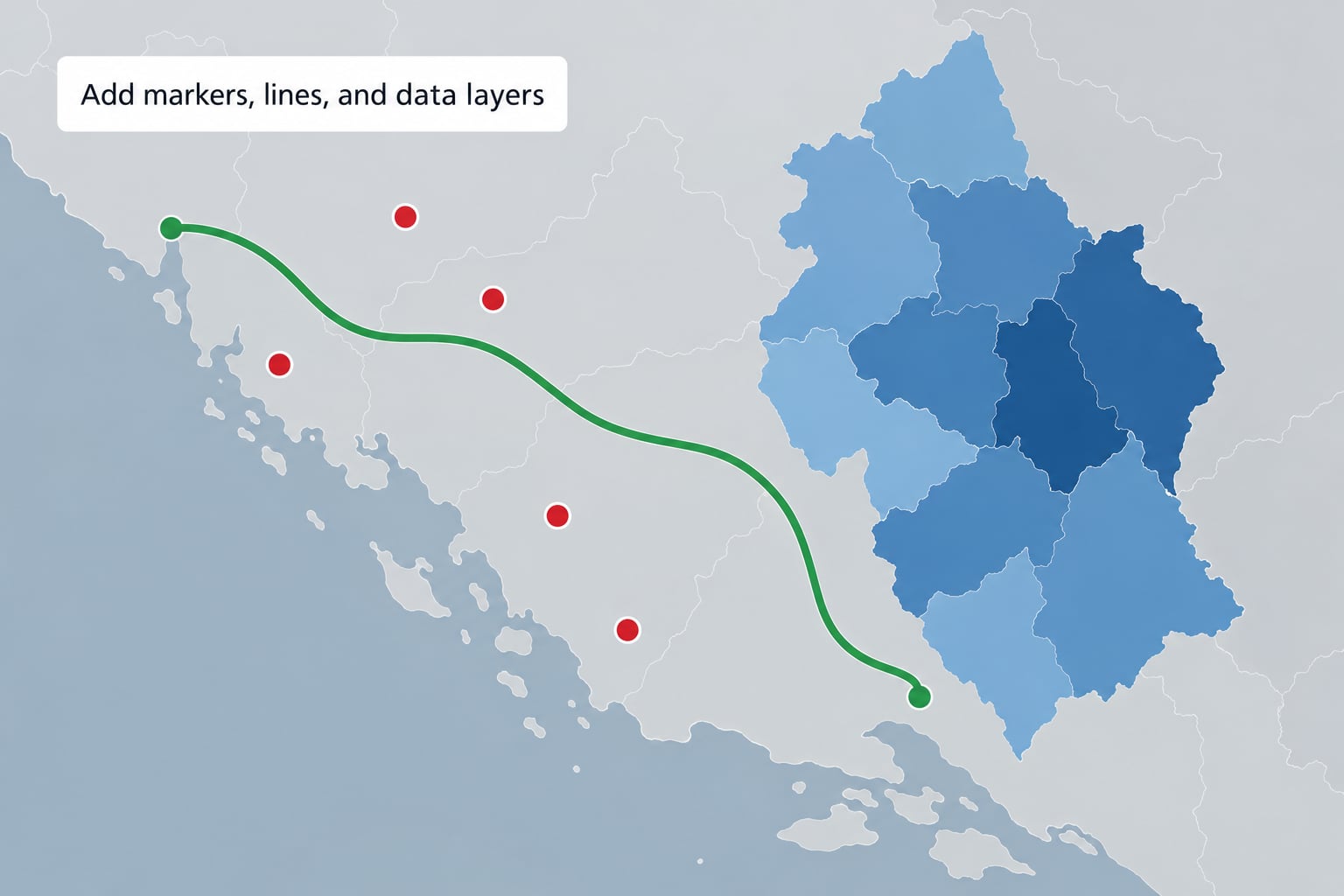
Geometry follows the question. Points fit incidents, facilities and individual events. Lines fit routes, journeys and boundaries that have direction or a path. Polygons fit rates and areas, which makes a choropleth the default for anything expressed as a percentage.
Match the renderer to the data. A circle layer suits counts and magnitudes, a fill layer suits shaded regions, and a line layer suits paths. Adding the layer from code looks like this:
map.on('load', () => {
  map.addSource('incidents', {
    type: 'geojson',
    data: 'data/incidents.geojson'
  });

  map.addLayer({
    id: 'incidents-circles',
    type: 'circle',
    source: 'incidents',
    paint: {
      'circle-radius': ['interpolate', ['linear'], ['get', 'count'], 0, 4, 50, 18],
      'circle-color': '#b2182b',
      'circle-stroke-width': 1,
      'circle-stroke-color': '#ffffff'
    }
  });
});
Avoid overcrowding before you add a clever renderer. Thousands of overlapping points hide each other and hide the pattern, which is why clustering matters: group nearby points into a circle showing a count, and let the cluster break apart when a reader zooms or clicks. Three categories on a legend beat eight. And when you show rates, say what the denominator is inside the map, because a high rate over a population of nine reads very differently from a high rate over ninety thousand.
Choose classed breaks over a continuous gradient when readers must compare regions against each other. Block colours are easier to rank at a glance; a gradient reads better for a smooth surface like rainfall or temperature.
5. Add useful interaction
Interaction should reveal reporting, not decorate the map. A hover or click popup that gives the name, the value and the date is useful. A pulsing halo on every point is not.
The patterns worth knowing:
- Pop-ups on hover and click, showing the fields a reader would want without leaving the story.
- Filtering by date, category or area, so readers can ask their own question of your data.
- Click-to-zoom, which carries a reader from a national view into a single neighbourhood in one action.
- Clustering for dense point data, as described above.
- Linked views, where a slide-out panel lists the records inside the current map extent and highlights them on the map. Two representations of one filtered set, which is often the single most valuable addition to a data story.
- Scroll-driven map states for narrative pieces, where each step moves the camera and highlights one geography using easeTo and setFeatureState.
A worked example: a map of reported incidents across a year, with filters for month, category and borough, plus a linked panel listing matching records. Clicking a borough in the panel zooms the map to it, and the panel shows the first three cases with links to the underlying reports. That is reporting surfaced through a map, not a map with reporting attached.
6. Add context, sources, and accessibility
A published news map needs a title, a short explanatory line, a data source, a methodology note, a date showing when the data was current, and a legend. All six are plain text in your page markup, above or below the map container. If the methodology changes, the date changes.
Keep Mapbox’s attribution visible. It is a licensing requirement and a courtesy to the mapping community, and it is a fast way to get your map rejected by an editor who has seen a missing credit line before.
Accessibility work is mostly about giving the map a text equivalent, which means publishing the data or the key findings as text on the same page. Beyond that:
- Make every control reachable by keyboard, with visible focus, and make sure tabbing does not scroll the page past the map.
- Give the map container a descriptive label so screen readers announce it as an image region rather than an empty box.
- Do not encode meaning in colour alone. Add symbols, patterns or direct labels, as discussed above.
- Keep touch targets large enough for a thumb and avoid hover-only information, since hover does not exist on a phone.
- Describe the finding in the story text, so a reader on a slow connection who never loads the map still gets the story.
That last one matters more than it sounds. A meaningful share of readers never see your map at all, because of bandwidth, data saver or an ad blocker.
7. Test the map before publication
Test on a real phone, on a real newsroom page, with the story’s images and scripts loaded, because a map that runs fine in isolation can stall inside a heavy article template.
Work through this list:
- Factual accuracy: does every value on the map match the source? Check ten by hand.
- Geographic level: is the zoom level appropriate to the claim being made?
- Labels: do place names collide or disappear at the default zoom?
- Zoom behaviour: does the initial view show the whole story, or start somewhere readers get lost?
- Load time: how long until the map is usable on a mid-range phone?
- Interactions: do pop-ups, filters and links all fire?
- Attribution: is the credit visible and not overlapped?
- Keyboard: can you reach and operate every control without a mouse?
- Text fallback: does the story still make sense with the map removed?
Then hand it to a colleague who did not build it and ask them to say what the map shows. If they describe the wrong pattern, the problem is usually the title or the legend, not the data. That test takes five minutes and catches more real errors than any amount of your own checking.
8. Publish and embed the map
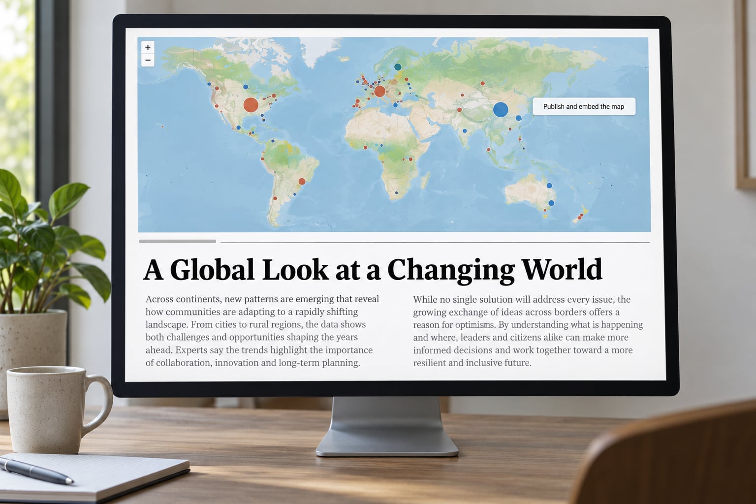
You have two publishing routes. Publish a Mapbox Studio style and embed it with an iframe, which is fast and needs no code beyond a URL. Or build the map in GL JS and ship it as part of the page, which is what you need for custom interaction, filters or scroll-driven scenes.
For the iframe route, the map’s URL holds the style, the centre coordinates and the zoom. Keep the token out of view where you can, and remember that a public token in a public page is expected: restrict it by URL in the token settings so it cannot be used on a domain you do not control.
Give the container an explicit height. A map in an unsized div collapses or grows unpredictably, which is one of the most common reasons an embedded news map breaks. Setting a fixed or aspect-ratio height fixes it in one line.
Not every story needs an interactive map. Reach for a static map image when the point is a single location, when the story is being read on a very slow connection, or when the map has to work in print or on paper. The Static Images API returns a map as a PNG or JPEG you generate server-side, which is exactly what you want for a social card, an article thumbnail or a graphic in a newsletter. Generate it from the same style ID as the interactive map so both versions look identical.
Keep the iframe small and lazy-load it below the fold. A newsroom map that costs more than the rest of the article combined will lose readers, and a map nobody scrolls to has wasted the day’s work.
Common Mistakes
Wrong geographic level. Mapping tract-level data on a national frame invites readers to treat noise as a pattern. Fix: set the zoom to the geography of your claim, and say the geography in the caption.
Too many layers. Each extra layer competes for the reader’s attention. Fix: keep the layers that carry the finding, and move everything else into a separate view or a second graphic.
Relying on colour alone. Fix: pair colour with labels, symbols or patterns, and check the map in greyscale before publishing.
Publishing stale or undocumented data. Fix: put the collection date and a methodology note on the page, and keep the transformation log with the project files.
Using a basemap with no labels. A data layer with no reference points is hard to place. Fix: either re-enable labels, or caption the map with the three or four place names a reader needs to orient.
Skipping mobile testing. Fix: test on a real phone before publish, with hover-only features replaced by tap.
Exposing the access token carelessly. Fix: restrict public tokens by URL and keep secret tokens server-side. Never commit one to a public repository.
Treating the map as a substitute for the story. A map is evidence, not narration. Fix: write the finding in the text and let the map show it.
Two habits cover most of that list. Test with a colleague who did not build the map, and keep the transformation log. Together they catch more errors than any amount of self-review.
Frequently Asked Questions
Do I need to know how to code to use Mapbox for news maps?
No, not for most of the work. Mapbox Studio is a browser editor where you upload data, add layers and adjust colors without writing any code, which covers annotated locator maps, choropleths and simple story graphics. You need some JavaScript only when a story needs behaviour Studio cannot provide: custom filters, linked panels, scroll-driven scenes or live updating. A workable split is to design and test the style in Studio, then hand the style ID to a developer who adds the interaction.
What is the best data format for a news map?
GeoJSON is the best default because it keeps attribute data and geometry in one readable file and needs no conversion step. Use CSV when you only have points and want to plot them directly, and treat shapefiles as an input format that needs converting or tiling. Keep raw files under roughly 10 MB; above that, simplify geometry in Mapshaper or build vector tiles with the Mapbox CLI. Whichever format you start with, keep a dated, unmodified copy of the source.
Can I update a Mapbox map after publication when new data arrives?
Yes, and you should plan for it. If the data lives in a Mapbox dataset or tileset, you upload a new version and the published style or map picks it up without a code change, which suits rolling coverage such as flood or wildfire reporting. If the GeoJSON is loaded by URL in your own code, update the file at the same path and add a cache-busting query string. Update the visible data date and methodology note at the same time, and tell readers what changed.
How do I make an interactive news map accessible to readers?
Publish the key finding and the underlying data as text on the same page, so the story works with the map removed. Label the map container so screen readers announce it, make every control keyboard reachable with visible focus, and never encode meaning in colour alone. Add patterns, symbols or direct labels, and avoid hover-only information since touch screens have no hover. Keep touch targets thumb-sized, respect reduced-motion preferences, and make sure attribution stays visible and unoverlapped.
Should I use Mapbox Studio or Mapbox GL JS?
Use Studio when the map is a finished graphic: a locator, a choropleth, an annotated base. It is faster, it needs no code, and it lets an editor adjust colours after you hand it over. Use GL JS when the reader needs to do something: filter by date, click to zoom, explore a linked panel, or have the map respond to scrolling. Plenty of newsroom projects use both, with Studio producing the style and GL JS supplying the behaviour.
How much does it cost to publish a Mapbox map?
Mapbox uses a monthly active user and map load metering model, and offers a free monthly allowance for low-traffic sites. A small newsroom with a handful of stories and steady but modest traffic usually stays inside that allowance; a popular election or disaster map will not. Before you publish something you expect to trend, check the current limits on Mapbox’s pricing page, restrict tokens by URL, and ask about nonprofit or newsroom programmes, which exist and are worth applying for.
Start with step one, not with an account. Write the finding you want a reader to take away in a single sentence, and check that a map is genuinely the best way to show it. If it is, clean the data before you open Mapbox, build the style in Studio, and only reach for GL JS when the reader needs to do something rather than look. Then hand the finished map to a colleague who did not build it and ask them what it shows. That one conversation catches more problems than any checklist.