
To use Jupyter notebooks for reporting, treat the notebook as the published artifact rather than a private scratchpad: load a documented source, clean it in visible code, run one analysis, label the chart, state what the result does and does not show, then restart the kernel and run it end to end so anyone can reproduce the number. That single habit — code, output and narrative in one file — is what makes a notebook checkable by an editor instead of a claim that has to be taken on faith.
A weekly numbers story usually dies in one of two places. Either the reporter hands over a figure with no working behind it, or the working exists in a folder of loose scripts that nobody can rerun six months later. A notebook fixes the second problem, provided you follow a few conventions. The rest of this guide walks through the full sequence, from a clean environment to a published file your readers and your desk can both open.
If you are new to the tool, the mechanics of running cells and kernels are straightforward. The part that takes judgment is deciding what belongs inside the file and what stays outside.
What You Need
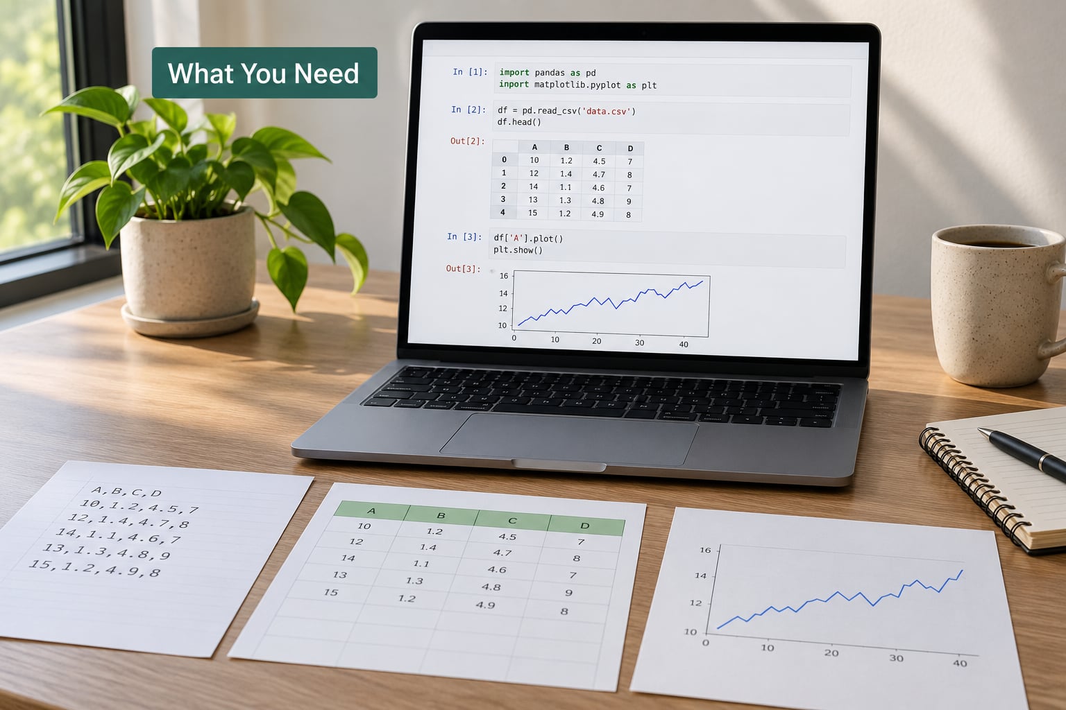
The minimum setup is small. You need Python, a notebook front end, and one library for tables plus one for charts. Everything else in this guide is optional and earns its place later.
- Python — the language the notebook kernel runs. A current 3.x release is enough for reporting work.
- JupyterLab or Jupyter Notebook — JupyterLab is the better default now because its file browser, terminal and debugger sit in the same window, which means fewer context switches when something fails.
- pandas — reading CSV and spreadsheet files, filtering, grouping and joining tables. Most reporting questions reduce to a groupby.
- A charting library — matplotlib for precise control over every label and axis, Altair when you would rather write a chart spec than fight styling parameters. Pick one and stay with it.
- nbconvert — ships with Jupyter and converts the notebook to HTML, PDF or Markdown. You will meet it again in the export step.
Two more items pay for themselves the first time a run breaks. A version-control tool such as Git records every revision of the notebook file, so a bad edit is one command away from undone. A dependency file, usually requirements.txt or an environment.yml, pins the exact package versions so a chart does not change shape because a library updated itself.
On a laptop, all of this installs in a few minutes and nothing else is required. A newsroom often wants more: a central repository where notebooks live, a scheduled runner so the report regenerates each week, and a shared place to publish the finished file. Treat those as infrastructure decisions the desk makes once. Your job is to keep each notebook self-contained enough that it still runs on a colleague’s machine when the central setup is unavailable.
One more preparation is worth doing before any code. Write down the reporting question in a sentence, and the source of the data in a second sentence. If you cannot do both, you are about to build a notebook that answers a question nobody asked.
Step-by-Step: Build a Reproducible Reporting Notebook
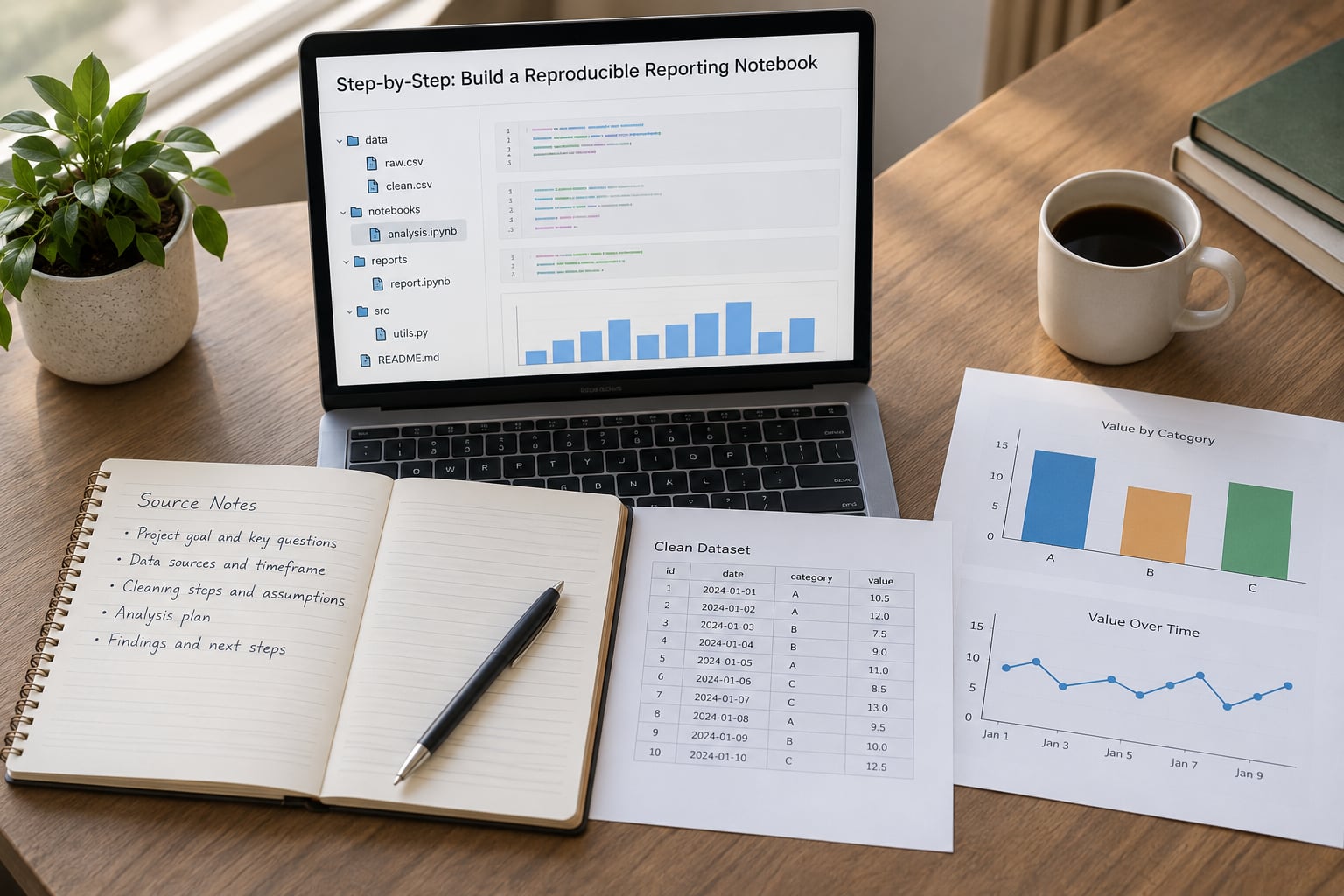
The sequence below runs in the order you should actually work in. Each step has a clear signal that it worked, so you know before moving on.
Step 1: Set Up a Clean Reporting Environment
Start from an isolated environment rather than your global install. Two projects depending on different versions of the same plotting library is a bad afternoon, and it is avoidable.
python -m venv .venv
source .venv/bin/activate        # Windows: .venvScriptsactivate
pip install jupyterlab pandas matplotlib nbconvert
pip freeze > requirements.txt
Launch the front end with jupyter lab from the project folder. Create a folder per story — elections-2026-turnout/ — with data/, notebooks/ and output/ inside it. That separation keeps the raw download away from anything you clean.
Commit the environment file and the notebook folder to Git on day one, not after the story is finished. The signal that step one worked: a colleague can clone the project, install from requirements.txt and open the notebook without a single message asking what you did differently.
Step 2: Import and Document the Data
Load the data in the first few cells of the notebook, and put the source in a markdown cell immediately above. The markdown cell is part of the report, not a comment to yourself.
import pandas as pd

SOURCE_URL = "https://example.gov/data/turnout.csv"
RETRIEVED = "2026-09-28"

turnout = pd.read_csv("data/turnout_raw.csv")
Three things belong with every dataset. Where it came from, including the exact URL or the person who sent the file. The date you retrieved it, because government portals get revised. And what one row represents — a precinct, a county, a month, an individual — because that single fact determines which aggregations are legitimate later.
For data that arrives from an API, save the raw response to data/ first and read from the file rather than calling the endpoint in a cell. A live call means the notebook produces a different answer next month and nobody can tell whether the analysis broke or the data changed. For anything sensitive, check the access terms of the source before you commit it to a shared repository.
The signal that step two worked: reading data/turnout_raw.csv is the only way the data enters the notebook, and the URL and retrieval date are visible in the rendered file.
Step 3: Inspect and Clean the Data
Cleaning in a notebook should be visible and re-runnable. If a spreadsheet was edited by hand to fix two bad rows, that edit belongs either in the source or in code that repeats it — not in a file the reader cannot see.
print(turnout.shape)
print(turnout.dtypes)
print(turnout.isna().sum())
print(turnout.duplicated().sum())
print(turnout["county"].unique()[:20])
Look for four things. Wrong types, where a number arrives as text because a stray symbol sits in one cell. Missing values, counted by column so you know whether a gap affects 3 rows or 30000. Duplicates, especially repeated rows from a paginated API. And inconsistent categories — “Clay”, “clay” and “CLAY COUNTY” are three groups wearing one name, and any groupby on them will be quietly wrong.
Make each fix explicit and keep the original frame untouched. A clean dataframe named turnout_clean that is built in visible code lets an editor trace any number back to the row it came from.
turnout_clean = turnout.copy()
turnout_clean["county"] = turnout_clean["county"].str.strip().str.title()
turnout_clean = turnout_clean.dropna(subset=["registered", "ballots_cast"])
turnout_clean["turnout_pct"] = (
    100 * turnout_clean["ballots_cast"] / turnout_clean["registered"]
).round(2)
Write a sentence above the cleaning block describing what you did and why. The signal that step three worked: running the cleaning cells twice from a fresh state produces the same row count and the same totals.
Step 4: Run and Explain the Analysis
Write small cells that each answer one question. A cell that loads data, filters it, aggregates it and plots the result in one block is the hardest kind of code to check, and checking it is the entire point.
by_county = (
    turnout_clean.groupby("county", as_index=False)
    .agg(registered=("registered", "sum"),
         ballots_cast=("ballots_cast", "sum"))
)
by_county["turnout_pct"] = (
    100 * by_county["ballots_cast"] / by_county["registered"]
).round(2)
by_county.sort_values("turnout_pct", ascending=False)
Before you accept a result, test the assumption behind it. Turnout percentages above 100 usually mean the registered and counted figures come from different reporting periods. A change that appears only in one region is often a definition change rather than a shift in behaviour. Comparing this cycle to a previous one means checking that the definition of a registered voter did not change in between.
Then label the unit of observation in a markdown line next to the output: one row is one county, aggregated across precincts. And state the limit of the claim. “Turnout rose in 61 of 68 counties” is a description of the data. “Voters shifted toward one party” is an inference that needs a different source entirely.
The signal that step four worked: you can point to the exact cell that produces the number you plan to publish, and the sentence above it explains what the number means and what it cannot tell you.
Step 5: Turn Results into Newsroom-Ready Visuals
A chart in a report should be readable by someone who never sees the code that produced it. That means units, a source line, and an axis that does not exaggerate.
import matplotlib.pyplot as plt

fig, ax = plt.subplots(figsize=(8, 4.5))
ax.bar(by_county.sort_values("turnout_pct")["county"],
       by_county.sort_values("turnout_pct")["turnout_pct"])
ax.set_ylabel("Ballots cast as a share of registered voters (%)")
ax.set_title("Turnout by county, 2026 general election")
ax.text(0, -0.18, "Source: state elections office, retrieved 2026-09-28",
        transform=ax.transAxes, fontsize=8)
plt.xticks(rotation=60, ha="right", fontsize=8)
plt.tight_layout()
Start the y axis at zero for bar charts. A truncated bar axis turns a two-point difference into what looks like a collapse, and readers screenshot charts out of context. For line charts showing a trend, a non-zero baseline is acceptable as long as the axis is labeled. Use the source line on every chart, and save the figure at a width that survives being placed in a narrow article column.
Export the image itself, not just the chart inside the notebook. A static PNG can go into a graphic or a deck; the interactive version stays in the notebook.
The signal that step five worked: a colleague who never opened the notebook can look at the chart and state what is being measured, over what period, and where the numbers came from.
Step 6: Add Reporting Context and Verification Checks
Code output is evidence, not explanation. The markdown cells around it carry the parts a reader needs in order to judge it: what the number means, which official source confirms it, and where it falls short.
Link the result to the reporting question in plain language. State the population, the time window and the exclusions. Note anything unusual — a precinct that reported late, a county whose figures were revised, a comparison period that used a different definition. Add an update date near the top of the notebook so a reader who opens it in six months knows how old it is.
Cross-check the headline figure against at least one independent source. If your notebook says 62.4 percent and the official press release says 62 percent, find out why the rounding differs before you publish either. Assertions work well here: a short cell that fails loudly when a value falls outside an expected range catches a broken data pull on the first run, not three weeks later.
total_turnout = 100 * turnout_clean["ballots_cast"].sum() / turnout_clean["registered"].sum()
assert 40 < total_turnout < 80, f"Implausible turnout: {total_turnout}"
print(round(total_turnout, 1))
The signal that step six worked: every published figure has a sentence of context next to it, and every figure has been confirmed against a source outside the notebook.
Step 7: Review, Save and Publish the Notebook
Before anything leaves your hands, do the check that catches most errors. Restart the kernel and run every cell from the top, in order. Interrupting the kernel resets every variable, which is the fastest way to expose the cell that secretly depends on something defined three screens earlier.
If the clean run works, export the notebook so others can read it without a Python install:
jupyter nbconvert --to html --execute notebooks/turnout_report.ipynb
  --output output/turnout_report.html
jupyter nbconvert --to webpdf notebooks/turnout_report.ipynb
--output output/turnout_report.pdfPDF export goes through LaTeX, which means installing a distribution. HTML is usually the easier path to a finished, shareable file, and it keeps the charts sharp at any size.
If a reader should see conclusions but not the code, remove the input cells during export rather than deleting them from your working file. Filtering on a cell tag — the hide_input tag, or a custom tag you apply through a tag preprocessor — keeps the analysis intact in the repository and out of the published version.
Then commit. A short message describing what changed and why is what makes the history readable later. Push, and hand the editor a link to the rendered notebook or the exported HTML file. If a weekly update is expected, scheduling the run so it regenerates on its own is a reasonable next step.
The signal that step seven worked: the exported file opens in a browser with no errors, every chart is visible, and the raw version still runs clean on restart.
Common Mistakes
These are the failures that come up most often, and each has a straightforward correction.
Hidden state between cells. The notebook works on your machine and fails for everyone else, usually because a variable was defined in a cell you later deleted or reordered. Restart the kernel and run all — every time, before you commit.
Opaque downloads. A CSV saved as final_v3_USE.csv with no record of where it came from. Store the URL and retrieval date in a markdown cell, and keep the raw file untouched so the chain of custody is visible.
Missing source dates. Official data gets revised, sometimes within days. Every dataset in a reporting notebook needs a retrieval date, and the published file needs an update date near the top.
Raw and cleaned data mixed together. Editing the loaded dataframe in place makes the transformation impossible to reproduce. Copy it, clean the copy, and name the result something meaningful.
Charts without units. A bar chart of bare numbers gives the reader nothing to interpret. Label the axis with the measure and its unit, and put the source on the figure.
Correlation described as cause. Two series moving together in a notebook establishes an association, nothing more. If the claim needs a cause, that needs a design and usually a second source.
An environment nobody else has. If your notebook needs a package that only exists on your laptop, it is a personal file, not a report. Pin versions and commit the dependency file.
Publishing a notebook nobody can read. A raw notebook full of tracebacks, half-finished cells and no narrative tells a reader nothing. Clean up, remove or hide the exploratory code, and leave the analysis in an order that makes sense to someone outside the project.
Sensitive data in a shared repository. Source material that carries a promise of confidentiality should not land in a repo with broad access. Check the terms of the data, and keep anything restricted in a local or access-controlled location with a documented path in the notebook.
Two habits prevent most of the list. Restart-and-run-all before every commit, and a sentence of explanation above every block of output. Everything else is a detail of those two.
Frequently Asked Questions
How do I make a reporting notebook reproducible?
Restart the kernel and run every cell from the top, in order. If that clean run reproduces your numbers, the notebook documents its own logic. Pin your package versions in a requirements file, keep raw data untouched, load it from a documented path, and record where it came from and when it was retrieved. Commit both the notebook and the dependency file so a colleague can rebuild the environment and rerun the analysis unchanged.
Can Jupyter notebooks handle confidential source data?
They can, but the notebook is only the analysis layer, not the safe place to keep the material. Check the terms of the source first, especially for government datasets and leaked records. Store sensitive files outside a shared repository in an access-controlled location, and reference the path in a markdown cell rather than embedding the file. Anyone with read access to the repository should be able to see what data a report uses without having access to the underlying records.
Should a recurring report be a notebook or a Python script?
Use a notebook while the question is still being explored, when you need to look at data, test an idea and read the output. Once the analysis is stable and running unchanged, move the logic into a script or module and let the notebook handle presentation. A notebook that runs to a fixed result on a schedule is fine, but the heavy lifting belongs in code you can import and test, with the notebook acting as the readable wrapper.
How do I share a notebook with readers who do not read code?
Export it rather than sharing the raw file. Converting the notebook to HTML produces a self-contained page anyone can open in a browser, and the web PDF exporter gives you a print-ready version. If the code should stay internal, tag the cells you want hidden and filter them during export, which keeps the full analysis in the repository while the published file shows only results, charts and narrative. A short summary of the finding usually belongs above the charts.
How do I version control notebooks with Git?
Commit the .ipynb file like any other file, and write commit messages that describe the reporting change rather than the code mechanics. Because notebook diffs include output, it helps to clear outputs before committing so reviewers see the code change alone. Keep the data folder out of the repository if it is large or restricted, and store the environment file so the pinned versions travel with the notebook. Reviewers benefit most from small, frequent commits rather than one large one before publication.
Conclusion: Start With One Auditable Claim
Pick one figure from the story you are working on now. Load its source into a fresh notebook, record where the data came from and when, clean it in visible code, and run the calculation from a restarted kernel. If the number survives that, you have something publishable — and a file that answers the only question an editor will actually ask, which is how do you know.
That habit, repeated, is what separates a notebook used for reporting from a notebook used for tinkering.