
A data caveat is a short, plain-language statement of what a dataset cannot tell you: its coverage gaps, its measurement limits, and the conditions under which a figure should not be read literally. How to document data caveats for readers comes down to three jobs, and they are smaller than most newsrooms assume. Name the limitation precisely, tell the reader what they should not conclude from it, and put the sentence where the reader meets the number. On a typical graphic that is 20 to 40 minutes of work. The ones that get skipped are the ones readers end up misreading.
Data caveat, defined: a reader-facing note that explains a known limitation in a dataset or in the way it is visualized, written so a non-specialist understands how that limitation affects the conclusion the graphic invites them to draw.
The reason to bother is not virtue. A reader who knows a survey missed 18 percent of adults cannot be caught out by a bad tweet quoting it, and you cannot be accused of overstating it six months later when the agency revises the series. Documenting data caveats is the cheapest insurance in a newsroom, because the alternative is a correction that costs far more than the note would have.
Most published guidance on this topic is written for researchers reusing your files, and it stops at the codebook. That is a different audience with a different question. A reuser wants to know that gdp_pc_real is chained dollars in 2015 currency. A reader wants to know whether they should trust the map enough to call their senator.
Table of Contents
- What You Need to Document Data Caveats for Readers
- Step-by-Step: How to Document Data Caveats for Readers
- Common Mistakes: Five ways newsrooms document data caveats badly
- Frequently Asked Questions
- Where should I put a data caveat in a newsroom chart?
- How do I explain missing or incomplete data without confusing readers?
- Should every data limitation appear in the chart itself?
- What is the difference between a methodology note and a reader-facing caveat?
- How can I document uncertainty in an interactive map or news app?
- Who should review data caveats before publication?
- Conclusion
What You Need to Document Data Caveats for Readers
Before you write a word, gather five things. Without them the process stalls at the point where someone has to invent a limitation the dataset does not actually have.
- The source documentation, if any. The agency release, the survey methodology PDF, the data dictionary, the codebook. Read it properly, since most caveats are stated in the footnotes of a technical appendix rather than in the headline documentation.
- A working copy with a cleaning log. Every row you deleted, every column you renamed, every outlier you dropped. Most caveats about your own work are only reconstructable if you kept a log while you worked.
- A list of the formats you are shipping. Social card, article graphic, interactive, mobile embed, newsletter. The same caveat needs three different treatments across those, and the social card is where it gets left off entirely.
- One named reviewer. A graphics editor or standards editor who is not the person who made the chart. This matters more than it sounds, because the person who built the chart has already decided which limitations matter.
- A home for the long version. A methodology box or a methods page that the caption can point to. If your only channel is a 12-word subtitle, you will end up cramming and writing something vague.
If the source ships with no documentation at all, that is not a blocker, it is a caveat. Say plainly that the source publishes no methodology, note what that prevents you from checking, and contact the agency for a comment. Readers find that more credible than a confident chart over undocumented numbers.
Step-by-Step: How to Document Data Caveats for Readers
Step 1: Identify the specific limitation
Vague concerns cannot be documented. “The data is incomplete” is not a caveat, it is a worry. Rewrite it as a sentence about what the dataset cannot show: which records are missing, which places are absent, which years were revised, which values were withheld.
Work from the seven types below rather than from memory. Most datasets carry three or four of them, and naming the type early saves an hour of arguing about wording later.
| Caveat type | What it means in the data | Plain-language phrasing a reader can use |
|---|---|---|
| Coverage gap | Whole places, groups, or periods are absent rather than zero | These figures cover only the counties listed. Places not listed had no reported cases, not zero cases. |
| Non-response bias | People who skipped a question differ systematically from those who answered | People who declined this question were more likely to have higher incomes, so the average is likely understated. |
| Measurement error | The thing counted is not the thing people mean | Police-recorded crime misses most household violence, which is why these totals are lower than the lived experience. |
| Missing for a reason | Blank values cluster in one group, so dropping them skews the result | Rows without a value were concentrated among younger workers, so excluding them tilts the figure upward. |
| Suppression or redaction | Values withheld, often to protect confidentiality in small groups | Values for groups under 10 people are withheld to protect privacy, so small areas can look artificially complete. |
| Revisions and vintages | Two series with the same name were built on different releases | The figures here use the first release from March; later revisions moved the annual total by about 2 percent. |
| Aggregation and rounding | Small denominators and rounded values exaggerate apparent precision | Counts under about 20 swing wildly from year to year, so treat small-area changes as a direction, not a level. |
You will know the list is complete when you can answer one question out loud: what would a reader wrongly believe after seeing this graphic with no caveat at all? That belief, in one sentence, is your caveat.
Step 2: Explain the limitation in plain language

The rewrite that matters most is dropping the hedge. Newsrooms write caveats in the language of legal disclosure, which is written to protect the publisher, not to inform the reader. Your version has to answer a reader’s question, not a lawyer’s.
Three rules do most of the work. Use specific numbers instead of “some”. Use a plain verb instead of a noun phrase, so “the agency does not publish” beats “the absence of published methodology”. And put the consequence before the technical cause, because readers act on the first clause.
| Weak version | Strong rewrite | Why it works better |
|---|---|---|
| Data may be incomplete due to reporting delays. | Counts for the last two weeks are still being added, so this week’s total will rise. | Names the affected period and tells the reader what will change. |
| Figures are subject to revision. | The agency revised last year’s total down by 1.8 percent in April. We use the original figure. | Quantifies the revision and states which vintage the story uses. |
| Not all areas report to this system. | Six states, including Texas and California, do not report to this system, so their numbers are absent rather than low. | Names examples and kills the most common misreading, that absent means small. |
| Small numbers may be unreliable. | Where the yearly count is under 20, one extra incident moves the rate by more than five points. | Replaces “unreliable” with the reader’s own threshold for caring. |
| These estimates come from a model. | These are model estimates, not counts. The model performs best in dense counties and poorly in rural ones. | Says what kind of number this is and where it breaks. |
Read every candidate sentence out loud. If you would not say it to a colleague at a desk, it is not plain language yet.
Step 3: Name the affected part of the data
A caveat that floats free of the data it qualifies ends up being ignored. Anchor it to the exact variable, place, period, or group where the limitation bites, and make sure that anchor is visible on the visual itself.
Three practical habits help. Shade or hatch the affected geography on the map rather than leaving it in the same colour as everything else. Mark revised years on the time axis so a reader comparing two headlines can see the break. And when you dropped rows during cleaning, say how many and from which group, in the note rather than in a method buried behind a link.
Cross-reference the caveat against your own headline while you write. If the chart says a gap rose and the caveat explains that the gap grew because reporting improved in six counties, the graphic is making a causal claim it cannot support, and no footnote fixes that.
Step 4: Show the consequence for interpretation
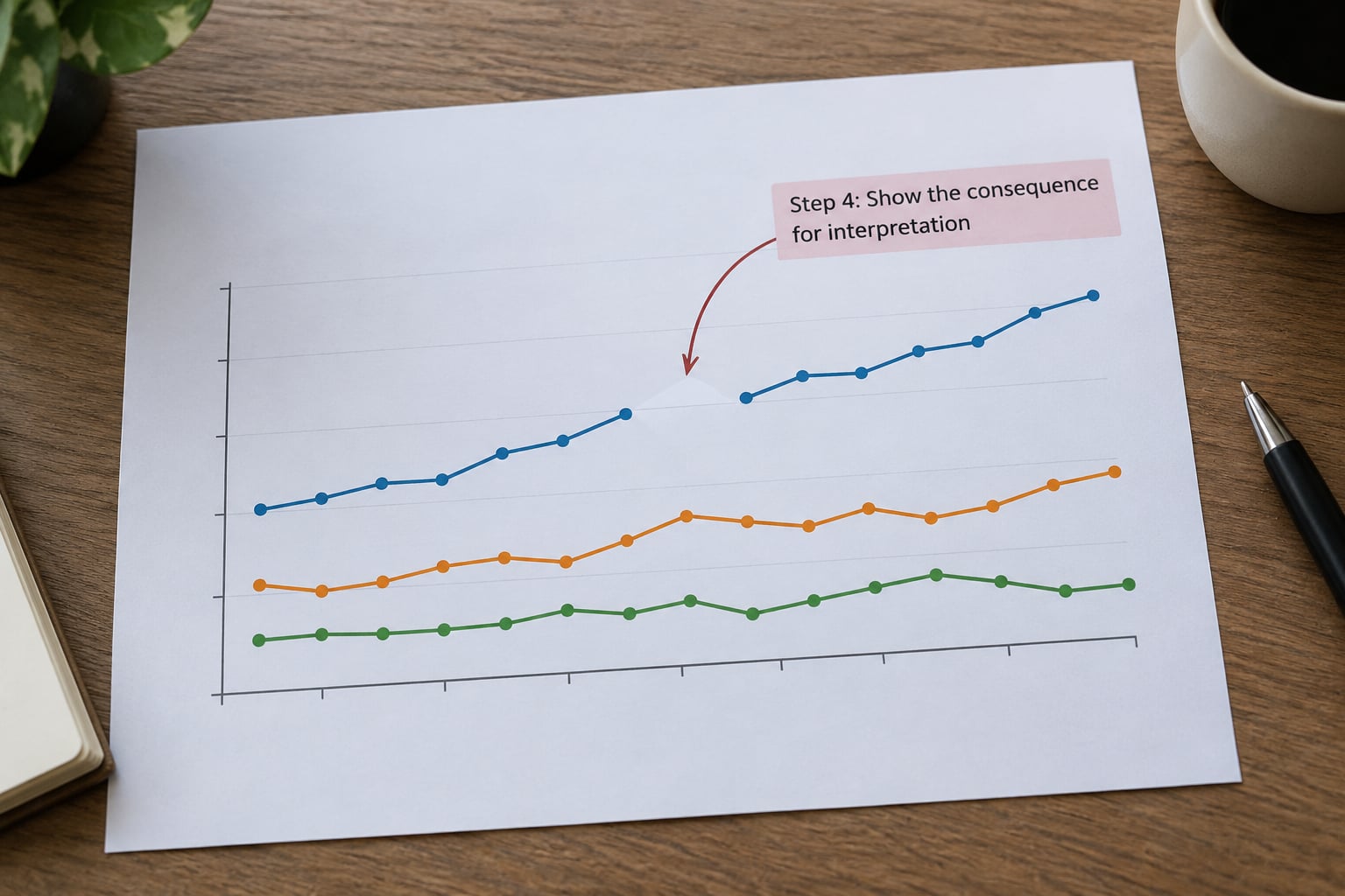
Most caveats stop at describing the data. Readers need the second half of the sentence: what they should now do differently with the number. This is the sentence that turns a disclaimer into something a reader can use.
There are only three useful moves. Tell them what the figure can support. Tell them what it cannot support. Or tell them what they would need to see for the comparison to hold, such as a second year of data or a source with full reporting.
Keep it to one sentence, and keep it positive where you can. “This shows where reporting is most complete, not where crime is highest” is doing more work than three paragraphs about methodology, because it redirects the reader’s interpretation rather than apologising for it.
If you cannot write that sentence, that is a signal about the graphic itself. A chart whose limitation cannot be summarised in a consequence clause is usually trying to make a claim the data cannot carry, and the honest fix is to change the headline, not to add another paragraph of fine print.
Step 5: Choose the right placement and format
Placement decides whether a caveat gets read. A note under a chart is seen by roughly the people who scroll slowly; the same note in a tooltip is seen by the people who hover, which on mobile is nobody. Match the placement to how the graphic is actually consumed.
| Placement | Put it here when | Length and form |
|---|---|---|
| On the visual, near the data | The limitation is specific to one place, series, or bar | One short annotation, 10 to 20 words |
| Subtitle under the headline | Every number in the graphic shares the same limitation | One sentence, no hedging |
| Source line | Provenance details, retrieval date, vintage | Small type, factual only |
| Caption | The limitation needs two or three sentences of explanation | Two to four sentences, still readable aloud |
| Tooltip, interactive only | The caveat varies by the element a reader selects | One sentence, never the only copy |
| Methodology box | Cleaning decisions, definitions, full variable list | Unlimited, linked from the caption |
| Alt text | Screen reader and non-visual reading | The limitation first, then the pattern |
Two rules keep this from failing in practice. Never let a tooltip be the only place a caveat exists, because most of your traffic is on a phone and tooltips do not fire on touch. And never put a caveat only in the methodology box if it could change how a reader reads the headline, because headlines get screenshotted and the methodology box does not travel with them.
Alt text deserves special attention. Screen reader users get your caveat in the same place sighted users get the headline, so lead with the limitation and follow with the pattern. It is the opposite of most alt text, which describes the shape of the chart first.
Step 6: Test, publish, and maintain the caveat
Before publication, run the caveat past someone outside the project. Ask two people to read the graphic and the note and then say what the chart shows. If their answer contains something you did not intend, the note failed, whatever the note says. In my experience that test catches more real problems than any line edit, because it measures the outcome rather than the wording.
Then verify each claim in the note against the source, not against your memory of the source. Numbers quoted from a release three months old are the most common error in published methodology notes, and they are the easiest to catch here.
Set the maintenance plan on the day you publish. Agencies revise, boundary definitions change, and suppression rules shift. Date-stamp the methods note, keep a short revision log listing what changed and when, and schedule a check at six and twelve months. When a correction does arrive, update the note and the log rather than silently editing the chart.
Here is the copy-paste methodology block most teams end up maintaining. Keep it in the story template so nobody writes it from scratch.
HOW WE REPORTED THIS
Source: [agency name], [dataset title], retrieved [date]. [Vintage or release note.]
What we counted: [what a record is, what a person is, what a day is]
What we excluded: [rows dropped, with counts and reasons]
Known gaps: [places, groups, or periods not in the source]
Revisions: [what changed since publication, with dates]
Known limits: [two sentences on what this data cannot show]
Questions: [contact name, email]
Before it goes out, check that every limitation from step 1 has a line somewhere, that each one is anchored to a specific part of the data, and that each includes a consequence for the reader. Any of the three missing means the note reads as boilerplate, which is exactly how most caveats get skipped.
Common Mistakes: Five ways newsrooms document data caveats badly
These five failure patterns account for most of the caveats I have read in published data stories. Each has a straightforward fix.
Burying the caveat where it cannot do any work
The limitation lives in a methodology page four clicks deep, while the chart travels on its own through social and newsletters. The fix is duplication, not simplification: the one-sentence version goes next to the chart, and the long version lives behind a link for anyone who wants it.
Writers also over-trim. A caveat cut until it carries no information, such as “some data may be incomplete”, costs the same space as a useful one and protects nobody. Trim the words, not the meaning.
Writing disclaimers instead of explanations
Boilerplate reads as a legal defence because it is one. The tell is passive voice and vague actors: “errors may occur”. Compare “Six states do not report to this system” and the reader instantly knows whether their own state is in the dark.
Overstating precision in the other direction
Some newsrooms swing from silence to a paragraph of hedging on every chart, which trains readers to skip the notes altogether. Rank your caveats by how much they change a reader’s conclusion, and write up only the top one or two. A page of equal-weight caveats has no hierarchy, so readers treat all of them as optional.
Mixing reader caveats with reuser documentation
A codebook entry explains that unemployment is measured against the civilian labour force. A reader caveat explains that a 0.4 point change is smaller than the margin of error. Both are true, both are needed, and putting them in the same document helps nobody. Ship a data dictionary and README alongside the story for reusers, and keep the reader-facing note about what the numbers mean in practice.
Publishing once and never touching it again
A caveat that described the data accurately at launch can quietly become false six months later, which is worse than having written nothing. Date-stamp the note, log every revision, and set the reminder now while the details are still fresh.
Frequently Asked Questions
Where should I put a data caveat in a newsroom chart?
Put it where the reader meets the number, not in a page they may never open. A limitation specific to one place or series belongs as an annotation on the visual itself. A limitation affecting every number belongs in the subtitle or caption, with the full cleaning and definition detail linked to a methodology box. On mobile, never rely on a tooltip alone, since tooltips do not fire on touch.
How do I explain missing or incomplete data without confusing readers?
Say what is missing, how much, and where. Name the affected places, groups, or periods, give a count or share, and state the reading it supports. The most common misreading is that absent data means a value of zero, so say explicitly that missing is not zero. If the missing cases cluster in one group, name the group, because that is what tells the reader which direction the figure is skewed.
Should every data limitation appear in the chart itself?
No. Rank limitations by how much they change the conclusion a reader would draw, then put the top one or two on or beside the chart and the rest in a methodology box. Caveats given equal weight teach readers to skim all of them. Keep the chart-level version to one sentence with a consequence for interpretation, and put cleaning steps, variable definitions, and provenance in the long note.
What is the difference between a methodology note and a reader-facing caveat?
A methodology note documents how the data was collected and processed, for readers who want to audit the work. A reader-facing caveat explains what the data cannot show and what the reader should not conclude from it. The first is technical and complete; the second is short, plain, and consequence-first. Publishing both is the standard, but the caveat must stand alone without requiring the reader to open the note.
How can I document uncertainty in an interactive map or news app?
Show uncertainty visually rather than describing it only in text. Use opacity or hatching for weaker estimates, and offer an uncertainty toggle so readers can see the ranking change. Put a one-sentence caveat in the tooltip for the specific element selected, repeat it in the caption because tooltips do not fire on touch, and give the method behind the estimate in a linked panel. Date-stamp the data version inside the interface, not only in the article.
Who should review data caveats before publication?
A named editor who did not build the graphic, ideally a graphics or standards editor, plus the reporter responsible for accuracy. Beyond proofreading, the reviewer’s job is to ask what a reader would wrongly believe after seeing the chart with no note. Running that question past one or two uninvolved colleagues is the fastest test of whether the caveat actually works.
Conclusion
To document data caveats for readers well, you need three things every time: a limitation named specifically, a sentence saying what the reader should not conclude from it, and a placement that meets the reader at the number. Start with your most-read graphic right now. Find the single limitation that would most change what a reader believes, write that consequence sentence in plain language, and place it beside the chart before anything else ships in 2026.