Making article pages mobile friendly comes down to four things: a viewport declaration, a fluid column that reflows instead of scrolling sideways, type and media sized for a small screen, and a page light enough to load on a phone. Google has indexed the mobile version of a page since 2019, so what a reader sees on a handset is the version that gets judged. Most fixes take an afternoon; the awkward ones take a weekend.
The workflow below is what I use with newsroom sites, and it works the same on WordPress, Ghost, Webflow or hand-written HTML. You can stop after Step 2 and already fix the most common complaint, which is text running off the right edge of the screen.
Table of Contents
- What You Need
- Step-by-Step: How to Make Article Pages Mobile Friendly
- Step 1: Audit the Existing Article Page
- Step 2: Set a Responsive Content Width
- Step 3: Make Typography and Spacing Easy to Read
- Step 4: Make Images, Video, and Embedded Content Responsive
- Step 5: Simplify Article Navigation and Calls to Action
- Step 6: Improve Mobile Performance and Accessibility
- Step 7: Test on Real Devices and Publish Responsively
- Common Mistakes
- Frequently Asked Questions
What You Need
You do not need a redesign, a new CMS or a developer on staff. You need the ability to edit the template that wraps an article body, not just the article body itself, plus a phone to test on. That distinction matters more than anything else in this guide, because most mobile problems live in the wrapper.
- A content system you can restyle. A theme file, block stylesheet or design system the article body inherits from. If you can only edit posts and not templates, the fixes below need a developer or a plugin.
- Editable type and spacing settings. Base font size, line height, paragraph spacing and link colours, either in your theme or as custom CSS.
- Flexible media handling. A way to serve resized images and to keep video and map embeds inside a fixed ratio box.
- Performance tooling. Chrome DevTools is built in. PageSpeed Insights and Lighthouse run in the browser and need no install.
- At least one real phone, ideally two. One current iPhone and one current Android handset catches the problems an emulator misses.
- A staging URL or a local copy. Test layout changes where a bad CSS rule cannot take the live site down.
Step-by-Step: How to Make Article Pages Mobile Friendly
Step 1: Audit the Existing Article Page
Open a live article on your phone, not in a desktop browser resized. Look for four failure modes in order: sideways scrolling, text you have to zoom to read, controls you cannot hit accurately, and elements that jump around while the page loads.
Write down what you find before you change anything, one line per problem with the URL and the phone you saw it on. A written list is what stops the “I fixed that last week” loop, and it gives you something to re-check after every change.
How you know it worked: you have a short list covering layout, readability, media, navigation and speed, and you know which of those five areas are already fine so you do not rebuild them.
Step 2: Set a Responsive Content Width
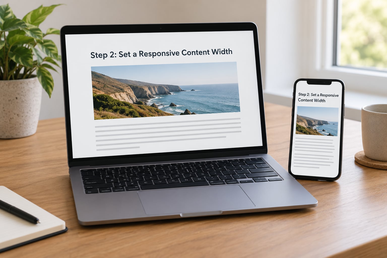
The single most common cause of a sideways-scrolling article is a missing or wrong viewport declaration. Without it, a mobile browser guesses a desktop-width screen and then shrinks the result, which makes everything tiny and forces zooming. Put this in the document head:
<meta name="viewport" content="width=device-width, initial-scale=1">Then make the article column fluid instead of fixed. A single readable column with padding on both sides beats any clever grid on a phone:
.article-body {
  width: 100%;
  max-width: 42rem;
  margin: 0 auto;
  padding: 0 1rem;
  box-sizing: border-box;
}

img, video, iframe, table {
  max-width: 100%;
  height: auto;
}
Any element you find wider than its container is usually one of four things: a wide table, an image with a fixed pixel width, an embed without a ratio wrapper, or a long unbroken string such as a URL. Fix those at the source. For tables, allow horizontal scrolling inside a wrapper instead of letting the page scroll.
Add breakpoints only where the layout genuinely changes, most often around 768px for a two-column to one-column switch. Starting mobile-first with no media query and adding complexity upward is far less painful than retrofitting a desktop layout downward.
How you know it worked: you can swipe across the article anywhere and the page itself never moves, and no element is cut off at either edge.
Step 3: Make Typography and Spacing Easy to Read
Article body text belongs at 16px or larger on a phone, with a line height around 1.5 to 1.6. Developers regularly argue for smaller text that fits more on screen, and readers regularly zoom in, which loses their place and slows them down.
Keep the line length between 45 and 75 characters on all screens. A 42rem maximum width does this automatically on desktop, and on mobile the screen itself is the limit, so you usually only need to check that no ad or pull-quote breaks out.
- Headings that step down in size rather than jumping 1.5x, so a reader can see the structure while scrolling.
- Paragraph spacing of at least 1em, because a wall of unbroken text is the mobile equivalent of a wall of text on paper.
- Links that are visually distinct without relying on colour alone, plus underlines for in-body links.
- Enough contrast to pass WCAG AA, which means 4.5:1 for body text and 3:1 for large heading text.
- A line height of 1.5 or more, and no fixed-height boxes around paragraphs.
Long articles also benefit from reader controls: an estimated read time near the top, and if your audience asks for it, text size and dark mode toggles. Dark mode is a few lines of CSS using the prefers-color-scheme media query, and it is cheap to add once your colours are defined as variables rather than hard-coded hex values in twenty places.
How you know it worked: you read a full article on a phone without zooming once, and you can trace the structure from headings alone.
Step 4: Make Images, Video, and Embedded Content Responsive
Images are usually the heaviest thing on an article page, and the retina displays on current phones mean a 1200px-wide image is not overkill, it is the minimum. Serve appropriately sized files with srcset and sizes, and pick a modern format such as WebP or AVIF with a fallback for older browsers.
Always set explicit width and height attributes on images so the browser reserves space before the file arrives. That one habit removes most layout shift on a story page. Add loading=”lazy” to anything below the fold, and leave the lead image eager since it is almost always your largest contentful paint element.
<img src="lead-1200.jpg"
     srcset="lead-600.jpg 600w, lead-1200.jpg 1200w"
     sizes="(max-width: 768px) 100vw, 672px"
     width="1200" height="675"
     alt="Voters queue outside a polling station on election morning">
Video, maps, charts and social embeds need a fixed ratio wrapper or a padding-top box, otherwise they keep their desktop height and push the article far down the screen. Every embed on the page should be able to shrink to phone width without a scrollbar of its own.
Captions and credit lines matter more on mobile because they sit closer to the content. Keep alt text descriptive, since many readers arrive from a link with no context, and keep text inside graphics large enough to read when the graphic fills a narrow screen.
How you know it worked: the article page stops shifting as you scroll, and no embed creates a horizontal scroll inside the page.
Step 5: Simplify Article Navigation and Calls to Action
Desktop navigation rarely survives contact with a phone. A full menu with nine top-level items has to collapse into something reachable with a thumb, and the usual pattern is a single menu button plus a short list of section links near the logo.
Keep the site header slim. A sticky bar that eats a fifth of a small screen is worse than useless on a long read, so either keep it under about 60px tall or let it hide as the reader scrolls down.
Give every tap target a minimum of 44 by 44 CSS pixels with clear spacing, or at least 24 by 24 to meet WCAG 2.2. In-body links inside a paragraph can be smaller; buttons, share icons, menu items and newsletter fields cannot.
Where an article runs long, a collapsible table of contents at the top and a progress indicator at the top of the screen give readers a sense of position, which matters when a phone screen holds six lines of text. For newsletters, an inline form after a meaningful section usually converts better than a pop-up that covers the story.
How you know it worked: you can reach the menu, the share controls and the newsletter form without scrolling back to the top or hunting, and you can tap them without aiming.
Step 6: Improve Mobile Performance and Accessibility
Article pages are often slow because of third-party additions rather than the story itself. Every analytics script, chat widget and tag manager is bytes on the critical path, and on mobile connections those bytes decide whether a reader stays. Audit the weight first, then remove or defer rather than optimise.
Core Web Vitals are the three numbers to watch. Aim for a largest contentful paint under 2.5 seconds, an interaction to next paint under 200 milliseconds, and a cumulative layout shift under 0.1, measured at the 75th percentile of real visits. Interaction to next paint replaced first input delay in 2024, so any checklist you read that still lists INP’s predecessor is out of date.
On the accessibility side, use semantic HTML for the article: one h1, headings in order, a figure and figcaption pair for images with captions, and a time element with a machine-readable datetime attribute on the byline date. Screen reader users navigate by heading and landmark, so a pile of styled divs is unreadable no matter how good the layout looks. Honour prefers-reduced-motion so animated progress bars and parallax headers stop moving for readers who ask them to.
How you know it worked: a keyboard-only pass through the article reaches every interactive element, reduced motion is respected, and the three Core Web Vitals pass in field data rather than only in a lab run.
Step 7: Test on Real Devices and Publish Responsively
Testing follows a fixed order so nothing gets skipped. Start with device emulation in Chrome DevTools: open DevTools, press Ctrl and Shift and M to toggle the device toolbar, then work through at least a small phone, a large phone and a tablet, throttling the network to a slower profile when you are checking performance.
Next, run Lighthouse in mobile mode against the live URL. It gives you performance, accessibility, best practices and SEO scores, and its accessibility audit catches tap target and contrast problems that visual inspection misses.
Then check PageSpeed Insights and read the field data section rather than only the lab run. Field data comes from real Chrome users on real phones and shows the vitals your actual readers experience, including if they come from slow connections or low-memory devices.
Finally, load the article on two physical phones and scroll the whole thing with a thumb, watching for anything that shifts, overlaps or hides text. Emulators are fast for catching layout bugs; they are poor at judging feel.
Repeat this for every distinct article template you publish: a standard story, a live blog, a gallery, a data interactive and a video page. Each one breaks in its own way, and the interactive ones usually need the most work.
How you know it worked: you can produce a Lighthouse mobile run, a field-data check and a two-phone walkthrough for every template, and all of them are clean.
Common Mistakes
Almost every broken article page I have been handed comes down to one of these. Each has a straightforward fix.
- Treating mobile as a separate site. A separate mobile URL on a subdomain creates duplicate content and splits your signals. Use one responsive set of URLs.
- Forgetting the viewport declaration in a template update. A plugin or theme update can silently drop it. Add a check for it to your release routine.
- Fixed pixel widths on images and embeds. Any hard-coded width breaks at some screen size. Use max-width: 100% and height: auto as a floor.
- Body text under 16px. It fits more words per screen and gets nobody’s reading faster, because they zoom and lose their place.
- Tiny tap targets and crowded controls. Share icons and pagination links spaced a few pixels apart produce mis-taps and a frustrated reader.
- Newsletter and app pop-ups covering the story. Interstitials over article content hurt both the reading experience and how search treats the page. Move the prompt inline.
- No width and height on images. Every image becomes a surprise, and the page jumps as it loads.
- Testing only in an emulator. Emulation catches layout errors and tells you almost nothing about feel, heat map or real font rendering.
- Testing the homepage instead of an article. The article template is a different piece of code with its own rules, and it is the one that matters.
- Ignoring the second article type. Fix the standard story, publish, and leave galleries and live blogs to fail on their own.
Two habits keep all this from decaying. Add a viewport and width check to your pre-publish checklist so it cannot regress, and re-run Lighthouse monthly rather than only at launch. Template changes ship often, and mobile regressions rarely come with an announcement.
Frequently Asked Questions
How do I check whether my article pages are mobile friendly?
Open your live article on a phone and swipe sideways anywhere on the page. If the page moves, something has a fixed width. Then run Lighthouse in mobile mode in Chrome DevTools for scores and tap target and contrast warnings, and check PageSpeed Insights for real-user field data. Google retired its standalone Mobile-Friendly Test tool, so its old pass or fail label no longer exists to check against.
What is the minimum font size for mobile articles?
Use 16px for article body text and never go below 14px anywhere, including captions and footnotes. Pair it with a line height between 1.5 and 1.6 and a line length of 45 to 75 characters. Smaller type fits more words per screen but forces readers to zoom, which loses their scroll position and is where most people abandon an article.
What viewport meta tag should an article page use?
Add meta name viewport with content set to width=device-width and initial-scale=1 in the document head of every template that renders an article. That tells the browser to match the real screen width instead of guessing a desktop width and zooming out. Resist locking user scaling with user-scalable=no, because blocking pinch zoom breaks the accessibility guarantee readers rely on.
Do I need a separate mobile site for news articles?
No. One responsive set of URLs is the supported approach, and Google indexes the mobile version of each page as the primary version. A separate mobile subdomain risks duplicate content and splits your link signals across two locations. Dynamic serving also works but adds complexity with no benefit, since the same HTML and CSS can adapt to any screen size.
Is responsive web design still the right approach for publishers?
Yes. Responsive design, where one page adapts across screen sizes using a viewport tag, fluid layouts and media queries, is still the standard. What changed is the tooling around it: Lighthouse and field Core Web Vitals replaced the old pass or fail mobile test, and interaction to next paint replaced first input delay as the responsiveness metric in 2024.
Start with the viewport tag and the fluid column. That single afternoon removes the sideways scroll and the tiny text, which are the two complaints readers actually say out loud. Then work down the list: media, navigation, speed, and a real-phone pass on every template you publish. That is how to make article pages mobile friendly without a rebuild, and it holds up as the templates change.